The controversy over the recently announced decision by YouTube to remove publicly viewable “Dislike” counts from all videos is continuing to grow. Many YT creators feel that the loss of a publicly viewable Like/Dislike ratio will be a serious detriment. I know that I consider that ratio useful.
There are some good arguments by Google/YouTube for this action, particularly relating to harassment campaigns targeting the Dislikes on specific videos. However, I believe that YouTube has gone too far in this instance, when a more nuanced approach would be preferable.
In particular, my view is that it is reasonable to remove the publicly viewable Dislike counts from videos by default, but that creators should be provided with an option to re-enable those counts on their specific videos (or on all of their videos) if they wish to do so.
With YouTube removing the counts by default, YouTube creators who are not aware of these issues will be automatically protected. But creators who feel that showing Dislike counts is good for them could opt to display them. Win-win!
–Lauren–
UPDATE (September 3, 2021): Apple has now announced that “based on feedback” they are delaying the launch of this project to “collect input and make improvements” before release.
– – –
Apple’s newly revealed plan to scan users’ Apple devices for photos and messages related to child abuse is actually fairly easy to explain from a high-level technical standpoint.
Apple has abandoned their “end-to-end” encrypted messaging promises. They’re gone. Poof! Flushed down the john. Because a communication system that supposedly is end-to-end encrypted — but has a backdoor built into user devices — is like being sold a beautiful car and discovering after the fact that it doesn’t have any engine. It’s fraudulent.
The depth of Apple’s betrayal of its users is not specifically in the context of dealing with child abuse — which we all agree is a very important issue indeed — but that by building any kind of backdoor mechanism into their devices they’ve opened the legal door to courts and other government entities around the world to make ever broader demands for secret, remote access to the data on your Apple phones and other devices. And even if you trust your government today with such power — imagine what a future government in whom you have less faith may do.
In essence, Apple has given away the game. It’s as if you went into a hospital to have your appendix removed, and when you awoke you learned that they also removed one of your kidneys and an eye. Surprise!
There is no general requirement that Apple (or other firms) provide end-to-end crypto in their products. But Apple has routinely proclaimed itself to be a bastion of users’ privacy, while simultaneously being highly critical of various other major firms’ privacy practices.
That’s all just history now, a popped balloon. Apple hasn’t only jumped the shark, they’ve fallen into the water and are sinking like a stone to the bottom.
–Lauren–
As the COVID “Delta” variant continues its spread around the globe, the Biden administration has deployed something of a basketball-style full-court press against misinformation on social media sites. That its intentions are laudable is evident and not at issue. Misinformation on social media and in other venues (such as various cable “news” channels), definitely play a major role in vaccine hesitancy — though it appears that political and peer allegiances play a significant role in this as well, even for persons who have accurate information about the available vaccines.
Yet good intentions by the administration do not necessarily always translate into optimum statements and actions, especially in an ecosystem as large and complex as social media. When President Biden recently asserted that Facebook is “killing people” (a statement that he later walked back) it raised many eyebrows both in the U.S. and internationally.
I implied above that the extent to which vaccine misinformation (as opposed to or in combination with other factors) is directly related to COVID infections and/or deaths is not a straightforward metric. But we can still certainly assert that Facebook has traditionally been an enormous — likely the largest — source of misinformation on social media. And it is also true, as Facebook strongly retorted in the wake of Biden’s original remark, that Facebook has been working to reduce COVID misinformation and increase the viewing of accurate disease and vaccine information on their platform. Other firms such as Twitter and Google have also been putting enormous resources toward misinformation control (and its subset of “disinformation” — which is misinformation being purposely disseminated with the knowledge that it is false).
But for those both inside and outside government who assert that these firms “aren’t doing enough” to control misinformation, there are technical realities that need to be fully understood. And key among these is this: There is no practical way to eliminate all misinformation from these platforms. It is fundamentally impossible without preventing ordinary users from posting content at all — at which point these platforms wouldn’t be social media any longer.
Even if it were possible for a human moderator (or humans in concert with automated scanning) to pre-moderate every single user posting before permitting them to be seen and/or shared publicly, differences in interpretation (“Is this statement in this post really misinformation?”), errors, and other factors would mean that some misinformation is bound to spread — and that can happen very quickly and in ways that would not necessarily be easily detected either by human moderators or by automated content scanning systems. But this is academic. Without drastically curtailing the amount of User Generated Content (UGC) being submitted to these platforms, such pre-moderation models are impractical.
Some other statements from the administration also triggered concerns. The administration appeared to suggest that the same misinformation standards should be applied by all social media firms — a concept that would obviously eliminate the ability of the Trust & Safety teams at these firms to make independent decisions on these matters. And while the administration denied that it was dictating to firms what content should be removed as misinformation, they did say that they were in frequent contact with firms about perceived misinformation. Exactly what that means is uncertain. The administration also said that a short list of “influencers” were responsible for most misinformation on social media — though it wasn’t really apparent what the administration would want firms to do with that list. Disable all associated accounts? Watch those accounts more closely for disinformation? I certainly don’t know what was meant.
But the fundamental nature of the dilemma is even more basic. For governments to become involved at all in social media firms’ decisions about misinformation is a classic slippery slope, for multiple reasons.
Even if government entities are only providing social media firms with “suggestions” or “pointers” to what they believe to be misinformation, the oversized influence that these could have on firms’ decisions cannot be overestimated, especially when some of these same governments have been threatening these same firms with antitrust and other actions.
Perhaps of even more concern, government involvement in misinformation content decisions could potentially undermine the currently very strong argument that these firms are not subject to First Amendment considerations, and so are able to make their own decisions about what content they will permit on their platforms. Loss of this crucial protection would be a big win for those politicians and groups who wish to prevent social media firms from removing hate speech and misinformation from their platforms. So ironically, government involvement in suggesting that particular content is misinformation could end up making it even more difficult for these firms to remove misinformation at all!
Even if you feel that the COVID crisis is reason enough to endorse government involvement in social media content takedowns, please consider for a moment the next steps. Today we’re talking about COVID misinformation. What sort of misinformation — there’s a lot out there! — will we be talking about tomorrow? Do we want the government urging content removal about various other kinds of misinformation? How do we even define misinformation in widely different subject areas?
And even if you agree with the current administration’s views on misinformation, how do you know that you will agree with the next administration’s views on these topics? If you want the current administration to have these powers, will you be agreeable to potentially a very different kind of administration having such powers in the future? The previous administration and the current one have vastly diverging views on a multitude of issues. We have every reason to expect at least some future administrations to follow this pattern.
The bottom line is clear. Even with the best of motives, governments should not be involved in content decisions involving misinformation on social media. Period.
–Lauren–
Ransomware is currently a huge topic in the news. A crucial gasoline pipeline shuts down. A major meat processor is sidelined. It almost feels as if there are new announced ransomware attacks every few days, and there are certainly many such attacks that are never made public.
We see commentators claiming that ransomware attacks are the software equivalent of 9/11, and that perpetrators should be treated as terrorists. Over on one popular right-wing news channel, a commentator gave a literal “thumbs up” to the idea that ransomware perpetrators might be assassinated.
The Biden administration and others are suggesting that if Russia’s Putin isn’t responsible for these attacks, he at least must be giving his tacit approval to the ones apparently originating there. For his part, Putin is laughing off such ideas.
There clearly is political hay to be made from linking ransomware attacks to state actors, but it is certainly true that ransomware attacks can potentially have much the same devastating impacts on crucial infrastructure and operations as more “traditional” cyberattacks.
And while it is definitely possible for a destruction-oriented cyberattack to masquerade as a ransomware attack, it is also true that the vast majority of ransomware attacks appear to be aimed not at actually causing damage, but for the rather more prosaic purpose of extorting money from the targeted firms.
All this having been said, there is actually a much more alarming bottom line. The vast majority of these ransomware attacks are not terribly sophisticated in execution. They don’t need to depend on armies of top-tier black-hat hackers. They usually leverage well-known authentication weaknesses, such as corporate networks accessible without robust 2-factor authentication techniques, and/or firms’ reliance on outmoded firewall/VPN security models.
Too often, we see that a single compromised password gives attackers essentially unlimited access behind corporate firewalls, with predictably dire results.
The irony is that the means to avoid these kinds of attacks are already available — but too many firms just don’t want to make the efforts to deploy them. In effect, their systems are left largely exposed — and then there’s professed surprise when the crooks simply saunter in! There are hobbyist forums on the Net, having already implemented these security improvements, that are now actually better protected than many major corporations!
I’ve discussed the specifics many times in the past. The use of 2-factor (aka 2-step) authentication can make compromised username/password combinations far less useful to attackers. When FIDO/U2F security keys are properly deployed to provide this authentication, successful fraudulent logins tend rapidly toward nil.
Combining these security key models with “zero trust” authentication, such as Google’s “BeyondCorp” (https://cloud.google.com/beyondcorp), and security is even further enhanced, since no longer can an attacker simply penetrating a firewall or compromised VPN find themselves with largely unfettered access to targeted internal corporate resources.
These kinds of security tools are available immediately. There is no need to wait for government actions or admissions from Putin! And sooner rather than later, firms and institutions that continue to stall on deploying these kinds of security methodologies will likely find themselves answering ever more pointed questions from their stockholders or other stakeholders, demanding to know why these security improvements weren’t already made *before* these organizations were targeted by new highly publicized ransomware attacks!
–Lauren–
While we’re all still reeling from the recent horrific, tragic. and utterly preventable incidents of mass shooting murders, inside the D.C. beltway today events are taking place that could put innumerable medically challenged Americans at deep risk — and the culprit is Louis DeJoy, the Postal Service (USPS) Postmaster General and Trump megadonor.
His 10-year plan for destroying the USPS, by treating it like his former for-profit shipping logistics business rather than the SERVICE is was intended to be — was released today, along with a flurry of self-congratulatory official USPS tweets that immediately attracted massive negative replies, most of them demanding that DeJoy be removed from his position. Now. Right now!
I strongly concur with this sentiment.
Even as first class and other mail delays have already been terrifying postal customers dependent on the USPS for critical prescription medications and other crucial products, DeJoy’s plan envisions even longer mail delays — including additional days of delay for delivery of local first class mail, banning first class mail from air shipping, raising rates, cutting back on post office hours, and — well, you get the idea.
Fundamentally the plan is simple. Destroy the USPS via the “death by a thousand cuts” — leaving to slowly twist in the wind those businesses and individuals without the wherewithal to rely on much more expensive commercial carriers.
While President Biden has taken some initial steps regarding the USPS by appointing several new appointees to the USPS board of governors (who need to be confirmed by the Senate), and this could lead to the ability for the ultimate ousting of DeJoy (since only the board can fire him directly), we do not have the time for this process to play out.
Biden has apparently been reluctant to take the “nuclear option” of firing DeJoy’s supporters on the board — they can be fired “for cause” — but many observers assert that their complicity in this DeJoy plan to wreck USPS services would be cause enough.
One thing is for sure. The kinds of changes that DeJoy is pushing through would be expensive and time consuming to unwind later on. And in the meantime, everybody — businesses and ordinary people alike — will suffer greatly at DeJoy’s hands.
President Biden should act immediately to take any and all legal steps to get DeJoy out of the USPS before DeJoy can do even more damage to us all.
–Lauren–
As it stands right now, major news organizations — in league with compliant politicians around the world — seem poised to use the power of their national governments to take actions that could absolutely destroy the essentially open Web, as we’ve known it since Sir Tim Berners-Lee created the first operational web server and client browser at CERN in 1990.
Australia — home of the right-wing Rupert Murdoch empire — is in the lead of pushing this nightmarish travesty, but other countries around the world are lining up to join in swinging wrecking balls at Web users worldwide.
Large Internet firms like Facebook and Google, feeling pressure to protect their income streams more than to protect their users, are taking varying approaches toward this situation, but the end result will likely be the same in any case — users get the shaft.
The underlying problem is that news organizations are now demanding to be paid by firms like Google and Facebook merely for being linked from them. The implications of this should be obvious — it creates the slippery slope where more and more sites of all sorts around the world would demand to be paid for links, with the result that the largest, richest Internet firms would likely be the last ones standing, and competition (along with choices available to users) would wither away.
The current situation is still in considerable flux — seemingly changing almost hour by hour — but the trend lines are clear. Google had originally taken a strong stance against this model, rightly pointing out how it could wreck the entire concept of open linking across the Web, the Web’s very foundation! But at the last minute, it seems that Google lost its backbone, and has been announcing payoff deals to Murdoch and others, which of course will just encourage more such demands. At the moment Facebook has taken the opposite approach, and has literally cut off news from their Australian users. The negative collateral effects that this move has created make it unlikely that this can be a long-term action.
But what we’re really seeing from Facebook and Google (and other large Internet firms who are likely to be joining their ranks in this respect) — despite their differing approaches at the moment — is essentially their floundering around in a kind of desperation. They don’t really want (and/or don’t know how) to address the vast damage that will be done to the overall Web by their actions, beyond their own individual ecosystems. From a profit center standpoint this arguably makes sense, but from the standpoint of ordinary users worldwide it does not.
To use the vernacular, users are being royally screwed, and that screwing has only just begun.
Some observers of how the news organizations and their government sycophants are pushing their demands have called these actions blackmail. There is one universal rule when dealing with blackmailers — no matter how much you pay them, they’ll always come back demanding more. In the case of the news link wars, the end result if the current path is continued, will be their demands for the entire Web — users be damned.
–Lauren–
Claims of “cancel culture” seems to be everywhere these days. Almost every day, we seem to hear somebody complaining that they have been “canceled” from social media, and pretty much inevitably there is an accompanying claim of politically biased motives for the action.
The term “cancel culture” itself appears to have been pretty much unknown until several years ago, and seems to have morphed from the term “call-out culture” — which ironically is generally concerned with someone getting more publicity than they desire, rather than less.
Be that as it may, cancel culture complaints — the lions’ share of which emanate from the political right wing — are now routinely used to lambaste social media and other Internet firms, to assert that their actions are based on political statements with which the firms do not agree and (according to these accusations) seek to suppress.
However, even a casual inspection of these claims suggest that the actual issues in play are hate speech, violent speech, and dangerous misinformation and disinformation — not political viewpoints, and formal studies reinforce this observation, e.g. False Accusation: The Unfounded Claim that Social Media Companies Censor Conservatives.
Putting aside for now the fact that the First Amendment does not apply to other than government actions against speech, even a cursory examination of the data reveals — confirmed by more rigorous analysis — not only that right-wing entities are overwhelmingly the source of most associated dangerous speech (though they are by no means the only source, there are sources on the left as well), but conservatives overall still have prominent visibility on social media platforms, dramatically calling into question the claims of “free speech” violations overall.
Inexorably intertwined with this are various loud, misguided, and dangerous demands for changes to (and in some cases total repeal of) Communications Decency Act Section 230, the key legislation that makes all forms of Internet UGC — User Generated Content — practical in the first place.
And here we see pretty much equally unsound proposals (largely completely conflicting with each other) from both sides of the political spectrum, often apparently based on political motives and/or a dramatic ignorance of the negative collateral damage that would be done to ordinary users if such proposals were enacted.
The draconian penalties associated with various of these proposals — aimed at Internet firms — would almost inevitably lead not to the actually desired goals of the right or left, but rather to the crushing of ordinary Internet users, by vastly reducing (or even eliminating entirely) the amount of their content on these platforms — that is, videos they create, comments, discussion forms, and everything else users want to share with others.
The practical effect of these proposals would be not to create more free speech or simply reduce hate and violent speech, misinformation and disinformation, but to make it impractical for Internet platforms to support user content — which is vast in scale beyond the imagination of most persons — in anything like the ways it is supported today. The risks would just be too enormous, and methodologies to meet the new demanded standards — even if we assume the future deployment of advanced AI systems and vast new armies of proactive moderators — do not exist and likely could never exist in a practical and affordable manner.
This is truly one of those “be careful what you wish for” moments, like asking the newly-released genie to “fix social media” and with a wave of his hand he eliminates the ability of anyone in the public — prominent or not, on the right or the left — to share their views or other content.
So as we see, complaints about social media are being driven largely by highly political arguments, but in reality invoke enormously complex technical challenges at gigantic scales — many of which we don’t even fundamentally understand given the toxic political culture of today.
As much as nobody would likely argue that Section 230 is perfect, I have yet to see any realistic proposals to change it that would not make matters far worse — especially for ordinary users who largely don’t understand how much they have to lose in these battles.
Like democracy itself, which has been referred to as “the worst possible system of governance, except for all the others” — buying into the big lie of cancel culture and demands to alter Section 230 is wrong for the Internet and would be terrible for its users.
–Lauren–
I increasingly suspect that the days of large-scale public distribution of unmoderated UGC (User Generated Content) on the Internet may shortly begin drawing to a close in significant ways. The most likely path leading to this over time will be a combination of steps taken independently by social media firms and future legislative mandates.
Such moderation at scale may follow the model of AI-based first-level filtering, followed by layers of human moderators. It seems unlikely that today’s scale of postings could continue under such a moderation model, but future technological developments may well turn out to be highly capable in this realm.
Back in 1985 when I launched my “Stargate” experiment to broadcast Usenet Netnews over the broadcast television vertical blanking interval of national “Superstation WTBS,” I decided that the project would only carry moderated Usenet newsgroups. Even more than 35 years ago, I was concerned about some of the behavior and content already beginning to become common on Usenet. My main related concerns back then did not involve hate speech or violent speech — which were not significant problems on the Net at that point — but human nature being what it is I felt that the situation was likely to get much worse rather than better.
What I had largely forgotten in the decades since then though, until I did a Google search on the topic today (a great deal of original or later information on Stargate is still online, including various of my relevant messages in very early mailing list archives that will likely long outlive me), is the level of animosity about that decision that I received at the time. My determination for Stargate to only carry moderated groups triggered cries of “censorship,” but I did not feel that responsible moderation equated with censorship — and that is still my view today.
And now, all these many years later, it’s clear that we’ve made no real progress in these regards. In fact, the associated issues of abuse of unmoderated content in hateful and dangerous ways makes the content problems that I was mostly concerned about back then seem like a soap bubble popping, compared with a nuclear bomb detonating now.
We must solve this. We must begin serious and coordinated work in this vein immediately. And my extremely strong preference is that we deal with these issues together as firms, organizations, customers, and users — rather than depend on government actions that, if history is any guide, will likely do enormous negative collateral damage.
Time is of the essence.
–Lauren–
The post below was originally published on 10 August 2019. In light of recent events, particularly the storming of the United States Capital by a violent mob — resulting in five deaths — and subsequent actions by major social media firms relating to the exiting President Donald Trump (terms of service enforcement actions by these firms that I do endorse under these extraordinary circumstances), I feel that the original post is again especially relevant. While the threats of moves by the Trump administration against CDA Section 230 are now moot, it is clear that 230 will be a central focus of Congress going forward, and it’s crucial that we all understand the risks of tampering with this key legislation that is foundational to the availability of responsible speech and content on the Internet. –Lauren–
– – – – – – – – – –
The Right’s (and Left’s) Insane Internet Content Power Grab
(10 August 2019)
Rumors are circulating widely — and some news sources claim to have seen actual drafts — of a possible Trump administration executive order aimed at giving the government control over content at large social media and other major Internet platforms.
This effort is based on one of the biggest lies of our age — the continuing claims mostly from the conservative right (but also from some elements of the liberal left) that these firms are using politically biased decisions to determine which content is inappropriate for their platforms. That lie is largely based on the false premise that it's impossible for employees of these firms to separate their personal political beliefs from content management decisions.
In fact, there is no evidence of political bias in these decisions at these firms. It is completely appropriate for these firms to remove hate speech and related attacks from their platforms — most of which does come from the right (though not exclusively so). Nazis, KKK, and a whole array of racist, antisemitic, anti-Muslim, misogynistic, and other violent hate groups are disproportionately creatures of the political right wing.
So it is understandable that hate speech and related content takedowns would largely affect the right — because they're the primary source of these postings and associated materials.
At the scales that these firms operate, no decision-making ecosystem can be 100% accurate, and so errors will occur. But that does not change the underlying reality that the "political bias" arguments are false.
The rumored draft Trump executive order would apparently give the FCC and FTC powers to determine if these firms were engaging in "inappropriate censorship" — the primary implied threat appears to be future changes to Section 230 of the Communications Decency Act, which broadly protects these (and other) firms and individuals from liability for materials that other parties post to their sites. In fact, 230 is effectively what makes social media possible in the first place, since without it the liability risks of allowing users to post anything publicly would almost certainly be overwhelming.
But wait, it gets worse!
At the same time that these political forces are making the false claims that content is taken down inappropriately from these sites for political purposes, governments and politicians are also demanding — especially in the wake of recent mass shootings — that these firms immediately take down an array of violent postings and similar content. The reality that (for example) such materials may be posted only minutes before shootings occur, and may be widely re-uploaded by other users in an array of formats after the fact, doesn't faze the politicians and others making these demands, who apparently either don't understand the enormous scale on which these firms operate, or simply don't care about such truths when they get in the way of politicians' political pandering.
The upshot of all this is an insane situation — demands that offending material be taken down almost instantly, but also demands that no material be taken down inappropriately. Even with the best of AI algorithms and a vast human monitoring workforce, these dual demands are in fundamental conflict. Individually, neither are practical. Taken together, they are utterly impossible.
Of course, we know what's actually going on. Many politicians on both the right and left are desperate to micromanage the Net, to control it for their own political and personal purposes. For them, it's not actually about protecting users, it's mostly about protecting themselves.
Here in the U.S., the First Amendment guarantees that any efforts like Trump's will trigger an orgy of court battles. For Trump himself, this probably doesn't matter too much — he likely doesn't really care how these battles turn out, so long as he's managed to score points with his base along the way.
But the broader risks of such strategies attacking the Internet are enormously dangerous, and Republicans who might smile today about such efforts would do well to imagine similar powers in the hands of a future Democratic administration.
Such governmental powers over Internet content are far too dangerous to be permitted to the administrations of any party. They are anathema to the very principles that make the Internet great. They must not be permitted to take root under any circumstances.
-Lauren-
 If you head over to our new Substack newsletter, you can read much more about these records, see a longer list, and keep in touch with DiS by subscribing - as from January I'm sending out weekly album recommendations.
There was no poll involved in creating this list. It's just my personal favourite, the ones that cut the deepest.
As the lone voice of the site nowadays, these were the records that were stuck on repeat on our ghost-ship... and I hope you find a new favourite from these (as that's the only point of listing season, right?!)
21) Jehnny Beth - To Love Is To Live
20) Angel Olsen - Whole New Mess
19) Princess Nokia - Everything is Beautiful
18) Nine Inch Nails - Ghosts V: Together & Ghosts VI: Locusts
17) Kate NV - Room for The Moon
16) Polly Scattergood - In This Moment
15) The Big Moon - Walking Like We Do
14) Sarah Davachi - Cantus, Descant
13) Daniel Avery & Alessandro Cortini - Illusion of Time
12) Fiona Apple - Fetch The Bolt Cutters
11) Juanita Stein - Snapshot
10) Moses Sumney - græ
9) Perfume Genius - Set Fire To My Heart Immediately
8) Julianna Barwick - Healing Is A Miracle
7) Mary Lattimore - Silver Ladders
6) Phoebe Bridgers - Punisher
5) Agnes Obel - Myopia
4) I Break Horses - Warnings
3) Laura Marling - Song For Our Daughter
2) Hayley Williams - Petals for Armor
1) G⬛⬛ M⬛⬛⬛⬛⬛⬛ - ⬛⬛⬛ ⬛⬛⬛⬛⬛⬛
 Don't call it a comeback... actually, do!
This is Sean Adams, the founder of Drowned in Sound.
Firstly, I'm sorry for the radio silence on this site for the last 18 months or so. I wrote a goodbye message a few times but didn't have the heart to publish it. It felt too final to say farewell.
As you may have seen on our social channels or in the media (even Billboard reported on our demise!), we decided to "pause" publishing due to what you could call financial constraints. Or to put it another way... our advertising revenue went from being an inhabitable house on a hillside to the entire cliff crumbling into the sea, hitting every rock on its way in... the camera slowly zoomed in as the debris was ravaged by the waves... and the director lingered on the shot for far longer than was necessary.
However, just before the end credits started rolling, we shared news that we managed to keep our "infamous" forums going.
I just wanted to offer a MASSIVE heart-felt thank you (THANK YOU!) to everyone who made a donation and continues to help keep the lights on and our community alive. It costs $600 a month due to the continued popularity of this free service, and every £1 you can spare makes a huge different. Learn more about how you can help with a regular or one-off contributoion, here.
Anyway...
What's this newsletter...?Drowned in Sound turns 20 on October 1st, so to mark the occasion and to keep the flame of the site alive, I'm starting a newsletter. Or rather, going back to DiS' roots, as before the site started, it was my personal newsletter under the guise of The Last Resort, featuring my incoherent teenage ramblings about Muse's first demo and stuff like that.
In this new newsletter, you can expect a mixture of my personal recommendations and hopefully cogent and coherent reflections on the last 20 years of music, alongside some gems from our archive, playlists, and recommend reads around the web. It's also quite likely I'll fail to resist sharing cat photos and existential memes...
Plus I'll likely drop in some bits about the class of 2021 too. I've posted a few reminders of DiS' past over on https://drownedinsound.substack.com, which will soon become easy to find on our homepage.
Without further ado... you can subscribe for free here:
To ensure it stays celebratory and doesn't get too self-indulgent, I've also decided to set up a slightly more personal newsletter in parallel, which ties in with the current Unhappy Hour strand of the monthly DiS radio show mixing together the two best flavours of music: melancholy and mellow. If that sad cocktail sounds of interest, here's the first edition about mittens, mezcal, and Lykke Li.
Sorry! I don't want your emailsThat's fair enough. Who needs another email in their inbox?! All of the posts will be available online and promoted on our social channels.
If you're not already, you can follow us/me on Twitter, Facebook, and Instagram.
More news soon...
Bye for now,
Sean xo
 DiS founder launches new Unhappy Hour newsletter & playlist series to go with the monthly Drowned in Sound radio show (more info below).
Here's the first edition to give you a taste of what's to come.
SubscribeSometimes I like to walk in the rain.
Headphones are a must for me on any walk (sorry, nature!) and from a lot of research, I can confirm that there's nothing more perfect than Lykke Li on a drizzly day. Pick any of her four albums on a day where it's less like tears are falling from heaven and closer to that feeling of walking through a dragon's breath. It. Is. Perfection.
If you're so inclined, you may feel at one with the cloud when 'Sadness is a Blessing' makes its final descent. It's one of those snow globe crescendos that swirls but also feels motionless amid a flood of emotion. Still, like a changing tide.
On 'Sadness... ' Motown rimshots snap beneath the lines "sorrow, the only lover I've ever known..." which hangs in the air, holding out its hand for the follow up "sorrow the only lover I can call my own..." Its mitten strings untangle as Lykke slowly pirouettes into "sadness is my boyfriend, oh sadness I'm your girl." It's such a killer line. I'd assume I'll one day meet someone who has it as a tattoo - if I haven't already!
If you're reading this and have never heard this song or haven't let its fug sprawl around you for a while, I don't mind if you feel compelled to run off and listen to it right away.
I've also made it track one on the playlist that will accompany these Unhappy Hour missives: subscribe here.
Still with me? I won't go on for much longer, promise... Let's get back to walking in a misty wood with sad piano laments overpowering the mulch underfoot... Whilst Lykke may have tried to fool us by opening her most recent album with with an all-lowercase string-nest entitled 'hard rain', there's just something about her music that feels more omnidirectional than that. Hard and heavy and oppressive her music is not. It's such more pervasive and powerful than that.
Perhaps it's the way her voice plumes around the microphone. Her gasps often left in the final edits. Gusts of humanity. Sighs in various stages of ecstasy and exasperation. It's perhaps in the textures created in the space between her exhalations and the microphone where Lykke Li's magic illuminates. It's that filled void that a listener shares in headphones and it feels intensely intimate, even though there's a distant cool gloom to everything Lykke does.
Many say that photography is the art of capturing light. Sound is the vibration of air, which makes the best producers electrocardiographers, capturing the pulse of someone's heart and soul. I say this because there's something about the way Lykke makes the air move that hits so different to almost anyone else. Listening to her voice live or on almost anyone's track, whether it's her recent sad banger hit with Mark Ronson or a resurrected tune with Royksopp, there's an unmistakable pause, like the air skids to a stop... rubber and smoke sprawls in super slow motion. Shards of glass erupt and glitter as they spray...
I'm aware a male rock critic describing a woman's voice at any greater length would be creepy (if it isn't a bit already). However, the medium is often the message but not always because sometimes the message is "I lay in silence, the silence talks... my heart keeps pulling in the wrong decision." Imagine if you not only wrote that line but it became a mainstream hit. On Spotify 'Late Night Feelings' has had 67 million plays - yes, sixty-seven MILLION! And only a third of of them were me...
It's maybe not even her best lyric. Not that it's a competition but from the crystallisation of reluctance "when everybody's dancing, I don't want to..." to "sex, money, feelings, die, baby don't you cry..." there are too many contenders for the shimmering crown of melancholic bliss. It's little wonder she's gone from the top of the Hype Machine back in the mid-noughties to working with David Lynch and forcing time to standstill during Twilight (soundtracks which REALLY deserve a serious reappraisal at some point for the cultural impact they've had). It's for all these reasons and more she's christening this newsletter for lovers of wonderfully miserable music.
The irony of all of this of course is that the meaning of Lykke's name in Swedish is "happiness, good fortune" and yet it's from moments of unhappiness that she's made enough to fund her own mezcal business (it's called Yola Mezcal and I can 1000% confirm it's one of the best brands) and carry on making it drizzle in our hearts for decades to come.
Until next time...
Keeeeeep cryyyyiiiing!!
Sean xo
P.S. Yes, I have clocked that as someone who as a teenager named a website "Drowned in Sound" that this drizzle and rain talk is another watery metaphor too far. What can I say? "Lonely rivers sigh..."
Here's the link to the Lykke Li: An Unhappy Hour Spotify playlist, which is hopefully well worth one hour and 13 minutes of your life at some point. Maybe on an autumnal walk.
Do let me know what you think of the tracks and this newsletter or the Unhappy Hour radio show via Twitter @seaninsound or Insta.
Further ReadingOne of Lykke Li's first interviews was Drowned in Sound's DiScover feature back in 2008. Loved this bit "sometimes I'm so fragile and weak, but other times not at all. It's almost as if I have this much stronger spirit inside that I can't imagine ever failing me - 'cause if it did, I can't even begin to imagine how I'd live. So I'd say it's more about my own different personalities and that struggle." Read the full piece here.
VOGUE on How Yola Jimenez Is Making Mezcal With Women's Empowerment in Mind.
NME's Andrew Trendell's interviewed Lykke Li on how heartbreak, hip hop and lots of mezcal helped 'So Sad So Sexy' come to life.
CONSEQUENCE OF SOUND spoke to Lykke Li about what "Lynchian" means.
The Unhappy Hour: Radio ShowYou can stream recent editions of the show on Mixcloud for free. Tune in to hear 2 hours of mellow and miserable music every 4 weeks, hosted by me, Sean Adams, the founder of the Drowned in Sound website.
CSS is about styling boxes. In fact, the whole web is made of boxes, from the browser viewport to elements on a page. But every once in a while a new feature comes along that makes us rethink our design approach.
Round displays, for example, make it fun to play with circular clip areas. Mobile screen notches and virtual keyboards offer challenges to best organize content that stays clear of them. And dual screen or foldable devices make us rethink how to best use available space in a number of different device postures.
 Sketches of a round display, a common rectangular mobile display, and a device with a foldable display.
These recent evolutions of the web platform made it both more challenging and more interesting to design products. They're great opportunities for us to break out of our rectangular boxes.
I'd like to talk about a new feature similar to the above: the Window Controls Overlay for Progressive Web Apps (PWAs).
Progressive Web Apps are blurring the lines between apps and websites. They combine the best of both worlds. On one hand, they're stable, linkable, searchable, and responsive just like websites. On the other hand, they provide additional powerful capabilities, work offline, and read files just like native apps.
As a design surface, PWAs are really interesting because they challenge us to think about what mixing web and device-native user interfaces can be. On desktop devices in particular, we have more than 40 years of history telling us what applications should look like, and it can be hard to break out of this mental model.
At the end of the day though, PWAs on desktop are constrained to the window they appear in: a rectangle with a title bar at the top.
Here's what a typical desktop PWA app looks like:
 Sketches of two rectangular user interfaces representing the desktop Progressive Web App status quo on the macOS and Windows operating systems, respectively.
Sure, as the author of a PWA, you get to choose the color of the title bar (using the Web Application Manifest theme_color property), but that's about it.
What if we could think outside this box, and reclaim the real estate of the app's entire window? Doing so would give us a chance to make our apps more beautiful and feel more integrated in the operating system.
This is exactly what the Window Controls Overlay offers. This new PWA functionality makes it possible to take advantage of the full surface area of the app, including where the title bar normally appears.
About the title bar and window controlsLet's start with an explanation of what the title bar and window controls are.
The title bar is the area displayed at the top of an app window, which usually contains the app's name. Window controls are the affordances, or buttons, that make it possible to minimize, maximize, or close the app's window, and are also displayed at the top.
 A sketch of a rectangular application user interface highlighting the title bar area and window control buttons.
Window Controls Overlay removes the physical constraint of the title bar and window controls areas. It frees up the full height of the app window, enabling the title bar and window control buttons to be overlaid on top of the application's web content.
 A sketch of a rectangular application user interface using Window Controls Overlay. The title bar and window controls are no longer in an area separated from the app's content.
If you are reading this article on a desktop computer, take a quick look at other apps. Chances are they're already doing something similar to this. In fact, the very web browser you are using to read this uses the top area to display tabs.
 A screenshot of the top area of a browser's user interface showing a group of tabs that share the same horizontal space as the app window controls.
Spotify displays album artwork all the way to the top edge of the application window.
 A screenshot of an album in Spotify's desktop application. Album artwork spans the entire width of the main content area, all the way to the top and right edges of the window, and the right edge of the main navigation area on the left side. The application and album navigation controls are overlaid directly on top of the album artwork.
Microsoft Word uses the available title bar space to display the auto-save and search functionalities, and more.
 A screenshot of Microsoft Word's toolbar interface. Document file information, search, and other functionality appear at the top of the window, sharing the same horizontal space as the app's window controls.
The whole point of this feature is to allow you to make use of this space with your own content while providing a way to account for the window control buttons. And it enables you to offer this modified experience on a range of platforms while not adversely affecting the experience on browsers or devices that don't support Window Controls Overlay. After all, PWAs are all about progressive enhancement, so this feature is a chance to enhance your app to use this extra space when it's available.
Let's use the featureFor the rest of this article, we'll be working on a demo app to learn more about using the feature.
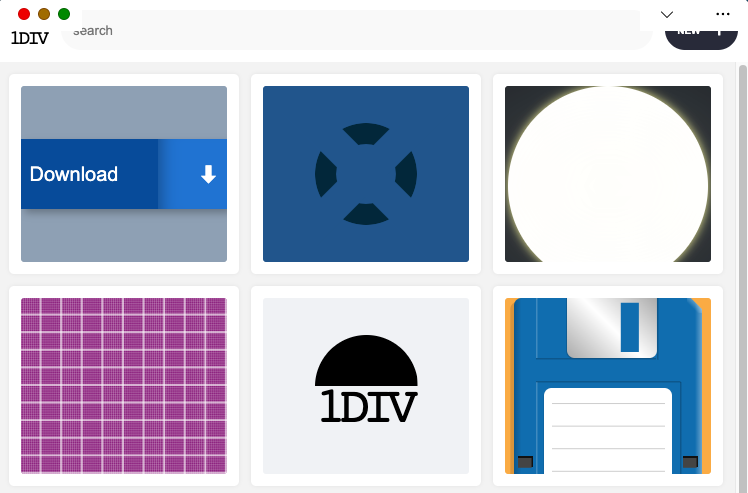
The demo app is called 1DIV. It's a simple CSS playground where users can create designs using CSS and a single HTML element.
The app has two pages. The first lists the existing CSS designs you've created:
 A screenshot of the 1DIV app displaying a thumbnail grid of CSS designs a user created.
The second page enables you to create and edit CSS designs:
 A screenshot of the 1DIV app editor page. The top half of the window displays a rendered CSS design, and a text editor on the bottom half of the window displays the CSS used to create it.
Since I've added a simple web manifest and service worker, we can install the app as a PWA on desktop. Here is what it looks like on macOS:
 Screenshots of the 1DIV app thumbnail view and CSS editor view on macOS. This version of the app's window has a separate control bar at the top for the app name and window control buttons.
And on Windows:
 Screenshots of the 1DIV app thumbnail view and CSS editor view on the Windows operating system. This version of the app's window also has a separate control bar at the top for the app name and window control buttons.
Our app is looking good, but the white title bar in the first page is wasted space. In the second page, it would be really nice if the design area went all the way to the top of the app window.
Let's use the Window Controls Overlay feature to improve this.
Enabling Window Controls OverlayThe feature is still experimental at the moment. To try it, you need to enable it in one of the supported browsers.
As of now, it has been implemented in Chromium, as a collaboration between Microsoft and Google. We can therefore use it in Chrome or Edge by going to the internal about://flags page, and enabling the Desktop PWA Window Controls Overlay flag.
Using Window Controls OverlayTo use the feature, we need to add the following display_override member to our web app's manifest file:
{
  "name": "1DIV",
  "description": "1DIV is a mini CSS playground",
  "lang": "en-US",
  "start_url": "/",
  "theme_color": "#ffffff",
  "background_color": "#ffffff",
  "display_override": [
    "window-controls-overlay"
  ],
  "icons": [
    ...
  ]
}
On the surface, the feature is really simple to use. This manifest change is the only thing we need to make the title bar disappear and turn the window controls into an overlay.
However, to provide a great experience for all users regardless of what device or browser they use, and to make the most of the title bar area in our design, we'll need a bit of CSS and JavaScript code.
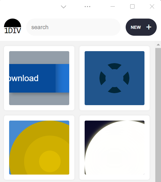
Here is what the app looks like now:
 Screenshot of the 1DIV app thumbnail view using Window Controls Overlay on macOS. The separate top bar area is gone, but the window controls are now blocking some of the app's interface
The title bar is gone, which is what we wanted, but our logo, search field, and NEW button are partially covered by the window controls because now our layout starts at the top of the window.
It's similar on Windows, with the difference that the close, maximize, and minimize buttons appear on the right side, grouped together with the PWA control buttons:
 Screenshot of the 1DIV app thumbnail display using Window Controls Overlay on the Windows operating system. The separate top bar area is gone, but the window controls are now blocking some of the app's content.
Using CSS to keep clear of the window controls
Screenshot of the 1DIV app thumbnail display using Window Controls Overlay on the Windows operating system. The separate top bar area is gone, but the window controls are now blocking some of the app's content.
Using CSS to keep clear of the window controls
Along with the feature, new CSS environment variables have been introduced:
- titlebar-area-x
- titlebar-area-y
- titlebar-area-width
- titlebar-area-height
You use these variables with the CSS env() function to position your content where the title bar would have been while ensuring it won't overlap with the window controls. In our case, we'll use two of the variables to position our header, which contains the logo, search bar, and NEW button.
header {
  position: absolute;
  left: env(titlebar-area-x, 0);
  width: env(titlebar-area-width, 100%);
  height: var(--toolbar-height);
}
The titlebar-area-x variable gives us the distance from the left of the viewport to where the title bar would appear, and titlebar-area-width is its width. (Remember, this is not equivalent to the width of the entire viewport, just the title bar portion, which as noted earlier, doesn't include the window controls.)
By doing this, we make sure our content remains fully visible. We're also defining fallback values (the second parameter in the env() function) for when the variables are not defined (such as on non-supporting browsers, or when the Windows Control Overlay feature is disabled).
 Screenshot of the 1DIV app thumbnail view on macOS with Window Controls Overlay and our CSS updated. The app content that the window controls had been blocking has been repositioned.
 Screenshot of the 1DIV app thumbnail view on the Windows operating system with Window Controls Overlay and our updated CSS. The app content that the window controls had been blocking has been repositioned.
Now our header adapts to its surroundings, and it doesn't feel like the window control buttons have been added as an afterthought. The app looks a lot more like a native app.
Changing the window controls background color so it blends inNow let's take a closer look at our second page: the CSS playground editor.
 Screenshots of the 1DIV app CSS editor view with Window Controls Overlay in macOS and Windows, respectively. The window controls overlay areas have a solid white background color, which contrasts with the hot pink color of the example CSS design displayed in the editor.
Not great. Our CSS demo area does go all the way to the top, which is what we wanted, but the way the window controls appear as white rectangles on top of it is quite jarring.
We can fix this by changing the app's theme color. There are a couple of ways to define it:
- PWAs can define a theme color in the web app manifest file using the theme_color manifest member. This color is then used by the OS in different ways. On desktop platforms, it is used to provide a background color to the title bar and window controls.
- Websites can use the theme-color meta tag as well. It's used by browsers to customize the color of the UI around the web page. For PWAs, this color can override the manifest theme_color.
In our case, we can set the manifest theme_color to white to provide the right default color for our app. The OS will read this color value when the app is installed and use it to make the window controls background color white. This color works great for our main page with the list of demos.
The theme-color meta tag can be changed at runtime, using JavaScript. So we can do that to override the white with the right demo background color when one is opened.
Here is the function we'll use:
function themeWindow(bgColor) {
  document.querySelector("meta[name=theme-color]").setAttribute('content', bgColor);
}
With this in place, we can imagine how using color and CSS transitions can produce a smooth change from the list page to the demo page, and enable the window control buttons to blend in with the rest of the app's interface.
 Screenshot of the 1DIV app CSS editor view on the Windows operating system with Window Controls Overlay and updated CSS demonstrating how the window control buttons blend in with the rest of the app's interface.
Dragging the window
Screenshot of the 1DIV app CSS editor view on the Windows operating system with Window Controls Overlay and updated CSS demonstrating how the window control buttons blend in with the rest of the app's interface.
Dragging the window
Now, getting rid of the title bar entirely does have an important accessibility consequence: it's much more difficult to move the application window around.
The title bar provides a sizable area for users to click and drag, but by using the Window Controls Overlay feature, this area becomes limited to where the control buttons are, and users have to very precisely aim between these buttons to move the window.
Fortunately, this can be fixed using CSS with the app-region property. This property is, for now, only supported in Chromium-based browsers and needs the -webkit- vendor prefix.
To make any element of the app become a dragging target for the window, we can use the following:
-webkit-app-region: drag;
It is also possible to explicitly make an element non-draggable:
-webkit-app-region: no-drag;
These options can be useful for us. We can make the entire header a dragging target, but make the search field and NEW button within it non-draggable so they can still be used as normal.
However, because the editor page doesn't display the header, users wouldn't be able to drag the window while editing code. So let's use a different approach. We'll create another element before our header, also absolutely positioned, and dedicated to dragging the window.
<div ></div>
<header>...</header>
.drag {
  position: absolute;
  top: 0;
  width: 100%;
  height: env(titlebar-area-height, 0);
  -webkit-app-region: drag;
}
With the above code, we're making the draggable area span the entire viewport width, and using the titlebar-area-height variable to make it as tall as what the title bar would have been. This way, our draggable area is aligned with the window control buttons as shown below.
And, now, to make sure our search field and button remain usable:
header .search,
header .new {
  -webkit-app-region: no-drag;
}
With the above code, users can click and drag where the title bar used to be. It is an area that users expect to be able to use to move windows on desktop, and we're not breaking this expectation, which is good.
 An animated view of the 1DIV app being dragged across a Windows desktop with the mouse.
Adapting to window resize
An animated view of the 1DIV app being dragged across a Windows desktop with the mouse.
Adapting to window resize
It may be useful for an app to know both whether the window controls overlay is visible and when its size changes. In our case, if the user made the window very narrow, there wouldn't be enough space for the search field, logo, and button to fit, so we'd want to push them down a bit.
The Window Controls Overlay feature comes with a JavaScript API we can use to do this: navigator.windowControlsOverlay.
The API provides three interesting things:
- navigator.windowControlsOverlay.visible lets us know whether the overlay is visible.
- navigator.windowControlsOverlay.getBoundingClientRect() lets us know the position and size of the title bar area.
- navigator.windowControlsOverlay.ongeometrychange lets us know when the size or visibility changes.
Let's use this to be aware of the size of the title bar area and move the header down if it's too narrow.
if (navigator.windowControlsOverlay) {
  navigator.windowControlsOverlay.addEventListener('geometrychange', () => {
    const { width } = navigator.windowControlsOverlay.getBoundingClientRect();
    document.body.classList.toggle('narrow', width < 250);
  });
}
In the example above, we set the narrow class on the body of the app if the title bar area is narrower than 250px. We could do something similar with a media query, but using the windowControlsOverlay API has two advantages for our use case:
- It's only fired when the feature is supported and used; we don't want to adapt the design otherwise.
- We get the size of the title bar area across operating systems, which is great because the size of the window controls is different on Mac and Windows. Using a media query wouldn't make it possible for us to know exactly how much space remains.
.narrow header {
  top: env(titlebar-area-height, 0);
  left: 0;
  width: 100%;
}
Using the above CSS code, we can move our header down to stay clear of the window control buttons when the window is too narrow, and move the thumbnails down accordingly.
 A screenshot of the 1DIV app on Windows showing the app's content adjusted for a much narrower viewport.
Thirty pixels of exciting design opportunities
A screenshot of the 1DIV app on Windows showing the app's content adjusted for a much narrower viewport.
Thirty pixels of exciting design opportunities
Using the Window Controls Overlay feature, we were able to take our simple demo app and turn it into something that feels so much more integrated on desktop devices. Something that reaches out of the usual window constraints and provides a custom experience for its users.
In reality, this feature only gives us about 30 pixels of extra room and comes with challenges on how to deal with the window controls. And yet, this extra room and those challenges can be turned into exciting design opportunities.
More devices of all shapes and forms get invented all the time, and the web keeps on evolving to adapt to them. New features get added to the web platform to allow us, web authors, to integrate more and more deeply with those devices. From watches or foldable devices to desktop computers, we need to evolve our design approach for the web. Building for the web now lets us think outside the rectangular box.
So let's embrace this. Let's use the standard technologies already at our disposal, and experiment with new ideas to provide tailored experiences for all devices, all from a single codebase!
If you get a chance to try the Window Controls Overlay feature and have feedback about it, you can open issues on the spec's repository. It's still early in the development of this feature, and you can help make it even better. Or, you can take a look at the feature's existing documentation, or this demo app and its source code.
Do you find yourself designing screens with only a vague idea of how the things on the screen relate to the things elsewhere in the system? Do you leave stakeholder meetings with unclear directives that often seem to contradict previous conversations? You know a better understanding of user needs would help the team get clear on what you are actually trying to accomplish, but time and budget for research is tight. When it comes to asking for more direct contact with your users, you might feel like poor Oliver Twist, timidly asking, "Please, sir, I want some more."
Here's the trick. You need to get stakeholders themselves to identify high-risk assumptions and hidden complexity, so that they become just as motivated as you to get answers from users. Basically, you need to make them think it's their idea.
In this article, I'll show you how to collaboratively expose misalignment and gaps in the team's shared understanding by bringing the team together around two simple questions:
- What are the objects?
- What are the relationships between those objects?
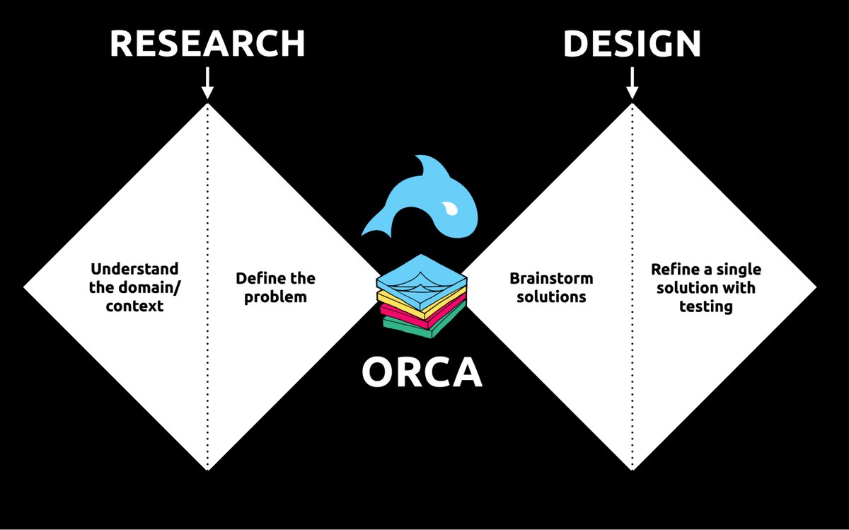
These two questions align to the first two steps of the ORCA process, which might become your new best friend when it comes to reducing guesswork. Wait, what's ORCA?! Glad you asked.
ORCA stands for Objects, Relationships, CTAs, and Attributes, and it outlines a process for creating solid object-oriented user experiences. Object-oriented UX is my design philosophy. ORCA is an iterative methodology for synthesizing user research into an elegant structural foundation to support screen and interaction design. OOUX and ORCA have made my work as a UX designer more collaborative, effective, efficient, fun, strategic, and meaningful.
The ORCA process has four iterative rounds and a whopping fifteen steps. In each round we get more clarity on our Os, Rs, Cs, and As.
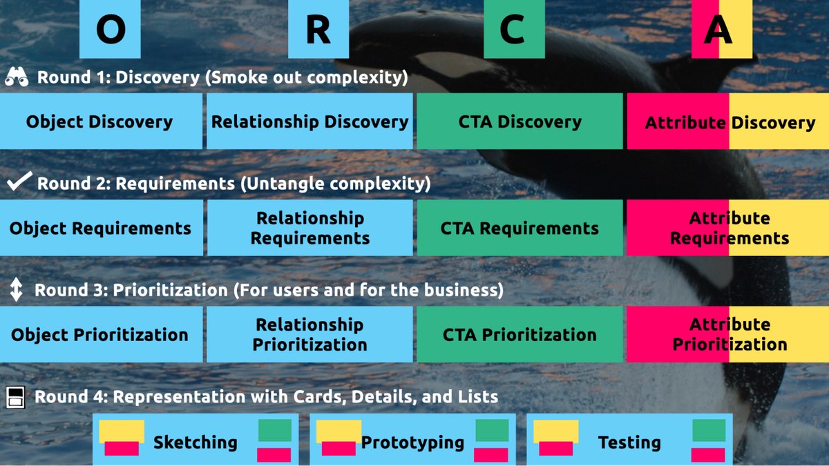 The four rounds and fifteen steps of the ORCA process. In the OOUX world, we love color-coding. Blue is reserved for objects! (Yellow is for core content, pink is for metadata, and green is for calls-to-action. Learn more about the color-coded object map and connecting CTAs to objects.)
I sometimes say that ORCA is a "garbage in, garbage out" process. To ensure that the testable prototype produced in the final round actually tests well, the process needs to be fed by good research. But if you don't have a ton of research, the beginning of the ORCA process serves another purpose: it helps you sell the need for research.
 ORCA strengthens the weak spot between research and design by helping distill research into solid information architecture—scaffolding for the screen design and interaction design to hang on.
In other words, the ORCA process serves as a gauntlet between research and design. With good research, you can gracefully ride the killer whale from research into design. But without good research, the process effectively spits you back into research and with a cache of specific open questions.
Getting in the same curiosity-boatWhat gets us into trouble is not what we don't know. It's what we know for sure that just ain't so.
Mark Twain
The first two steps of the ORCA process—Object Discovery and Relationship Discovery—shine a spotlight on the dark, dusty corners of your team's misalignments and any inherent complexity that's been swept under the rug. It begins to expose what this classic comic so beautifully illustrates:
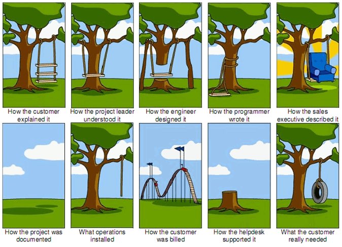 The original "Tree Swing Project Management" cartoon dates back to the 1960s or 1970s and has no artist attribution we could find.
This is one reason why so many UX designers are frustrated in their job and why many projects fail. And this is also why we often can't sell research: every decision-maker is confident in their own mental picture.
Once we expose hidden fuzzy patches in each picture and the differences between them all, the case for user research makes itself.
But how we do this is important. However much we might want to, we can't just tell everyone, "YOU ARE WRONG!" Instead, we need to facilitate and guide our team members to self-identify holes in their picture. When stakeholders take ownership of assumptions and gaps in understanding, BAM! Suddenly, UX research is not such a hard sell, and everyone is aboard the same curiosity-boat.
Say your users are doctors. And you have no idea how doctors use the system you are tasked with redesigning.
You might try to sell research by honestly saying: "We need to understand doctors better! What are their pain points? How do they use the current app?" But here's the problem with that. Those questions are vague, and the answers to them don't feel acutely actionable.
Instead, you want your stakeholders themselves to ask super-specific questions. This is more like the kind of conversation you need to facilitate. Let's listen in:
"Wait a sec, how often do doctors share patients? Does a patient in this system have primary and secondary doctors?"
"Can a patient even have more than one primary doctor?"
"Is it a 'primary doctor' or just a 'primary caregiver'… Can't that role be a nurse practitioner?"
"No, caregivers are something else… That's the patient's family contacts, right?"
"So are caregivers in scope for this redesign?"
"Yeah, because if a caregiver is present at an appointment, the doctor needs to note that. Like, tag the caregiver on the note… Or on the appointment?"
Now we are getting somewhere. Do you see how powerful it can be getting stakeholders to debate these questions themselves? The diabolical goal here is to shake their confidence—gently and diplomatically.
When these kinds of questions bubble up collaboratively and come directly from the mouths of your stakeholders and decision-makers, suddenly, designing screens without knowing the answers to these questions seems incredibly risky, even silly.
If we create software without understanding the real-world information environment of our users, we will likely create software that does not align to the real-world information environment of our users. And this will, hands down, result in a more confusing, more complex, and less intuitive software product.
The two questionsBut how do we get to these kinds of meaty questions diplomatically, efficiently, collaboratively, and reliably?
We can do this by starting with those two big questions that align to the first two steps of the ORCA process:
- What are the objects?
- What are the relationships between those objects?
In practice, getting to these answers is easier said than done. I'm going to show you how these two simple questions can provide the outline for an Object Definition Workshop. During this workshop, these "seed" questions will blossom into dozens of specific questions and shine a spotlight on the need for more user research.
Prep work: Noun foragingIn the next section, I'll show you how to run an Object Definition Workshop with your stakeholders (and entire cross-functional team, hopefully). But first, you need to do some prep work.
Basically, look for nouns that are particular to the business or industry of your project, and do it across at least a few sources. I call this noun foraging.
Here are just a few great noun foraging sources:
- the product's marketing site
- the product's competitors' marketing sites (competitive analysis, anyone?)
- the existing product (look at labels!)
- user interview transcripts
- notes from stakeholder interviews or vision docs from stakeholders
Put your detective hat on, my dear Watson. Get resourceful and leverage what you have. If all you have is a marketing website, some screenshots of the existing legacy system, and access to customer service chat logs, then use those.
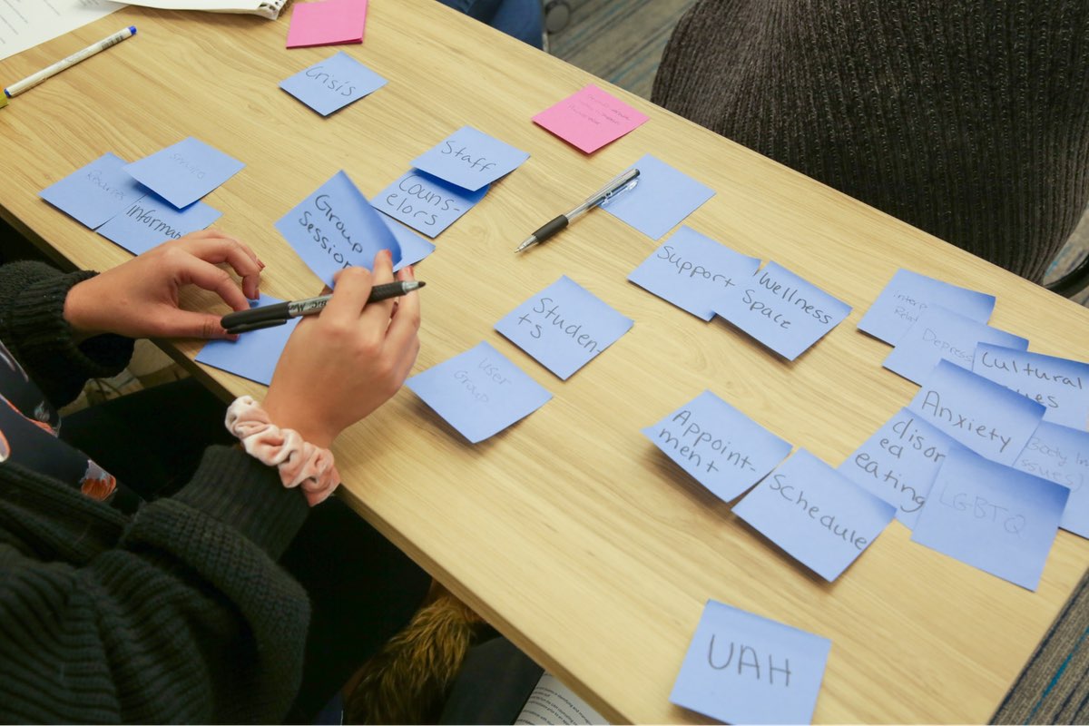
As you peruse these sources, watch for the nouns that are used over and over again, and start listing them (preferably on blue sticky notes if you'll be creating an object map later!).
You'll want to focus on nouns that might represent objects in your system. If you are having trouble determining if a noun might be object-worthy, remember the acronym SIP and test for:
- Structure
- Instances
- Purpose
Think of a library app, for example. Is "book" an object?
Structure: can you think of a few attributes for this potential object? Title, author, publish date… Yep, it has structure. Check!
Instance: what are some examples of this potential "book" object? Can you name a few? The Alchemist, Ready Player One, Everybody Poops… OK, check!
Purpose: why is this object important to the users and business? Well, "book" is what our library client is providing to people and books are why people come to the library… Check, check, check!
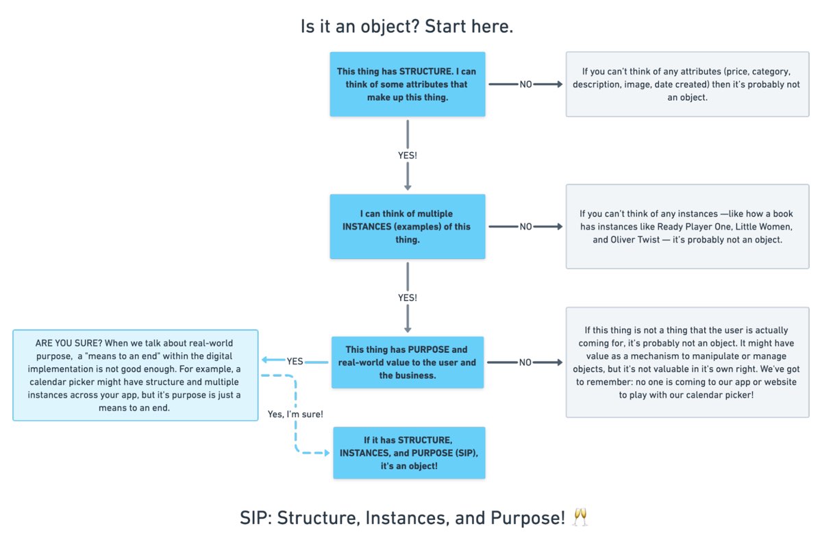 SIP: Structure, Instances, and Purpose! (Here's a flowchart where I elaborate even more on SIP.)
As you are noun foraging, focus on capturing the nouns that have SIP. Avoid capturing components like dropdowns, checkboxes, and calendar pickers—your UX system is not your design system! Components are just the packaging for objects—they are a means to an end. No one is coming to your digital place to play with your dropdown! They are coming for the VALUABLE THINGS and what they can do with them. Those things, or objects, are what we are trying to identify.
Let's say we work for a startup disrupting the email experience. This is how I'd start my noun foraging.
First I'd look at my own email client, which happens to be Gmail. I'd then look at Outlook and the new HEY email. I'd look at Yahoo, Hotmail…I'd even look at Slack and Basecamp and other so-called "email replacers." I'd read some articles, reviews, and forum threads where people are complaining about email. While doing all this, I would look for and write down the nouns.
(Before moving on, feel free to go noun foraging for this hypothetical product, too, and then scroll down to see how much our lists match up. Just don't get lost in your own emails! Come back to me!)
Drumroll, please…
Here are a few nouns I came up with during my noun foraging:
- email message
- thread
- contact
- client
- rule/automation
- email address that is not a contact?
- contact groups
- attachment
- Google doc file / other integrated file
- newsletter? (HEY treats this differently)
- saved responses and templates
 In the OOUX world, we love color-coding. Blue is reserved for objects! (Yellow is for core content, pink is for metadata, and green is for calls-to-action. Learn more about the color coded object map and connecting CTAs to objects.)
Scan your list of nouns and pick out words that you are completely clueless about. In our email example, it might be client or automation. Do as much homework as you can before your session with stakeholders: google what's googleable. But other terms might be so specific to the product or domain that you need to have a conversation about them.
Aside: here are some real nouns foraged during my own past project work that I needed my stakeholders to help me understand:
- Record Locator
- Incentive Home
- Augmented Line Item
- Curriculum-Based Measurement Probe
This is really all you need to prepare for the workshop session: a list of nouns that represent potential objects and a short list of nouns that need to be defined further.
Facilitate an Object Definition WorkshopYou could actually start your workshop with noun foraging—this activity can be done collaboratively. If you have five people in the room, pick five sources, assign one to every person, and give everyone ten minutes to find the objects within their source. When the time's up, come together and find the overlap. Affinity mapping is your friend here!
If your team is short on time and might be reluctant to do this kind of grunt work (which is usually the case) do your own noun foraging beforehand, but be prepared to show your work. I love presenting screenshots of documents and screens with all the nouns already highlighted. Bring the artifacts of your process, and start the workshop with a five-minute overview of your noun foraging journey.
HOT TIP: before jumping into the workshop, frame the conversation as a requirements-gathering session to help you better understand the scope and details of the system. You don't need to let them know that you're looking for gaps in the team's understanding so that you can prove the need for more user research—that will be our little secret. Instead, go into the session optimistically, as if your knowledgeable stakeholders and PMs and biz folks already have all the answers.
Then, let the question whack-a-mole commence.
1. What is this thing?Want to have some real fun? At the beginning of your session, ask stakeholders to privately write definitions for the handful of obscure nouns you might be uncertain about. Then, have everyone show their cards at the same time and see if you get different definitions (you will). This is gold for exposing misalignment and starting great conversations.
As your discussion unfolds, capture any agreed-upon definitions. And when uncertainty emerges, quietly (but visibly) start an "open questions" parking lot.
Do you remember when having a great website was enough? Now, people are getting answers from Siri, Google search snippets, and mobile apps, not just our websites. Forward-thinking organizations have adopted an omnichannel content strategy, whose mission is to reach audiences across multiple digital channels and platforms.
But how do you set up a content management system (CMS) to reach your audience now and in the future? I learned the hard way that creating a content model—a definition of content types, attributes, and relationships that let people and systems understand content—with my more familiar design-system thinking would capsize my customer's omnichannel content strategy. You can avoid that outcome by creating content models that are semantic and that also connect related content.
I recently had the opportunity to lead the CMS implementation for a Fortune 500 company. The client was excited by the benefits of an omnichannel content strategy, including content reuse, multichannel marketing, and robot delivery—designing content to be intelligible to bots, Google knowledge panels, snippets, and voice user interfaces.
A content model is a critical foundation for an omnichannel content strategy, and for our content to be understood by multiple systems, the model needed semantic types—types named according to their meaning instead of their presentation. Our goal was to let authors create content and reuse it wherever it was relevant. But as the project proceeded, I realized that supporting content reuse at the scale that my customer needed required the whole team to recognize a new pattern.
Despite our best intentions, we kept drawing from what we were more familiar with: design systems. Unlike web-focused content strategies, an omnichannel content strategy can't rely on WYSIWYG tools for design and layout. Our tendency to approach the content model with our familiar design-system thinking constantly led us to veer away from one of the primary purposes of a content model: delivering content to audiences on multiple marketing channels.
Two essential principles for an effective content modelWe needed to help our designers, developers, and stakeholders understand that we were doing something very different from their prior web projects, where it was natural for everyone to think about content as visual building blocks fitting into layouts. The previous approach was not only more familiar but also more intuitive—at least at first—because it made the designs feel more tangible. We discovered two principles that helped the team understand how a content model differs from the design systems that we were used to:
- Content models must define semantics instead of layout.
- And content models should connect content that belongs together.
A semantic content model uses type and attribute names that reflect the meaning of the content, not how it will be displayed. For example, in a nonsemantic model, teams might create types like teasers, media blocks, and cards. Although these types might make it easy to lay out content, they don't help delivery channels understand the content's meaning, which in turn would have opened the door to the content being presented in each marketing channel. In contrast, a semantic content model uses type names like product, service, and testimonial so that each delivery channel can understand the content and use it as it sees fit.
When you're creating a semantic content model, a great place to start is to look over the types and properties defined by Schema.org, a community-driven resource for type definitions that are intelligible to platforms like Google search.
A semantic content model has several benefits:
- Even if your team doesn't care about omnichannel content, a semantic content model decouples content from its presentation so that teams can evolve the website's design without needing to refactor its content. In this way, content can withstand disruptive website redesigns.
- A semantic content model also provides a competitive edge. By adding structured data based on Schema.org's types and properties, a website can provide hints to help Google understand the content, display it in search snippets or knowledge panels, and use it to answer voice-interface user questions. Potential visitors could discover your content without ever setting foot in your website.
- Beyond those practical benefits, you'll also need a semantic content model if you want to deliver omnichannel content. To use the same content in multiple marketing channels, delivery channels need to be able to understand it. For example, if your content model were to provide a list of questions and answers, it could easily be rendered on a frequently asked questions (FAQ) page, but it could also be used in a voice interface or by a bot that answers common questions.
For example, using a semantic content model for articles, events, people, and locations lets A List Apart provide cleanly structured data for search engines so that users can read the content on the website, in Google knowledge panels, and even with hypothetical voice interfaces in the future.
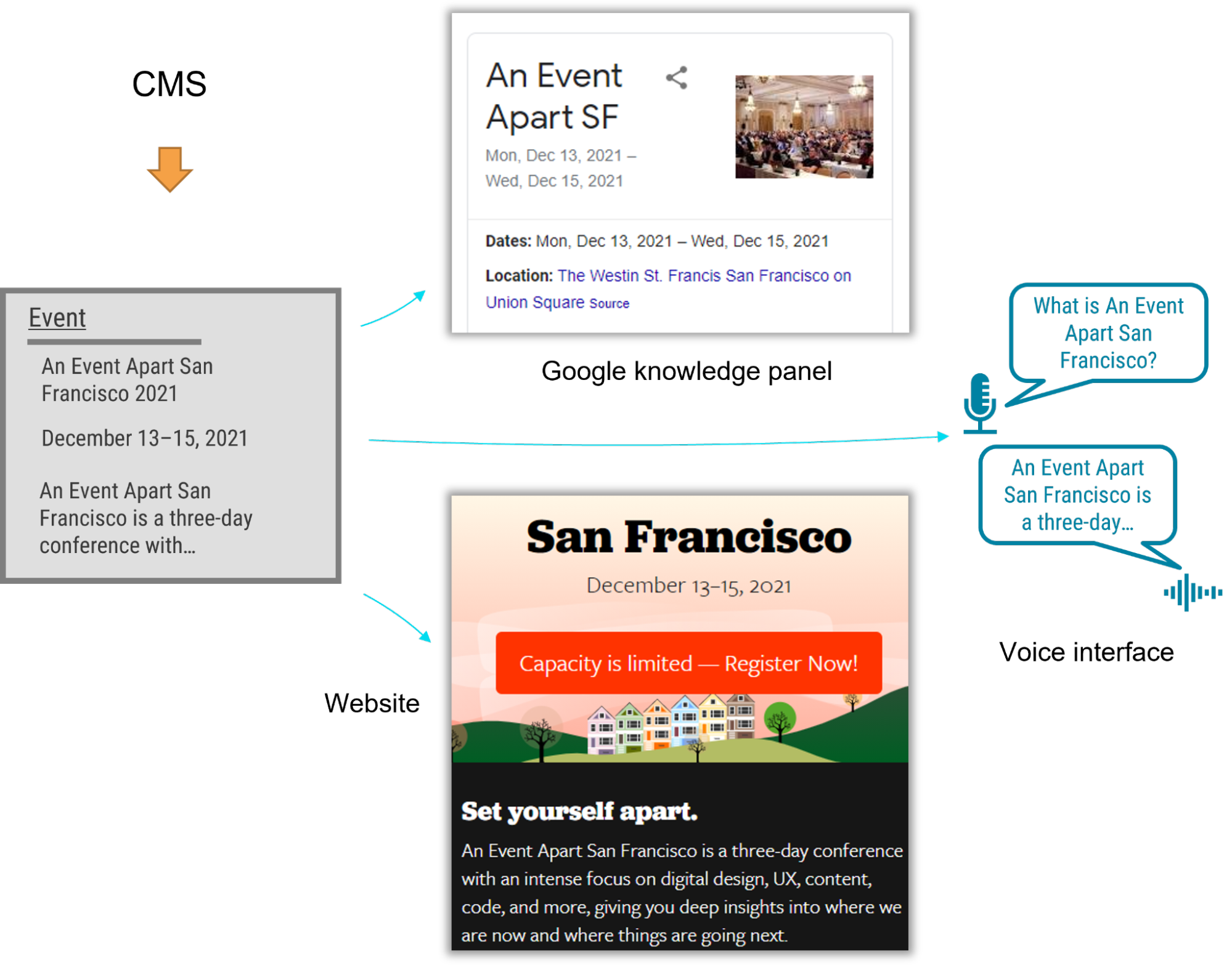 Content models that connect
After struggling to describe what makes a good content model, I've come to realize that the best models are those that are semantic and that also connect related content components (such as a FAQ item's question and answer pair), instead of slicing up related content across disparate content components. A good content model connects content that should remain together so that multiple delivery channels can use it without needing to first put those pieces back together.
Think about writing an article or essay. An article's meaning and usefulness depends upon its parts being kept together. Would one of the headings or paragraphs be meaningful on their own without the context of the full article? On our project, our familiar design-system thinking often led us to want to create content models that would slice content into disparate chunks to fit the web-centric layout. This had a similar impact to an article that were to have been separated from its headline. Because we were slicing content into standalone pieces based on layout, content that belonged together became difficult to manage and nearly impossible for multiple delivery channels to understand.
To illustrate, let's look at how connecting related content applies in a real-world scenario. The design team for our customer presented a complex layout for a software product page that included multiple tabs and sections. Our instincts were to follow suit with the content model. Shouldn't we make it as easy and as flexible as possible to add any number of tabs in the future?
Because our design-system instincts were so familiar, it felt like we had needed a content type called "tab section" so that multiple tab sections could be added to a page. Each tab section would display various types of content. One tab might provide the software's overview or its specifications. Another tab might provide a list of resources.
Our inclination to break down the content model into "tab section" pieces would have led to an unnecessarily complex model and a cumbersome editing experience, and it would have also created content that couldn't have been understood by additional delivery channels. For example, how would another system have been able to tell which "tab section" referred to a product's specifications or its resource list—would that other system have to have resorted to counting tab sections and content blocks? This would have prevented the tabs from ever being reordered, and it would have required adding logic in every other delivery channel to interpret the design system's layout. Furthermore, if the customer were to have no longer wanted to display this content in a tab layout, it would have been tedious to migrate to a new content model to reflect the new page redesign.
 A content model based on design components is unnecessarily complex, and it's unintelligible to systems.
We had a breakthrough when we discovered that our customer had a specific purpose in mind for each tab: it would reveal specific information such as the software product's overview, specifications, related resources, and pricing. Once implementation began, our inclination to focus on what's visual and familiar had obscured the intent of the designs. With a little digging, it didn't take long to realize that the concept of tabs wasn't relevant to the content model. The meaning of the content that they were planning to display in the tabs was what mattered.
In fact, the customer could have decided to display this content in a different way—without tabs—somewhere else. This realization prompted us to define content types for the software product based on the meaningful attributes that the customer had wanted to render on the web. There were obvious semantic attributes like name and description as well as rich attributes like screenshots, software requirements, and feature lists. The software's product information stayed together because it wasn't sliced across separate components like "tab sections" that were derived from the content's presentation. Any delivery channel—including future ones—could understand and present this content.
 A good content model connects content that belongs together so it can be easily managed and reused.
Conclusion
A good content model connects content that belongs together so it can be easily managed and reused.
Conclusion
In this omnichannel marketing project, we discovered that the best way to keep our content model on track was to ensure that it was semantic (with type and attribute names that reflected the meaning of the content) and that it kept content together that belonged together (instead of fragmenting it). These two concepts curtailed our temptation to shape the content model based on the design. So if you're working on a content model to support an omnichannel content strategy—or even if you just want to make sure that Google and other interfaces understand your content—remember:
- A design system isn't a content model. Team members may be tempted to conflate them and to make your content model mirror your design system, so you should protect the semantic value and contextual structure of the content strategy during the entire implementation process. This will let every delivery channel consume the content without needing a magic decoder ring.
- If your team is struggling to make this transition, you can still reap some of the benefits by using Schema.org-based structured data in your website. Even if additional delivery channels aren't on the immediate horizon, the benefit to search engine optimization is a compelling reason on its own.
- Additionally, remind the team that decoupling the content model from the design will let them update the designs more easily because they won't be held back by the cost of content migrations. They'll be able to create new designs without the obstacle of compatibility between the design and the content, and they'll be ready for the next big thing.
By rigorously advocating for these principles, you'll help your team treat content the way that it deserves—as the most critical asset in your user experience and the best way to connect with your audience.
Antiracist economist Kim Crayton says that "intention without strategy is chaos." We've discussed how our biases, assumptions, and inattention toward marginalized and vulnerable groups lead to dangerous and unethical tech—but what, specifically, do we need to do to fix it? The intention to make our tech safer is not enough; we need a strategy.
This chapter will equip you with that plan of action. It covers how to integrate safety principles into your design work in order to create tech that's safe, how to convince your stakeholders that this work is necessary, and how to respond to the critique that what we actually need is more diversity. (Spoiler: we do, but diversity alone is not the antidote to fixing unethical, unsafe tech.)
The process for inclusive safetyWhen you are designing for safety, your goals are to:
- identify ways your product can be used for abuse,
- design ways to prevent the abuse, and
- provide support for vulnerable users to reclaim power and control.
The Process for Inclusive Safety is a tool to help you reach those goals (Fig 5.1). It's a methodology I created in 2018 to capture the various techniques I was using when designing products with safety in mind. Whether you are creating an entirely new product or adding to an existing feature, the Process can help you make your product safe and inclusive. The Process includes five general areas of action:
- Conducting research
- Creating archetypes
- Brainstorming problems
- Designing solutions
- Testing for safety
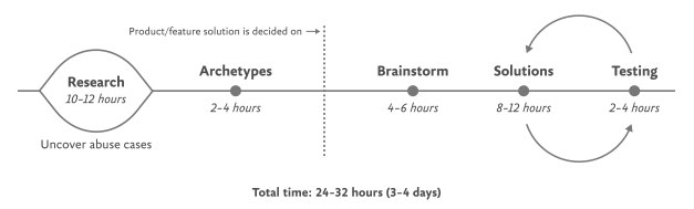 Fig 5.1: Each aspect of the Process for Inclusive Safety can be incorporated into your design process where it makes the most sense for you. The times given are estimates to help you incorporate the stages into your design plan.
The Process is meant to be flexible—it won't make sense for teams to implement every step in some situations. Use the parts that are relevant to your unique work and context; this is meant to be something you can insert into your existing design practice.
And once you use it, if you have an idea for making it better or simply want to provide context of how it helped your team, please get in touch with me. It's a living document that I hope will continue to be a useful and realistic tool that technologists can use in their day-to-day work.
If you're working on a product specifically for a vulnerable group or survivors of some form of trauma, such as an app for survivors of domestic violence, sexual assault, or drug addiction, be sure to read Chapter 7, which covers that situation explicitly and should be handled a bit differently. The guidelines here are for prioritizing safety when designing a more general product that will have a wide user base (which, we already know from statistics, will include certain groups that should be protected from harm). Chapter 7 is focused on products that are specifically for vulnerable groups and people who have experienced trauma.
Step 1: Conduct researchDesign research should include a broad analysis of how your tech might be weaponized for abuse as well as specific insights into the experiences of survivors and perpetrators of that type of abuse. At this stage, you and your team will investigate issues of interpersonal harm and abuse, and explore any other safety, security, or inclusivity issues that might be a concern for your product or service, like data security, racist algorithms, and harassment.
Broad researchYour project should begin with broad, general research into similar products and issues around safety and ethical concerns that have already been reported. For example, a team building a smart home device would do well to understand the multitude of ways that existing smart home devices have been used as tools of abuse. If your product will involve AI, seek to understand the potentials for racism and other issues that have been reported in existing AI products. Nearly all types of technology have some kind of potential or actual harm that's been reported on in the news or written about by academics. Google Scholar is a useful tool for finding these studies.
Specific research: SurvivorsWhen possible and appropriate, include direct research (surveys and interviews) with people who are experts in the forms of harm you have uncovered. Ideally, you'll want to interview advocates working in the space of your research first so that you have a more solid understanding of the topic and are better equipped to not retraumatize survivors. If you've uncovered possible domestic violence issues, for example, the experts you'll want to speak with are survivors themselves, as well as workers at domestic violence hotlines, shelters, other related nonprofits, and lawyers.
Especially when interviewing survivors of any kind of trauma, it is important to pay people for their knowledge and lived experiences. Don't ask survivors to share their trauma for free, as this is exploitative. While some survivors may not want to be paid, you should always make the offer in the initial ask. An alternative to payment is to donate to an organization working against the type of violence that the interviewee experienced. We'll talk more about how to appropriately interview survivors in Chapter 6.
Specific research: AbusersIt's unlikely that teams aiming to design for safety will be able to interview self-proclaimed abusers or people who have broken laws around things like hacking. Don't make this a goal; rather, try to get at this angle in your general research. Aim to understand how abusers or bad actors weaponize technology to use against others, how they cover their tracks, and how they explain or rationalize the abuse.
Step 2: Create archetypesOnce you've finished conducting your research, use your insights to create abuser and survivor archetypes. Archetypes are not personas, as they're not based on real people that you interviewed and surveyed. Instead, they're based on your research into likely safety issues, much like when we design for accessibility: we don't need to have found a group of blind or low-vision users in our interview pool to create a design that's inclusive of them. Instead, we base those designs on existing research into what this group needs. Personas typically represent real users and include many details, while archetypes are broader and can be more generalized.
The abuser archetype is someone who will look at the product as a tool to perform harm (Fig 5.2). They may be trying to harm someone they don't know through surveillance or anonymous harassment, or they may be trying to control, monitor, abuse, or torment someone they know personally.
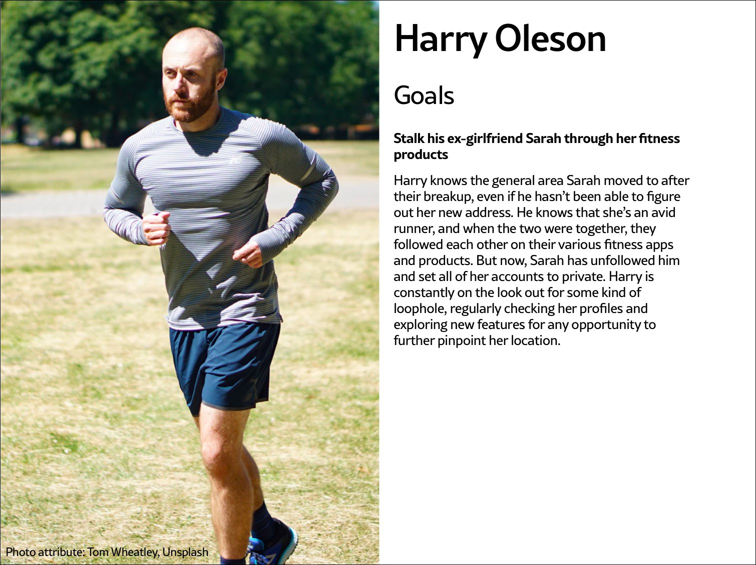 Fig 5.2: Harry Oleson, an abuser archetype for a fitness product, is looking for ways to stalk his ex-girlfriend through the fitness apps she uses.
The survivor archetype is someone who is being abused with the product. There are various situations to consider in terms of the archetype's understanding of the abuse and how to put an end to it: Do they need proof of abuse they already suspect is happening, or are they unaware they've been targeted in the first place and need to be alerted (Fig 5.3)?
 Fig 5.3: The survivor archetype Lisa Zwaan suspects her husband is weaponizing their home's IoT devices against her, but in the face of his insistence that she simply doesn't understand how to use the products, she's unsure. She needs some kind of proof of the abuse.
You may want to make multiple survivor archetypes to capture a range of different experiences. They may know that the abuse is happening but not be able to stop it, like when an abuser locks them out of IoT devices; or they know it's happening but don't know how, such as when a stalker keeps figuring out their location (Fig 5.4). Include as many of these scenarios as you need to in your survivor archetype. You'll use these later on when you design solutions to help your survivor archetypes achieve their goals of preventing and ending abuse.
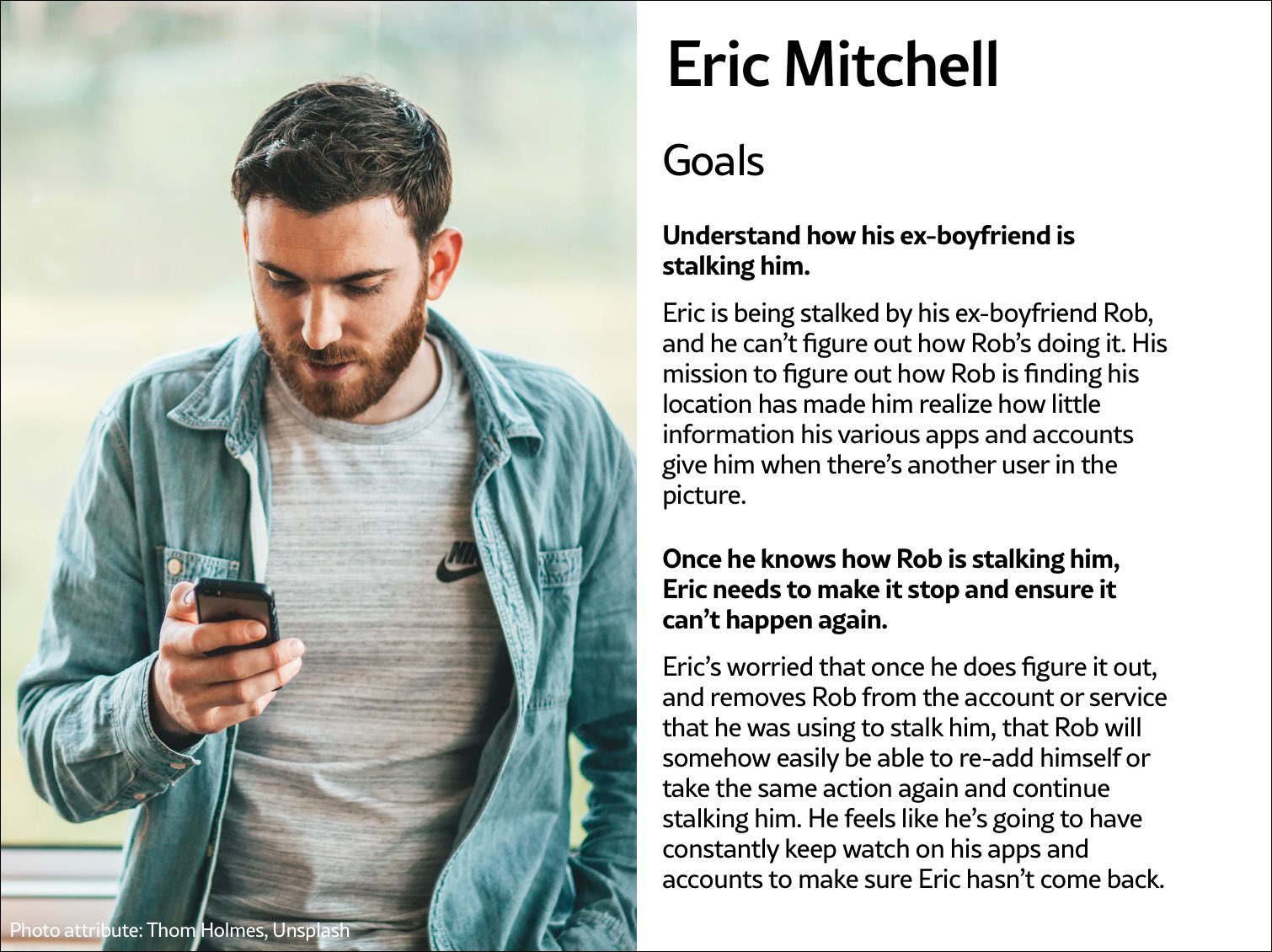 Fig 5.4: The survivor archetype Eric Mitchell knows he's being stalked by his ex-boyfriend Rob but can't figure out how Rob is learning his location information.
It may be useful for you to create persona-like artifacts for your archetypes, such as the three examples shown. Instead of focusing on the demographic information we often see in personas, focus on their goals. The goals of the abuser will be to carry out the specific abuse you've identified, while the goals of the survivor will be to prevent abuse, understand that abuse is happening, make ongoing abuse stop, or regain control over the technology that's being used for abuse. Later, you'll brainstorm how to prevent the abuser's goals and assist the survivor's goals.
And while the "abuser/survivor" model fits most cases, it doesn't fit all, so modify it as you need to. For example, if you uncovered an issue with security, such as the ability for someone to hack into a home camera system and talk to children, the malicious hacker would get the abuser archetype and the child's parents would get survivor archetype.
Step 3: Brainstorm problemsAfter creating archetypes, brainstorm novel abuse cases and safety issues. "Novel" means things not found in your research; you're trying to identify completely new safety issues that are unique to your product or service. The goal with this step is to exhaust every effort of identifying harms your product could cause. You aren't worrying about how to prevent the harm yet—that comes in the next step.
How could your product be used for any kind of abuse, outside of what you've already identified in your research? I recommend setting aside at least a few hours with your team for this process.
If you're looking for somewhere to start, try doing a Black Mirror brainstorm. This exercise is based on the show Black Mirror, which features stories about the dark possibilities of technology. Try to figure out how your product would be used in an episode of the show—the most wild, awful, out-of-control ways it could be used for harm. When I've led Black Mirror brainstorms, participants usually end up having a good deal of fun (which I think is great—it's okay to have fun when designing for safety!). I recommend time-boxing a Black Mirror brainstorm to half an hour, and then dialing it back and using the rest of the time thinking of more realistic forms of harm.
After you've identified as many opportunities for abuse as possible, you may still not feel confident that you've uncovered every potential form of harm. A healthy amount of anxiety is normal when you're doing this kind of work. It's common for teams designing for safety to worry, "Have we really identified every possible harm? What if we've missed something?" If you've spent at least four hours coming up with ways your product could be used for harm and have run out of ideas, go to the next step.
It's impossible to guarantee you've thought of everything; instead of aiming for 100 percent assurance, recognize that you've taken this time and have done the best you can, and commit to continuing to prioritize safety in the future. Once your product is released, your users may identify new issues that you missed; aim to receive that feedback graciously and course-correct quickly.
Step 4: Design solutionsAt this point, you should have a list of ways your product can be used for harm as well as survivor and abuser archetypes describing opposing user goals. The next step is to identify ways to design against the identified abuser's goals and to support the survivor's goals. This step is a good one to insert alongside existing parts of your design process where you're proposing solutions for the various problems your research uncovered.
Some questions to ask yourself to help prevent harm and support your archetypes include:
- Can you design your product in such a way that the identified harm cannot happen in the first place? If not, what roadblocks can you put up to prevent the harm from happening?
- How can you make the victim aware that abuse is happening through your product?
- How can you help the victim understand what they need to do to make the problem stop?
- Can you identify any types of user activity that would indicate some form of harm or abuse? Could your product help the user access support?
In some products, it's possible to proactively recognize that harm is happening. For example, a pregnancy app might be modified to allow the user to report that they were the victim of an assault, which could trigger an offer to receive resources for local and national organizations. This sort of proactiveness is not always possible, but it's worth taking a half hour to discuss if any type of user activity would indicate some form of harm or abuse, and how your product could assist the user in receiving help in a safe manner.
That said, use caution: you don't want to do anything that could put a user in harm's way if their devices are being monitored. If you do offer some kind of proactive help, always make it voluntary, and think through other safety issues, such as the need to keep the user in-app in case an abuser is checking their search history. We'll walk through a good example of this in the next chapter.
Step 5: Test for safetyThe final step is to test your prototypes from the point of view of your archetypes: the person who wants to weaponize the product for harm and the victim of the harm who needs to regain control over the technology. Just like any other kind of product testing, at this point you'll aim to rigorously test out your safety solutions so that you can identify gaps and correct them, validate that your designs will help keep your users safe, and feel more confident releasing your product into the world.
Ideally, safety testing happens along with usability testing. If you're at a company that doesn't do usability testing, you might be able to use safety testing to cleverly perform both; a user who goes through your design attempting to weaponize the product against someone else can also be encouraged to point out interactions or other elements of the design that don't make sense to them.
You'll want to conduct safety testing on either your final prototype or the actual product if it's already been released. There's nothing wrong with testing an existing product that wasn't designed with safety goals in mind from the onset—"retrofitting" it for safety is a good thing to do.
Remember that testing for safety involves testing from the perspective of both an abuser and a survivor, though it may not make sense for you to do both. Alternatively, if you made multiple survivor archetypes to capture multiple scenarios, you'll want to test from the perspective of each one.
As with other sorts of usability testing, you as the designer are most likely too close to the product and its design by this point to be a valuable tester; you know the product too well. Instead of doing it yourself, set up testing as you would with other usability testing: find someone who is not familiar with the product and its design, set the scene, give them a task, encourage them to think out loud, and observe how they attempt to complete it.
Abuser testingThe goal of this testing is to understand how easy it is for someone to weaponize your product for harm. Unlike with usability testing, you want to make it impossible, or at least difficult, for them to achieve their goal. Reference the goals in the abuser archetype you created earlier, and use your product in an attempt to achieve them.
For example, for a fitness app with GPS-enabled location features, we can imagine that the abuser archetype would have the goal of figuring out where his ex-girlfriend now lives. With this goal in mind, you'd try everything possible to figure out the location of another user who has their privacy settings enabled. You might try to see her running routes, view any available information on her profile, view anything available about her location (which she has set to private), and investigate the profiles of any other users somehow connected with her account, such as her followers.
If by the end of this you've managed to uncover some of her location data, despite her having set her profile to private, you know now that your product enables stalking. Your next step is to go back to step 4 and figure out how to prevent this from happening. You may need to repeat the process of designing solutions and testing them more than once.
Survivor testingSurvivor testing involves identifying how to give information and power to the survivor. It might not always make sense based on the product or context. Thwarting the attempt of an abuser archetype to stalk someone also satisfies the goal of the survivor archetype to not be stalked, so separate testing wouldn't be needed from the survivor's perspective.
However, there are cases where it makes sense. For example, for a smart thermostat, a survivor archetype's goals would be to understand who or what is making the temperature change when they aren't doing it themselves. You could test this by looking for the thermostat's history log and checking for usernames, actions, and times; if you couldn't find that information, you would have more work to do in step 4.
Another goal might be regaining control of the thermostat once the survivor realizes the abuser is remotely changing its settings. Your test would involve attempting to figure out how to do this: are there instructions that explain how to remove another user and change the password, and are they easy to find? This might again reveal that more work is needed to make it clear to the user how they can regain control of the device or account.
Stress testingTo make your product more inclusive and compassionate, consider adding stress testing. This concept comes from Design for Real Life by Eric Meyer and Sara Wachter-Boettcher. The authors pointed out that personas typically center people who are having a good day—but real users are often anxious, stressed out, having a bad day, or even experiencing tragedy. These are called "stress cases," and testing your products for users in stress-case situations can help you identify places where your design lacks compassion. Design for Real Life has more details about what it looks like to incorporate stress cases into your design as well as many other great tactics for compassionate design.
In the 1950s, many in the elite running community had begun to believe it wasn't possible to run a mile in less than four minutes. Runners had been attempting it since the late 19th century and were beginning to draw the conclusion that the human body simply wasn't built for the task.
But on May 6, 1956, Roger Bannister took everyone by surprise. It was a cold, wet day in Oxford, England—conditions no one expected to lend themselves to record-setting—and yet Bannister did just that, running a mile in 3:59.4 and becoming the first person in the record books to run a mile in under four minutes.
This shift in the benchmark had profound effects; the world now knew that the four-minute mile was possible. Bannister's record lasted only forty-six days, when it was snatched away by Australian runner John Landy. Then a year later, three runners all beat the four-minute barrier together in the same race. Since then, over 1,400 runners have officially run a mile in under four minutes; the current record is 3:43.13, held by Moroccan athlete Hicham El Guerrouj.
We achieve far more when we believe that something is possible, and we will believe it's possible only when we see someone else has already done it—and as with human running speed, so it is with what we believe are the hard limits for how a website needs to perform.
Establishing standards for a sustainable webIn most major industries, the key metrics of environmental performance are fairly well established, such as miles per gallon for cars or energy per square meter for homes. The tools and methods for calculating those metrics are standardized as well, which keeps everyone on the same page when doing environmental assessments. In the world of websites and apps, however, we aren't held to any particular environmental standards, and only recently have gained the tools and methods we need to even make an environmental assessment.
The primary goal in sustainable web design is to reduce carbon emissions. However, it's almost impossible to actually measure the amount of CO2 produced by a web product. We can't measure the fumes coming out of the exhaust pipes on our laptops. The emissions of our websites are far away, out of sight and out of mind, coming out of power stations burning coal and gas. We have no way to trace the electrons from a website or app back to the power station where the electricity is being generated and actually know the exact amount of greenhouse gas produced. So what do we do?
If we can't measure the actual carbon emissions, then we need to find what we can measure. The primary factors that could be used as indicators of carbon emissions are:
- Data transfer
- Carbon intensity of electricity
Let's take a look at how we can use these metrics to quantify the energy consumption, and in turn the carbon footprint, of the websites and web apps we create.
Data transferMost researchers use kilowatt-hours per gigabyte (kWh/GB) as a metric of energy efficiency when measuring the amount of data transferred over the internet when a website or application is used. This provides a great reference point for energy consumption and carbon emissions. As a rule of thumb, the more data transferred, the more energy used in the data center, telecoms networks, and end user devices.
For web pages, data transfer for a single visit can be most easily estimated by measuring the page weight, meaning the transfer size of the page in kilobytes the first time someone visits the page. It's fairly easy to measure using the developer tools in any modern web browser. Often your web hosting account will include statistics for the total data transfer of any web application (Fig 2.1).
 Fig 2.1: The Kinsta hosting dashboard displays data transfer alongside traffic volumes. If you divide data transfer by visits, you get the average data per visit, which can be used as a metric of efficiency.
The nice thing about page weight as a metric is that it allows us to compare the efficiency of web pages on a level playing field without confusing the issue with constantly changing traffic volumes.
Reducing page weight requires a large scope. By early 2020, the median page weight was 1.97 MB for setups the HTTP Archive classifies as "desktop" and 1.77 MB for "mobile," with desktop increasing 36 percent since January 2016 and mobile page weights nearly doubling in the same period (Fig 2.2). Roughly half of this data transfer is image files, making images the single biggest source of carbon emissions on the average website.
History clearly shows us that our web pages can be smaller, if only we set our minds to it. While most technologies become ever more energy efficient, including the underlying technology of the web such as data centers and transmission networks, websites themselves are a technology that becomes less efficient as time goes on.
 Fig 2.2: The historical page weight data from HTTP Archive can teach us a lot about what is possible in the future.
You might be familiar with the concept of performance budgeting as a way of focusing a project team on creating faster user experiences. For example, we might specify that the website must load in a maximum of one second on a broadband connection and three seconds on a 3G connection. Much like speed limits while driving, performance budgets are upper limits rather than vague suggestions, so the goal should always be to come in under budget.
Designing for fast performance does often lead to reduced data transfer and emissions, but it isn't always the case. Web performance is often more about the subjective perception of load times than it is about the true efficiency of the underlying system, whereas page weight and transfer size are more objective measures and more reliable benchmarks for sustainable web design.
We can set a page weight budget in reference to a benchmark of industry averages, using data from sources like HTTP Archive. We can also benchmark page weight against competitors or the old version of the website we're replacing. For example, we might set a maximum page weight budget as equal to our most efficient competitor, or we could set the benchmark lower to guarantee we are best in class.
If we want to take it to the next level, then we could also start looking at the transfer size of our web pages for repeat visitors. Although page weight for the first time someone visits is the easiest thing to measure, and easy to compare on a like-for-like basis, we can learn even more if we start looking at transfer size in other scenarios too. For example, visitors who load the same page multiple times will likely have a high percentage of the files cached in their browser, meaning they don't need to transfer all of the files on subsequent visits. Likewise, a visitor who navigates to new pages on the same website will likely not need to load the full page each time, as some global assets from areas like the header and footer may already be cached in their browser. Measuring transfer size at this next level of detail can help us learn even more about how we can optimize efficiency for users who regularly visit our pages, and enable us to set page weight budgets for additional scenarios beyond the first visit.
Page weight budgets are easy to track throughout a design and development process. Although they don't actually tell us carbon emission and energy consumption analytics directly, they give us a clear indication of efficiency relative to other websites. And as transfer size is an effective analog for energy consumption, we can actually use it to estimate energy consumption too.
In summary, reduced data transfer translates to energy efficiency, a key factor to reducing carbon emissions of web products. The more efficient our products, the less electricity they use, and the less fossil fuels need to be burned to produce the electricity to power them. But as we'll see next, since all web products demand some power, it's important to consider the source of that electricity, too.
Carbon intensity of electricityRegardless of energy efficiency, the level of pollution caused by digital products depends on the carbon intensity of the energy being used to power them. Carbon intensity is a term used to define the grams of CO2 produced for every kilowatt-hour of electricity (gCO2/kWh). This varies widely, with renewable energy sources and nuclear having an extremely low carbon intensity of less than 10 gCO2/kWh (even when factoring in their construction); whereas fossil fuels have very high carbon intensity of approximately 200-400 gCO2/kWh.
Most electricity comes from national or state grids, where energy from a variety of different sources is mixed together with varying levels of carbon intensity. The distributed nature of the internet means that a single user of a website or app might be using energy from multiple different grids simultaneously; a website user in Paris uses electricity from the French national grid to power their home internet and devices, but the website's data center could be in Dallas, USA, pulling electricity from the Texas grid, while the telecoms networks use energy from everywhere between Dallas and Paris.
We don't have control over the full energy supply of web services, but we do have some control over where we host our projects. With a data center using a significant proportion of the energy of any website, locating the data center in an area with low carbon energy will tangibly reduce its carbon emissions. Danish startup Tomorrow reports and maps this user-contributed data, and a glance at their map shows how, for example, choosing a data center in France will have significantly lower carbon emissions than a data center in the Netherlands (Fig 2.3).
 Fig 2.3: Tomorrow's electricityMap shows live data for the carbon intensity of electricity by country.
That said, we don't want to locate our servers too far away from our users; it takes energy to transmit data through the telecom's networks, and the further the data travels, the more energy is consumed. Just like food miles, we can think of the distance from the data center to the website's core user base as "megabyte miles"—and we want it to be as small as possible.
Using the distance itself as a benchmark, we can use website analytics to identify the country, state, or even city where our core user group is located and measure the distance from that location to the data center used by our hosting company. This will be a somewhat fuzzy metric as we don't know the precise center of mass of our users or the exact location of a data center, but we can at least get a rough idea.
For example, if a website is hosted in London but the primary user base is on the West Coast of the USA, then we could look up the distance from London to San Francisco, which is 5,300 miles. That's a long way! We can see that hosting it somewhere in North America, ideally on the West Coast, would significantly reduce the distance and thus the energy used to transmit the data. In addition, locating our servers closer to our visitors helps reduce latency and delivers better user experience, so it's a win-win.
Converting it back to carbon emissionsIf we combine carbon intensity with a calculation for energy consumption, we can calculate the carbon emissions of our websites and apps. A tool my team created does this by measuring the data transfer over the wire when loading a web page, calculating the amount of electricity associated, and then converting that into a figure for CO2 (Fig 2.4). It also factors in whether or not the web hosting is powered by renewable energy.
If you want to take it to the next level and tailor the data more accurately to the unique aspects of your project, the Energy and Emissions Worksheet accompanying this book shows you how.
 Fig 2.4: The Website Carbon Calculator shows how the Riverford Organic website embodies their commitment to sustainability, being both low carbon and hosted in a data center using renewable energy.
With the ability to calculate carbon emissions for our projects, we could actually take a page weight budget one step further and set carbon budgets as well. CO2 is not a metric commonly used in web projects; we're more familiar with kilobytes and megabytes, and can fairly easily look at design options and files to assess how big they are. Translating that into carbon adds a layer of abstraction that isn't as intuitive—but carbon budgets do focus our minds on the primary thing we're trying to reduce, and support the core objective of sustainable web design: reducing carbon emissions.
Browser EnergyData transfer might be the simplest and most complete analog for energy consumption in our digital projects, but by giving us one number to represent the energy used in the data center, the telecoms networks, and the end user's devices, it can't offer us insights into the efficiency in any specific part of the system.
One part of the system we can look at in more detail is the energy used by end users' devices. As front-end web technologies become more advanced, the computational load is increasingly moving from the data center to users' devices, whether they be phones, tablets, laptops, desktops, or even smart TVs. Modern web browsers allow us to implement more complex styling and animation on the fly using CSS and JavaScript. Furthermore, JavaScript libraries such as Angular and React allow us to create applications where the "thinking" work is done partly or entirely in the browser.
All of these advances are exciting and open up new possibilities for what the web can do to serve society and create positive experiences. However, more computation in the user's web browser means more energy used by their devices. This has implications not just environmentally, but also for user experience and inclusivity. Applications that put a heavy processing load on the user's device can inadvertently exclude users with older, slower devices and cause batteries on phones and laptops to drain faster. Furthermore, if we build web applications that require the user to have up-to-date, powerful devices, people throw away old devices much more frequently. This isn't just bad for the environment, but it puts a disproportionate financial burden on the poorest in society.
In part because the tools are limited, and partly because there are so many different models of devices, it's difficult to measure website energy consumption on end users' devices. One tool we do currently have is the Energy Impact monitor inside the developer console of the Safari browser (Fig 2.5).
 Fig 2.5: The Energy Impact meter in Safari (on the right) shows how a website consumes CPU energy.
You know when you load a website and your computer's cooling fans start spinning so frantically you think it might actually take off? That's essentially what this tool is measuring.
It shows us the percentage of CPU used and the duration of CPU usage when loading the web page, and uses these figures to generate an energy impact rating. It doesn't give us precise data for the amount of electricity used in kilowatts, but the information it does provide can be used to benchmark how efficiently your websites use energy and set targets for improvement.
We've been having conversations for thousands of years. Whether to convey information, conduct transactions, or simply to check in on one another, people have yammered away, chattering and gesticulating, through spoken conversation for countless generations. Only in the last few millennia have we begun to commit our conversations to writing, and only in the last few decades have we begun to outsource them to the computer, a machine that shows much more affinity for written correspondence than for the slangy vagaries of spoken language.
Computers have trouble because between spoken and written language, speech is more primordial. To have successful conversations with us, machines must grapple with the messiness of human speech: the disfluencies and pauses, the gestures and body language, and the variations in word choice and spoken dialect that can stymie even the most carefully crafted human-computer interaction. In the human-to-human scenario, spoken language also has the privilege of face-to-face contact, where we can readily interpret nonverbal social cues.
In contrast, written language immediately concretizes as we commit it to record and retains usages long after they become obsolete in spoken communication (the salutation "To whom it may concern," for example), generating its own fossil record of outdated terms and phrases. Because it tends to be more consistent, polished, and formal, written text is fundamentally much easier for machines to parse and understand.
Spoken language has no such luxury. Besides the nonverbal cues that decorate conversations with emphasis and emotional context, there are also verbal cues and vocal behaviors that modulate conversation in nuanced ways: how something is said, not what. Whether rapid-fire, low-pitched, or high-decibel, whether sarcastic, stilted, or sighing, our spoken language conveys much more than the written word could ever muster. So when it comes to voice interfaces—the machines we conduct spoken conversations with—we face exciting challenges as designers and content strategists.
Voice InteractionsWe interact with voice interfaces for a variety of reasons, but according to Michael McTear, Zoraida Callejas, and David Griol in The Conversational Interface, those motivations by and large mirror the reasons we initiate conversations with other people, too (http://bkaprt.com/vcu36/01-01). Generally, we start up a conversation because:
- we need something done (such as a transaction),
- we want to know something (information of some sort), or
- we are social beings and want someone to talk to (conversation for conversation's sake).
These three categories—which I call transactional, informational, and prosocial—also characterize essentially every voice interaction: a single conversation from beginning to end that realizes some outcome for the user, starting with the voice interface's first greeting and ending with the user exiting the interface. Note here that a conversation in our human sense—a chat between people that leads to some result and lasts an arbitrary length of time—could encompass multiple transactional, informational, and prosocial voice interactions in succession. In other words, a voice interaction is a conversation, but a conversation is not necessarily a single voice interaction.
Purely prosocial conversations are more gimmicky than captivating in most voice interfaces, because machines don't yet have the capacity to really want to know how we're doing and to do the sort of glad-handing humans crave. There's also ongoing debate as to whether users actually prefer the sort of organic human conversation that begins with a prosocial voice interaction and shifts seamlessly into other types. In fact, in Voice User Interface Design, Michael Cohen, James Giangola, and Jennifer Balogh recommend sticking to users' expectations by mimicking how they interact with other voice interfaces rather than trying too hard to be human—potentially alienating them in the process (http://bkaprt.com/vcu36/01-01).
That leaves two genres of conversations we can have with one another that a voice interface can easily have with us, too: a transactional voice interaction realizing some outcome ("buy iced tea") and an informational voice interaction teaching us something new ("discuss a musical").
Transactional voice interactionsUnless you're tapping buttons on a food delivery app, you're generally having a conversation—and therefore a voice interaction—when you order a Hawaiian pizza with extra pineapple. Even when we walk up to the counter and place an order, the conversation quickly pivots from an initial smattering of neighborly small talk to the real mission at hand: ordering a pizza (generously topped with pineapple, as it should be).
Alison: Hey, how's it going?
Burhan: Hi, welcome to Crust Deluxe! It's cold out there. How can I help you?
Alison: Can I get a Hawaiian pizza with extra pineapple?
Burhan: Sure, what size?
Alison: Large.
Burhan: Anything else?
Alison: No thanks, that's it.
Burhan: Something to drink?
Alison: I'll have a bottle of Coke.
Burhan: You got it. That'll be $13.55 and about fifteen minutes.
Each progressive disclosure in this transactional conversation reveals more and more of the desired outcome of the transaction: a service rendered or a product delivered. Transactional conversations have certain key traits: they're direct, to the point, and economical. They quickly dispense with pleasantries.
Informational voice interactionsMeanwhile, some conversations are primarily about obtaining information. Though Alison might visit Crust Deluxe with the sole purpose of placing an order, she might not actually want to walk out with a pizza at all. She might be just as interested in whether they serve halal or kosher dishes, gluten-free options, or something else. Here, though we again have a prosocial mini-conversation at the beginning to establish politeness, we're after much more.
Alison: Hey, how's it going?
Burhan: Hi, welcome to Crust Deluxe! It's cold out there. How can I help you?
Alison: Can I ask a few questions?
Burhan: Of course! Go right ahead.
Alison: Do you have any halal options on the menu?
Burhan: Absolutely! We can make any pie halal by request. We also have lots of vegetarian, ovo-lacto, and vegan options. Are you thinking about any other dietary restrictions?
Alison: What about gluten-free pizzas?
Burhan: We can definitely do a gluten-free crust for you, no problem, for both our deep-dish and thin-crust pizzas. Anything else I can answer for you?
Alison: That's it for now. Good to know. Thanks!
Burhan: Anytime, come back soon!
This is a very different dialogue. Here, the goal is to get a certain set of facts. Informational conversations are investigative quests for the truth—research expeditions to gather data, news, or facts. Voice interactions that are informational might be more long-winded than transactional conversations by necessity. Responses tend to be lengthier, more informative, and carefully communicated so the customer understands the key takeaways.
Voice InterfacesAt their core, voice interfaces employ speech to support users in reaching their goals. But simply because an interface has a voice component doesn't mean that every user interaction with it is mediated through voice. Because multimodal voice interfaces can lean on visual components like screens as crutches, we're most concerned in this book with pure voice interfaces, which depend entirely on spoken conversation, lack any visual component whatsoever, and are therefore much more nuanced and challenging to tackle.
Though voice interfaces have long been integral to the imagined future of humanity in science fiction, only recently have those lofty visions become fully realized in genuine voice interfaces.
Interactive voice response (IVR) systemsThough written conversational interfaces have been fixtures of computing for many decades, voice interfaces first emerged in the early 1990s with text-to-speech (TTS) dictation programs that recited written text aloud, as well as speech-enabled in-car systems that gave directions to a user-provided address. With the advent of interactive voice response (IVR) systems, intended as an alternative to overburdened customer service representatives, we became acquainted with the first true voice interfaces that engaged in authentic conversation.
IVR systems allowed organizations to reduce their reliance on call centers but soon became notorious for their clunkiness. Commonplace in the corporate world, these systems were primarily designed as metaphorical switchboards to guide customers to a real phone agent ("Say Reservations to book a flight or check an itinerary"); chances are you will enter a conversation with one when you call an airline or hotel conglomerate. Despite their functional issues and users' frustration with their inability to speak to an actual human right away, IVR systems proliferated in the early 1990s across a variety of industries (http://bkaprt.com/vcu36/01-02, PDF).
While IVR systems are great for highly repetitive, monotonous conversations that generally don't veer from a single format, they have a reputation for less scintillating conversation than we're used to in real life (or even in science fiction).
Screen readersParallel to the evolution of IVR systems was the invention of the screen reader, a tool that transcribes visual content into synthesized speech. For Blind or visually impaired website users, it's the predominant method of interacting with text, multimedia, or form elements. Screen readers represent perhaps the closest equivalent we have today to an out-of-the-box implementation of content delivered through voice.
Among the first screen readers known by that moniker was the Screen Reader for the BBC Micro and NEEC Portable developed by the Research Centre for the Education of the Visually Handicapped (RCEVH) at the University of Birmingham in 1986 (http://bkaprt.com/vcu36/01-03). That same year, Jim Thatcher created the first IBM Screen Reader for text-based computers, later recreated for computers with graphical user interfaces (GUIs) (http://bkaprt.com/vcu36/01-04).
With the rapid growth of the web in the 1990s, the demand for accessible tools for websites exploded. Thanks to the introduction of semantic HTML and especially ARIA roles beginning in 2008, screen readers started facilitating speedy interactions with web pages that ostensibly allow disabled users to traverse the page as an aural and temporal space rather than a visual and physical one. In other words, screen readers for the web "provide mechanisms that translate visual design constructs—proximity, proportion, etc.—into useful information," writes Aaron Gustafson in A List Apart. "At least they do when documents are authored thoughtfully" (http://bkaprt.com/vcu36/01-05).
Though deeply instructive for voice interface designers, there's one significant problem with screen readers: they're difficult to use and unremittingly verbose. The visual structures of websites and web navigation don't translate well to screen readers, sometimes resulting in unwieldy pronouncements that name every manipulable HTML element and announce every formatting change. For many screen reader users, working with web-based interfaces exacts a cognitive toll.
In Wired, accessibility advocate and voice engineer Chris Maury considers why the screen reader experience is ill-suited to users relying on voice:
From the beginning, I hated the way that Screen Readers work. Why are they designed the way they are? It makes no sense to present information visually and then, and only then, translate that into audio. All of the time and energy that goes into creating the perfect user experience for an app is wasted, or even worse, adversely impacting the experience for blind users. (http://bkaprt.com/vcu36/01-06)
In many cases, well-designed voice interfaces can speed users to their destination better than long-winded screen reader monologues. After all, visual interface users have the benefit of darting around the viewport freely to find information, ignoring areas irrelevant to them. Blind users, meanwhile, are obligated to listen to every utterance synthesized into speech and therefore prize brevity and efficiency. Disabled users who have long had no choice but to employ clunky screen readers may find that voice interfaces, particularly more modern voice assistants, offer a more streamlined experience.
Voice assistantsWhen we think of voice assistants (the subset of voice interfaces now commonplace in living rooms, smart homes, and offices), many of us immediately picture HAL from 2001: A Space Odyssey or hear Majel Barrett's voice as the omniscient computer in Star Trek. Voice assistants are akin to personal concierges that can answer questions, schedule appointments, conduct searches, and perform other common day-to-day tasks. And they're rapidly gaining more attention from accessibility advocates for their assistive potential.
Before the earliest IVR systems found success in the enterprise, Apple published a demonstration video in 1987 depicting the Knowledge Navigator, a voice assistant that could transcribe spoken words and recognize human speech to a great degree of accuracy. Then, in 2001, Tim Berners-Lee and others formulated their vision for a Semantic Web "agent" that would perform typical errands like "checking calendars, making appointments, and finding locations" (http://bkaprt.com/vcu36/01-07, behind paywall). It wasn't until 2011 that Apple's Siri finally entered the picture, making voice assistants a tangible reality for consumers.
Thanks to the plethora of voice assistants available today, there is considerable variation in how programmable and customizable certain voice assistants are over others (Fig 1.1). At one extreme, everything except vendor-provided features is locked down; for example, at the time of their release, the core functionality of Apple's Siri and Microsoft's Cortana couldn't be extended beyond their existing capabilities. Even today, it isn't possible to program Siri to perform arbitrary functions, because there's no means by which developers can interact with Siri at a low level, apart from predefined categories of tasks like sending messages, hailing rideshares, making restaurant reservations, and certain others.
At the opposite end of the spectrum, voice assistants like Amazon Alexa and Google Home offer a core foundation on which developers can build custom voice interfaces. For this reason, programmable voice assistants that lend themselves to customization and extensibility are becoming increasingly popular for developers who feel stifled by the limitations of Siri and Cortana. Amazon offers the Alexa Skills Kit, a developer framework for building custom voice interfaces for Amazon Alexa, while Google Home offers the ability to program arbitrary Google Assistant skills. Today, users can choose from among thousands of custom-built skills within both the Amazon Alexa and Google Assistant ecosystems.
 Fig 1.1: Voice assistants like Amazon Alexa and Google Home tend to be more programmable, and thus more flexible, than their counterpart Apple Siri.
As corporations like Amazon, Apple, Microsoft, and Google continue to stake their territory, they're also selling and open-sourcing an unprecedented array of tools and frameworks for designers and developers that aim to make building voice interfaces as easy as possible, even without code.
Often by necessity, voice assistants like Amazon Alexa tend to be monochannel—they're tightly coupled to a device and can't be accessed on a computer or smartphone instead. By contrast, many development platforms like Google's Dialogflow have introduced omnichannel capabilities so users can build a single conversational interface that then manifests as a voice interface, textual chatbot, and IVR system upon deployment. I don't prescribe any specific implementation approaches in this design-focused book, but in Chapter 4 we'll get into some of the implications these variables might have on the way you build out your design artifacts.
Voice ContentSimply put, voice content is content delivered through voice. To preserve what makes human conversation so compelling in the first place, voice content needs to be free-flowing and organic, contextless and concise—everything written content isn't.
Our world is replete with voice content in various forms: screen readers reciting website content, voice assistants rattling off a weather forecast, and automated phone hotline responses governed by IVR systems. In this book, we're most concerned with content delivered auditorily—not as an option, but as a necessity.
For many of us, our first foray into informational voice interfaces will be to deliver content to users. There's only one problem: any content we already have isn't in any way ready for this new habitat. So how do we make the content trapped on our websites more conversational? And how do we write new copy that lends itself to voice interactions?
Lately, we've begun slicing and dicing our content in unprecedented ways. Websites are, in many respects, colossal vaults of what I call macrocontent: lengthy prose that can extend for infinitely scrollable miles in a browser window, like microfilm viewers of newspaper archives. Back in 2002, well before the present-day ubiquity of voice assistants, technologist Anil Dash defined microcontent as permalinked pieces of content that stay legible regardless of environment, such as email or text messages:
A day's weather forcast [sic], the arrival and departure times for an airplane flight, an abstract from a long publication, or a single instant message can all be examples of microcontent. (http://bkaprt.com/vcu36/01-08)
I'd update Dash's definition of microcontent to include all examples of bite-sized content that go well beyond written communiqués. After all, today we encounter microcontent in interfaces where a small snippet of copy is displayed alone, unmoored from the browser, like a textbot confirmation of a restaurant reservation. Microcontent offers the best opportunity to gauge how your content can be stretched to the very edges of its capabilities, informing delivery channels both established and novel.
As microcontent, voice content is unique because it's an example of how content is experienced in time rather than in space. We can glance at a digital sign underground for an instant and know when the next train is arriving, but voice interfaces hold our attention captive for periods of time that we can't easily escape or skip, something screen reader users are all too familiar with.
Because microcontent is fundamentally made up of isolated blobs with no relation to the channels where they'll eventually end up, we need to ensure that our microcontent truly performs well as voice content—and that means focusing on the two most important traits of robust voice content: voice content legibility and voice content discoverability.
Fundamentally, the legibility and discoverability of our voice content both have to do with how voice content manifests in perceived time and space.
I'm not sure when I first heard this quote, but it's something that has stayed with me over the years. How do you create services for situations you can't imagine? Or design products that work on devices yet to be invented?
Flash, Photoshop, and responsive designWhen I first started designing websites, my go-to software was Photoshop. I created a 960px canvas and set about creating a layout that I would later drop content in. The development phase was about attaining pixel-perfect accuracy using fixed widths, fixed heights, and absolute positioning.
Ethan Marcotte's talk at An Event Apart and subsequent article "Responsive Web Design" in A List Apart in 2010 changed all this. I was sold on responsive design as soon as I heard about it, but I was also terrified. The pixel-perfect designs full of magic numbers that I had previously prided myself on producing were no longer good enough.
The fear wasn't helped by my first experience with responsive design. My first project was to take an existing fixed-width website and make it responsive. What I learned the hard way was that you can't just add responsiveness at the end of a project. To create fluid layouts, you need to plan throughout the design phase.
A new way to designDesigning responsive or fluid sites has always been about removing limitations, producing content that can be viewed on any device. It relies on the use of percentage-based layouts, which I initially achieved with native CSS and utility classes:
.column-span-6 {
  width: 49%;
  float: left;
  margin-right: 0.5%;
  margin-left: 0.5%;
}


.column-span-4 {
  width: 32%;
  float: left;
  margin-right: 0.5%;
  margin-left: 0.5%;
}

.column-span-3 {
  width: 24%;
  float: left;
  margin-right: 0.5%;
  margin-left: 0.5%;
}
Then with Sass so I could take advantage of @includes to re-use repeated blocks of code and move back to more semantic markup:
.logo {
  @include colSpan(6);
}

.search {
  @include colSpan(3);
}

.social-share {
  @include colSpan(3);
}
Media queries
The second ingredient for responsive design is media queries. Without them, content would shrink to fit the available space regardless of whether that content remained readable (The exact opposite problem occurred with the introduction of a mobile-first approach).
 Components becoming too small at mobile breakpoints
Media queries prevented this by allowing us to add breakpoints where the design could adapt. Like most people, I started out with three breakpoints: one for desktop, one for tablets, and one for mobile. Over the years, I added more and more for phablets, wide screens, and so on.
For years, I happily worked this way and improved both my design and front-end skills in the process. The only problem I encountered was making changes to content, since with our Sass grid system in place, there was no way for the site owners to add content without amending the markup—something a small business owner might struggle with. This is because each row in the grid was defined using a div as a container. Adding content meant creating new row markup, which requires a level of HTML knowledge.
Row markup was a staple of early responsive design, present in all the widely used frameworks like Bootstrap and Skeleton.
<section >
  <div >1 of 7</div>
  <div >2 of 7</div>
  <div >3 of 7</div>
</section>

<section >
  <div >4 of 7</div>
  <div >5 of 7</div>
  <div >6 of 7</div>
</section>

<section >
  <div >7 of 7</div>
</section>
 Components placed in the rows of a Sass grid
Another problem arose as I moved from a design agency building websites for small- to medium-sized businesses, to larger in-house teams where I worked across a suite of related sites. In those roles I started to work much more with reusable components.
Our reliance on media queries resulted in components that were tied to common viewport sizes. If the goal of component libraries is reuse, then this is a real problem because you can only use these components if the devices you're designing for correspond to the viewport sizes used in the pattern library—in the process not really hitting that "devices that don't yet exist" goal.
Then there's the problem of space. Media queries allow components to adapt based on the viewport size, but what if I put a component into a sidebar, like in the figure below?
 Components responding to the viewport width with media queries
Container queries: our savior or a false dawn?
Components responding to the viewport width with media queries
Container queries: our savior or a false dawn?
Container queries have long been touted as an improvement upon media queries, but at the time of writing are unsupported in most browsers. There are JavaScript workarounds, but they can create dependency and compatibility issues. The basic theory underlying container queries is that elements should change based on the size of their parent container and not the viewport width, as seen in the following illustrations.
 Components responding to their parent container with container queries
One of the biggest arguments in favor of container queries is that they help us create components or design patterns that are truly reusable because they can be picked up and placed anywhere in a layout. This is an important step in moving toward a form of component-based design that works at any size on any device.
In other words, responsive components to replace responsive layouts.
Container queries will help us move from designing pages that respond to the browser or device size to designing components that can be placed in a sidebar or in the main content, and respond accordingly.
My concern is that we are still using layout to determine when a design needs to adapt. This approach will always be restrictive, as we will still need pre-defined breakpoints. For this reason, my main question with container queries is, How would we decide when to change the CSS used by a component?
A component library removed from context and real content is probably not the best place for that decision.
As the diagrams below illustrate, we can use container queries to create designs for specific container widths, but what if I want to change the design based on the image size or ratio?
 Cards responding to their parent container with container queries
 Cards responding based on their own content
In this example, the dimensions of the container are not what should dictate the design; rather, the image is.
It's hard to say for sure whether container queries will be a success story until we have solid cross-browser support for them. Responsive component libraries would definitely evolve how we design and would improve the possibilities for reuse and design at scale. But maybe we will always need to adjust these components to suit our content.
CSS is changingWhilst the container query debate rumbles on, there have been numerous advances in CSS that change the way we think about design. The days of fixed-width elements measured in pixels and floated div elements used to cobble layouts together are long gone, consigned to history along with table layouts. Flexbox and CSS Grid have revolutionized layouts for the web. We can now create elements that wrap onto new rows when they run out of space, not when the device changes.
.wrapper {
  display: grid;
  grid-template-columns: repeat(auto-fit, 450px);
  gap: 10px;
}
The repeat() function paired with auto-fit or auto-fill allows us to specify how much space each column should use while leaving it up to the browser to decide when to spill the columns onto a new line. Similar things can be achieved with Flexbox, as elements can wrap over multiple rows and "flex" to fill available space.
.wrapper {
  display: flex;
  flex-wrap: wrap;
  justify-content: space-between;
}

.child {
  flex-basis: 32%;
  margin-bottom: 20px;
}
The biggest benefit of all this is you don't need to wrap elements in container rows. Without rows, content isn't tied to page markup in quite the same way, allowing for removals or additions of content without additional development.
 A traditional Grid layout without the usual row containers
This is a big step forward when it comes to creating designs that allow for evolving content, but the real game changer for flexible designs is CSS Subgrid.
Remember the days of crafting perfectly aligned interfaces, only for the customer to add an unbelievably long header almost as soon as they're given CMS access, like the illustration below?
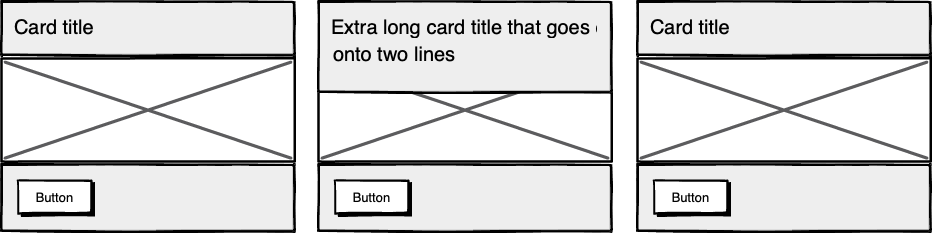 Cards unable to respond to a sibling's content changes
Subgrid allows elements to respond to adjustments in their own content and in the content of sibling elements, helping us create designs more resilient to change.
 Cards responding to content in sibling cards
.wrapper {
  display: grid;
  grid-template-columns: repeat(auto-fit, minmax(150px, 1fr));
     grid-template-rows: auto 1fr auto;
  gap: 10px;
}

.sub-grid {
  display: grid;
  grid-row: span 3;
  grid-template-rows: subgrid; /* sets rows to parent grid */
}
CSS Grid allows us to separate layout and content, thereby enabling flexible designs. Meanwhile, Subgrid allows us to create designs that can adapt in order to suit morphing content. Subgrid at the time of writing is only supported in Firefox but the above code can be implemented behind an @supports feature query.
Intrinsic layoutsI'd be remiss not to mention intrinsic layouts, the term created by Jen Simmons to describe a mixture of new and old CSS features used to create layouts that respond to available space.
Responsive layouts have flexible columns using percentages. Intrinsic layouts, on the other hand, use the fr unit to create flexible columns that won't ever shrink so much that they render the content illegible.
fr units is a way to say I want you to distribute the extra space in this way, but...don't ever make it smaller than the content that's inside of it.
—Jen Simmons, "Designing Intrinsic Layouts"
Intrinsic layouts can also utilize a mixture of fixed and flexible units, allowing the content to dictate the space it takes up.
 Slide from "Designing Intrinsic Layouts" by Jen Simmons
What makes intrinsic design stand out is that it not only creates designs that can withstand future devices but also helps scale design without losing flexibility. Components and patterns can be lifted and reused without the prerequisite of having the same breakpoints or the same amount of content as in the previous implementation.
We can now create designs that adapt to the space they have, the content within them, and the content around them. With an intrinsic approach, we can construct responsive components without depending on container queries.
Another 2010 moment?This intrinsic approach should in my view be every bit as groundbreaking as responsive web design was ten years ago. For me, it's another "everything changed" moment.
But it doesn't seem to be moving quite as fast; I haven't yet had that same career-changing moment I had with responsive design, despite the widely shared and brilliant talk that brought it to my attention.
One reason for that could be that I now work in a large organization, which is quite different from the design agency role I had in 2010. In my agency days, every new project was a clean slate, a chance to try something new. Nowadays, projects use existing tools and frameworks and are often improvements to existing websites with an existing codebase.
Another could be that I feel more prepared for change now. In 2010 I was new to design in general; the shift was frightening and required a lot of learning. Also, an intrinsic approach isn't exactly all-new; it's about using existing skills and existing CSS knowledge in a different way.
You can't framework your way out of a content problemAnother reason for the slightly slower adoption of intrinsic design could be the lack of quick-fix framework solutions available to kick-start the change.
Responsive grid systems were all over the place ten years ago. With a framework like Bootstrap or Skeleton, you had a responsive design template at your fingertips.
Intrinsic design and frameworks do not go hand in hand quite so well because the benefit of having a selection of units is a hindrance when it comes to creating layout templates. The beauty of intrinsic design is combining different units and experimenting with techniques to get the best for your content.
And then there are design tools. We probably all, at some point in our careers, used Photoshop templates for desktop, tablet, and mobile devices to drop designs in and show how the site would look at all three stages.
How do you do that now, with each component responding to content and layouts flexing as and when they need to? This type of design must happen in the browser, which personally I'm a big fan of.
The debate about "whether designers should code" is another that has rumbled on for years. When designing a digital product, we should, at the very least, design for a best- and worst-case scenario when it comes to content. To do this in a graphics-based software package is far from ideal. In code, we can add longer sentences, more radio buttons, and extra tabs, and watch in real time as the design adapts. Does it still work? Is the design too reliant on the current content?
Personally, I look forward to the day intrinsic design is the standard for design, when a design component can be truly flexible and adapt to both its space and content with no reliance on device or container dimensions.
Content firstContent is not constant. After all, to design for the unknown or unexpected we need to account for content changes like our earlier Subgrid card example that allowed the cards to respond to adjustments to their own content and the content of sibling elements.
Thankfully, there's more to CSS than layout, and plenty of properties and values can help us put content first. Subgrid and pseudo-elements like ::first-line and ::first-letter help to separate design from markup so we can create designs that allow for changes.
Instead of old markup hacks like this—
<p>
  <span >First line of text with different styling</span>...
</p>
—we can target content based on where it appears.
.element::first-line {
  font-size: 1.4em;
}

.element::first-letter {
  color: red;
}
Much bigger additions to CSS include logical properties, which change the way we construct designs using logical dimensions (start and end) instead of physical ones (left and right), something CSS Grid also does with functions like min(), max(), and clamp().
This flexibility allows for directional changes according to content, a common requirement when we need to present content in multiple languages. In the past, this was often achieved with Sass mixins but was often limited to switching from left-to-right to right-to-left orientation.
In the Sass version, directional variables need to be set.
$direction: rtl;
$opposite-direction: ltr;

$start-direction: right;
$end-direction: left;
These variables can be used as values—
body {
  direction: $direction;
  text-align: $start-direction;
}
—or as properties.
margin-#{$end-direction}: 10px;
padding-#{$start-direction}: 10px;
However, now we have native logical properties, removing the reliance on both Sass (or a similar tool) and pre-planning that necessitated using variables throughout a codebase. These properties also start to break apart the tight coupling between a design and strict physical dimensions, creating more flexibility for changes in language and in direction.
margin-block-end: 10px;
padding-block-start: 10px;
There are also native start and end values for properties like text-align, which means we can replace text-align: right with text-align: start.
Like the earlier examples, these properties help to build out designs that aren't constrained to one language; the design will reflect the content's needs.
 Fixed and fluid
We briefly covered the power of combining fixed widths with fluid widths with intrinsic layouts. The min() and max() functions are a similar concept, allowing you to specify a fixed value with a flexible alternative.
For min() this means setting a fluid minimum value and a maximum fixed value.
.element {
  width: min(50%, 300px);
}

The element in the figure above will be 50% of its container as long as the element's width doesn't exceed 300px.
For max() we can set a flexible max value and a minimum fixed value.
.element {
  width: max(50%, 300px);
}

Now the element will be 50% of its container as long as the element's width is at least 300px. This means we can set limits but allow content to react to the available space.
The clamp() function builds on this by allowing us to set a preferred value with a third parameter. Now we can allow the element to shrink or grow if it needs to without getting to a point where it becomes unusable.
.element {
  width: clamp(300px, 50%, 600px);
}

This time, the element's width will be 50% (the preferred value) of its container but never less than 300px and never more than 600px.
With these techniques, we have a content-first approach to responsive design. We can separate content from markup, meaning the changes users make will not affect the design. We can start to future-proof designs by planning for unexpected changes in language or direction. And we can increase flexibility by setting desired dimensions alongside flexible alternatives, allowing for more or less content to be displayed correctly.
Situation firstThanks to what we've discussed so far, we can cover device flexibility by changing our approach, designing around content and space instead of catering to devices. But what about that last bit of Jeffrey Zeldman's quote, "...situations you haven't imagined"?
It's a very different thing to design for someone seated at a desktop computer as opposed to someone using a mobile phone and moving through a crowded street in glaring sunshine. Situations and environments are hard to plan for or predict because they change as people react to their own unique challenges and tasks.
This is why choice is so important. One size never fits all, so we need to design for multiple scenarios to create equal experiences for all our users.
Thankfully, there is a lot we can do to provide choice.
Responsible design"There are parts of the world where mobile data is prohibitively expensive, and where there is little or no broadband infrastructure."
"I Used the Web for a Day on a 50 MB Budget"
Chris Ashton
One of the biggest assumptions we make is that people interacting with our designs have a good wifi connection and a wide screen monitor. But in the real world, our users may be commuters traveling on trains or other forms of transport using smaller mobile devices that can experience drops in connectivity. There is nothing more frustrating than a web page that won't load, but there are ways we can help users use less data or deal with sporadic connectivity.
The srcset attribute allows the browser to decide which image to serve. This means we can create smaller 'cropped' images to display on mobile devices in turn using less bandwidth and less data.
<img
  src="image-file.jpg"
  srcset="large.jpg 1024w,
             medium.jpg 640w,
             small.jpg 320w"
     alt="Image alt text" />
The preload attribute can also help us to think about how and when media is downloaded. It can be used to tell a browser about any critical assets that need to be downloaded with high priority, improving perceived performance and the user experience.
<link rel="stylesheet" href="style.css"> <!--Standard stylesheet markup-->
<link rel="preload" href="style.css" as="style"> <!--Preload stylesheet markup-->
There's also native lazy loading, which indicates assets that should only be downloaded when they are needed.
<img src="image.png" loading="lazy" alt="…">
With srcset, preload, and lazy loading, we can start to tailor a user's experience based on the situation they find themselves in. What none of this does, however, is allow the user themselves to decide what they want downloaded, as the decision is usually the browser's to make.
So how can we put users in control?
The return of media queriesMedia queries have always been about much more than device sizes. They allow content to adapt to different situations, with screen size being just one of them.
We've long been able to check for media types like print and speech and features such as hover, resolution, and color. These checks allow us to provide options that suit more than one scenario; it's less about one-size-fits-all and more about serving adaptable content.
As of this writing, the Media Queries Level 5 spec is still under development. It introduces some really exciting queries that in the future will help us design for multiple other unexpected situations.
For example, there's a light-level feature that allows you to modify styles if a user is in sunlight or darkness. Paired with custom properties, these features allow us to quickly create designs or themes for specific environments.
@media (light-level: normal) {
  --background-color: #fff;
  --text-color: #0b0c0c;
}

@media (light-level: dim) {
  --background-color: #efd226;
  --text-color: #0b0c0c;
}
Another key feature of the Level 5 spec is personalization. Instead of creating designs that are the same for everyone, users can choose what works for them. This is achieved by using features like prefers-reduced-data, prefers-color-scheme, and prefers-reduced-motion, the latter two of which already enjoy broad browser support. These features tap into preferences set via the operating system or browser so people don't have to spend time making each site they visit more usable.
Media queries like this go beyond choices made by a browser to grant more control to the user.
Expect the unexpectedIn the end, the one thing we should always expect is for things to change. Devices in particular change faster than we can keep up, with foldable screens already on the market.
We can't design the same way we have for this ever-changing landscape, but we can design for content. By putting content first and allowing that content to adapt to whatever space surrounds it, we can create more robust, flexible designs that increase the longevity of our products.
A lot of the CSS discussed here is about moving away from layouts and putting content at the heart of design. From responsive components to fixed and fluid units, there is so much more we can do to take a more intrinsic approach. Even better, we can test these techniques during the design phase by designing in-browser and watching how our designs adapt in real-time.
When it comes to unexpected situations, we need to make sure our products are usable when people need them, whenever and wherever that might be. We can move closer to achieving this by involving users in our design decisions, by creating choice via browsers, and by giving control to our users with user-preference-based media queries.
Good design for the unexpected should allow for change, provide choice, and give control to those we serve: our users themselves.
Musings on whether a virtual reality or a computer generated reality could ever match our real reality. I wrote my first version of this essay in 2008, while in Pinedale, Wyoming, visiting my daughter Isabel and doing some cross-country skiing among the aspen trees. The trees have great patterns like eyes on them. Nice examples […]
The post Here's to the Real World first appeared on Rudy's Blog.
It's the first volume of the Lightspeed Trilogy, and the second volume is well underway.

This internal council document was only recently unearthed in our archives. It refers to a secret governmental emergency plan to "purify" the town following some kind of "infestation or plague," the details of which have now been lost.
Although we can now no longer be entirely sure what Plan C consisted of, the image of a nuclear mushroom cloud offers us a clear indication of the council's intention. Our archivists have postulated that the council might have thought it simpler and more cost effective to remove all living things than to target specific vermin and/or undesirable microscopic pathogens.
What also seems clear is that an unidentified but enthusiastic council employee took it upon themselves to extend Plan C to almost every eventuality, in effect making the nuclear Plan C simply the only plan.
The notion that the council planned to employ a nuclear option is further supported by a minor story in a local newspaper from the time. In October 1979, seven-year-old schoolboy Nigel Johnson, mixed up his family's contribution to his school's annual harvest festival. Instead of the intended box containing four cans of oxtail soup and spaghetti hoops in tomato sauce, he took a quarter tonne of enriched uranium and other weapons-grade nuclear materials.
The boy's father, a local councillor, when questioned how his son could have found such materials at home, claimed ignorance. "Boys are always picking up things like this in the playground," he said and added "it's the fault of liberal teachers and communist dinner ladies and I firmly believe they should be among the first to be cleansed."
The racer has spent almost 3 years in the workshop, welcoming me every time I walk in the door. While it still is an unusually amusing sight, it isn't doing me a whole lot of good. The original plan of parking it in our living room seemed like an increasingly bad idea - a split level mid-century house, oddly enough, isn't optimized for motorsports displays. So, what about loaning it to a museum, so others can marvel/point and laugh at it? Why not? So a call was made to a Big Motorcycle Museum in Alabama - the word "Loan" didn't get finished before the other end of the line snapped back a snotty "We only accept donations - on OUR terms - NO LOANED MOTORCYCLES!". Oh, really: Not at my current net worth.
So the next call went out to the nearby St. Francis Motorcycle Museum. I asked if they were interested in displaying an experimental homebuilt roadracer. They said they would be interested if it is something different - is it . . . different?
Last night, the racer was loaded up in the van and rolled into their front door this morning. Would the spot between the ELR and unmolested R90/6 be OK? Oh, yes.


The museum opened up in 2016 - it isn't on the usual internet lists of motorcycle museums, or at least not yet. It is run by enthusiasts - and it shows. No idea how long my old racer will be there - if all goes well, I'll retire not too many years from now and it'll end up in someone else's living room, office, or . . . museum.
In the mean time, the next racer is in that stage where lots of work has been done, but it doesn't look that way - just an increasing spread of small parts waiting to become one big part. Boring, indeed.

That's one of the wheel uprights - one of two welded assemblies of 6 machined tubes each that gets finish machined after welding. It is far more work than the similar bolted-up solid aluminum one at the back of the last racer, but the new ones weigh less than half and look a lot better (Yes, that matters!). A fiber wound forging would look even better and weigh even less - not happening with the resources at hand. The last racer's rolling chassis assembly weighed 290 lbs - if the next one can get down to 170 lbs, we'll be in great shape.
When the decision was made to build the last racer, the first 3 thoughts went through my head:
- This is going to be a lot of work.
- This should be a lot of fun when it is done.
- This is going to generate a lot of stupid comments.
2) It was. More fun than anybody knows (Test rides were offered, but . . . never meet your heroes...).
3) Far less than I expected - but everyone knows how Facebook really works:
Frequently Posted Comments (FPC):
- Low CG motorcycles are hard to balance - ever try balancing a short broom?
- That's just a copy of the Gurney Alligator!
- You'll die if you crash or run into something!
- The rider can't see where he's going on the track!!!!!
2) Except for the liquid cooled twin cylinder engine, 2 wheel steering, no steering head, virtual hub center steering front suspension, remote mount handlebar, and laid back seat and rider position, yeah, man - no difference at all - like total rip-off, dude...
Most of those 'Gators are in museums or collections now - none of them were club raced on the track. That said, it was the first and last recumbent motorcycle to get any decent coverage from the legacy motorcycle media, so that's all that many understand. That has to change, eventually...
3) Crashed twice - once at medium speed, and again at high speed - didn't die either time, as far as I can remember. And if you're at risk of colliding with stationary objects at the track, well, find another sport - roadracing is not for you.
4) Yes, my line of sight while sitting upright is quite a bit lower than normal - yes, that changes one's perspective quite a bit - one gets over it very quickly with some seat time. But when leaned over, my line of sight is no lower than the normal - look at how high off the track the rider's helmet is when he's dragging his elbows. If you need to sit up higher and see where you're going on the track, again, go find another sport - roadracing is not for you.
I've found the best response to such nonsense on Facebook was to leave it - far too much noise - no real benefit to anything I'm doing in the real world, where I prefer to live, work, build, and best of all, race.
4.30pm - 5.05pm GMT, 8 December 2021.
Register for free here.


After my recent review of Pump Street Chocolate's Eccles bar, I was contacted and asked if I'd be interested in writing about some of their Christmas collection. And so it was that a few days later, a delicious delivery arrived on my doorstep.
This year, Pump Street Chocolate have several Christmas themed items, which they’ve organised into different collections to suit various tastes and budgets.
Each collection comes gift wrapped with a Christmas card. I really like this approach, as it simplifies the process of finding a beautiful gift, while adding variety and giving the whole thing a touch of class. Pump Street are known for their elegantly simple packaging, but these collections have a real wow factor which is sure to get a positive response from anyone lucky enough to receive one.
That said, if you prefer to keep things simpler, all of the Christmas products are available to buy individually as well.

The first item I received was this Father Christmas made from 65% Ecuadorian dark chocolate. It comes in this attractive – and sturdy – cardboard tube that kept it in perfect condition. I know from experience that packaging irregular shaped items to be sent through the post is no easy task, so it’s great to see that it’s as effective as it is beautiful.

What does it taste like? Well I can’t actually tell you that, because this little beauty is going to be part of my own Christmas this year. But I’m pretty sure it’s going to be delicious.

The other item I was sent was a collection of Christmas themed bars in this very nice box. It’s a simple cardboard affair with a nicely printed paper sleeve, but it feels like quality. Balancing that line between simplicity, sustainability and elegance is something Pump Street do oh so well, and this box is right on point. Most importantly, it also kept the four enclosed bars in perfect condition.
The bars are:
- Eccles 55%
- Grenada Milk & Nutmeg 60%
- Gingerbread 62%
- Panettone 70%

Of course, I’ve already reviewed the Eccles 55% bar, which is absolutely fabulous. Here’s a quick summary of the others:
Grenada Milk & Nutmeg 60%A 60% dark chocolate made with cocoa beans from the Crayfish Bay estate in Grenada and flavoured with locally grown Grenadian nutmeg.
Gingerbread 62%Made with Pump Street Bakery’s Gingerbread Cookies spiced with ginger, cinnamon and cardamom in a Jamaican 62% dark chocolate.
Panettone 70%A traditional Panettone made with almonds and candied fruit in a 70% St Vincent origin dark chocolate.
All in all, I wouldn’t hesitate in recommending any of the Pump Street Chocolate Christmas collections for the chocolate lover in your life. But you don’t have to limit yourself to just the Christmas themed options; I would be happy to recommend any of their creations at any time of the year. They are unique craft chocolate gifts that taste as good as they look.
Information- Buy it online from:
- Contains dark chocolate, milk chocolate.
- Cacao Origin: Ecuador, Grenada, Jamaica, St Vincent
- Filed under bean to bar, christmas, pump street, uk.
The post Pump Street Chocolate Christmas Collections appeared first on Chocablog.
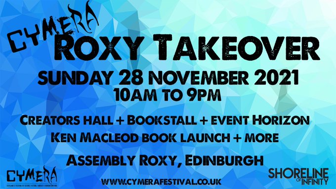

Pump Street Chocolate are one of Britain's best known and best loved bean-to-bar chocolate makers. Started by father and daughter Chris and Jo Brennan in 2017 as a sideline to their village bakery in Suffolk, they have quickly grown to be one of the world's most respected makers.
Being a spin-off from the bakery, they are well known for combining baked goods with their chocolate. In particular, their Sourdough and Rye bars take bread from the bakery and refine it into the chocolate itself. To combine bread and chocolate is no easy task, but Pump Street consistently manage to capture the flavour and texture of their bread in the chocolate, marrying the two expertly.
Combining an Eccles cake and chocolate is another matter entirely. A Pump Street Eccles cake contains raisins, currants, brown sugar and alcohol, all of which can potentially contain water – the enemy of chocolate! If you tried to simply grind one into chocolate, you'd likely end up with a thick, sticky mess.
I'm not entirely sure how they have produced this bar, but the chocolate itself tastes just like a traditional Eccles cake; bready and friuity with a hint of brandy, but you also get whole currants and raisins and just a hint of brandy. The result is very identifiably an Eccles cake, rather than some other kind of fruit cake flavoured chocolate. Each of the flavours – bread, fruit, spice and alcohol – are there and identifiable, but none of them detract from the chocolate.
I love this bar and highly recommend you check it out, along with the rest of the Pump Street range. The bakery series bars are always the most interesting to me, but Pump Street have proved themselves to be some of the best in the world, so you really can't go wrong whatever you choose.
Thanks to The Foodie Bag for supplying the photography background and other equipment used in this post.
Information- Buy it online from:
- Contains dark chocolate (55% cocoa solids).
- Cacao Origin: Ecuador
- Filed under bread, eccles, pump street, uk.
The post Pump Street Chocolate 55% Ecuador With Eccles Cake appeared first on Chocablog.

The story has been long in the making. Sometime in the early 1990s I had an idea for a story called 'Nineteen Eighty-Nine', in which events like those of 1989 in our world happen in the world of George Orwell's Nineteen Eighty-Four. I wrote it and sent it to Interzone, and they sent me a kind rejection note suggesting that I try a local fanzine. I sent it to the local fanzine New Dawn Fades, and they rejected it. The editor softened the blow by encouraging me to write something else for them. They later accepted, I think, a review and a poem. But for the moment, I was done with short stories. After that, there was nothing for it but to write a novel.
That's the story I've told now and again, usually with the punch-line that the best thing about the story was the title, because it tells you exactly what the story is about.
Now I'm going to have to retire that anecdote.
Earlier this year, shortly after I had read that Orwell's fiction was now out of copyright, Ian Whates emailed me to ask for a story for a new venture he was planning. I pitched 'Nineteen Eighty-Nine'. Ian was keen, so I looked at my old story (or what I could find of it), decided it was beyond help, and wrote an entirely new story. I'm fairly sure it's an improvement on my first attempt.
One inspiration for the new version was the article 'If there is Hope' by Tony Keen, in Journey Planet #3 (pdf). Another was the article Orwell on Workers and Other Animals, by Gwydion M. Williams, which makes the intriguing point that 1945 is missing from the world of Nineteen Eighty-Four.
While writing the story I chanced on a clue to Orwell's pessimism that, as far as I know, has escaped scholarly attention. Orwell, it turns out, had read and been impressed by George Walford's pamphlet The Intellectual and the People.
Walford drew on his mentor Harold Walsby's The Domain of Ideologies, the founding text of what Walford later called Systematic Ideology. This argued that the major social outlooks form a historical, numerical, and political series in decreasing order of antiquity, size, unity, and radicalism. The (historically) oldest and (currently) largest group is the apolitical, followed by the conservative, the reformist, the revolutionary, and the anarchist ... with the tiniest, least effectual and most extreme group being the Systematic Ideologists themselves, who understand the whole process but can't think what to do about it.
More about this another time, but it seems to me significant that Orwell attributed political apathy, ignorance and indifference to - not 'perhaps the largest single group' of the population, as Walford did - but to the vast majority: 85%.
I've been with the same hosting company for many years. Yesterday (Australian time), first time ever, their email servers went down for several hours. It's back again now.
If anyone tried to send an email during that time, particularly anyone who is wanting to subscribe to email alerts, please try again. I'm referring to the article I posted a couple of days ago.

The IPCC Summary for Policymakers WG1 report has just been released. You can download it here.
I will be going through it and the technical summary (when it comes out) over the next few days. An initial glance shows that we need to do more to reduce emissions. A whole lot more.
The press conference is on YouTube:
This report will have a lot more space devoted to regional changes. There is a fabulous interactive atlas which allows you to drill down and across in all sorts of ways.
There is so much to work through. Here are some initial points that might interest you:
- It's still possible to keep global warming to <2C if we get to zero emissions by 2050. If we keep the same rate, we'll prob hit 2C by mid-century.
- "Climate change is already affecting every inhabited region across the globe with human influence contributing to many observed changes in weather and climate extremes"
- There has been an increase in the lower bound of climate sensitivity, which is now more confidently estimated at between 2C and 5C, with a "likely range of 2.5°C to 4°C (high confidence), compared to 1.5°C to 4.5°C in AR5, which did not provide a best estimate."
- "Global warming of 1.5°C relative to 1850-1900 would be exceeded during the 21st century under the intermediate, high and very high scenarios considered in this report"
- "It is virtually certain that the Arctic will continue to warm more than global surface temperature, with high confidence above two times the rate of global warming."
- Of particular interest to Australia & USA, it is very likely droughts and floods will worsen, amplified by ENSO: "It is very likely that rainfall variability related to the El Niño-Southern Oscillation is projected to be amplified by the second half of the 21st century in the SSP2-4.5, SSP3-7.0 and SSP5-8.5 scenarios."
- As I've long expected, the oceans and surface won't keep absorbing CO2 at the current rate: "under the intermediate scenario that stabilizes atmospheric CO2 concentrations this century (SSP2-4.5), the rates of CO2 taken up by the land and oceans are projected to decrease in the second half of the 21st century".
Andrew Dessler summed it up well, if a little crudely, on Twitter:
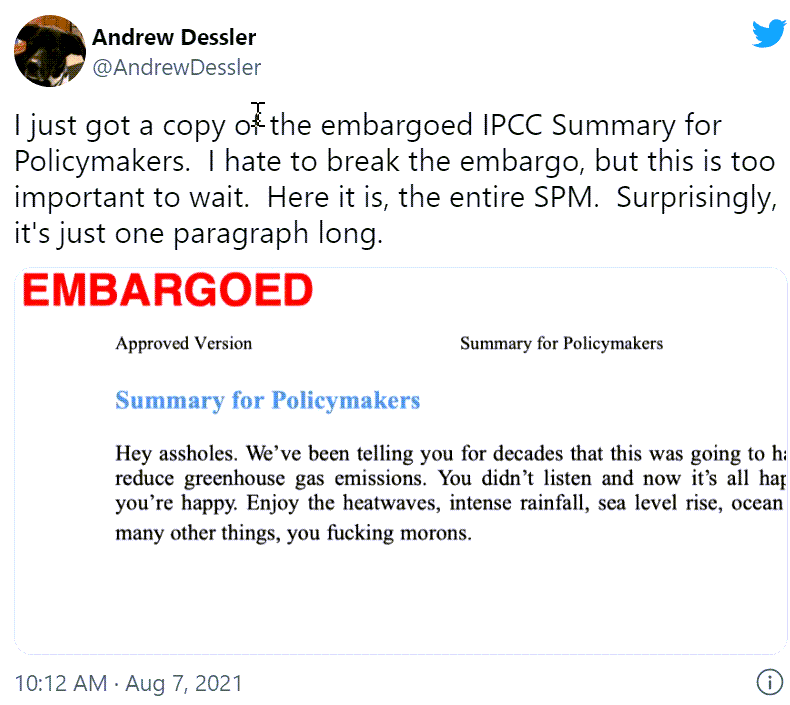
Further reading
There are lots of articles in the media already. Journos got advanced copy (bloggers didn't). Also other sources.
- Climate change report a 'code red for humanity', United Nations chief warns - from ABC News (Australia)
- Climate crisis 'unequivocally' caused by human activities, says IPCC report - from the Guardian (UK)
- IPCC report's verdict on climate crimes of humanity: guilty as hell - also from the Guardian
- UN report: Earth warming likely to pass limit set by leaders - from the Washington Post
- A Hotter Future Is Certain, Climate Panel Warns. But How Hot Is Up to Us - from the New York Times
- Australian weather extremes to get more extreme as climate heats: IPCC - from the Sydney Morning Herald
- This is the most sobering report card yet on climate change and Earth's future. Here's what you need to know - by Pep Canadell at The Conversation
Sorry for not following up my last post sooner. There'll be another climate post shortly.
 My excuse is being consumed by the Delta variant of SARS-CoV-2. Not me personally, I hasten to add. It's a big problem in the state next door, NSW, and has slipped from there into my home state, Victoria, a couple of times (and other parts of Australia). That's meant lockdowns to get us back to zero COVID-19. Having a slightly obsessive tendency, I've been spending too much time on the endless press conferences, news articles and tweets about the subject. This has been at the expense of writing blog articles about climate change, I'm sorry to say.
 While I'm preparing the next article (or procrastinating on its writing) I want to alert people who signed up for email alerts to new articles here on HotWhopper. The normal emails will stop because Feedburner is being shut down this month. Here's the notice:
Recently, the Feedburner team released a system update announcement , that the email subscription service will be discontinued in August 2021.
After August 2021, your feed will still continue to work, but the automated emails to your subscribers will no longer be supported. If you'd like to continue sending emails, you can download your subscriber contacts.
If you'd like to continue to receive email alerts, please let me know directly, using the email address to which you want them sent. You can do the same if you no longer want alerts, although the subs will be opt-in, not opt-out. That is, if you don't let me know you want to continue, you will no longer receive email updates.
You can let me know either way by sending an email to subscribeHW at HotWhopper.com (replacing the "at" with @) or clicking on the link. If you're already a subscriber, you should be receiving this article as an email already, but the emailed articles will only continue if I set it up. I'll probably use mailchimp, which AFAIK is reliable and secure.
One of the big challenges for the next racer was building an engine with my own crankcases. The built and fully developed engine was expected to weight under a 100 lbs and produce over a 100 hp. The initial engine build is the relatively quick, cheap, and easy part - the development is where time, money, and work can be challenging. All of that isn't entirely necessary any more - the recent KTM 890 engine fills the design requirements reasonably well. A KTM Duke 890 has just rolled in the shop, and a lot of the previous donor engines and parts have been sold to help pay for some of it. This project was about a year behind schedule - this moves things forward quite a bit! Absolutely no changes are required for the rest of the motorcycle. A 4-stroke twin provides greater opportunities for racing in clubs that accommodate real purpose-built race bikes.

The 2-stroke engine design that I had in mind would still be a good project and would have made for a good story, but other than being a different way of doing the same thing, it wouldn't have done anything better than the above 890 engine. That said, while lap times and all that don't care about "The Story", the most intriguing racing motorcycles have at least one good Story behind them beyond the score chart. I don't believe that racing is strictly about the racer and not the motorcycle, otherwise we could just dispense with the expense of those unnecessary machines and just race without the burdening the racer with equipment: Running barefoot and naked! No, that's really not my idea of fun, either
Oh yes - that 2-stoke engine: Modern casting methods could result in a far lighter engine than any backyard foundry can render. Something simple, cheap, and easy to work on with over 100 hp and under 50 lbs will take a real design and development team and facilities - it could still happen, but it won't be one man's story.In the mean time, work is still in progress. Ever wonder what a 2WD motorcycle differential looks like? The inner (Rear wheel) pulley is solidly mounted to the spool - the outer (Front wheel) pulley is mounted to the spool with a one way clutch bearing. The spool itself mounts in the drive arm and is chain driven by the engine.

Before tearing down the KTM, it'll require some break-in mileage. It is the first "Normal" motorcycle I've ridden since race school, early 2012. It seems like a shame to take apart a perfectly good bike (I really like the Duke 890 an awful lot!), but the next racer should make it all worth it!
I got asked to blurb the UK reissue of Lynne Tillman 's first book Weird Fucks a couple of days ago... which reminded me of what happened when I first attempted to obtain a copy....
A month or so after first meeting Lynne at a party in NCY in the spring of 1989, I was in Paris to interview Ralph Rumney about the Situationist show at the Pompidou Centre for Art Monthly. Rumney asked me if there was anyone in Paris I wanted to be introduced to and I said I'd really like to meet Gil J. Wolman, who I knew he knew. We just went around to Wolman's because he didn't have a phone but sadly he was out. Rumney suggested we try Jim Haynes who lived nearby, nice guy but hardly as exciting to me as getting to meet the man who'd made L'Anticoncept. We caught Jim at home and at that time he was making various literary works available by photocopying them individually when people asked for them. Weird Fucks was one of those books. I asked Jim to make me a copy of Lynne's novel and he looked around for the art work but couldn't find it. Embarrassed he'd mislaid the originals of the book I wanted, he insisted on giving me a copy of his autobiography Thanks For Coming published by Faber. It seemed like a day of disappointments with first not getting to meet Wolman, then not getting Lynne's book. However, later when I examined Thanks For Coming I discovered it reproduced a page from International Times that included a photograph of my mother at Alex Trocchi's 1969 Arts Lab event State of Revolt. Years later I discovered that Lynne organised the State of Revolt shortly after graduating from college and then moving to London..... So I unknowingly left Jim Hayne's pad with a little bit of Lynne's and my own family history crossing 20 years earlier.

What would be worse than a Republican US government that doesn't believe in climate change? Perhaps, a Republican US government that does believe in climate change.
Try a thought experiment. Assume Republicans fully accept human activity, in particular burning fossil fuel, causes global warming. Now, I'm not a political scientist, but it seems to me that a major plank of US right wing philosophy is "preserve the American way of life", and that their foreign policy gives primacy to US interests. (Of course many other countries have a similar philosophy, but don't have the firepower to back it up.)
Now, continue the thought experiment: How can these Republican Climate Hawks square the circle of reducing the impact of global warming on the US, while preserving the American Way of Life?

Geo-engineering looks like a really attractive option. Not only does it — in theory — avoid the need to reduce fossil fuel consumption, but it also creates huge opportunities for space technology, defence contractors etc. And if the rest of the world doesn't agree? The US will have to save the rest of the world for their own good.
The chances of success of geo-engineering, and the possible side effects, are impossible to know. But that argument hasn't held back the war on drugs or the war on terror. Of course, if we changed track with those policies, we could try new ones.
Today I'm going to tackle a difficult but important topic - internal conflict. Given the number of people involved, the number and complexity of the issues, and the decades over which the climate movement is likely to be needed, it's a pipe dream to think there will always be harmony. At the same time, if the sort of problems mentioned here aren't acknowledged and, preferably, dealt with well, they can spread and become very destructive. Sweeping things under the carpet, pretending conflict doesn't exist, only allows it to fester and grow.
When a large number of people are working toward a common purpose, it is inevitable there will be internal politics. (If you prefer "virtually inevitable" or "almost inevitable", I'd love you to point out an instance that's been free of this.)
In this article, I'll use the word "movement". I don't like to apply that term to mitigating and adapting to climate change (which is bigger than any movement); however, in the context of this article it's the best word I've been able to come up with.
Everyone who works in an organisation for even a short time, understands internal politics have an influence on decisions, behaviour, alliances, staff promotions and so on. The same goes for any movement, whether it's related to broad social justice, climate change, anti-litter, health, equal opportunity, local politics or anything where a dozen or more people come together around a common purpose.
Conflicts can arise for any number of reasons, some that could be regarded as fundamental, and some are confusingly petty and vindictive. Here are several to watch out for:
- "Means and methods" camps - opposing camps can emerge having fundamentally different and, perhaps, opposing views on how to achieve the common purpose (nuclear vs anti-nuclear; all adaptation no mitigation vs mitigation plus adaptation etc.)
- Personalities and personal ambition - with camps emerging based on individuals within the overall movement (personality cults). These can arise if it's thought there will be personal reward for the personality or the follower (such as fame, career progression, book contracts, committee posts, awards, or other personal recognition). I'm not having a dig at our climate champions. We need them and most leaders in the climate movement are above petty politics. It's wannabes and people scrambling to position themselves where this can become a problem.
- Ideology and political leanings - dismissing and therefore alienating large segments of society based on their politics or ideology (hard left vs left vs centre vs right vs extreme right).
- Position on other causes - dismissing and alienating individuals or segments of society based on their opinions or actions or perceived level of support for other causes - e.g. do they give equal or better attention to social causes (feminist, BLM, gender issues, voting rights etc) and if it's not seen as good enough, if they're seen to be mainly focused on climate, they must be bad people.
- Personal attributes - dismissing or alienating people on the basis of attributes such as sex, gender, skin colour, ethnic origin, cultural background, religion or lack of, sexual preference, education level, political allegiance, friends, colleagues, profession, or opinions expressed on matters unrelated to that common purpose. E.g. all men are bastards, particularly if they are white baby boomers.
The most toxic behaviours I see are related to points 1 and 2 above, and to a lesser extent points 4 and 5. These can (usually by intent) elicit emotive rather than rational responses - anger, hurt feelings, public naming and shaming of individuals whether deserved or not (i.e. straight up defamation). All of this leads to a weakening of the movement making it less able to focus on the common purpose. It can result in fragmentation, a muddying of the waters. It can cause hard-working, committed people to be disillusioned and give up. It can confuse the general public if it spills over into the mass media, reducing their understanding of the important issues.
I'm no mediator. That's not my training or talent. I think I am able to see most things clearly but when it comes to helping people work through personal differences, I defer to people who are expert in that area. I'm not a political animal either, normally being more of an onlooker than a participant. At the same time, as you know, I'm not likely to do nothing when I see good people being unfairly maligned. (Mostly I've addressed malinging by climate science deniers, yet this sort of ugliness has been happening within the climate movement too.)
I don't really want to say much more on this topic. These matters need to be dealt with internally by the more responsible and able members of the movement, rather than airing all the gory details in public (which can in turn cause a lot of harm). I know I've sometimes been a bit intemperate myself, dashing off an angry tweet or two and maybe going a bit overboard in articles here from time to time. I'll keep trying to do better, though I still won't hesitate to call out and ridicule climate science denial.
This article is more by way of reminder and a caution. If you're tempted to join a camp or become a groupie to a personality - just take care you're doing it with your eyes wide open and with good reason. Avoid taking at face value everything someone you might admire says. Do what you can to keep the movement healthy. Stay focused on the common purpose.
Then all the usual things - be prepared to change your mind if the information changes. Forgive individuals if they make what you regard as a mistake now and then. At the same time, watch out for people who exhibit ongoing patterns of toxic behaviour, who may not be as trustworthy or authentic as all that (to use another word I very much dislike), who might be using you and/or abusing others for their own purposes. Remember, you might very well become their next target.
In the end, people come and go, but the issues remain. Harnessing yourself to a particular individual may not be the most productive path in the long term. In the same vein, tying yourself to a particular and very narrow means of achieving the goal could limit the chances of getting there.
Welcome - and please help the world address the problems of climate changeThe climate movement must remain broad and diverse, welcoming people from all over, with all our flaws, with all our brilliant ideas including conflicting ones, and with all our efforts - if it is to achieve the results we must.
-------------------------
We've had a tough few months with more and worse fires, drought, floods, heat waves, disappearing glaciers, water supply problems, rising seas and a global pandemic.
There's much more to be done.
It's nice to be back, and quite lovely to read your words of welcome here and on Twitter. Thank you.
Further readingHere are some relevant articles I came across in a Google search. I don't know if they're among the best examples. Although I've done some work to improve social justice over the years, I've never regarded myself as an activist so this is not my field. Given the sensitivies of social justice movements, the references might or might not be politically acceptable! If you know of other good articles, please add them in the comments.
Three Ways to Reduce Internal Conflict in Civil Resistance Movements - by Joel Preston Smith, September 20, 2018.
Conflict and Movements for Social Change: The Politics of Mediation and the Mediation of Politics - by Kenneth Cloke, July 2013
Crises and Conflicts in Social Movement Organisations by Jo Freeman, published in Chrysalis: A Magazine of Women's Culture, No. 5, 1978, pp. 43-51 - (just to show that internal conflict is timeless).
I spent a lot of time in western Canada in the early 1970s. That's 50 years ago for all you young ones. The world was very different then. Edmonton was experiencing it's longest winter since, almost, forever. It was a long cold winter. In the summer in British Columbia they kidnapped whoever happened to be in the local pubs to fight the annual forest fires, but the temperatures rarely exceeded 80F. It was what people thought of as a bit unusual but not completely abnormal.
Today the world is different. Hard to believe this week, but this is what we should have expected.
#Canada just had a temperature of nearly 50°C (Lytton, 49.6°C)
— World Meteorological Organization (@WMO) June 30, 2021
"Without human-induced climate change, it would have been almost impossible ...as the chances of natural occurrence is once every tens of thousands of years," says @metoffice scientist
Details https://t.co/fb1nIF8wny pic.twitter.com/rxKGmQqZZM
Western Canada is wondering if it has been relocated to Death Valley.
There was famine somewhere in the world back then as there is now, but today, all of a sudden we need to find food for three times as many people.
We're trying to get on top of a global pandemic that everyone says was anticipated but that no-one prepared for.
We've accepted and supported and elected leaders who aren't game to read the writing on the wall, aren't able to act, and keep pointing the finger at someone else for their inadequacies - anyone else will do.
We're looking to evangelical pastor's wives to "save the world", when they can't even stick up for their own supporters.
Alright - it's not all gloom and doom. There are some elected leaders in various countries around the world who are realists and who are keen to make sure the human race survives until at least 2100.
There are journos and communicators who are still quite sure, or at least hopeful, the message coming from the harbingers of knowledge and science will make its way through to political leaders, if not the general population. And that we'll act on it.
For even more good news - I'm coming back, soon, with some analysis and information about where we are today and what's in store. It won't be pretty.
Are you up for it?
MIKE: What writers and books inspired you to become a writer ?
HOME: It was never my plan to become a writer. As a kid I read a lot but I was much more into rock and roll and in particular glam rock than the idea of being a writer. At the start of the seventies my favourite band was T.Rex but I liked most glam stuff as long as it had a decent stomp from Sweet through to Iron Virgin. I'm old enough to remember when Rebels Rule was getting some heavy radio play and at the time I couldn't believe it didn't become a hit and Iron Virgin disappeared. The couple of years before punk was a bit of a desert as far as new music went - so I went backwards into northern soul coz I knew a lot of people into that but also British mod and what became known as freakbeat, I was listening to earlier Pretty Things and Downliners Sect in 1975. Back then I didn't realise my taste in northern soul was very mod orientated, more Twisted Wheel than Wigan, I only found out about those distinctions later. I got into punk in the summer of 1976 after seeing the Pistols on So It Goes, and immediately discovered Nuggets and all that USA porto-punk - I knew Lou Reed's solo stuff from the seventies but the Stooges, Patti Smith, Flamin' Groovies and MC5 were all new to me as a 14 year-old in 1976. But punk wasn't nearly as popular at my school as northern soul and then jazz funk for the hipster kids, or disco for those that just followed the charts.
As far as writers from that era go there were a whole raft of pulp writers doing everything from horror to youthsploitation but if I was gonna pull out one key influence it would be the Mike Norman hells angels books that I first read when I was 11 or 12, around the same time I was getting into kung fu films…. I was also reading a lot of Michael Moorcock but more Elric titles than Jerry Cornelius, I read Moorcock's more experimental stuff later.Of course loads of kids I knew read The Rats by James Herbert around 1974/5 that and the skinhead books were probably the biggest sensations in my milieu at the time. A lot of the white boys at my school were also into Sven Hassel but I didn't like nazi shit so I didn't read them and neither did the girls (although many dug stuff like The Rats). Some of the African and Afro-Caribbean kids at my school also read those books but the Muslim kids who made up about 25% of the pupils weren't interested in any of that stuff at all There's an interview with Mick Norman, his real name was Laurence James, on my website, coz the first four books he wrote are really important to me and he was also the editor for the earlier Richard Allen skinhead books. Sadly he died 20 years ago but I was glad I got to know him at the end of his life. https://www.stewarthomesociety.org/interviews/james.htm
MIKE: You seem to always have some kind of project on the go, are you type of person who struggles to take it easy or is it a case of stay busy to pay bills ?
HOME: I just like doing things so I don't really like to take it easy. I don't think making money is a good motivation for doing anything other than a 9 to 5 work, although its great if my stuff makes a few bob and I can continue to avoid a regular job…. But I'm curious about many things including exercise systems and I never have the time to try our all the fitness regimes that fascinate me coz generally I can't set aside more than a few hours a day to workout, although on the odd occasions I've gone on a sports holiday and done 6 or 7 hours a day of training I've really enjoyed it but of course you have to mix hardcore strength and cardio with gentler stuff like stretching, it would be counterproductive to spend that much time on nonstop weightlifting for a week or two!
MIKE I first read you back in 93, 94 Red London & No Pity but have not kept up with all your work through the years, what books of yours would you reccomend to people new to you ?
HOME: There is a lot of variation between the different books and which to recommend would depend on someones's interests and tastes. No Pity and Red London were part of a cycle of early books riffing on youthsploitation fiction - of those books the last Slow Death really puts a polish on what I was doing but in some ways Defiant Pose is my favourite and I think it has the single best scene, one where the Houses of Parliament are burned to the ground while the main character gets his cock out and recites an incendiary revolutionary tract. But it was 69 Things To Do With A Dead Princess that got the attention of the literary types as it's more experimental and shows my interest in writers like Alain Robbe-Grillet and Ann Quin. I'm very fond of Tainted Love which is fiction but closely based on my mother's life once she came to London when she was 16 in 1960 - she was working with the likes of Christine Keeler as a hostess at Murray's Cabaret Club before I was born, then involved in the early LSD scene but sadly died of heroin overdose in 1979. She packed a lot into her short but incredible life. I did her story as a novel so as to avoid problems with certain people who were still living but most of what's in it is true. I had to change a few things around to avoid libel problems as that one came out with a corporate publisher.
MIKE: I absolutely loved She's My Witch that I read around Xmas time , I think it's my favourite book of yours of ones I have read, can you tell us a bit about it ?
HOME: That came out of observing what was happening to people who'd been going to punk and garage rock gigs for a long time but I simultaneously wanted to do a story similar to my mother's but for a generation down. So rather than coming to London from South Wales like my mother, the main character Maria has come to London from Valencia - it's the same trajectory as my mother but a woman from my generation rather than the previous one. So instead of modern jazz and beatniks, the subcultural interest is punk rock. And there is an involvement with witchcraft rather than Indian gurus. I didn't make a big thing out of it in Tainted Love but one of my mother's favourite books was the BDSM classic Story of O by Pauline Réage AKA Anne Desclos. So while in Tainted Love my mother does high class hostessing, as she did in real life, Maria in She's My Witch is a former dominatrix. Over the years quite a few woman who've worked as a dominatrix have told me they like my fiction, so I've got to know a few. Recently I've been making art with Itziar Bilbao Urrutia, who as her name implies is from Bilbao and for a couple of decades has been the premier suspension bondage dominatrix in London. But I wrote the first draft of Witch before I met Itzi. The end of the story also parallels my mother's life, Maria dies from a heroin overdose.
In some ways Tainted Love and Witch addresses something that few punks wanted to deal with back in the seventies, which is how close a lot of what we did was to the earlier freak subculture, so I wanted to draw that out with stories of two lives a generation apart. I also thought it was interesting to address albeit obliquely the Ruta Destroy Valencia party scene of the post-Franco period. There's not much about it in English and it was nice to start to correct that. I was just struck going to punk and garage gigs in London a decade or so ago by how many people from the Iberian peninsula I met there who'd moved to London and who'd gone to all those amazing clubs to the south of Valencia back in the day. Of course there are loads of other subcultural scenes from that and other times which have been ignored. Just before I left school in 78 a few of the kids in my year who'd been very into northern soul were getting into the Britfunk scene and were moving over to being jazzfunkateers - that whole thing was huge around the same time as punk in the UK but its been largely ignored too, so it was nice to see a piece about it by Alexis Petridis in The Guardian last week.
MIKE: You edited Denizen of the Dead book which was great fun if you dislike gentrification, were you happy with that ?
HOME: When I originally had the idea for Denizen of the Dead I thought I'd do a novel based on these luxury investment blocks that are being built all around me and across London. But on reflection it made more sense to do an anthology with different writers because it was meant to be a form of protest and that should be collective. Novels are a lot easier to get attention for than short story collections but I think I made the right decision to do an anthology. I'm really happy with the book and I particularly like the fact it has the sigil spells in it, I worked with some witches to do a protest called Hex In The Park against gentrification in east central London in 2017 and when I said I was doing the book they said I had to have a spell against Neo-liberalism in it and they'd do it. That wouldn't have happened if I'd just done a novel on my own, so I'm pleased it panned out the way it did. Also if London had been gentrified in the late-seventies like it is now, we'd have never had those huge punk rock and Britfunk scenes, there just wouldn't have been the venues for them. Lower property prices do an enormous amount for creativity, gentrification kills it. There's some film of Hex In The Park on my YouTube channel: https://youtu.be/nYMQiBlY4eg
MIKE: I just started 9 Lives of Ray the Cat Jones, your latest book, tell us a bit about that ?
HOME: Many of my books are entirely made up but like Tainted Love that is based on a true story but done as fiction because it wasn't possible to get to the truth about everything to do with my mum's cousin Ray Jones. There are a lot fo criminals in my family but Ray is the most famous one. I hadn't intended to do a book about him but I was talking to the writer Paul Buck one day and he said he didn't believe the story about my relative's escape from Pentonville although he'd included it in his book The E-List about prison escapes. The version of the story Paul had came from Mad Frankie Fraser and I thought it was bullshit too, so I asked Paul why he hadn't researched the incident. Paul said he didn't know how to do that but I did, so I went back through old newspapers and of course it turned out the Frankie Fraser version was a pretty stupid exaggeration of a very successful escape.Another interesting thing about Ray was he was a burglar with left-wing views when most London criminals leaned to the right - maybe that's because like my mother he grew up in South Wales and came to London as a young adult. Anyway I found the books about crime in London in the 50s and 60s which mentioned Ray pretty fictional, so I figured I'd do the story as a novel. I had a fair bit of true material to work from including Ray's own outline of his life alongside newspaper reports of his court appearances going back to the early 1940s. I thought it was a story that needed telling. It originally came out in 2014 but it was soon out of print, so it's just been reissued. There aren't too many books about class conscious cat burglars so I'm proud to have done one.
MIKE: How have you coped with lockdown? Has it affected you much in terms of promoting your work, or has it been more of a pain to your social life ?
HOME: Worst thing about lockdown has been not being able to go out and do talks and readings coz I'd pick up money for that and sell a few books at the same time. Not being able to go out in person definitely has a negative effect on book sales, so that's a downer. And of course I miss all the beautiful people I used to encounter at garage gigs too! I've got a foldout weights bench and a load of weights, so I'm happy enough at home because I can workout - glad I got all that stuff cheap over the years coz lockdown really made exercise equipment expensive. My view of lockdown was it was an unfortunate necessity to halt Covid, I just think the UK government handled it really badly, they should have acted sooner and been stricter so that we didn't have to endure such long lockdown periods. Johnson and his cronies really need to be held to account for how badly they handled things, and those most directly involved in stupidity like the Eat Out To Help Out scheme really do deserve some form of punishment. It seems like they were more interested in corruptly handing out money to their posh mates than our welfare.
MIKE: What five albums would you grab if house was on fire? As you are a writer would you grab any books as well ?
HOME: Coz I've not been getting to any gigs due to the pandemic I'd go for all live albums right now…. which wouldn't necessarily be the case in other situations. So in a soul groove Aretha Franklin Live at Fillmore West and Major Lance Live At The Torch, Punk rock would have to be Jayne County Rock 'N' Roll Resurrection (Live 1980) and the Adam and the Ants In Bondage 1978-79 bootleg, for the live 1978 Marquee set included on it. I saw the Ants a load of times at the Marquee in 1978, as well as at other places but never saw them after the last appearance of the old Ants at the Electric Ballroom at the end of December 1979. They really were the best band regularly playing London back in 1978/9, so it's a real shame there aren't better recordings of some of those songs! Final album would have be to be a toss up between Slade Alive and Hawkwind's Space Ritual, which ever came to hand first but both are great examples of post-sixties but pre-punk rock and roll. Books? I'd have to save my sixties hardback and paperback copies of Terry Taylor's Baron's Court All Change - he was the inspiration for the narrator of Absolute Beginners by Colin MacInnes and was an incredible guy and friend of my mum. Baron's Court is about early mod culture at the end of the fifties/beginning of the sixties straight from the horse's mouth and published in 1961. it's also the first British novel to mention LSD!
MIKE: What are you working on currently ?
HOME: Well as I can't go out to get inspiration it's a lockdown novel about a guy going crazy in his one bedroom council flat in Islington…. while practising ninjitsu on Zoom and watching a load of old ninja movies. I've got another book called Art School Orgy finished but that has some legal issues so may be hard to get published immediately. Had the same problem with Denizen of the Dead, publishers really don't like any risk of legal action even if it's pretty unlikely. I'd like to be making some films too but that will probably have to wait until I can work with others on them, once we're on the other side of the pandemic.
MIKE: I read something about Joe England saying you inspired him, does it feel good to be passing the torch so to speak, not that you are coming to end of career ?
HOME: Always nice to be told you're an inspiration but especially by someone whose work grooves you! We all need to get ideas from somewhere, we're not creating in a vacuum. I got a load of inspiration from other writers too, so yeah the torch has to move on…. although I've no plans to stop writing for the time being I may shift to more non-fiction for a while. My last non-fiction book Re-Enter The Dragon: Genre Theory, Brucesploitation and the Sleazy Joys of Lowbrow Cinema came out in 2018, so it would be nice to follow that up with another film book…. but then my love of martial arts and exercise might also lead to some more sport orientated titles too.
This interview original appeared as a Facebook punk post.
She's My Witch by Stewart Home (London Books 2020)
This novel tells the story of a social-media driven romance between a Spanish Witch and a London born fitness instructor, in London between 2011 and 2014.
It moves through a background of the physical space of London, but more importantly through a re-imagined London-scape of memories, dreams, and reflections. The couple's relationship is shaped by overlays of legends and patterns and archetypal characters from the lovers' fascination with shlock music and exploitation cinema.
The narrative is punctuated with a sequence from the Swiss IJJ Tarot deck, in numerical order, each chapter is headed with the image of a Major Arcana Tarot card. It begins with The Fool and ends with the World.
In his lecture about the Tarot, Carl Jung noted that "man always felt the need of finding an access through the unconscious to the meaning of an actual condition, because there is a sort of correspondence or a likeness between the prevailing condition and the condition of the collective unconscious." Jung's experiments with divination were intended to accelerate the process of "individuation," the move toward wholeness and integrity, by means of playful combinations of archetypes.
In She's My Witch, the playful archetypes come from popular fiction, the dominatrix, the fitness coach, the ex-skinhead - and their reminiscences of Screaming Lord Sutch; the Angry Brigade and the Valencia Rave scene. As in a lot of Home's previous fiction, the plot is constructed around pulp archetypes, rather than individualised characters. For each reference there is an "occult" element. The themes are of "otherness": the underground world of secret knowledge that permeates an understanding of the hidden; the unofficial secret histories where identities are fluid, genders are blurred and shapes are shifted.
The witchcraft operates in a specific set of dates and times - a contemporary folk history post Rave and pre-Brexit - when social-media began to become paramount in shaping social interactions and bewitching collective unconscious.
As the mystical psychologist and filmmaker, Alejandro Jodorowsky, puts it, "the Tarot will teach you how to create a soul."
Stewart Home She's My Witch ISBN 978-0-9957217-4-6 (2020) London Books Paperback £9.99
This book review by Nigel Ayers first appeared in print in The Enquiring Eye: Journal of the Museum of Witchcraft & Magic, Issue 4, Autumn 2020. The magazine can be bought online here.
She's My Witch by Stewart Home can be bought online here.
Other reviews of She's My Witch included those at 3AM Magazine, The Morning Star and 3.16 Magazine.
B. From what I've heard, the English literary press is a little afraid of you. What was their reaction to the publication of Tainted Love?
H. I've got the press cuttings somewhere but I'd have to look them out. The book that really made a difference to perceptions of me as a writer was 69 Things To Do With A Dead Princess, which was my seventh novel. Tainted Love was my ninth novel but I was doing non-fiction books as well, cultural commentary on anti-art movements and punk rock. Before Dead Princess I just had a reputation as a troublemaker among literary types but when that book came out I got praised for having a subversive grip on literary form. Tainted Love is one of only two books of mine that was sold in English through a literary agent, so it was on a corporate publisher Virgin. I don't think people were really expecting to find me on that type of publisher or to do a book based on my mother's life. I don't remember much about the reviews but I do remember my agent saying Virgin had done a really good job of publicising the book which made me laugh. I don't think their press department knew what to do with me but they got some radio coverage on the BBC and even sent a new PR girl they'd hired to take me to the radio station… that was unusual too because I was used to going and doing those things on my own rather than than having someone from the publisher to hold my hand. Of course it is nice to have someone looking after you every step of the way but it isn't necessary. Anyway all the coverage the agent liked I engineered from my own contacts which were pretty good by that time, and of course because the press came through me it was positive. But even today I think a lot of literary types are still frightened of me - and also puzzled by some of my friendships with other writers because they don't understand what I have in common with say Lynne Tillman or Chloe Aridjis.
B. I can imagine many were surprised to read that Tainted Love's main character is your mother, Julia-Callan Thompson, although it's not exactly biographical. How much of the book is true, and how much is fiction?
H. As far as I can tell it's mostly true, the fictional element comes from me writing it in the first person as my mother to tell the story, although she is renamed Jilly rather than Julie because I'm treating it as fiction. About 20 years ago I did a lot of research into my mother's life and talked to everyone I could get hold of who knew her and was willing to chat. It was difficult to get people to go into any detail was her sex work, although it was obvious to me she'd been doing that. Her friends mostly didn't want to talk about that aspect of her life but I forced the issue with a few of them. With a lot of people I had to keep going back to them to get fuller stories, and of course in some instances it looked to me like they or their partners were also doing sex work but I wouldn't challenge the sometimes utterly unbelievable tales some came up with to show this wasn't the case.I was interested in my mother and not bothered about getting to the bottom of her friend's lives.
I spent years trying to get hold of Terry Taylor and when I finally did he was much more frank about my mother and sex work for the simple reason that I was, as he put it, hip enough to appreciate her. Of course there were variant versions of stories about my mother and instances where different sources or even the same source at different times told contradictory tales. I often had to make critical judgements about what was and wasn't true, on the whole those weren't hard calls as some sources were obviously more reliable than others. I also had my mother's diary, address book and some other papers that all helped. I've put some non-fiction about my mother and that probably gives a good idea of how I arrived at the version of her life-story I used in the novel. There was an enormous amount of research involved. In terms of the non-fiction about my mother maybe a good place to start is with The Real Dharma Bums (https://www.stewarthomesociety.org/praxis/dharmabums.htm) and to then move on to 2 Ladbroke Grove Hipsters of the 1960s (https://stewarthomesociety.org/blog/2009/03/18/grainger-trina-2-ladbroke-grove-hipsters-of-the-1960s/). Those are about the two great loves of her life. That said, I'm not claiming to be right on every detail of her life.
B. The novel portrays London's subcultures of the sixties in a different light to the usual - less sugar-coated if you will. Do you think that people often view the different subcultures of that era as having little to no correlation, when the reality was rather the opposite?
H. I think the problem is that people like things they can recognise and so they want a familiar story and recognisable names. But if you actually examine the historical evidence things turn out to be very different to the fairy-tales that are told again and again. That's obviously in terms of drug culture to take just one example. When I was looking into my mother's life I knew she knew Terry Taylor and I knew he'd been the real-life inspiration for the main character in Absolute Beginners by Colin MacInnes. Since Terry had written a book Baron's Court, All Change I thought I should read it and was really surprised to discover it was a lost classic about the birth of British mod culture. Now the standard understanding was that stylish mods took amphetamines and the sloppily dressed kids were into dope. But in Baron's Court it's the other way around and Terry obviously knew the score on that and was giving an accurate albeit fictional description of those scenes. Terry, my mother and various other characters were also connected to Victor James Kapur. Back then the story was Operation Julie in the 1970s was the first big acid bust in the UK. Talking to people from my mother's circle I got to know about the big bust of Kapur's two London labs in 1967, although no one I spoke to could remember the name of the chemist and I had to chase it up in old newspaper stories (which weren't hard to find). When I finally spoke to Terry Taylor, he of course remembered Kapur and was able to name him, but I'd identified the chemist from press reports by then. I brought the story of the UKs first major acid factory bust back into circulation in an essay I did for the book Psychedelic Art, Social Crisis and Counterculture in the 1960s edited by Christoph Grunenberg and Jonathan Harris in 2005. Subsequently it was taken up by Andy Roberts in his 2008 book Albion Dreaming: A Social History of LSD in Britain and has subsequently spread further. So now anybody who knows anything about UK acid culture knows Operation Julie wasn't the first major manufacturing bust but for about 30 years that fairytale was the dominant story in the media at least.
That said you can go to other areas of British subculture and discover the dominant stories about them aren't true. For example the idea that the skinhead cult started in the east end of London in 1969. Anyone who cares to look at photos of the Hounslow mod/skinhead band Neat Change can see a couple of members of this group were west London skinheads before they broke up in 1968, and their singer Jimmy Edwards told me they were skinheads in 1966! No one was much interested in that until I put an interview with Jimmy Edwards on my website in 2010 alongside some pictures of the band which I got from their guitarist Brian Sprackling, I don't think they'd been published before I put them on my site, they certainly weren't online. Since the band broke up in 1968, it's obvious they adopted the skinhead look before then and probably by 1967 and at a stretch in 1966 as their singer Jimmy Edwards claimed. Whatever way you look at it there is clear evidence there that there were skinheads in west London before 1969, so skinhead didn't originate in east London in the last year of the sixties as is so often - and completely wrongly - claimed. I only had small versions of the photos on my site but a few people picked up on what I'd done and reused them larger elsewhere (as I had bigger versions from Brian). The original interview I did with Jimmy Edwards is here, sadly he's not alive any longer: <https://www.stewarthomesociety.org/interviews/edwards.htm>
So the history of these subcultures is totally mythologised and most people don't understand much about their real evolution. They are more closely connected than many of those involved in them want to admit. In the late-seventies, I'd switch continually between punk, mod, rude boy and skin styles - I couldn't see the point of getting hung up on just one. Some where less fluid in the adoption of subcultures but. minority were like me. One of the reasons my book has the title Tainted Love is because when I was at school I had a friend whose older brother worked in a factory and would come home while I was hanging out with his sibling. In the mid-seventies a lot of the kids at my school were into boot boy culture which had evolved out of skinhead and suedehead, and although we were down south a lot of the boot boys were also into northern soul. My friend's brother really liked northern tunes and in the mid-seventies Tainted Love was considered a hot northern soul spin, although obviously later it became too well known to be considered very cool on that scene. Anyway, my friend's brother would come in from his factory job and put on a record and drink a cup of tea before going to tinker with his motorbike or whatever, and the record he put on most often was Tainted Love. The older brother had been adopted so I always associated that tune with kids who'd been separated from their mothers. But one of the oddities about my friend's brother was that apart from northern soul, he was really obsessed with the prog rock band Greenslade, so aside from some northern tunes, I first became acquainted with a some of the more obscure progressive rock bands because of him too.
B. In the book you state; "Anyone who thinks you can understand the history of London in the sixties by looking at the lives of Mary Quant, Twiggy, Bailey and The Shrimp, Mick Jagger, Michael Caine and Terrence Stamp, is sadly deluded". Could you elaborate on this?
H. History from below is always more interesting than the stories of so-called 'great' men and it usually is men, although I've quite consciously pulled out the names of some well-known women from the sixties. There's a much more interesting story to be told about the sixties than that to be found in the memoirs of the more prominent sixties figures and those who are impressed by them and write about that decade as if it consists only of them. That's partly why I wanted to tell my mother's story but as fiction, because biography and autobiography always and already is fiction. I also remember the sixties since I was born at the start of the decade and for me it wasn't all about The Beatles, I remember waiting for the bus to go to school when The Beatles broke up and some of the older kids were really cut up about it but I didn't give a damn coz I wasn't into The Beatles. In terms of media the sixties for me was much more about spy flicks and TV shows and stuff like that. I really used to love The Man From UNCLE, I used to stay up late to watch it when I was five years old. So there isn't just one sixties, there are many sixties that people experienced in London, and even more variations of the sixties experienced around the world. Nearly a decade after I did Tainted Love I wrote a book based on the life of my mother's cousin Ray The Cat Jones who was a well-known burglar who made a front page headline grabbing escape from Pentonville Prison in London in 1958. He was a lot older than my mother and his life covered a longer time period, but in my book he encounters my mother's world in the sixties and seventies and its completely alien to him and his experiences. His sixties is very different to my mother's sixties. But again it's a history from below and while The 9 Lives of Ray The Cat Jones is a novel and fictional, it's probably truer to life than vast majority of ghost-written criminal autobiographies.
B. Lots of celebrities appear, though many of them in very questionable situations. The John Lennon and Brian Jones cameos come to mind. Weren't you afraid of getting into legal problems?
H. I have my mother's address book and John Lennon is in it alongside a lot of other pop musicians and cultural figures, there are an incredible number of well known people in there - but I found the lesser knowns more interesting to research. One publisher rejected the book because they didn't like the stuff about Lennon which is as far as I can tell pretty true to life. I thought everyone knew Lennon could be a complete arsehole. However there were no libel issues with Lennon because the dead aren't protected by libel laws and he was dead long before I wrote the book.
There were two other figures I wanted to include from the pop scene of the sixties but both were still alive when I wrote the book - and still are now - I'd heard stories about them and my mother but couldn't use them because they are rich enough to sue and in England the libel laws are about protecting protecting the rich not the truth. One of them is nearly as well known as Lennon so including him would have been a huge risk and probably no publisher would have taken the book if I'd insisted he was in it. So Brian Jones was a substitute for these two figures and he behaves like Brain Jones - I read several books about him to get a grasp on that - rather than those he is a substitute for.
If you read the pop picker sections of Tainted Love and look at Robert Frank's Cocksucker Blues documentary of the Rolling Stones 1972 US tour, then you'll see how you might re-read the film to make it as true to life as my writing. There's a woman presented as a groupie but she's a junkie and to me looks like a pro. My impression is the managements and record companies preferred professional sex workers to groupies because they didn't expected to be treated as special or for some kind of lasting relationship to develop, so they were generally much less trouble than groupies. As a result pros would be put in for the band by those working with them because it was considered safe, and of course a lot of sex workers used drugs and would deal them on the side, so it was all handy. That's not to say the pop star in question necessarily knew they were dealing with a sex worker because they weren't the person parting with dosh for the service.
Eckhart Schmidt's 1982 movie The Fan doesn't deal with the pro side of things but it's a fictional exploration of just how badly things can go wrong with when a pop musician sleeps with a fan. I see fiction as a much more direct route and honest way to get to the truth in terms of individual lives than biography and especially autobiography where you couldn't substitute Brain Jones for those who are still alive and protected by wealth. Another figure I didn't put into Tainted Love because they were living when I wrote the book is Sean Connery. My mother claimed that the Bond actor paid for a good time with her when she was working as a hostess at Churchills in Bond Street in 1964. Of course, the fact my mother said this doesn't make it true but since it would be hard to prove one way or the other, it would have been tempting to use if Connery had died younger than he eventually did. That said, there's more evidence for the pop musicians than the actor.
B. The novel's timeline reaches the end of the seventies, with counterculture already fully amortised as a mass phenomenon. In your view, was it a failed revolution or just a by-product of the birth of the late-capitalist consumer society?
H. Elements of the counterculture were revolutionary but it wasn't revolutionary across the board, in fact it was quite a mixed bag but under capitalism we all reproduce our own alienation. I do think en bloc it was more than just a a by-product of late-capitalist consumerism, although the latter is characteristic of parts of it. But there's also a danger of fetishising the sixties and overlooking the flappers and cocaine frenzies of the twenties, or the Zoot boys of the forties.
B. The use and abuse of drugs is a recurrent theme in the novel and, for that generation, was more than just a hedonistic escape. The use of illegal substances is probably more widespread today than ever but detached from these countercultural or psychedelic values. What do you think about drugs and their relationship with counterculture?
H. Drugs were absolutely crucial to the counterculture, alongside sex work they financed a lot of it but of course they were more than that since there was a deep interest in expanding consciousness in parts of the beatnik and hippie subcultures. That's one of the things missing from the straighter parts of the revolutionary milieu, the understanding that mature communism isn't just about the return at a higher level of the anti-economic forms of primitive communist societies but also about reclaiming the characteristic modes of consciousness of such social forms, which we could say is characterised by shamanism. I'd agree drug use is more widespread today and also largely detached from a psychedelic desire to expand consciousness. My most recent novel in English She's My Witch addresses that in an oblique way, since the main character Maria is into both occult modes of consciousness and drugs but they are separate pursuits to her in a way they were not for my mother in the sixties. She's My Witch is very much an attempt to take a subcultural life-story that is similar to my mother's but a generation down so it is punk rock and witchcraft rather than beatnik jazz and Indian gurus that fire Maria's imagination. Despite my mother coming from South Wales and Maria in Witch from the mountains to the west of Valencia, they both end up in London and die prematurely from a heroin overdose. The style of the books is rather different but thematically they are very much linked but with the crucial different that in the earlier one an interest in drugs and expanded states of of consciousness are linked in a way they are not in the more recent novel.
B. Paradoxically, drug usage was utilised by the authorities to justify repression and abuse. The toughest parts of the novel are those in which police officers appear.
H. It was very hard to get out of my mother's friends how badly she was abused by the police. Terry Taylor had left London and wasn't in regular touch with her when that was happening, so I had to get it from other people. In Tainted Love I'm recording what I dragged out of people since they weren't too willing to tell me. But I don't think that level of abuse will surprise anyone whose been at the sharp end of London policing. Strangely at the end of September 2020 one of the most notorious of the bent coppers as far as the London counterculture goes, Norman Pilcher, put his name to a book called Bent Coppers: The Story of The Man Who Arrested John Lennon, George Harrison and Brian Jones, I haven't bothered to read it because while he tells of corruption all around him, he now claims he wasn't involved in it, which is a blatant lie. Nearly 20 years ago I asked to speak to one ex-cop who'd lodged a blatantly false report about my mother. He refused to talk to me but I hope I made this retired thug feel uncomfortable. I would have done the same for others if I could have got hold of them. I assume they're mostly dead now.
B. Tainted Love was published over 15 years ago. Do you think the sixties still have something to teach us?
H. Every age has something to teach us, so of course the sixties does too. As Marx famously said: "Men make their own history, but they do not make it as they please; they do not make it under self-selected circumstances, but under circumstances existing already, given and transmitted from the past. The tradition of all dead generations weighs like a nightmare on the brains of the living."
Interview by Alejandro Alvarfer. A slightly shortened version of this interview can be found in issue 7 of Bruxismo which at the time I of posting it here was still available for sale from the following link. https://colectivobruxista.es/producto/bruxismo7/?v=a33c1ea972fc

I never much cared for marzipan as a child. I think it was a combination of the texture and flavour that didn’t appeal to me. Although it could simply have been the fact that I was only ever offered bad marzipan.
Looking back at some of my old marzipan reviews, it’s clear I wasn’t much of a fan, well into adulthood. But over the years my tastes have changed. I’ve also been lucky enough to try much higher quality confections, and it’s fair to say I’ve come around to the marvels of marzipan.
Recently, a representative of Niederegger, one of Europe’s best known marzipan producers, got in touch to ask if I’d like to try some of their latest range and a few days later, a rather delightful box of treats arrived in the post. This chonky 125g monster immediately caught my eye.
Described as a ‘loaf’, I can see the resemblance , however to me it looks more like a tightly wrapped German sausage.

Once unwrapped, we can see it’s actually a rather unusual dome-shaped chocolate bar. Cutting through it reveals a thin chocolate shell and a whole lot of marzipan.
Cutting into it and as you can see, it looks great. It’s a substantial feast, full of toffee-hazelnut marzipan goodness. And you’ll be pleased to know, it tastes great too.
Looking back, I think one of the things I didn’t like about the marzipan I had as a child was the ultra-smooth uniform texture that didn’t feel particularly pleasant in the mouth. This marzipan crumbles. It has bits. There’s stuff going on that just makes it more interesting that the overwhelming blandness of the cheap, packet marzipan that covered so many childhood cakes.

If I have one complaint it’s that the toffee flavour is a little subtle. The hazelnuts are definitely there, but the toffee is a little lost. That said, the flavour balance and level of sweetness is great. Not too sweet to be sickly, but sweet enough to mean that one bite is never enough. It took all my strength and courage not to eat the whole bar in one go.
Looking at the Niederegger website, there’s a few other flavours in the “loaf” range; Strawberry Cheesecake, Hazelnut Praline and Double Chocolate although they appear to be smaller 75g bars. I’ll definitely be seeking them out. I suggest you do to.
Information- Buy it online from:
- Contains dark chocolate (50% cocoa solids).
- Filed under germany, hazelnut, marzipan, niederegger.
The post Niederegger Loaf of the Year Hazelnut Toffee appeared first on Chocablog.

I don’t get a chance to review a lot of bean-to-bar chocolate these days. That’s partly because I don’t get sent chocolate for review quite as often as I used to, but also because a maker has to be pretty special to catch my eye in a world where new chocolate companies are popping up every week.

I’d heard of Fossa Chocolate when my friend Jess offered to send me a few bars, but I’d never tried them for myself.

Fossa are a small maker based in Singapore. They work closely with farmers, co-operatives and local ingredient suppliers to produce some extraordinary and unusual flavours. I’ve just got three to try here, but I can say right from the start that I’ll be seeking out more!

First off, I have to say how much I like this kind of packaging. It’s simple, elegant and plastic free. The bars are easy to reseal after you break a piece off, and you don’t have to wrestle with it to close it up neatly. The simple colour scheme adds a touch of class and makes it easy to tell the varieties apart.

I wanted to start my taste journey with the unflavoured dark chocolate; the 70% Indonesia Pak Eddy. The tasting notes on the bar say “Creamy almonds with notes of raisins and floral undertones”, but as we all know, everyone perceives flavours slightly differently, and there will always be minor differences between batches of craft chocolate anyway.
The bar has a great snap and a wonderful, rich aroma. It has a great melt too. A small piece on the tongue quickly and evenly starts to melt away releasing all its wonderful flavour. It’s chocolatey at first, but the more it melts, the more of those fruity, raisin flavour notes come forward. The balance is spot on, not too sweet, but not a hint of bitterness. Wonderful stuff.

Next up, I wanted to try the one I knew would be most challenging. “Salted Egg Cereal – Your favourite tze-char dish in a bar”.
I confess I didn’t know what tze-char was, but Wikipedia tells me that it’s a Singaporean term used to “describe a Chinese food stall which provides a wide selection of common and affordable dishes”. So, a local dish that will likely be much more familiar to Singaporean people. Although, I’m not sure if they would be familiar with it in chocolate bar form!
I’m not a big fan of the flavour of egg (eggs are best used in cakes, as everyone knows), and as expected I did find it a little challenging. It’s a flavoured white chocolate, a little softer than the dark chocolate, but with a very pleasant creamy, cereal aroma.

The first taste is of a pleasant white chocolate, but as it melts, you get more of the egg flavour and a decent amount of spicy heat. A quick glance at the ingredients tells me it does contain curry leaves and chilli padi.
This is a tough one for me to review, because I’m not personally keen on the flavour, but it is clearly very well made and well balanced. I think it will appeal to those a little more familiar with “the original” than me.

Finally, we have Honey Orchid Dancong Hongcha Tea. A quick glance at the Fossa website tells me:
“Mi Lan Xiang (Honey Orchid) is a dancong tea cultivated in the Phoenix Mountain of Guangdong Province.
This lot was hand-harvested from Zhen Ya village in Spring 2010. Made into a Hongcha (western black tea) and further aged for eight years, this tea is incredibly smooth and creamy with very low astringence. It has a characteristic lychee fragrance and red date sweetness. Complemented by the biscuity Kokoa Kamili cacao from Tanzania, it is a delicious bar to be slowly savoured.”
There’s a lot to love here. First off, I love tea flavoured chocolates. They’re difficult to make, but when done right can be truly wonderful. I also love lychee flavour notes in chocolate, and I truly love the Kokoa Kamili cocoa beans from Tanzania. I’ve worked with them myself, and they’re amongst my favourite in the world.
So does the chocolate live up to all that? Totally.
Those lychee tasting notes are spot on. In fact, you’d be forgiven for thinking this bar wasn’t packed full of real lychee fruit. But it isn’t; the only flavouring here is tea. And while there is a little hint of a more recognisable tea flavour toward the end, it’s that smooth, tropical fruit flavour that shines through. I love this bar. It makes me want to seek some of the tea to try on its own.
Overall, an outstanding little selection of bars from Fossa. Their range is quite large, so I’m looking forward to trying more soon. You should seek some out too.
Information- Buy it online from:
- Contains dark chocolate, milk chocolate, white chocolate.
- Cacao Origin: Indonesia, Tanzania
- Filed under bean to bar, egg, fossa, singapore, tea.
The post Fossa Chocolate, Singapore appeared first on Chocablog.

You gotta hand it both partners in this collaboration: both State Bicycle Co. and The Grateful Dead have smashed it out of the Golden Gate Park with this smokin’ klunker and a psychedelic range of accessories.

Coincidentally, the collection dropped today: 4/20 also being a celebration of cannabis culture. Fun fact: one of the original Waldos was a roadie for the Dead’s bassist Phil Lesh.

Oh man, if we weren’t already hooked on klunker kulture, this one hits that high point of history when cycling’s counter-culture took to the hills.

The klunker is available in two guises: our favorite is featured here, emblazoned with Dead iconography, and a goddamn bottle opener on the seat tube.

There’s a beautiful black version too, decorated with the Dead’s ‘Dancing Bears’ icons, although don’t get us started on the accompanying apparel and accessories.

The list is long but, needless to say, our favorite is the 4/20 bar ends. And we’re a sucker for the tie-dyed jerseys. And saddles. And bar tape. Oh, man. This is one bike I’d like to take on a long, strange ride.
See more on the SBC website.

The post Shake Down Street: State Bicycle Co & The Grateful Dead Klunker appeared first on The Spoken.


It finally happened: ENVE, our favorite composite component maker has announced the commencement of its own custom frame program — and while the name and livery might be one of the most uninspiring yet, the bare bones are looking beautiful.

The addition of the ‘Custom Road’ to the catalog was a logical next step for ENVE who, up till now, has stuck mainly to the production of wheelsets, forks, and finishing kits.

It’s made-in-the-USA with completely custom geometry from a versatile molding kit and will be available in Race (up to 25-31mm wide tires) and All Road (29-35mm) modes.

The integrated frame and finishing kit are what I'm most stoked about. It's an ethos that hearkens to the LOOK 795 and even further back to that of the French constructeurs.

Inside ENVE’s one-piece, SES AR Bar/Stem Combo is Chris King’s new AeroSet™ headset that allows the cabling to be routed straight down through the bars and frame.

A complete comes with SRAM Red or Force AXS, Shimano Dura-Ace or Ultegra Di2 and disc brake drivetrains only. Frame-only is also an option, as is a custom travel case.

Custom paint? Oh yes: four templates, two finishes, and thirty-eight colors. Pick one. I’d love one, but could I please have it in raw carbon so I can admire its construction?
Head to ENVE for more information and pricing:

The post Straight Up Layup: ENVE’s New Custom Road Program appeared first on The Spoken.

Not many would choose a fatbike as a first choice of vehicle to take on a long distance tour, but it depends on what type of terrain you intend to tackle. Marc traversed a good chunk of Europe to realize a fatbike was his ideal carriage.

Marc’s list of conquered countries include France, Spain, Portugal, the United Kingdom, Italy, Belgium, Holland, Iceland, Sri-Lanka, Morocco, Mauritania and half of Africa.

All of his travels had been aboard a touring bicycle, but a new cheap fat bike changed the game, awarding the ability to float over everything from fesh-fesh to deep snow.

He destroyed that cheap fat bike, but he was working as a mechanic and, subsequently, frame builder at a Parisian travel bike brand before accepting the same role at Victoire.

He’s been working at the Auvergne workshop for two years now, developing his dream bike that’s now a reality. It’s stout enough to handle Marc’s 120kg frame and 5″ tires.

Orange HOPE components flash like autumn leaves against the camouflage paint, which took thirty hours of sanding, priming, painting and clear-coating to apply.

Marc intends to ride the 2021 Grande Traversée du Massif Central à VTT aboard his new Victoire before returning to Iceland to ride from Akureyri to Reykjavik. But meanwhile he’s carousing around the Puy-de-Dôme region that surrounds the Victoire workshop.

The post L’automne Tourer: Marc’s Fall Fat Bike By Victoire Cycles appeared first on The Spoken.

It’s been two years since Cameron Falconer blew me away with the fat-tyred mini-velo dirt shredder he built for a Japanese customer. This new lemon sherbet cruiser again proves Falconer’s focus on fabricating insanely fun and functional bikes.

Cameron can build you a rock-solid roadie or a sure-footed back road tourer, but he also has a reputation as the go-to builder if you’re after something, well, a little different.

Travis of Paul Components contracted Cameron to build him a klunker-inspired mountain bike — the grandparent of the modern MTB — and there are others, too.

Building up freaky pedal-powered ensembles that break out of boxes is something Japan’s Blue Lug bike shop is also famous for, which they did with this new cruiser.

Like Travis’ Falconer, the components are almost all made in the USA. The headset, cranks and bash guard, freewheel and chain ring were made by White Industries.

Paul Components manufactured the Boxcar stem, hubs, brake levers, Klamper brakes and the Tall and Handsome seat post. Nitto made the handlebars.

My favorite detail is the 1990 Selle Italia Flite saddle — another complete juxtaposition to the overall perceived style of bike but, for some, it’s kinda the Holy Grail of saddles. Classy and iconoclastic, just how we like it.

The post Fast And Fizzy: Falconer Cruiser by Blue Lug appeared first on The Spoken.