Today's web is not always an amiable place. Sites greet you with a popover that demands assent to their cookie policy, and leave you with Taboola ads promising "One Weird Trick!" to cure your ailments. Social media sites are tuned for engagement, and few things are more engaging than a fight. Today it seems that people want to quarrel; I have seen flame wars among birders.
These tensions are often at odds with a site's goals. If we are providing support and advice to customers, we don't want those customers to wrangle with each other. If we offer news about the latest research, we want readers to feel at ease; if we promote upcoming marches, we want our core supporters to feel comfortable and we want curious newcomers to feel welcome.
In a study for a conference on the History of the Web, I looked to the origins of Computer Science in Vienna (1928-1934) for a case study of the importance of amiability in a research community and the disastrous consequences of its loss. That story has interesting implications for web environments that promote amiable interaction among disparate, difficult (and sometimes disagreeable) people.
The Vienna CircleThough people had been thinking about calculating engines and thinking machines from antiquity, Computing really got going in Depression-era Vienna. The people who worked out the theory had no interest in building machines; they wanted to puzzle out the limits of reason in the absence of divine authority. If we could not rely on God or Aristotle to tell us how to think, could we instead build arguments that were self-contained and demonstrably correct? Can we be sure that mathematics is consistent? Are there things that are true but that cannot be expressed in language?
The core ideas were worked out in the weekly meetings (Thursdays at 6) of a group remembered as the Vienna Circle. They got together in the office of Professor Moritz Schlick at the University of Vienna to discuss problems in philosophy, math, and language. The intersection of physics and philosophy had long been a specialty of this Vienna department, and this work had placed them among the world leaders. Schlick's colleague Hans Hahn was a central participant, and by 1928 Hahn brought along his graduate students Karl Menger and Kurt Gödel. Other frequent participants included philosopher Rudolf Carnap, psychologist Karl Popper, economist Ludwig von Mises (brought by his brother Frederick, a physicist), graphic designer Otto Neurath (inventor of infographics), and architect Josef Frank (brought by his physicist brother, Phillip). Out-of-town visitors often joined, including the young Johnny von Neumann, Alfred Tarski, and the irascible Ludwig Wittgenstein.
When Schlick's office grew too dim, participants adjourned to a nearby café for additional discussion with an even larger circle of participants. This convivial circle was far from unique. An intersecting circle-Neurath, von Mises, Oskar Morgenstern-established the Austrian School of free-market economics. There were theatrical circles (Peter Lorre, Hedy Lamarr, Max Reinhardt), and literary circles. The café was where things happened.
The interdisciplinarity of the group posed real challenges of temperament and understanding. Personalities were often a challenge. Gödel was convinced people were trying to poison him. Architect Josef Frank depended on contracts for public housing, which Mises opposed as wasteful. Wittgenstein's temper had lost him his job as a secondary school teacher, and for some of these years he maintained a detailed list of whom he was willing to meet. Neurath was eager to detect muddled thinking and would interrupt a speaker with a shouted "Metaphysics!" The continuing amity of these meetings was facilitated by the personality of their leader, Moritz Schlick, who would be remembered as notably adept in keeping disagreements from becoming quarrels.
In the CaféThe Viennese café of this era was long remembered as a particularly good place to argue with your friends, to read, and to write. Built to serve an imperial capital, the cafés found themselves with too much space and too few customers now that the Empire was gone. There was no need to turn tables: a café could only survive by coaxing customers to linger. Perhaps they would order another coffee, or one of their friends might drop by. One could play chess, or billiards, or read newspapers from abroad. Coffee was invariably served with a glass of purified spring water, still a novelty in an era in which most water was still unsafe to drink. That water glass would be refilled indefinitely.
In the basement of one café, the poet Jura Soyfer staged "The End Of The World," a musical comedy in which Professor Peep has discovered a comet heading for earth.
Prof. Peep: The comet is going to destroy everybody!
Hitler: Destroying everybody is my business.
Of course, coffee can be prepared in many ways, and the Viennese café developed a broad vocabulary to represent precisely how one preferred to drink it: melange, Einspänner, Brauner, Schwarzer, Kapuziner. This extensive customization, with correspondingly esoteric conventions of service, established the café as a comfortable and personal third space, a neutral ground in which anyone who could afford a coffee would be welcome. Viennese of this era were fastidious in their use of personal titles, of which an abundance were in common use. Café waiters greeted regular customers with titles too, but were careful to address their patrons with titles a notch or two greater than they deserved. A graduate student would be Doktor, an unpaid postdoc Professor. This assurance mattered all the more because so many members of the Circle (and so many other Viennese) came from elsewhere: Carnap from Wuppertal, Gödel from Brno, von Neumann from Budapest. No one was going to make fun of your clothes, mannerisms, or accent. Your friends wouldn't be bothered by the pram in the hall. Everyone shared a Germanic Austrian literary and philosophical culture, not least those whose ancestors had been Eastern European Jews who knew that culture well, having read all about it in books.
The amiability of the café circle was enhanced by its openness. Because the circle sometimes extended to architects and actors, people could feel less constrained to admit shortfalls in their understanding. It was soon discovered that marble tabletops made a useful surface for pencil sketches, serving all as an improvised and accessible blackboard.
Comedies like "The End Of The World" and fictional newspaper sketches or feuilletons of writers like Joseph Roth and Stefan Zweig served as a second defense against disagreeable or churlish behavior. The knowledge that, if one got carried away, a parody of one's remarks might shortly appear in Neue Freie Presse surely helped Professor Schlick keep matters in hand.
The End Of Red ViennaThough Austria's government drifted to the right after the War, Vienna's city council had been Socialist, dedicated to public housing based on user-centered design, and embracing ambitious programs of public outreach and adult education. In 1934 the Socialists lost a local election, and this era soon came to its end as the new administration focused on the imagined threat of the International Jewish Conspiracy. Most members of the Circle fled within months: von Neumann to Princeton, Neurath to Holland and Oxford, Popper to New Zealand, Carnap to Chicago. Prof. Schlick was murdered on the steps of the University by a student outraged by his former association with Jews. Jura Soyfer, who wrote "The End Of The World," died in Buchenwald.
In 1939, von Neumann finally convinced Gödel to accept a job in Princeton. Gödel was required to pay large fines to emigrate. The officer in charge of these fees would look back on this as the best posting of his career; his name was Eichmann.
Design for AmiabilityAn impressive literature recounts those discussions and the environment that facilitated the development of computing. How can we design for amiability? This is not just a matter of choosing rounded typefaces and a cheerful pastel palette. I believe we may identify eight distinct issues that exert design forces in usefully amiable directions.
Seriousness: The Vienna Circle was wrestling with a notoriously difficult book—Wittgenstein's Tractus Logico-Philosophicus—and a catalog of outstanding open questions in mathematics. They were concerned with consequential problems, not merely scoring points for debating. Constant reminders that the questions you are considering matter—not only that they are consequential or that those opposing you are scoundrels—help promote amity.
Empiricism: The characteristic approach of the Vienna Circle demanded that knowledge be grounded either in direct observation or in rigorous reasoning. Disagreement, when it arose, could be settled by observation or by proof. If neither seemed ready to hand, the matter could not be settled. On these terms, one can seldom if ever demolish an opposing argument, and trolling is pointless.
Abstraction: Disputes grow worse when losing the argument entails lost face or lost jobs. The Vienna Circle's focus on theory—the limits of mathematics, the capability of language—promoted amity. Without seriousness, abstraction could have been merely academic, but the limits of reason and the consistency of mathematics were clearly serious.
Formality: The punctilious demeanor of waiters and the elaborated rituals of coffee service helped to establish orderly attitudes amongst the argumentative participants. This stands in contrast to the contemptuous sneer that now dominates social media.
Schlamperei: Members of the Vienna Circle maintained a global correspondence, and they knew their work was at the frontier of research. Still, this was Vienna, at the margins of Europe: old-fashioned, frumpy, and dingy. Many participants came from even more obscure backwaters. Most or all harbored the suspicion that they were really schleppers, and a tinge of the ridiculous helped to moderate tempers. The director of "The End Of The World" had to pass the hat for money to purchase a moon for the set, and thought it was funny enough to write up for publication.
Openness: All sorts of people were involved in discussion, anyone might join in. Each week would bring different participants. Fluid borders reduce tension, and provide opportunities to broaden the range of discussion and the terms of engagement. Low entrance friction was characteristic of the café: anyone could come, and if you came twice you were virtually a regular. Permeable boundaries and café culture made it easier for moderating influences to draw in raconteurs and storytellers to defuse awkward moments, and Vienna's cafés had no shortage of humorists. Openness counteracts the suspicion that promoters of amiability are exerting censorship.
Parody: The environs of the Circle—the university office and the café—were unmistakably public. There were writers about, some of them renowned humorists. The prospect that one's bad taste or bad behavior might be ridiculed in print kept discussion within bounds. The sanction of public humiliation, however, was itself made mild by the veneer of fiction; even if you got a little carried away and a character based on you made a splash in some newspaper fiction, it wasn't the end of the world.
Engagement: The subject matter was important to the participants, but it was esoteric: it did not matter very much to their mothers or their siblings. A small stumble or a minor humiliation could be shrugged off in ways that major media confrontations cannot.
I believe it is notable that this environment was designed to promote amiability through several different voices. The café waiter flattered each newcomer and served everyone, and also kept out local pickpockets and drunks who would be mere disruptions. Schlick and other regulars kept discussion moving and on track. The fiction writers and raconteurs—perhaps the most peripheral of the participants—kept people in a good mood and reminded them that bad behavior could make anyone ridiculous. Crucially, each of these voices were human: you could reason with them. Algorithmic or AI moderators, however clever, are seldom perceived as reasonable. The café circles had no central authority or Moderator against whom everyone's resentments might be focused. Even after the disaster of 1934, what people remembered were those cheerful arguments.
"Language is not merely a set of unrelated sounds, clauses, rules, and meanings; it is a totally coherent system bound to context and behavior." — Kenneth L. Pike
The web has accents. So should our design systems.
Design Systems as Living LanguagesDesign systems aren't component libraries—they're living languages. Tokens are phonemes, components are words, patterns are phrases, layouts are sentences. The conversations we build with users become the stories our products tell.
But here's what we've forgotten: the more fluently a language is spoken, the more accents it can support without losing meaning. English in Scotland differs from English in Sydney, yet both are unmistakably English. The language adapts to context while preserving core meaning. This couldn't be more obvious to me, a Brazilian Portuguese speaker, who learned English with an American accent, and lives in Sydney.
Our design systems must work the same way. Rigid adherence to visual rules creates brittle systems that break under contextual pressure. Fluent systems bend without breaking.
Consistency becomes a prison
The promise of design systems was simple: consistent components would accelerate development and unify experiences. But as systems matured and products grew more complex, that promise has become a prison. Teams file "exception" requests by the hundreds. Products launch with workarounds instead of system components. Designers spend more time defending consistency than solving user problems.
Our design systems must learn to speak dialects.
A design dialect is a systematic adaptation of a design system that maintains core principles while developing new patterns for specific contexts. Unlike one-off customizations or brand themes, dialects preserve the system's essential grammar while expanding its vocabulary to serve different users, environments, or constraints.
When Perfect Consistency FailsAt Booking.com, I learned this lesson the hard way. We A/B-tested everything—color, copy, button shapes, even logo colors. As a professional with a graphic design education and experience building brand style guides, I found this shocking. While everyone fell in love with Airbnb's pristine design system, Booking grew into a giant without ever considering visual consistency.
The chaos taught me something profound: consistency isn't ROI; solved problems are.
At Shopify. Polaris (https://polaris-react.shopify.com/) was our crown jewel—a mature design language perfect for merchants on laptops. As a product team, we were expected to adopt Polaris as-is. Then my fulfillment team hit an "Oh, Ship!" moment, as we faced the challenge of building an app for warehouse pickers using our interface on shared, battered Android scanners in dim aisles, wearing thick gloves, scanning dozens of items per minute, many with limited levels of English understanding.
Task completion with standard Polaris: 0%.
Every component that worked beautifully for merchants failed completely for pickers. White backgrounds created glare. 44px tap targets were invisible to gloved fingers. Sentence-case labels took too long to parse. Multi-step flows confused non-native speakers.
We faced a choice: abandon Polaris entirely, or teach it to speak warehouse.
The Birth of a DialectWe chose evolution over revolution. Working within Polaris's core principles—clarity, efficiency, consistency—we developed what we now call a design dialect:
ConstraintFluent MoveRationale
Glare & low lightDark surfaces + light textReduce glare on low-DPI screens
Gloves & haste90px tap targets (~2cm)Accommodate thick gloves
MultilingualSingle-task screens, plain languageReduce cognitive load
Result: Task completion jumped from 0% to 100%. Onboarding time dropped from three weeks to one shift.
This wasn't customization or theming—this was a dialect: a systematic adaptation that maintained Polaris's core grammar while developing new vocabulary for a specific context. Polaris hadn't failed; it had learned to speak warehouse.
The Flexibility FrameworkAt Atlassian, working on the Jira platform—itself a system within the larger Atlassian system—I pushed for formalizing this insight. With dozens of products sharing a design language across different codebases, we needed systematic flexibility so we built directly into our ways of working. The old model—exception requests and special approvals—was failing at scale.
We developed the Flexibility Framework to help designers define how flexible they wanted their components to be:
TierActionOwnership
ConsistentAdopt unchangedPlatform locks design + code
OpinionatedAdapt within boundsPlatform provides smart defaults, products customize
FlexibleExtend freelyPlatform defines behavior, products own presentation
During a navigation redesign, we tiered every element. Logo and global search stayed Consistent. Breadcrumbs and contextual actions became Flexible. Product teams could immediately see where innovation was welcome and where consistency mattered.
The Decision LadderFlexibility needs boundaries. We created a simple ladder for evaluating when rules should bend:
Good: Ship with existing system components. Fast, consistent, proven.
Better: Stretch a component slightly. Document the change. Contribute improvements back to the system for all to use.
Best: Prototype the ideal experience first. If user testing validates the benefit, update the system to support it.
The key question: "Which option lets users succeed fastest?"
Rules are tools, not relics.
Unity Beats UniformityGmail, Drive, and Maps are unmistakably Google—yet each speaks with its own accent. They achieve unity through shared principles, not cloned components. One extra week of debate over button color costs roughly $30K in engineer time.
Unity is a brand outcome; fluency is a user outcome. When the two clash, side with the user.
Governance Without GatesHow do you maintain coherence while enabling dialects? Treat your system like a living vocabulary:
Document every deviation - e.g., dialects/warehouse.md with before/after screenshots and rationale.
Promote shared patterns - when three teams adopt a dialect independently, review it for core inclusion.
Deprecate with context - retire old idioms via flags and migration notes, never a big-bang purge.
A living dictionary scales better than a frozen rulebook.
Start Small: Your First DialectReady to introduce dialects? Start with one broken experience:
This week: Find one user flow where perfect consistency blocks task completion. Could be mobile users struggling with desktop-sized components, or accessibility needs your standard patterns don't address.
Document the context: What makes standard patterns fail here? Environmental constraints? User capabilities? Task urgency?
Design one systematic change: Focus on behavior over aesthetics. If gloves are the problem, bigger targets aren't ""breaking the system""—they're serving the user. Earn the variations and make them intentional.
Test and measure: Does the change improve task completion? Time to productivity? User satisfaction?
Show the savings: If that dialect frees even half a sprint, fluency has paid for itself.
Beyond the Component LibraryWe're not managing design systems anymore—we're cultivating design languages. Languages that grow with their speakers. Languages that develop accents without losing meaning. Languages that serve human needs over aesthetic ideals.
The warehouse workers who went from 0% to 100% task completion didn't care that our buttons broke the style guide. They cared that the buttons finally worked.
Your users feel the same way. Give your system permission to speak their language.
Picture this: You're in a meeting room at your tech company, and two people are having what looks like the same conversation about the same design problem. One is talking about whether the team has the right skills to tackle it. The other is diving deep into whether the solution actually solves the user's problem. Same room, same problem, completely different lenses.
This is the beautiful, sometimes messy reality of having both a Design Manager and a Lead Designer on the same team. And if you're wondering how to make this work without creating confusion, overlap, or the dreaded "too many cooks" scenario, you're asking the right question.
The traditional answer has been to draw clean lines on an org chart. The Design Manager handles people, the Lead Designer handles craft. Problem solved, right? Except clean org charts are fantasy. In reality, both roles care deeply about team health, design quality, and shipping great work.
The magic happens when you embrace the overlap instead of fighting it—when you start thinking of your design org as a design organism.
The Anatomy of a Healthy Design TeamHere's what I've learned from years of being on both sides of this equation: think of your design team as a living organism. The Design Manager tends to the mind (the psychological safety, the career growth, the team dynamics). The Lead Designer tends to the body (the craft skills, the design standards, the hands-on work that ships to users).
But just like mind and body aren't completely separate systems, so, too, do these roles overlap in important ways. You can't have a healthy person without both working in harmony. The trick is knowing where those overlaps are and how to navigate them gracefully.
When we look at how healthy teams actually function, three critical systems emerge. Each requires both roles to work together, but with one taking primary responsibility for keeping that system strong.
The Nervous System: People & PsychologyPrimary caretaker: Design Manager
Supporting role: Lead Designer
The nervous system is all about signals, feedback, and psychological safety. When this system is healthy, information flows freely, people feel safe to take risks, and the team can adapt quickly to new challenges.
The Design Manager is the primary caretaker here. They're monitoring the team's psychological pulse, ensuring feedback loops are healthy, and creating the conditions for people to grow. They're hosting career conversations, managing workload, and making sure no one burns out.
But the Lead Designer plays a crucial supporting role. They're providing sensory input about craft development needs, spotting when someone's design skills are stagnating, and helping identify growth opportunities that the Design Manager might miss.
Design Manager tends to:
- Career conversations and growth planning
- Team psychological safety and dynamics
- Workload management and resource allocation
- Performance reviews and feedback systems
- Creating learning opportunities
Lead Designer supports by:
- Providing craft-specific feedback on team member development
- Identifying design skill gaps and growth opportunities
- Offering design mentorship and guidance
- Signaling when team members are ready for more complex challenges
Primary caretaker: Lead Designer
Supporting role: Design Manager
The muscular system is about strength, coordination, and skill development. When this system is healthy, the team can execute complex design work with precision, maintain consistent quality, and adapt their craft to new challenges.
The Lead Designer is the primary caretaker here. They're setting design standards, providing craft coaching, and ensuring that shipping work meets the quality bar. They're the ones who can tell you if a design decision is sound or if we're solving the right problem.
But the Design Manager plays a crucial supporting role. They're ensuring the team has the resources and support to do their best craft work, like proper nutrition and recovery time for an athlete.
Lead Designer tends to:
- Definition of design standards and system usage
- Feedback on what design work meets the standard
- Experience direction for the product
- Design decisions and product-wide alignment
- Innovation and craft advancement
Design Manager supports by:
- Ensuring design standards are understood and adopted across the team
- Confirming experience direction is being followed
- Supporting practices and systems that scale without bottlenecking
- Facilitating design alignment across teams
- Providing resources and removing obstacles to great craft work
Shared caretakers: Both Design Manager and Lead Designer
The circulatory system is about how information, decisions, and energy flow through the team. When this system is healthy, strategic direction is clear, priorities are aligned, and the team can respond quickly to new opportunities or challenges.
This is where true partnership happens. Both roles are responsible for keeping the circulation strong, but they're bringing different perspectives to the table.
Lead Designer contributes:
- User needs are met by the product
- Overall product quality and experience
- Strategic design initiatives
- Research-based user needs for each initiative
Design Manager contributes:
- Communication to team and stakeholders
- Stakeholder management and alignment
- Cross-functional team accountability
- Strategic business initiatives
Both collaborate on:
- Co-creation of strategy with leadership
- Team goals and prioritization approach
- Organizational structure decisions
- Success measures and frameworks
The key to making this partnership sing is understanding that all three systems need to work together. A team with great craft skills but poor psychological safety will burn out. A team with great culture but weak craft execution will ship mediocre work. A team with both but poor strategic circulation will work hard on the wrong things.
Be Explicit About Which System You're TendingWhen you're in a meeting about a design problem, it helps to acknowledge which system you're primarily focused on. "I'm thinking about this from a team capacity perspective" (nervous system) or "I'm looking at this through the lens of user needs" (muscular system) gives everyone context for your input.
This isn't about staying in your lane. It's about being transparent as to which lens you're using, so the other person knows how to best add their perspective.
Create Healthy Feedback LoopsThe most successful partnerships I've seen establish clear feedback loops between the systems:
Nervous system signals to muscular system: "The team is struggling with confidence in their design skills" → Lead Designer provides more craft coaching and clearer standards.
Muscular system signals to nervous system: "The team's craft skills are advancing faster than their project complexity" → Design Manager finds more challenging growth opportunities.
Both systems signal to circulatory system: "We're seeing patterns in team health and craft development that suggest we need to adjust our strategic priorities."
Handle Handoffs GracefullyThe most critical moments in this partnership are when something moves from one system to another. This might be when a design standard (muscular system) needs to be rolled out across the team (nervous system), or when a strategic initiative (circulatory system) needs specific craft execution (muscular system).
Make these transitions explicit. "I've defined the new component standards. Can you help me think through how to get the team up to speed?" or "We've agreed on this strategic direction. I'm going to focus on the specific user experience approach from here."
Stay Curious, Not TerritorialThe Design Manager who never thinks about craft, or the Lead Designer who never considers team dynamics, is like a doctor who only looks at one body system. Great design leadership requires both people to care about the whole organism, even when they're not the primary caretaker.
This means asking questions rather than making assumptions. "What do you think about the team's craft development in this area?" or "How do you see this impacting team morale and workload?" keeps both perspectives active in every decision.
When the Organism Gets SickEven with clear roles, this partnership can go sideways. Here are the most common failure modes I've seen:
System IsolationThe Design Manager focuses only on the nervous system and ignores craft development. The Lead Designer focuses only on the muscular system and ignores team dynamics. Both people retreat to their comfort zones and stop collaborating.
The symptoms: Team members get mixed messages, work quality suffers, morale drops.
The treatment: Reconnect around shared outcomes. What are you both trying to achieve? Usually it's great design work that ships on time from a healthy team. Figure out how both systems serve that goal.
Poor CirculationStrategic direction is unclear, priorities keep shifting, and neither role is taking responsibility for keeping information flowing.
The symptoms: Team members are confused about priorities, work gets duplicated or dropped, deadlines are missed.
The treatment: Explicitly assign responsibility for circulation. Who's communicating what to whom? How often? What's the feedback loop?
Autoimmune ResponseOne person feels threatened by the other's expertise. The Design Manager thinks the Lead Designer is undermining their authority. The Lead Designer thinks the Design Manager doesn't understand craft.
The symptoms: Defensive behavior, territorial disputes, team members caught in the middle.
The treatment: Remember that you're both caretakers of the same organism. When one system fails, the whole team suffers. When both systems are healthy, the team thrives.
The PayoffYes, this model requires more communication. Yes, it requires both people to be secure enough to share responsibility for team health. But the payoff is worth it: better decisions, stronger teams, and design work that's both excellent and sustainable.
When both roles are healthy and working well together, you get the best of both worlds: deep craft expertise and strong people leadership. When one person is out sick, on vacation, or overwhelmed, the other can help maintain the team's health. When a decision requires both the people perspective and the craft perspective, you've got both right there in the room.
Most importantly, the framework scales. As your team grows, you can apply the same system thinking to new challenges. Need to launch a design system? Lead Designer tends to the muscular system (standards and implementation), Design Manager tends to the nervous system (team adoption and change management), and both tend to circulation (communication and stakeholder alignment).
The Bottom LineThe relationship between a Design Manager and Lead Designer isn't about dividing territories. It's about multiplying impact. When both roles understand they're tending to different aspects of the same healthy organism, magic happens.
The mind and body work together. The team gets both the strategic thinking and the craft excellence they need. And most importantly, the work that ships to users benefits from both perspectives.
So the next time you're in that meeting room, wondering why two people are talking about the same problem from different angles, remember: you're watching shared leadership in action. And if it's working well, both the mind and body of your design team are getting stronger.
As a product builder over too many years to mention, I've lost count of the number of times I've seen promising ideas go from zero to hero in a few weeks, only to fizzle out within months.
Financial products, which is the field I work in, are no exception. With people's real hard-earned money on the line, user expectations running high, and a crowded market, it's tempting to throw as many features at the wall as possible and hope something sticks. But this approach is a recipe for disaster. Here's why:
The pitfalls of feature-first developmentWhen you start building a financial product from the ground up, or are migrating existing customer journeys from paper or telephony channels onto online banking or mobile apps, it's easy to get caught up in the excitement of creating new features. You might think, "If I can just add one more thing that solves this particular user problem, they'll love me!" But what happens when you inevitably hit a roadblock because the narcs (your security team!) don't like it? When a hard-fought feature isn't as popular as you thought, or it breaks due to unforeseen complexity?
This is where the concept of Minimum Viable Product (MVP) comes in. Jason Fried's book Getting Real and his podcast Rework often touch on this idea, even if he doesn't always call it that. An MVP is a product that provides just enough value to your users to keep them engaged, but not so much that it becomes overwhelming or difficult to maintain. It sounds like an easy concept but it requires a razor sharp eye, a ruthless edge and having the courage to stick by your opinion because it is easy to be seduced by "the Columbo Effect"… when there's always "just one more thing…" that someone wants to add.
The problem with most finance apps, however, is that they often become a reflection of the internal politics of the business rather than an experience solely designed around the customer. This means that the focus is on delivering as many features and functionalities as possible to satisfy the needs and desires of competing internal departments, rather than providing a clear value proposition that is focused on what the people out there in the real world want. As a result, these products can very easily bloat to become a mixed bag of confusing, unrelated and ultimately unlovable customer experiences—a feature salad, you might say.
The importance of bedrockSo what's a better approach? How can we build products that are stable, user-friendly, and—most importantly—stick?
That's where the concept of "bedrock" comes in. Bedrock is the core element of your product that truly matters to users. It's the fundamental building block that provides value and stays relevant over time.
In the world of retail banking, which is where I work, the bedrock has got to be in and around the regular servicing journeys. People open their current account once in a blue moon but they look at it every day. They sign up for a credit card every year or two, but they check their balance and pay their bill at least once a month.
Identifying the core tasks that people want to do and then relentlessly striving to make them easy to do, dependable, and trustworthy is where the gravy's at.
But how do you get to bedrock? By focusing on the "MVP" approach, prioritizing simplicity, and iterating towards a clear value proposition. This means cutting out unnecessary features and focusing on delivering real value to your users.
It also means having some guts, because your colleagues might not always instantly share your vision to start with. And controversially, sometimes it can even mean making it clear to customers that you're not going to come to their house and make their dinner. The occasional "opinionated user interface design" (i.e. clunky workaround for edge cases) might sometimes be what you need to use to test a concept or buy you space to work on something more important.
Practical strategies for building financial products that stickSo what are the key strategies I've learned from my own experience and research?
- Start with a clear "why": What problem are you trying to solve? For whom? Make sure your mission is crystal clear before building anything. Make sure it aligns with your company's objectives, too.
- Focus on a single, core feature and obsess on getting that right before moving on to something else: Resist the temptation to add too many features at once. Instead, choose one that delivers real value and iterate from there.
- Prioritize simplicity over complexity: Less is often more when it comes to financial products. Cut out unnecessary bells and whistles and keep the focus on what matters most.
- Embrace continuous iteration: Bedrock isn't a fixed destination—it's a dynamic process. Continuously gather user feedback, refine your product, and iterate towards that bedrock state.
- Stop, look and listen: Don't just test your product as part of your delivery process—test it repeatedly in the field. Use it yourself. Run A/B tests. Gather user feedback. Talk to people who use it, and refine accordingly.
There's an interesting paradox at play here: building towards bedrock means sacrificing some short-term growth potential in favour of long-term stability. But the payoff is worth it—products built with a focus on bedrock will outlast and outperform their competitors, and deliver sustained value to users over time.
So, how do you start your journey towards bedrock? Take it one step at a time. Start by identifying those core elements that truly matter to your users. Focus on building and refining a single, powerful feature that delivers real value. And above all, test obsessively—for, in the words of Abraham Lincoln, Alan Kay, or Peter Drucker (whomever you believe!!), "The best way to predict the future is to create it."
 User Research Is Storytelling [ 30-May-24 7:04pm ]
Ever since I was a boy, I've been fascinated with movies. I loved the characters and the excitement—but most of all the stories. I wanted to be an actor. And I believed that I'd get to do the things that Indiana Jones did and go on exciting adventures. I even dreamed up ideas for movies that my friends and I could make and star in. But they never went any further. I did, however, end up working in user experience (UX). Now, I realize that there's an element of theater to UX—I hadn't really considered it before, but user research is storytelling. And to get the most out of user research, you need to tell a good story where you bring stakeholders—the product team and decision makers—along and get them interested in learning more.
Think of your favorite movie. More than likely it follows a three-act structure that's commonly seen in storytelling: the setup, the conflict, and the resolution. The first act shows what exists today, and it helps you get to know the characters and the challenges and problems that they face. Act two introduces the conflict, where the action is. Here, problems grow or get worse. And the third and final act is the resolution. This is where the issues are resolved and the characters learn and change. I believe that this structure is also a great way to think about user research, and I think that it can be especially helpful in explaining user research to others.
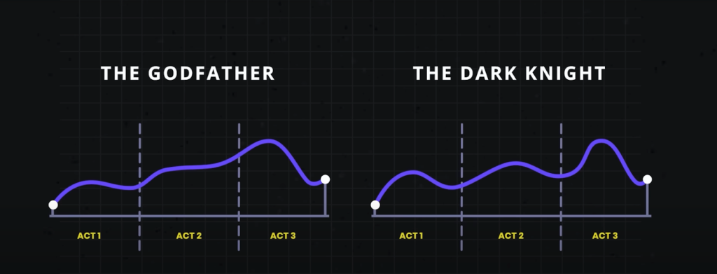 Three-act structure in movies (© 2024 StudioBinder. Image used with permission from StudioBinder.).
Use storytelling as a structure to do research
Three-act structure in movies (© 2024 StudioBinder. Image used with permission from StudioBinder.).
Use storytelling as a structure to do research
It's sad to say, but many have come to see research as being expendable. If budgets or timelines are tight, research tends to be one of the first things to go. Instead of investing in research, some product managers rely on designers or—worse—their own opinion to make the "right" choices for users based on their experience or accepted best practices. That may get teams some of the way, but that approach can so easily miss out on solving users' real problems. To remain user-centered, this is something we should avoid. User research elevates design. It keeps it on track, pointing to problems and opportunities. Being aware of the issues with your product and reacting to them can help you stay ahead of your competitors.
In the three-act structure, each act corresponds to a part of the process, and each part is critical to telling the whole story. Let's look at the different acts and how they align with user research.
Act one: setupThe setup is all about understanding the background, and that's where foundational research comes in. Foundational research (also called generative, discovery, or initial research) helps you understand users and identify their problems. You're learning about what exists today, the challenges users have, and how the challenges affect them—just like in the movies. To do foundational research, you can conduct contextual inquiries or diary studies (or both!), which can help you start to identify problems as well as opportunities. It doesn't need to be a huge investment in time or money.
Erika Hall writes about minimum viable ethnography, which can be as simple as spending 15 minutes with a user and asking them one thing: "'Walk me through your day yesterday.' That's it. Present that one request. Shut up and listen to them for 15 minutes. Do your damndest to keep yourself and your interests out of it. Bam, you're doing ethnography." According to Hall, "[This] will probably prove quite illuminating. In the highly unlikely case that you didn't learn anything new or useful, carry on with enhanced confidence in your direction."
This makes total sense to me. And I love that this makes user research so accessible. You don't need to prepare a lot of documentation; you can just recruit participants and do it! This can yield a wealth of information about your users, and it'll help you better understand them and what's going on in their lives. That's really what act one is all about: understanding where users are coming from.
Jared Spool talks about the importance of foundational research and how it should form the bulk of your research. If you can draw from any additional user data that you can get your hands on, such as surveys or analytics, that can supplement what you've heard in the foundational studies or even point to areas that need further investigation. Together, all this data paints a clearer picture of the state of things and all its shortcomings. And that's the beginning of a compelling story. It's the point in the plot where you realize that the main characters—or the users in this case—are facing challenges that they need to overcome. Like in the movies, this is where you start to build empathy for the characters and root for them to succeed. And hopefully stakeholders are now doing the same. Their sympathy may be with their business, which could be losing money because users can't complete certain tasks. Or maybe they do empathize with users' struggles. Either way, act one is your initial hook to get the stakeholders interested and invested.
Once stakeholders begin to understand the value of foundational research, that can open doors to more opportunities that involve users in the decision-making process. And that can guide product teams toward being more user-centered. This benefits everyone—users, the product, and stakeholders. It's like winning an Oscar in movie terms—it often leads to your product being well received and successful. And this can be an incentive for stakeholders to repeat this process with other products. Storytelling is the key to this process, and knowing how to tell a good story is the only way to get stakeholders to really care about doing more research.
This brings us to act two, where you iteratively evaluate a design or concept to see whether it addresses the issues.
Act two: conflictAct two is all about digging deeper into the problems that you identified in act one. This usually involves directional research, such as usability tests, where you assess a potential solution (such as a design) to see whether it addresses the issues that you found. The issues could include unmet needs or problems with a flow or process that's tripping users up. Like act two in a movie, more issues will crop up along the way. It's here that you learn more about the characters as they grow and develop through this act.
Usability tests should typically include around five participants according to Jakob Nielsen, who found that that number of users can usually identify most of the problems: "As you add more and more users, you learn less and less because you will keep seeing the same things again and again… After the fifth user, you are wasting your time by observing the same findings repeatedly but not learning much new."
There are parallels with storytelling here too; if you try to tell a story with too many characters, the plot may get lost. Having fewer participants means that each user's struggles will be more memorable and easier to relay to other stakeholders when talking about the research. This can help convey the issues that need to be addressed while also highlighting the value of doing the research in the first place.
Researchers have run usability tests in person for decades, but you can also conduct usability tests remotely using tools like Microsoft Teams, Zoom, or other teleconferencing software. This approach has become increasingly popular since the beginning of the pandemic, and it works well. You can think of in-person usability tests like going to a play and remote sessions as more like watching a movie. There are advantages and disadvantages to each. In-person usability research is a much richer experience. Stakeholders can experience the sessions with other stakeholders. You also get real-time reactions—including surprise, agreement, disagreement, and discussions about what they're seeing. Much like going to a play, where audiences get to take in the stage, the costumes, the lighting, and the actors' interactions, in-person research lets you see users up close, including their body language, how they interact with the moderator, and how the scene is set up.
If in-person usability testing is like watching a play—staged and controlled—then conducting usability testing in the field is like immersive theater where any two sessions might be very different from one another. You can take usability testing into the field by creating a replica of the space where users interact with the product and then conduct your research there. Or you can go out to meet users at their location to do your research. With either option, you get to see how things work in context, things come up that wouldn't have in a lab environment—and conversion can shift in entirely different directions. As researchers, you have less control over how these sessions go, but this can sometimes help you understand users even better. Meeting users where they are can provide clues to the external forces that could be affecting how they use your product. In-person usability tests provide another level of detail that's often missing from remote usability tests.
That's not to say that the "movies"—remote sessions—aren't a good option. Remote sessions can reach a wider audience. They allow a lot more stakeholders to be involved in the research and to see what's going on. And they open the doors to a much wider geographical pool of users. But with any remote session there is the potential of time wasted if participants can't log in or get their microphone working.
The benefit of usability testing, whether remote or in person, is that you get to see real users interact with the designs in real time, and you can ask them questions to understand their thought processes and grasp of the solution. This can help you not only identify problems but also glean why they're problems in the first place. Furthermore, you can test hypotheses and gauge whether your thinking is correct. By the end of the sessions, you'll have a much clearer picture of how usable the designs are and whether they work for their intended purposes. Act two is the heart of the story—where the excitement is—but there can be surprises too. This is equally true of usability tests. Often, participants will say unexpected things, which change the way that you look at things—and these twists in the story can move things in new directions.
Unfortunately, user research is sometimes seen as expendable. And too often usability testing is the only research process that some stakeholders think that they ever need. In fact, if the designs that you're evaluating in the usability test aren't grounded in a solid understanding of your users (foundational research), there's not much to be gained by doing usability testing in the first place. That's because you're narrowing the focus of what you're getting feedback on, without understanding the users' needs. As a result, there's no way of knowing whether the designs might solve a problem that users have. It's only feedback on a particular design in the context of a usability test.
On the other hand, if you only do foundational research, while you might have set out to solve the right problem, you won't know whether the thing that you're building will actually solve that. This illustrates the importance of doing both foundational and directional research.
In act two, stakeholders will—hopefully—get to watch the story unfold in the user sessions, which creates the conflict and tension in the current design by surfacing their highs and lows. And in turn, this can help motivate stakeholders to address the issues that come up.
Act three: resolutionWhile the first two acts are about understanding the background and the tensions that can propel stakeholders into action, the third part is about resolving the problems from the first two acts. While it's important to have an audience for the first two acts, it's crucial that they stick around for the final act. That means the whole product team, including developers, UX practitioners, business analysts, delivery managers, product managers, and any other stakeholders that have a say in the next steps. It allows the whole team to hear users' feedback together, ask questions, and discuss what's possible within the project's constraints. And it lets the UX research and design teams clarify, suggest alternatives, or give more context behind their decisions. So you can get everyone on the same page and get agreement on the way forward.
This act is mostly told in voiceover with some audience participation. The researcher is the narrator, who paints a picture of the issues and what the future of the product could look like given the things that the team has learned. They give the stakeholders their recommendations and their guidance on creating this vision.
Nancy Duarte in the Harvard Business Review offers an approach to structuring presentations that follow a persuasive story. "The most effective presenters use the same techniques as great storytellers: By reminding people of the status quo and then revealing the path to a better way, they set up a conflict that needs to be resolved," writes Duarte. "That tension helps them persuade the audience to adopt a new mindset or behave differently."
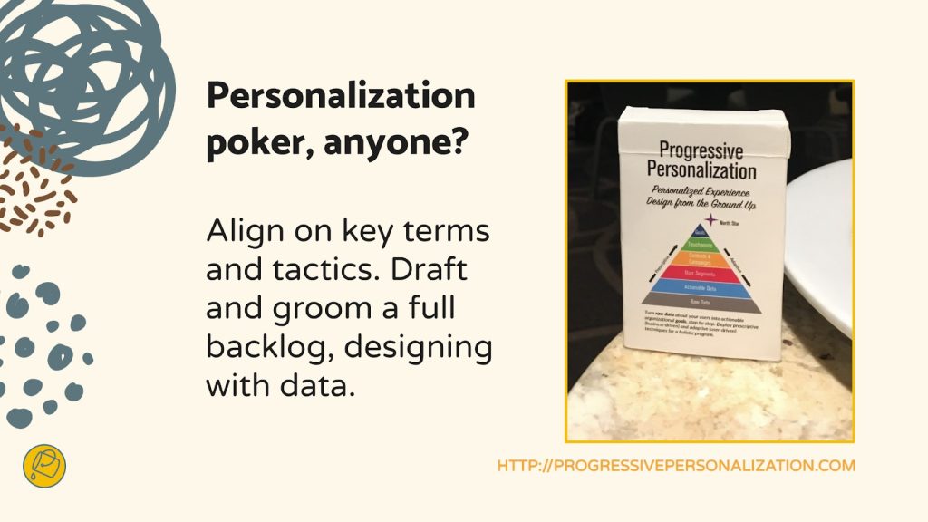
To Ignite a Personalization Practice, Run this Prepersonalization Workshop [ 16-Apr-24 8:51pm ]Picture this. You've joined a squad at your company that's designing new product features with an emphasis on automation or AI. Or your company has just implemented a personalization engine. Either way, you're designing with data. Now what? When it comes to designing for personalization, there are many cautionary tales, no overnight successes, and few guides for the perplexed.
Between the fantasy of getting it right and the fear of it going wrong—like when we encounter "persofails" in the vein of a company repeatedly imploring everyday consumers to buy additional toilet seats—the personalization gap is real. It's an especially confounding place to be a digital professional without a map, a compass, or a plan.
For those of you venturing into personalization, there's no Lonely Planet and few tour guides because effective personalization is so specific to each organization's talent, technology, and market position.
But you can ensure that your team has packed its bags sensibly.
 Designing for personalization makes for strange bedfellows. A savvy art-installation satire on the challenges of humane design in the era of the algorithm. Credit: Signs of the Times, Scott Kelly and Ben Polkinghome.
There's a DIY formula to increase your chances for success. At minimum, you'll defuse your boss's irrational exuberance. Before the party you'll need to effectively prepare.
We call it prepersonalization.
Behind the musicConsider Spotify's DJ feature, which debuted this past year.
https://www.youtube.com/watch?v=ok-aNnc0DkoWe're used to seeing the polished final result of a personalization feature. Before the year-end award, the making-of backstory, or the behind-the-scenes victory lap, a personalized feature had to be conceived, budgeted, and prioritized. Before any personalization feature goes live in your product or service, it lives amid a backlog of worthy ideas for expressing customer experiences more dynamically.
So how do you know where to place your personalization bets? How do you design consistent interactions that won't trip up users or—worse—breed mistrust? We've found that for many budgeted programs to justify their ongoing investments, they first needed one or more workshops to convene key stakeholders and internal customers of the technology. Make yours count.
From Big Tech to fledgling startups, we've seen the same evolution up close with our clients. In our experiences with working on small and large personalization efforts, a program's ultimate track record—and its ability to weather tough questions, work steadily toward shared answers, and organize its design and technology efforts—turns on how effectively these prepersonalization activities play out.
Time and again, we've seen effective workshops separate future success stories from unsuccessful efforts, saving countless time, resources, and collective well-being in the process.
A personalization practice involves a multiyear effort of testing and feature development. It's not a switch-flip moment in your tech stack. It's best managed as a backlog that often evolves through three steps:
- customer experience optimization (CXO, also known as A/B testing or experimentation)
- always-on automations (whether rules-based or machine-generated)
- mature features or standalone product development (such as Spotify's DJ experience)
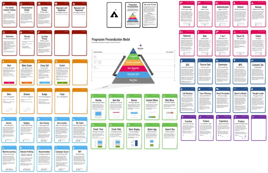
This is why we created our progressive personalization framework and why we're field-testing an accompanying deck of cards: we believe that there's a base grammar, a set of "nouns and verbs" that your organization can use to design experiences that are customized, personalized, or automated. You won't need these cards. But we strongly recommend that you create something similar, whether that might be digital or physical.
Set your kitchen timerHow long does it take to cook up a prepersonalization workshop? The surrounding assessment activities that we recommend including can (and often do) span weeks. For the core workshop, we recommend aiming for two to three days. Here's a summary of our broader approach along with details on the essential first-day activities.
The full arc of the wider workshop is threefold:
- Kickstart: This sets the terms of engagement as you focus on the opportunity as well as the readiness and drive of your team and your leadership. .
- Plan your work: This is the heart of the card-based workshop activities where you specify a plan of attack and the scope of work.
- Work your plan: This phase is all about creating a competitive environment for team participants to individually pitch their own pilots that each contain a proof-of-concept project, its business case, and its operating model.
Give yourself at least a day, split into two large time blocks, to power through a concentrated version of those first two phases.
Kickstart: Whet your appetiteWe call the first lesson the "landscape of connected experience." It explores the personalization possibilities in your organization. A connected experience, in our parlance, is any UX requiring the orchestration of multiple systems of record on the backend. This could be a content-management system combined with a marketing-automation platform. It could be a digital-asset manager combined with a customer-data platform.
Spark conversation by naming consumer examples and business-to-business examples of connected experience interactions that you admire, find familiar, or even dislike. This should cover a representative range of personalization patterns, including automated app-based interactions (such as onboarding sequences or wizards), notifications, and recommenders. We have a catalog of these in the cards. Here's a list of 142 different interactions to jog your thinking.
This is all about setting the table. What are the possible paths for the practice in your organization? If you want a broader view, here's a long-form primer and a strategic framework.
Assess each example that you discuss for its complexity and the level of effort that you estimate that it would take for your team to deliver that feature (or something similar). In our cards, we divide connected experiences into five levels: functions, features, experiences, complete products, and portfolios. Size your own build here. This will help to focus the conversation on the merits of ongoing investment as well as the gap between what you deliver today and what you want to deliver in the future.
Next, have your team plot each idea on the following 2×2 grid, which lays out the four enduring arguments for a personalized experience. This is critical because it emphasizes how personalization can not only help your external customers but also affect your own ways of working. It's also a reminder (which is why we used the word argument earlier) of the broader effort beyond these tactical interventions.
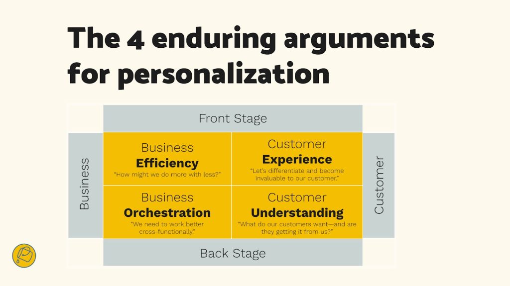 Getting intentional about the desired outcomes is an important component to a large-scale personalization program. Credit: Bucket Studio.
Each team member should vote on where they see your product or service putting its emphasis. Naturally, you can't prioritize all of them. The intention here is to flesh out how different departments may view their own upsides to the effort, which can vary from one to the next. Documenting your desired outcomes lets you know how the team internally aligns across representatives from different departments or functional areas.
The third and final kickstart activity is about naming your personalization gap. Is your customer journey well documented? Will data and privacy compliance be too big of a challenge? Do you have content metadata needs that you have to address? (We're pretty sure that you do: it's just a matter of recognizing the relative size of that need and its remedy.) In our cards, we've noted a number of program risks, including common team dispositions. Our Detractor card, for example, lists six stakeholder behaviors that hinder progress.
Effectively collaborating and managing expectations is critical to your success. Consider the potential barriers to your future progress. Press the participants to name specific steps to overcome or mitigate those barriers in your organization. As studies have shown, personalization efforts face many common barriers.
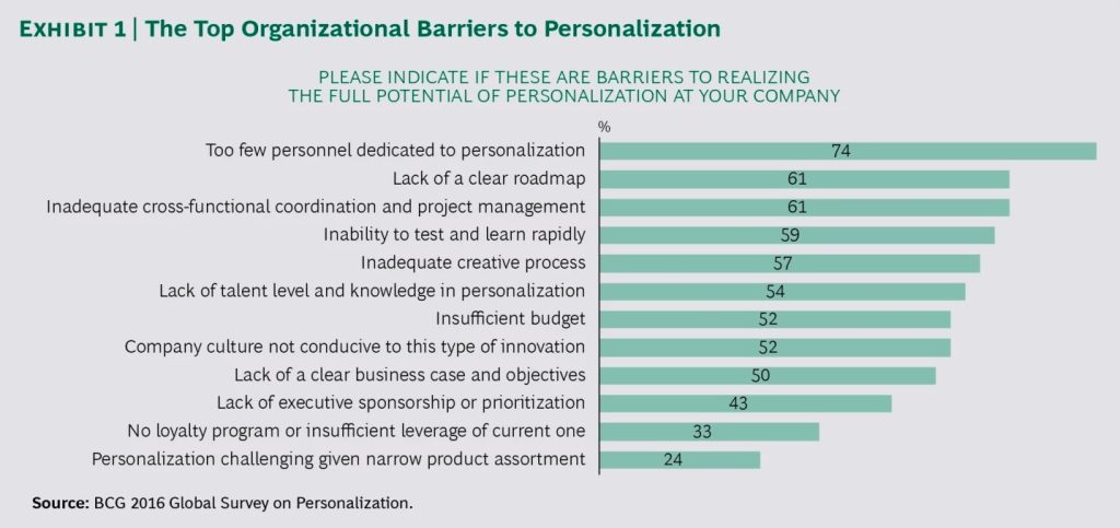 The largest management consultancies have established practice areas in personalization, and they regularly research program risks and challenges. Credit: Boston Consulting Group.
At this point, you've hopefully discussed sample interactions, emphasized a key area of benefit, and flagged key gaps? Good—you're ready to continue.
Hit that test kitchenNext, let's look at what you'll need to bring your personalization recipes to life. Personalization engines, which are robust software suites for automating and expressing dynamic content, can intimidate new customers. Their capabilities are sweeping and powerful, and they present broad options for how your organization can conduct its activities. This presents the question: Where do you begin when you're configuring a connected experience?
What's important here is to avoid treating the installed software like it were a dream kitchen from some fantasy remodeling project (as one of our client executives memorably put it). These software engines are more like test kitchens where your team can begin devising, tasting, and refining the snacks and meals that will become a part of your personalization program's regularly evolving menu.
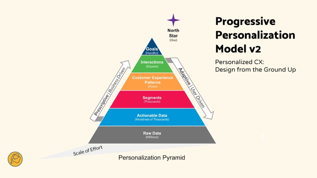 Progressive personalization, a framework for designing connected experiences. Credit: Bucket Studio and Colin Eagan.
The ultimate menu of the prioritized backlog will come together over the course of the workshop. And creating "dishes" is the way that you'll have individual team stakeholders construct personalized interactions that serve their needs or the needs of others.
The dishes will come from recipes, and those recipes have set ingredients.
 In the same way that ingredients form a recipe, you can also create cards to break down a personalized interaction into its constituent parts. Credit: Bucket Studio and Colin Eagan.
Verify your ingredients
In the same way that ingredients form a recipe, you can also create cards to break down a personalized interaction into its constituent parts. Credit: Bucket Studio and Colin Eagan.
Verify your ingredients
Like a good product manager, you'll make sure—andyou'll validate with the right stakeholders present—that you have all the ingredients on hand to cook up your desired interaction (or that you can work out what needs to be added to your pantry). These ingredients include the audience that you're targeting, content and design elements, the context for the interaction, and your measure for how it'll come together.
This isn't just about discovering requirements. Documenting your personalizations as a series of if-then statements lets the team:
- compare findings toward a unified approach for developing features, not unlike when artists paint with the same palette;
- specify a consistent set of interactions that users find uniform or familiar;
- and develop parity across performance measurements and key performance indicators too.
This helps you streamline your designs and your technical efforts while you deliver a shared palette of core motifs of your personalized or automated experience.
Compose your recipeWhat ingredients are important to you? Think of a who-what-when-why construct:
- Who are your key audience segments or groups?
- What kind of content will you give them, in what design elements, and under what circumstances?
- And for which business and user benefits?
We first developed these cards and card categories five years ago. We regularly play-test their fit with conference audiences and clients. And we still encounter new possibilities. But they all follow an underlying who-what-when-why logic.
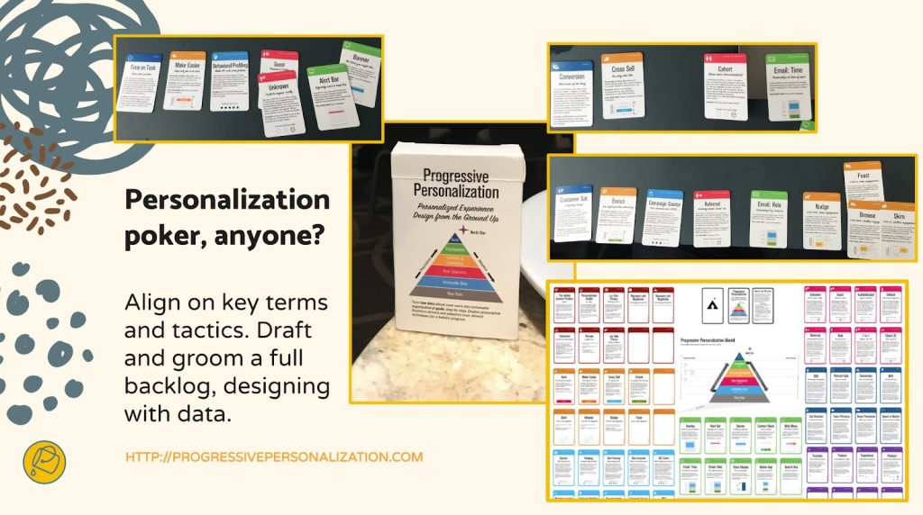
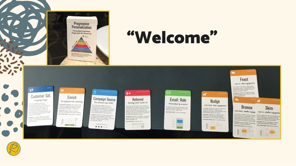
Here are three examples for a subscription-based reading app, which you can generally follow along with right to left in the cards in the accompanying photo below.
- Nurture personalization: When a guest or an unknown visitor interacts with a product title, a banner or alert bar appears that makes it easier for them to encounter a related title they may want to read, saving them time.
- Welcome automation: When there's a newly registered user, an email is generated to call out the breadth of the content catalog and to make them a happier subscriber.
- Winback automation: Before their subscription lapses or after a recent failed renewal, a user is sent an email that gives them a promotional offer to suggest that they reconsider renewing or to remind them to renew.
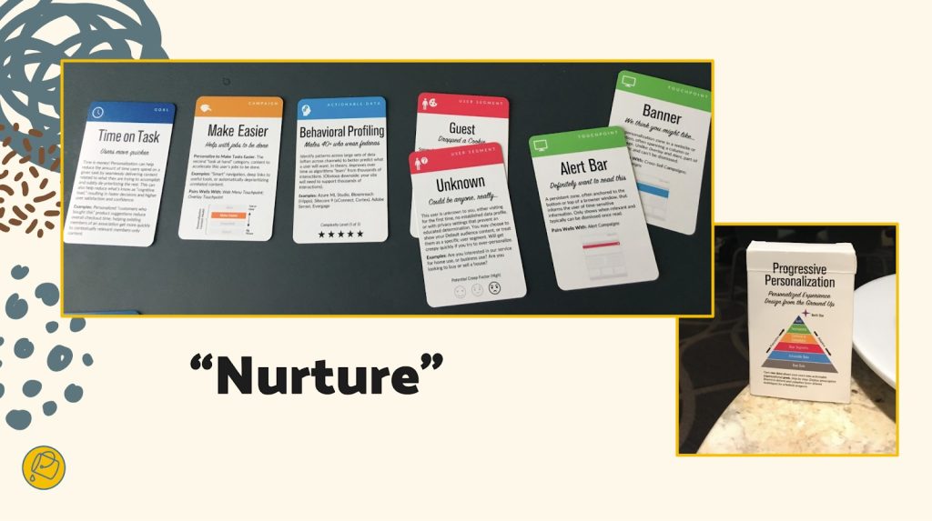 A "nurture" automation may trigger a banner or alert box that promotes content that makes it easier for users to complete a common task, based on behavioral profiling of two user types. Credit: Bucket Studio.
 A "welcome" automation may be triggered for any user that sends an email to help familiarize them with the breadth of a content library, and this email ideally helps them consider selecting various titles (no matter how much time they devote to reviewing the email's content itself). Credit: Bucket Studio.
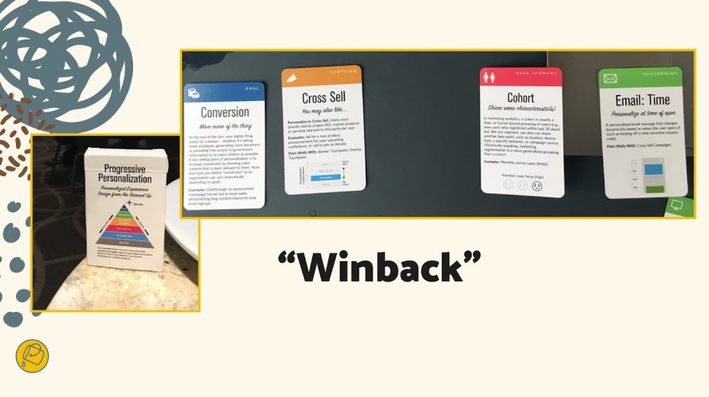 A "winback" automation may be triggered for a specific group, such as users with recently failed credit-card transactions or users at risk of churning out of active usage, that present them with a specific offer to mitigate near-future inactivity. Credit: Bucket Studio.
A useful preworkshop activity may be to think through a first draft of what these cards might be for your organization, although we've also found that this process sometimes flows best through cocreating the recipes themselves. Start with a set of blank cards, and begin labeling and grouping them through the design process, eventually distilling them to a refined subset of highly useful candidate cards.
You can think of the later stages of the workshop as moving from recipes toward a cookbook in focus—like a more nuanced customer-journey mapping. Individual "cooks" will pitch their recipes to the team, using a common jobs-to-be-done format so that measurability and results are baked in, and from there, the resulting collection will be prioritized for finished design and delivery to production.
Better kitchens require better architectureSimplifying a customer experience is a complicated effort for those who are inside delivering it. Beware anyone who says otherwise. With that being said, "Complicated problems can be hard to solve, but they are addressable with rules and recipes."
When personalization becomes a laugh line, it's because a team is overfitting: they aren't designing with their best data. Like a sparse pantry, every organization has metadata debt to go along with its technical debt, and this creates a drag on personalization effectiveness. Your AI's output quality, for example, is indeed limited by your IA. Spotify's poster-child prowess today was unfathomable before they acquired a seemingly modest metadata startup that now powers its underlying information architecture.
You can definitely stand the heat…Personalization technology opens a doorway into a confounding ocean of possible designs. Only a disciplined and highly collaborative approach will bring about the necessary focus and intention to succeed. So banish the dream kitchen. Instead, hit the test kitchen to save time, preserve job satisfaction and security, and safely dispense with the fanciful ideas that originate upstairs of the doers in your organization. There are meals to serve and mouths to feed.
This workshop framework gives you a fighting shot at lasting success as well as sound beginnings. Wiring up your information layer isn't an overnight affair. But if you use the same cookbook and shared recipes, you'll have solid footing for success. We designed these activities to make your organization's needs concrete and clear, long before the hazards pile up.
While there are associated costs toward investing in this kind of technology and product design, your ability to size up and confront your unique situation and your digital capabilities is time well spent. Don't squander it. The proof, as they say, is in the pudding.
The Wax and the Wane of the Web [ 29-Feb-24 2:45pm ]I offer a single bit of advice to friends and family when they become new parents: When you start to think that you've got everything figured out, everything will change. Just as you start to get the hang of feedings, diapers, and regular naps, it's time for solid food, potty training, and overnight sleeping. When you figure those out, it's time for preschool and rare naps. The cycle goes on and on.
The same applies for those of us working in design and development these days. Having worked on the web for almost three decades at this point, I've seen the regular wax and wane of ideas, techniques, and technologies. Each time that we as developers and designers get into a regular rhythm, some new idea or technology comes along to shake things up and remake our world.
How we got hereI built my first website in the mid-'90s. Design and development on the web back then was a free-for-all, with few established norms. For any layout aside from a single column, we used table elements, often with empty cells containing a single pixel spacer GIF to add empty space. We styled text with numerous font tags, nesting the tags every time we wanted to vary the font style. And we had only three or four typefaces to choose from: Arial, Courier, or Times New Roman. When Verdana and Georgia came out in 1996, we rejoiced because our options had nearly doubled. The only safe colors to choose from were the 216 "web safe" colors known to work across platforms. The few interactive elements (like contact forms, guest books, and counters) were mostly powered by CGI scripts (predominantly written in Perl at the time). Achieving any kind of unique look involved a pile of hacks all the way down. Interaction was often limited to specific pages in a site.
The birth of web standardsAt the turn of the century, a new cycle started. Crufty code littered with table layouts and font tags waned, and a push for web standards waxed. Newer technologies like CSS got more widespread adoption by browsers makers, developers, and designers. This shift toward standards didn't happen accidentally or overnight. It took active engagement between the W3C and browser vendors and heavy evangelism from folks like the Web Standards Project to build standards. A List Apart and books like Designing with Web Standards by Jeffrey Zeldman played key roles in teaching developers and designers why standards are important, how to implement them, and how to sell them to their organizations. And approaches like progressive enhancement introduced the idea that content should be available for all browsers—with additional enhancements available for more advanced browsers. Meanwhile, sites like the CSS Zen Garden showcased just how powerful and versatile CSS can be when combined with a solid semantic HTML structure.
Server-side languages like PHP, Java, and .NET overtook Perl as the predominant back-end processors, and the cgi-bin was tossed in the trash bin. With these better server-side tools came the first era of web applications, starting with content-management systems (particularly in the blogging space with tools like Blogger, Grey Matter, Movable Type, and WordPress). In the mid-2000s, AJAX opened doors for asynchronous interaction between the front end and back end. Suddenly, pages could update their content without needing to reload. A crop of JavaScript frameworks like Prototype, YUI, and jQuery arose to help developers build more reliable client-side interaction across browsers that had wildly varying levels of standards support. Techniques like image replacement let crafty designers and developers display fonts of their choosing. And technologies like Flash made it possible to add animations, games, and even more interactivity.
These new technologies, standards, and techniques reinvigorated the industry in many ways. Web design flourished as designers and developers explored more diverse styles and layouts. But we still relied on tons of hacks. Early CSS was a huge improvement over table-based layouts when it came to basic layout and text styling, but its limitations at the time meant that designers and developers still relied heavily on images for complex shapes (such as rounded or angled corners) and tiled backgrounds for the appearance of full-length columns (among other hacks). Complicated layouts required all manner of nested floats or absolute positioning (or both). Flash and image replacement for custom fonts was a great start toward varying the typefaces from the big five, but both hacks introduced accessibility and performance problems. And JavaScript libraries made it easy for anyone to add a dash of interaction to pages, although at the cost of doubling or even quadrupling the download size of simple websites.
The web as software platformThe symbiosis between the front end and back end continued to improve, and that led to the current era of modern web applications. Between expanded server-side programming languages (which kept growing to include Ruby, Python, Go, and others) and newer front-end tools like React, Vue, and Angular, we could build fully capable software on the web. Alongside these tools came others, including collaborative version control, build automation, and shared package libraries. What was once primarily an environment for linked documents became a realm of infinite possibilities.
At the same time, mobile devices became more capable, and they gave us internet access in our pockets. Mobile apps and responsive design opened up opportunities for new interactions anywhere and any time.
This combination of capable mobile devices and powerful development tools contributed to the waxing of social media and other centralized tools for people to connect and consume. As it became easier and more common to connect with others directly on Twitter, Facebook, and even Slack, the desire for hosted personal sites waned. Social media offered connections on a global scale, with both the good and bad that that entails.
Want a much more extensive history of how we got here, with some other takes on ways that we can improve? Jeremy Keith wrote "Of Time and the Web." Or check out the "Web Design History Timeline" at the Web Design Museum. Neal Agarwal also has a fun tour through "Internet Artifacts."
Where we are nowIn the last couple of years, it's felt like we've begun to reach another major inflection point. As social-media platforms fracture and wane, there's been a growing interest in owning our own content again. There are many different ways to make a website, from the tried-and-true classic of hosting plain HTML files to static site generators to content management systems of all flavors. The fracturing of social media also comes with a cost: we lose crucial infrastructure for discovery and connection. Webmentions, RSS, ActivityPub, and other tools of the IndieWeb can help with this, but they're still relatively underimplemented and hard to use for the less nerdy. We can build amazing personal websites and add to them regularly, but without discovery and connection, it can sometimes feel like we may as well be shouting into the void.
Browser support for CSS, JavaScript, and other standards like web components has accelerated, especially through efforts like Interop. New technologies gain support across the board in a fraction of the time that they used to. I often learn about a new feature and check its browser support only to find that its coverage is already above 80 percent. Nowadays, the barrier to using newer techniques often isn't browser support but simply the limits of how quickly designers and developers can learn what's available and how to adopt it.
Today, with a few commands and a couple of lines of code, we can prototype almost any idea. All the tools that we now have available make it easier than ever to start something new. But the upfront cost that these frameworks may save in initial delivery eventually comes due as upgrading and maintaining them becomes a part of our technical debt.
If we rely on third-party frameworks, adopting new standards can sometimes take longer since we may have to wait for those frameworks to adopt those standards. These frameworks—which used to let us adopt new techniques sooner—have now become hindrances instead. These same frameworks often come with performance costs too, forcing users to wait for scripts to load before they can read or interact with pages. And when scripts fail (whether through poor code, network issues, or other environmental factors), there's often no alternative, leaving users with blank or broken pages.
Where do we go from here?Today's hacks help to shape tomorrow's standards. And there's nothing inherently wrong with embracing hacks—for now—to move the present forward. Problems only arise when we're unwilling to admit that they're hacks or we hesitate to replace them. So what can we do to create the future we want for the web?
Build for the long haul. Optimize for performance, for accessibility, and for the user. Weigh the costs of those developer-friendly tools. They may make your job a little easier today, but how do they affect everything else? What's the cost to users? To future developers? To standards adoption? Sometimes the convenience may be worth it. Sometimes it's just a hack that you've grown accustomed to. And sometimes it's holding you back from even better options.
Start from standards. Standards continue to evolve over time, but browsers have done a remarkably good job of continuing to support older standards. The same isn't always true of third-party frameworks. Sites built with even the hackiest of HTML from the '90s still work just fine today. The same can't always be said of sites built with frameworks even after just a couple years.
Design with care. Whether your craft is code, pixels, or processes, consider the impacts of each decision. The convenience of many a modern tool comes at the cost of not always understanding the underlying decisions that have led to its design and not always considering the impact that those decisions can have. Rather than rushing headlong to "move fast and break things," use the time saved by modern tools to consider more carefully and design with deliberation.
Always be learning. If you're always learning, you're also growing. Sometimes it may be hard to pinpoint what's worth learning and what's just today's hack. You might end up focusing on something that won't matter next year, even if you were to focus solely on learning standards. (Remember XHTML?) But constant learning opens up new connections in your brain, and the hacks that you learn one day may help to inform different experiments another day.
Play, experiment, and be weird! This web that we've built is the ultimate experiment. It's the single largest human endeavor in history, and yet each of us can create our own pocket within it. Be courageous and try new things. Build a playground for ideas. Make goofy experiments in your own mad science lab. Start your own small business. There has never been a more empowering place to be creative, take risks, and explore what we're capable of.
Share and amplify. As you experiment, play, and learn, share what's worked for you. Write on your own website, post on whichever social media site you prefer, or shout it from a TikTok. Write something for A List Apart! But take the time to amplify others too: find new voices, learn from them, and share what they've taught you.
Go forth and makeAs designers and developers for the web (and beyond), we're responsible for building the future every day, whether that may take the shape of personal websites, social media tools used by billions, or anything in between. Let's imbue our values into the things that we create, and let's make the web a better place for everyone. Create that thing that only you are uniquely qualified to make. Then share it, make it better, make it again, or make something new. Learn. Make. Share. Grow. Rinse and repeat. Every time you think that you've mastered the web, everything will change.
Opportunities for AI in Accessibility [ 07-Feb-24 2:00pm ]In reading Joe Dolson's recent piece on the intersection of AI and accessibility, I absolutely appreciated the skepticism that he has for AI in general as well as for the ways that many have been using it. In fact, I'm very skeptical of AI myself, despite my role at Microsoft as an accessibility innovation strategist who helps run the AI for Accessibility grant program. As with any tool, AI can be used in very constructive, inclusive, and accessible ways; and it can also be used in destructive, exclusive, and harmful ones. And there are a ton of uses somewhere in the mediocre middle as well.
I'd like you to consider this a "yes… and" piece to complement Joe's post. I'm not trying to refute any of what he's saying but rather provide some visibility to projects and opportunities where AI can make meaningful differences for people with disabilities. To be clear, I'm not saying that there aren't real risks or pressing issues with AI that need to be addressed—there are, and we've needed to address them, like, yesterday—but I want to take a little time to talk about what's possible in hopes that we'll get there one day.
Alternative textJoe's piece spends a lot of time talking about computer-vision models generating alternative text. He highlights a ton of valid issues with the current state of things. And while computer-vision models continue to improve in the quality and richness of detail in their descriptions, their results aren't great. As he rightly points out, the current state of image analysis is pretty poor—especially for certain image types—in large part because current AI systems examine images in isolation rather than within the contexts that they're in (which is a consequence of having separate "foundation" models for text analysis and image analysis). Today's models aren't trained to distinguish between images that are contextually relevant (that should probably have descriptions) and those that are purely decorative (which might not need a description) either. Still, I still think there's potential in this space.
As Joe mentions, human-in-the-loop authoring of alt text should absolutely be a thing. And if AI can pop in to offer a starting point for alt text—even if that starting point might be a prompt saying What is this BS? That's not right at all… Let me try to offer a starting point—I think that's a win.
Taking things a step further, if we can specifically train a model to analyze image usage in context, it could help us more quickly identify which images are likely to be decorative and which ones likely require a description. That will help reinforce which contexts call for image descriptions and it'll improve authors' efficiency toward making their pages more accessible.
While complex images—like graphs and charts—are challenging to describe in any sort of succinct way (even for humans), the image example shared in the GPT4 announcement points to an interesting opportunity as well. Let's suppose that you came across a chart whose description was simply the title of the chart and the kind of visualization it was, such as: Pie chart comparing smartphone usage to feature phone usage among US households making under $30,000 a year. (That would be a pretty awful alt text for a chart since that would tend to leave many questions about the data unanswered, but then again, let's suppose that that was the description that was in place.) If your browser knew that that image was a pie chart (because an onboard model concluded this), imagine a world where users could ask questions like these about the graphic:
- Do more people use smartphones or feature phones?
- How many more?
- Is there a group of people that don't fall into either of these buckets?
- How many is that?
Setting aside the realities of large language model (LLM) hallucinations—where a model just makes up plausible-sounding "facts"—for a moment, the opportunity to learn more about images and data in this way could be revolutionary for blind and low-vision folks as well as for people with various forms of color blindness, cognitive disabilities, and so on. It could also be useful in educational contexts to help people who can see these charts, as is, to understand the data in the charts.
Taking things a step further: What if you could ask your browser to simplify a complex chart? What if you could ask it to isolate a single line on a line graph? What if you could ask your browser to transpose the colors of the different lines to work better for form of color blindness you have? What if you could ask it to swap colors for patterns? Given these tools' chat-based interfaces and our existing ability to manipulate images in today's AI tools, that seems like a possibility.
Now imagine a purpose-built model that could extract the information from that chart and convert it to another format. For example, perhaps it could turn that pie chart (or better yet, a series of pie charts) into more accessible (and useful) formats, like spreadsheets. That would be amazing!
Matching algorithmsSafiya Umoja Noble absolutely hit the nail on the head when she titled her book Algorithms of Oppression. While her book was focused on the ways that search engines reinforce racism, I think that it's equally true that all computer models have the potential to amplify conflict, bias, and intolerance. Whether it's Twitter always showing you the latest tweet from a bored billionaire, YouTube sending us into a Q-hole, or Instagram warping our ideas of what natural bodies look like, we know that poorly authored and maintained algorithms are incredibly harmful. A lot of this stems from a lack of diversity among the people who shape and build them. When these platforms are built with inclusively baked in, however, there's real potential for algorithm development to help people with disabilities.
Take Mentra, for example. They are an employment network for neurodivergent people. They use an algorithm to match job seekers with potential employers based on over 75 data points. On the job-seeker side of things, it considers each candidate's strengths, their necessary and preferred workplace accommodations, environmental sensitivities, and so on. On the employer side, it considers each work environment, communication factors related to each job, and the like. As a company run by neurodivergent folks, Mentra made the decision to flip the script when it came to typical employment sites. They use their algorithm to propose available candidates to companies, who can then connect with job seekers that they are interested in; reducing the emotional and physical labor on the job-seeker side of things.
When more people with disabilities are involved in the creation of algorithms, that can reduce the chances that these algorithms will inflict harm on their communities. That's why diverse teams are so important.
Imagine that a social media company's recommendation engine was tuned to analyze who you're following and if it was tuned to prioritize follow recommendations for people who talked about similar things but who were different in some key ways from your existing sphere of influence. For example, if you were to follow a bunch of nondisabled white male academics who talk about AI, it could suggest that you follow academics who are disabled or aren't white or aren't male who also talk about AI. If you took its recommendations, perhaps you'd get a more holistic and nuanced understanding of what's happening in the AI field. These same systems should also use their understanding of biases about particular communities—including, for instance, the disability community—to make sure that they aren't recommending any of their users follow accounts that perpetuate biases against (or, worse, spewing hate toward) those groups.
Other ways that AI can helps people with disabilitiesIf I weren't trying to put this together between other tasks, I'm sure that I could go on and on, providing all kinds of examples of how AI could be used to help people with disabilities, but I'm going to make this last section into a bit of a lightning round. In no particular order:
- Voice preservation. You may have seen the VALL-E paper or Apple's Global Accessibility Awareness Day announcement or you may be familiar with the voice-preservation offerings from Microsoft, Acapela, or others. It's possible to train an AI model to replicate your voice, which can be a tremendous boon for people who have ALS (Lou Gehrig's disease) or motor-neuron disease or other medical conditions that can lead to an inability to talk. This is, of course, the same tech that can also be used to create audio deepfakes, so it's something that we need to approach responsibly, but the tech has truly transformative potential.
- Voice recognition. Researchers like those in the Speech Accessibility Project are paying people with disabilities for their help in collecting recordings of people with atypical speech. As I type, they are actively recruiting people with Parkinson's and related conditions, and they have plans to expand this to other conditions as the project progresses. This research will result in more inclusive data sets that will let more people with disabilities use voice assistants, dictation software, and voice-response services as well as control their computers and other devices more easily, using only their voice.
- Text transformation. The current generation of LLMs is quite capable of adjusting existing text content without injecting hallucinations. This is hugely empowering for people with cognitive disabilities who may benefit from text summaries or simplified versions of text or even text that's prepped for Bionic Reading.
We need to recognize that our differences matter. Our lived experiences are influenced by the intersections of the identities that we exist in. These lived experiences—with all their complexities (and joys and pain)—are valuable inputs to the software, services, and societies that we shape. Our differences need to be represented in the data that we use to train new models, and the folks who contribute that valuable information need to be compensated for sharing it with us. Inclusive data sets yield more robust models that foster more equitable outcomes.
Want a model that doesn't demean or patronize or objectify people with disabilities? Make sure that you have content about disabilities that's authored by people with a range of disabilities, and make sure that that's well represented in the training data.
Want a model that doesn't use ableist language? You may be able to use existing data sets to build a filter that can intercept and remediate ableist language before it reaches readers. That being said, when it comes to sensitivity reading, AI models won't be replacing human copy editors anytime soon.
Want a coding copilot that gives you accessible recommendations from the jump? Train it on code that you know to be accessible.
I have no doubt that AI can and will harm people… today, tomorrow, and well into the future. But I also believe that we can acknowledge that and, with an eye towards accessibility (and, more broadly, inclusion), make thoughtful, considerate, and intentional changes in our approaches to AI that will reduce harm over time as well. Today, tomorrow, and well into the future.
Many thanks to Kartik Sawhney for helping me with the development of this piece, Ashley Bischoff for her invaluable editorial assistance, and, of course, Joe Dolson for the prompt.
I am a creative. [ 29-Jan-24 3:53pm ]I am a creative. What I do is alchemy. It is a mystery. I do not so much do it, as let it be done through me.
I am a creative. Not all creative people like this label. Not all see themselves this way. Some creative people see science in what they do. That is their truth, and I respect it. Maybe I even envy them, a little. But my process is different—my being is different.
Apologizing and qualifying in advance is a distraction. That's what my brain does to sabotage me. I set it aside for now. I can come back later to apologize and qualify. After I've said what I came to say. Which is hard enough.
Except when it is easy and flows like a river of wine.
Sometimes it does come that way. Sometimes what I need to create comes in an instant. I have learned not to say it at that moment, because if you admit that sometimes the idea just comes and it is the best idea and you know it is the best idea, they think you don't work hard enough.
Sometimes I work and work and work until the idea comes. Sometimes it comes instantly and I don't tell anyone for three days. Sometimes I'm so excited by the idea that came instantly that I blurt it out, can't help myself. Like a boy who found a prize in his Cracker Jacks. Sometimes I get away with this. Sometimes other people agree: yes, that is the best idea. Most times they don't and I regret having given way to enthusiasm.
Enthusiasm is best saved for the meeting where it will make a difference. Not the casual get-together that precedes that meeting by two other meetings. Nobody knows why we have all these meetings. We keep saying we're doing away with them, but then just finding other ways to have them. Sometimes they are even good. But other times they are a distraction from the actual work. The proportion between when meetings are useful, and when they are a pitiful distraction, varies, depending on what you do and where you do it. And who you are and how you do it. Again I digress. I am a creative. That is the theme.
Sometimes many hours of hard and patient work produce something that is barely serviceable. Sometimes I have to accept that and move on to the next project.
Don't ask about process. I am a creative.I am a creative. I don't control my dreams. And I don't control my best ideas.
I can hammer away, surround myself with facts or images, and sometimes that works. I can go for a walk, and sometimes that works. I can be making dinner and there's a Eureka having nothing to do with sizzling oil and bubbling pots. Often I know what to do the instant I wake up. And then, almost as often, as I become conscious and part of the world again, the idea that would have saved me turns to vanishing dust in a mindless wind of oblivion. For creativity, I believe, comes from that other world. The one we enter in dreams, and perhaps, before birth and after death. But that's for poets to wonder, and I am not a poet. I am a creative. And it's for theologians to mass armies about in their creative world that they insist is real. But that is another digression. And a depressing one. Maybe on a much more important topic than whether I am a creative or not. But still a digression from what I came here to say.
Sometimes the process is avoidance. And agony. You know the cliché about the tortured artist? It's true, even when the artist (and let's put that noun in quotes) is trying to write a soft drink jingle, a callback in a tired sitcom, a budget request.
Some people who hate being called creative may be closeted creatives, but that's between them and their gods. No offense meant. Your truth is true, too. But mine is for me.
Creatives recognize creatives.Creatives recognize creatives like queers recognize queers, like real rappers recognize real rappers, like cons know cons. Creatives feel massive respect for creatives. We love, honor, emulate, and practically deify the great ones. To deify any human is, of course, a tragic mistake. We have been warned. We know better. We know people are just people. They squabble, they are lonely, they regret their most important decisions, they are poor and hungry, they can be cruel, they can be just as stupid as we can, because, like us, they are clay. But. But. But they make this amazing thing. They birth something that did not exist before them, and could not exist without them. They are the mothers of ideas. And I suppose, since it's just lying there, I have to add that they are the mothers of invention. Ba dum bum! OK, that's done. Continue.
Creatives belittle our own small achievements, because we compare them to those of the great ones. Beautiful animation! Well, I'm no Miyazaki. Now THAT is greatness. That is greatness straight from the mind of God. This half-starved little thing that I made? It more or less fell off the back of the turnip truck. And the turnips weren't even fresh.
Creatives knows that, at best, they are Salieri. Even the creatives who are Mozart believe that.
I am a creative. I haven't worked in advertising in 30 years, but in my nightmares, it's my former creative directors who judge me. And they are right to do so. I am too lazy, too facile, and when it really counts, my mind goes blank. There is no pill for creative dysfunction.
I am a creative. Every deadline I make is an adventure that makes Indiana Jones look like a pensioner snoring in a deck chair. The longer I remain a creative, the faster I am when I do my work and the longer I brood and walk in circles and stare blankly before I do that work.
I am still 10 times faster than people who are not creative, or people who have only been creative a short while, or people who have only been professionally creative a short while. It's just that, before I work 10 times as fast as they do, I spend twice as long as they do putting the work off. I am that confident in my ability to do a great job when I put my mind to it. I am that addicted to the adrenaline rush of postponement. I am still that afraid of the jump.
I am not an artist.I am a creative. Not an artist. Though I dreamed, as a lad, of someday being that. Some of us belittle our gifts and dislike ourselves because we are not Michelangelos and Warhols. That is narcissism—but at least we aren't in politics.
I am a creative. Though I believe in reason and science, I decide by intuition and impulse. And live with what follows—the catastrophes as well as the triumphs.
I am a creative. Every word I've said here will annoy other creatives, who see things differently. Ask two creatives a question, get three opinions. Our disagreement, our passion about it, and our commitment to our own truth are, at least to me, the proofs that we are creatives, no matter how we may feel about it.
I am a creative. I lament my lack of taste in the areas about which I know very little, which is to say almost all areas of human knowledge. And I trust my taste above all other things in the areas closest to my heart, or perhaps, more accurately, to my obsessions. Without my obsessions, I would probably have to spend my time looking life in the eye, and almost none of us can do that for long. Not honestly. Not really. Because much in life, if you really look at it, is unbearable.
I am a creative. I believe, as a parent believes, that when I am gone, some small good part of me will carry on in the mind of at least one other person.
Working saves me from worrying about work.I am a creative. I live in dread of my small gift suddenly going away.
I am a creative. I am too busy making the next thing to spend too much time deeply considering that almost nothing I make will come anywhere near the greatness I comically aspire to.
I am a creative. I believe in the ultimate mystery of process. I believe in it so much, I am even fool enough to publish an essay I dictated into a tiny machine and didn't take time to review or revise. I won't do this often, I promise. But I did it just now, because, as afraid as I might be of your seeing through my pitiful gestures toward the beautiful, I was even more afraid of forgetting what I came to say.
There. I think I've said it.
Humility: An Essential Value [ 22-Jun-23 2:00pm ]Humility, a designer's essential value—that has a nice ring to it. What about humility, an office manager's essential value? Or a dentist's? Or a librarian's? They all sound great. When humility is our guiding light, the path is always open for fulfillment, evolution, connection, and engagement. In this chapter, we're going to talk about why.
That said, this is a book for designers, and to that end, I'd like to start with a story—well, a journey, really. It's a personal one, and I'm going to make myself a bit vulnerable along the way. I call it:
The Tale of Justin's Preposterous PateWhen I was coming out of art school, a long-haired, goateed neophyte, print was a known quantity to me; design on the web, however, was rife with complexities to navigate and discover, a problem to be solved. Though I had been formally trained in graphic design, typography, and layout, what fascinated me was how these traditional skills might be applied to a fledgling digital landscape. This theme would ultimately shape the rest of my career.
So rather than graduate and go into print like many of my friends, I devoured HTML and JavaScript books into the wee hours of the morning and taught myself how to code during my senior year. I wanted—nay, needed—to better understand the underlying implications of what my design decisions would mean once rendered in a browser.
The late '90s and early 2000s were the so-called "Wild West" of web design. Designers at the time were all figuring out how to apply design and visual communication to the digital landscape. What were the rules? How could we break them and still engage, entertain, and convey information? At a more macro level, how could my values, inclusive of humility, respect, and connection, align in tandem with that? I was hungry to find out.
Though I'm talking about a different era, those are timeless considerations between non-career interactions and the world of design. What are your core passions, or values, that transcend medium? It's essentially the same concept we discussed earlier on the direct parallels between what fulfills you, agnostic of the tangible or digital realms; the core themes are all the same.
First within tables, animated GIFs, Flash, then with Web Standards, divs, and CSS, there was personality, raw unbridled creativity, and unique means of presentment that often defied any semblance of a visible grid. Splash screens and "browser requirement" pages aplenty. Usability and accessibility were typically victims of such a creation, but such paramount facets of any digital design were largely (and, in hindsight, unfairly) disregarded at the expense of experimentation.
For example, this iteration of my personal portfolio site ("the pseudoroom") from that era was experimental, if not a bit heavy- handed, in the visual communication of the concept of a living sketchbook. Very skeuomorphic. I collaborated with fellow designer and dear friend Marc Clancy (now a co-founder of the creative project organizing app Milanote) on this one, where we'd first sketch and then pass a Photoshop file back and forth to trick things out and play with varied user interactions. Then, I'd break it down and code it into a digital layout.
 Figure 1: "the pseudoroom" website, hitting the sketchbook metaphor hard.
Along with design folio pieces, the site also offered free downloads for Mac OS customizations: desktop wallpapers that were effectively design experimentation, custom-designed typefaces, and desktop icons.
From around the same time, GUI Galaxy was a design, pixel art, and Mac-centric news portal some graphic designer friends and I conceived, designed, developed, and deployed.
 Figure 2: GUI Galaxy, web standards-compliant design news portal
Design news portals were incredibly popular during this period, featuring (what would now be considered) Tweet-size, small-format snippets of pertinent news from the categories I previously mentioned. If you took Twitter, curated it to a few categories, and wrapped it in a custom-branded experience, you'd have a design news portal from the late 90s / early 2000s.
We as designers had evolved and created a bandwidth-sensitive, web standards award-winning, much more accessibility-conscious website. Still ripe with experimentation, yet more mindful of equitable engagement. You can see a couple of content panes here, noting general news (tech, design) and Mac-centric news below. We also offered many of the custom downloads I cited before as present on my folio site but branded and themed to GUI Galaxy.
The site's backbone was a homegrown CMS, with the presentation layer consisting of global design + illustration + news author collaboration. And the collaboration effort here, in addition to experimentation on a 'brand' and content delivery, was hitting my core. We were designing something bigger than any single one of us and connecting with a global audience.
Collaboration and connection transcend medium in their impact, immensely fulfilling me as a designer.
Now, why am I taking you down this trip of design memory lane? Two reasons.
First, there's a reason for the nostalgia for that design era (the "Wild West" era, as I called it earlier): the inherent exploration, personality, and creativity that saturated many design portals and personal portfolio sites. Ultra-finely detailed pixel art UI, custom illustration, bespoke vector graphics, all underpinned by a strong design community.
Today's web design has been in a period of stagnation. I suspect there's a strong chance you've seen a site whose structure looks something like this: a hero image / banner with text overlaid, perhaps with a lovely rotating carousel of images (laying the snark on heavy there), a call to action, and three columns of sub-content directly beneath. Maybe an icon library is employed with selections that vaguely relate to their respective content.
Design, as it's applied to the digital landscape, is in dire need of thoughtful layout, typography, and visual engagement that goes hand-in-hand with all the modern considerations we now know are paramount: usability. Accessibility. Load times and bandwidth- sensitive content delivery. A responsive presentation that meets human beings wherever they're engaging from. We must be mindful of, and respectful toward, those concerns—but not at the expense of creativity of visual communication or via replicating cookie-cutter layouts.
Pixel ProblemsWebsites during this period were often designed and built on Macs whose OS and desktops looked something like this. This is Mac OS 7.5, but 8 and 9 weren't that different.
 Figure 3: A Mac OS 7.5-centric desktop.
Desktop icons fascinated me: how could any single one, at any given point, stand out to get my attention? In this example, the user's desktop is tidy, but think of a more realistic example with icon pandemonium. Or, say an icon was part of a larger system grouping (fonts, extensions, control panels)—how did it also maintain cohesion amongst a group?
These were 32 x 32 pixel creations, utilizing a 256-color palette, designed pixel-by-pixel as mini mosaics. To me, this was the embodiment of digital visual communication under such ridiculous constraints. And often, ridiculous restrictions can yield the purification of concept and theme.
So I began to research and do my homework. I was a student of this new medium, hungry to dissect, process, discover, and make it my own.
Expanding upon the notion of exploration, I wanted to see how I could push the limits of a 32x32 pixel grid with that 256-color palette. Those ridiculous constraints forced a clarity of concept and presentation that I found incredibly appealing. The digital gauntlet had been tossed, and that challenge fueled me. And so, in my dorm room into the wee hours of the morning, I toiled away, bringing conceptual sketches into mini mosaic fruition.
These are some of my creations, utilizing the only tool available at the time to create icons called ResEdit. ResEdit was a clunky, built-in Mac OS utility not really made for exactly what we were using it for. At the core of all of this work: Research. Challenge. Problem- solving. Again, these core connection-based values are agnostic of medium.
 Figure 4: A selection of my pixel art design, 32x32 pixel canvas, 8-bit palette
There's one more design portal I want to talk about, which also serves as the second reason for my story to bring this all together.
This is K10k, short for Kaliber 1000. K10k was founded in 1998 by Michael Schmidt and Toke Nygaard, and was the design news portal on the web during this period. With its pixel art-fueled presentation, ultra-focused care given to every facet and detail, and with many of the more influential designers of the time who were invited to be news authors on the site, well... it was the place to be, my friend. With respect where respect is due, GUI Galaxy's concept was inspired by what these folks were doing.
 Figure 5: The K10k website
For my part, the combination of my web design work and pixel art exploration began to get me some notoriety in the design scene. Eventually, K10k noticed and added me as one of their very select group of news authors to contribute content to the site.
Amongst my personal work and side projects—and now with this inclusion—in the design community, this put me on the map. My design work also began to be published in various printed collections, in magazines domestically and overseas, and featured on other design news portals. With that degree of success while in my early twenties, something else happened:
I evolved—devolved, really—into a colossal asshole (and in just about a year out of art school, no less). The press and the praise became what fulfilled me, and they went straight to my head. They inflated my ego. I actually felt somewhat superior to my fellow designers.
The casualties? My design stagnated. Its evolution—my evolution— stagnated.
I felt so supremely confident in my abilities that I effectively stopped researching and discovering. When previously sketching concepts or iterating ideas in lead was my automatic step one, I instead leaped right into Photoshop. I drew my inspiration from the smallest of sources (and with blinders on). Any critique of my work from my peers was often vehemently dismissed. The most tragic loss: I had lost touch with my values.
My ego almost cost me some of my friendships and burgeoning professional relationships. I was toxic in talking about design and in collaboration. But thankfully, those same friends gave me a priceless gift: candor. They called me out on my unhealthy behavior.
Admittedly, it was a gift I initially did not accept but ultimately was able to deeply reflect upon. I was soon able to accept, and process, and course correct. The realization laid me low, but the re-awakening was essential. I let go of the "reward" of adulation and re-centered upon what stoked the fire for me in art school. Most importantly: I got back to my core values.
Always StudentsFollowing that short-term regression, I was able to push forward in my personal design and career. And I could self-reflect as I got older to facilitate further growth and course correction as needed.
As an example, let's talk about the Large Hadron Collider. The LHC was designed "to help answer some of the fundamental open questions in physics, which concern the basic laws governing the interactions and forces among the elementary objects, the deep structure of space and time, and in particular the interrelation between quantum mechanics and general relativity." Thanks, Wikipedia.
Around fifteen years ago, in one of my earlier professional roles, I designed the interface for the application that generated the LHC's particle collision diagrams. These diagrams are the rendering of what's actually happening inside the Collider during any given particle collision event and are often considered works of art unto themselves.
Designing the interface for this application was a fascinating process for me, in that I worked with Fermilab physicists to understand what the application was trying to achieve, but also how the physicists themselves would be using it. To that end, in this role,
I cut my teeth on usability testing, working with the Fermilab team to iterate and improve the interface. How they spoke and what they spoke about was like an alien language to me. And by making myself humble and working under the mindset that I was but a student, I made myself available to be a part of their world to generate that vital connection.
I also had my first ethnographic observation experience: going to the Fermilab location and observing how the physicists used the tool in their actual environment, on their actual terminals. For example, one takeaway was that due to the level of ambient light-driven contrast within the facility, the data columns ended up using white text on a dark gray background instead of black text-on-white. This enabled them to pore over reams of data during the day and ease their eye strain. And Fermilab and CERN are government entities with rigorous accessibility standards, so my knowledge in that realm also grew. The barrier-free design was another essential form of connection.
So to those core drivers of my visual problem-solving soul and ultimate fulfillment: discovery, exposure to new media, observation, human connection, and evolution. What opened the door for those values was me checking my ego before I walked through it.
An evergreen willingness to listen, learn, understand, grow, evolve, and connect yields our best work. In particular, I want to focus on the words 'grow' and 'evolve' in that statement. If we are always students of our craft, we are also continually making ourselves available to evolve. Yes, we have years of applicable design study under our belt. Or the focused lab sessions from a UX bootcamp. Or the monogrammed portfolio of our work. Or, ultimately, decades of a career behind us.
But all that said: experience does not equal "expert."
As soon as we close our minds via an inner monologue of 'knowing it all' or branding ourselves a "#thoughtleader" on social media, the designer we are is our final form. The designer we can be will never exist.
Personalization Pyramid: A Framework for Designing with User Data [ 08-Dec-22 3:00pm ]As a UX professional in today's data-driven landscape, it's increasingly likely that you've been asked to design a personalized digital experience, whether it's a public website, user portal, or native application. Yet while there continues to be no shortage of marketing hype around personalization platforms, we still have very few standardized approaches for implementing personalized UX.
That's where we come in. After completing dozens of personalization projects over the past few years, we gave ourselves a goal: could you create a holistic personalization framework specifically for UX practitioners? The Personalization Pyramid is a designer-centric model for standing up human-centered personalization programs, spanning data, segmentation, content delivery, and overall goals. By using this approach, you will be able to understand the core components of a contemporary, UX-driven personalization program (or at the very least know enough to get started).
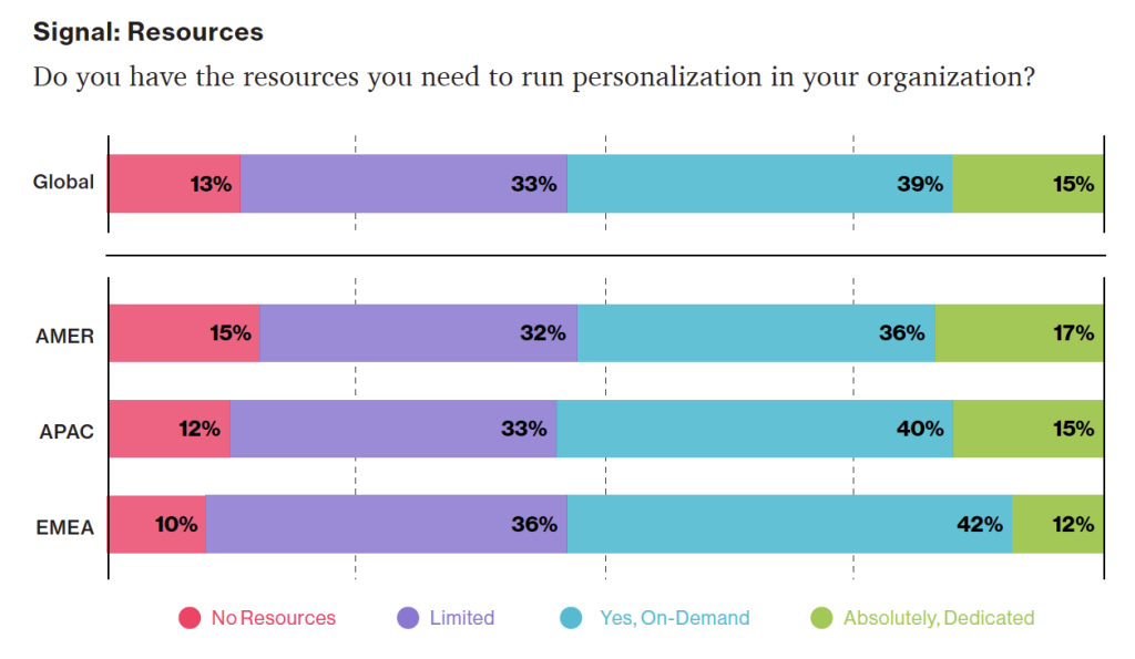
Growing tools for personalization: According to a Dynamic Yield survey, 39% of respondents felt support is available on-demand when a business case is made for it (up 15% from 2020).
Source: "The State of Personalization Maturity - Q4 2021" Dynamic Yield conducted its annual maturity survey across roles and sectors in the Americas (AMER), Europe and the Middle East (EMEA), and the Asia-Pacific (APAC) regions. This marks the fourth consecutive year publishing our research, which includes more than 450 responses from individuals in the C-Suite, Marketing, Merchandising, CX, Product, and IT.
Getting StartedFor the sake of this article, we'll assume you're already familiar with the basics of digital personalization. A good overview can be found here: Website Personalization Planning. While UX projects in this area can take on many different forms, they often stem from similar starting points.
Common scenarios for starting a personalization project:
- Your organization or client purchased a content management system (CMS) or marketing automation platform (MAP) or related technology that supports personalization
- The CMO, CDO, or CIO has identified personalization as a goal
- Customer data is disjointed or ambiguous
- You are running some isolated targeting campaigns or A/B testing
- Stakeholders disagree on personalization approach
- Mandate of customer privacy rules (e.g. GDPR) requires revisiting existing user targeting practices
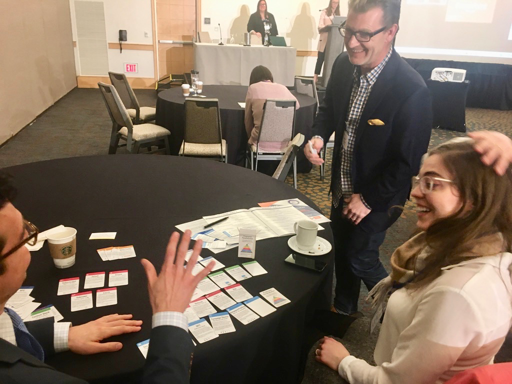 Workshopping personalization at a conference.
Regardless of where you begin, a successful personalization program will require the same core building blocks. We've captured these as the "levels" on the pyramid. Whether you are a UX designer, researcher, or strategist, understanding the core components can help make your contribution successful.
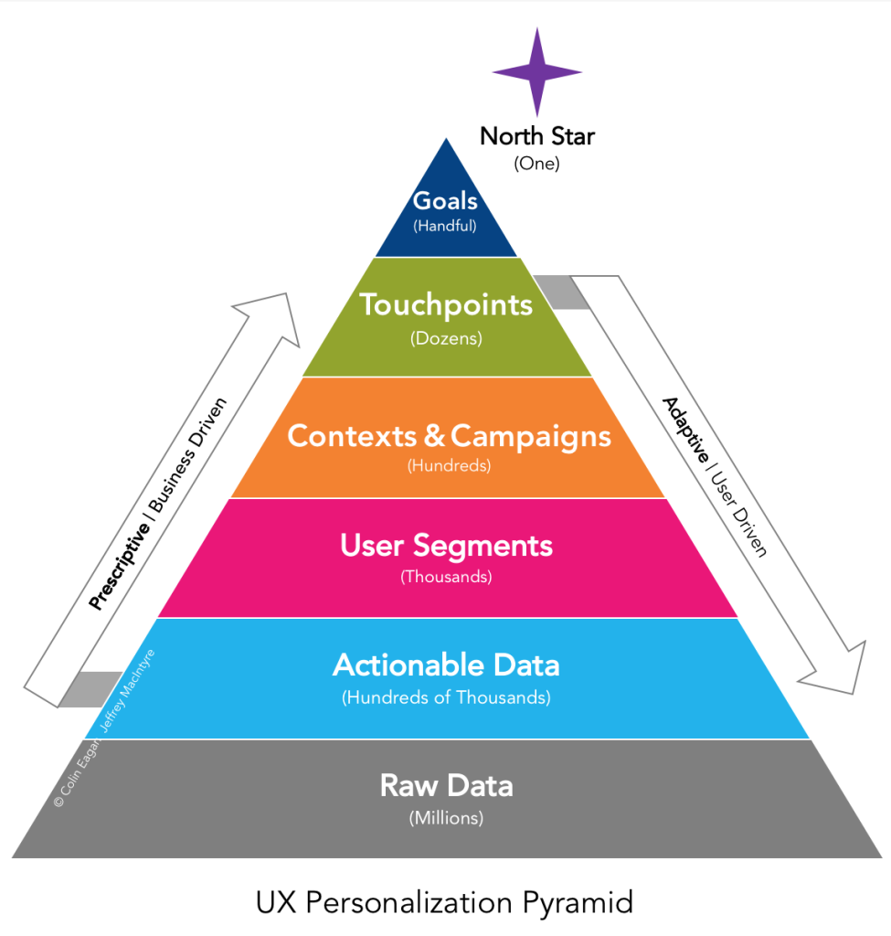 From the ground up: Soup-to-nuts personalization, without going nuts.
From top to bottom, the levels include:
- North Star: What larger strategic objective is driving the personalization program?
- Goals: What are the specific, measurable outcomes of the program?
- Touchpoints: Where will the personalized experience be served?
- Contexts and Campaigns: What personalization content will the user see?
- User Segments: What constitutes a unique, usable audience?
- Actionable Data: What reliable and authoritative data is captured by our technical platform to drive personalization?
- Raw Data: What wider set of data is conceivably available (already in our setting) allowing you to personalize?
We'll go through each of these levels in turn. To help make this actionable, we created an accompanying deck of cards to illustrate specific examples from each level. We've found them helpful in personalization brainstorming sessions, and will include examples for you here.
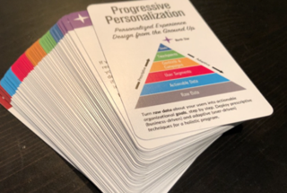 Personalization pack: Deck of cards to help kickstart your personalization brainstorming.
Starting at the Top
Personalization pack: Deck of cards to help kickstart your personalization brainstorming.
Starting at the Top
The components of the pyramid are as follows:
North StarA north star is what you are aiming for overall with your personalization program (big or small). The North Star defines the (one) overall mission of the personalization program. What do you wish to accomplish? North Stars cast a shadow. The bigger the star, the bigger the shadow. Example of North Starts might include:
- Function: Personalize based on basic user inputs. Examples: "Raw" notifications, basic search results, system user settings and configuration options, general customization, basic optimizations
- Feature: Self-contained personalization componentry. Examples: "Cooked" notifications, advanced optimizations (geolocation), basic dynamic messaging, customized modules, automations, recommenders
- Experience: Personalized user experiences across multiple interactions and user flows. Examples: Email campaigns, landing pages, advanced messaging (i.e. C2C chat) or conversational interfaces, larger user flows and content-intensive optimizations (localization).
- Product: Highly differentiating personalized product experiences. Examples: Standalone, branded experiences with personalization at their core, like the "algotorial" playlists by Spotify such as Discover Weekly.
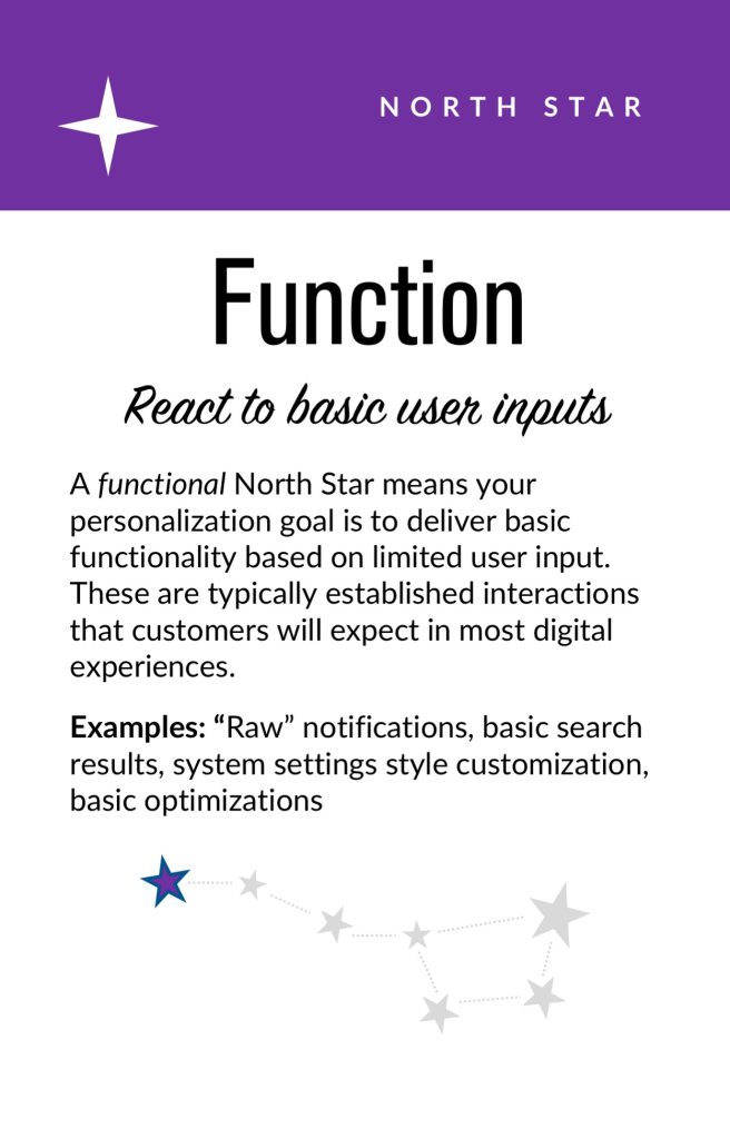
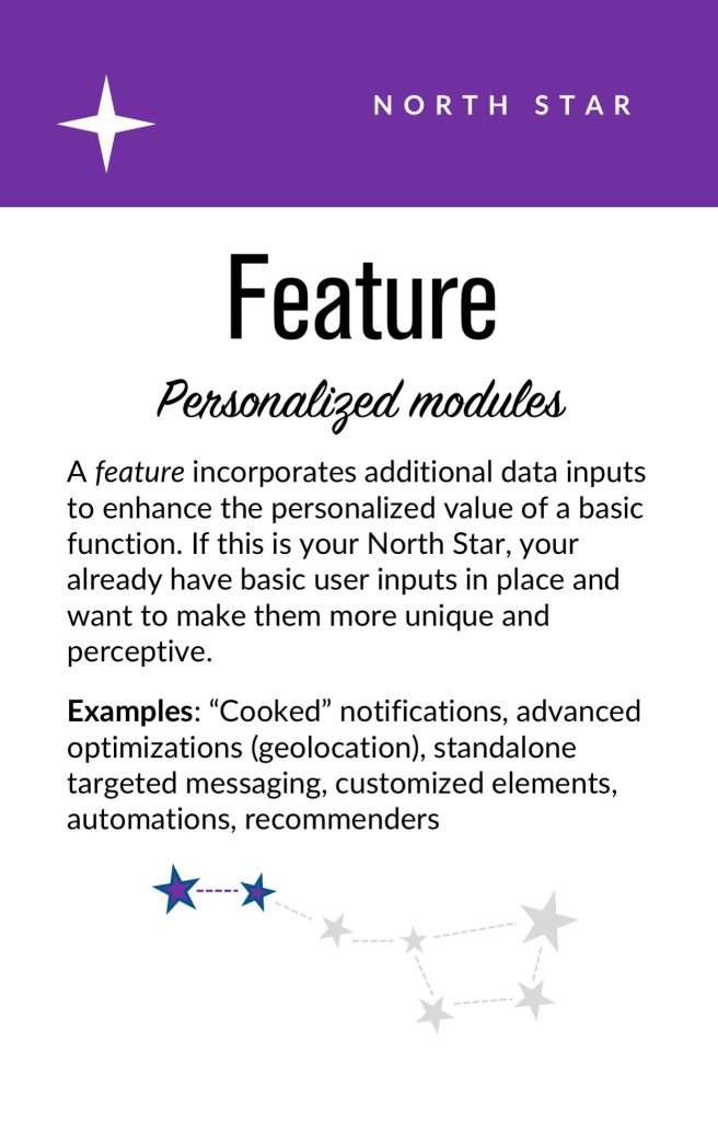
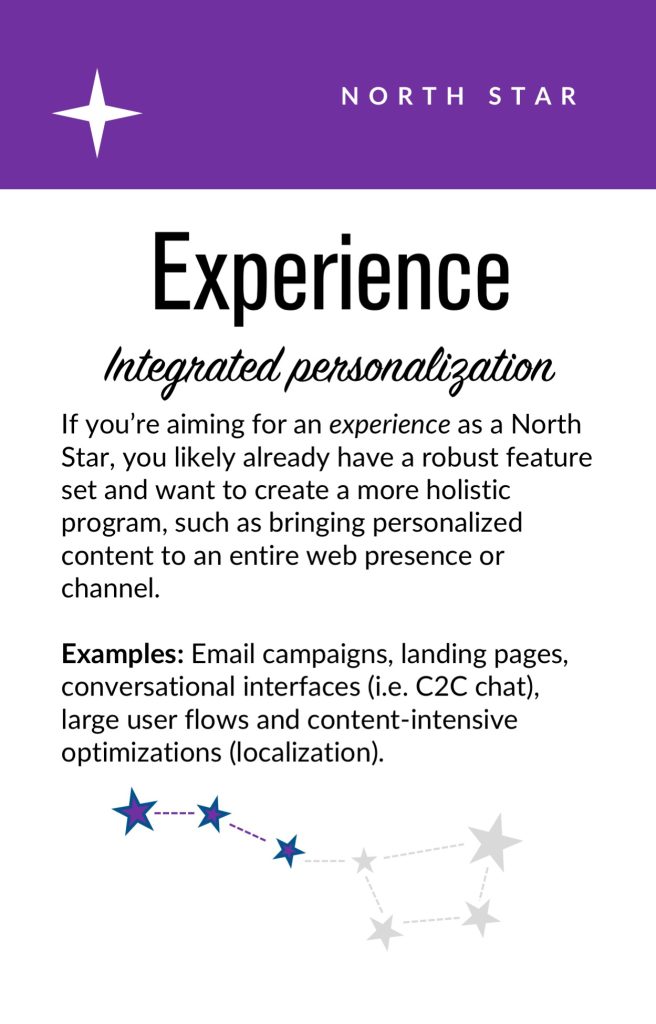 North star cards. These can help orient your team towards a common goal that personalization will help achieve; Also, these are useful for characterizing the end-state ambition of the presently stated personalization effort.
Goals
North star cards. These can help orient your team towards a common goal that personalization will help achieve; Also, these are useful for characterizing the end-state ambition of the presently stated personalization effort.
Goals
As in any good UX design, personalization can help accelerate designing with customer intentions. Goals are the tactical and measurable metrics that will prove the overall program is successful. A good place to start is with your current analytics and measurement program and metrics you can benchmark against. In some cases, new goals may be appropriate. The key thing to remember is that personalization itself is not a goal, rather it is a means to an end. Common goals include:
- Conversion
- Time on task
- Net promoter score (NPS)
- Customer satisfaction
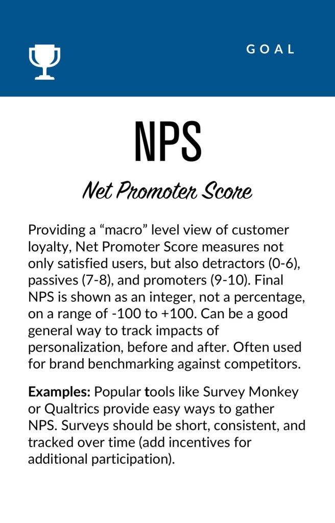
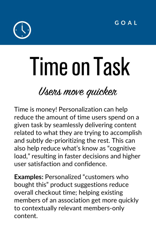
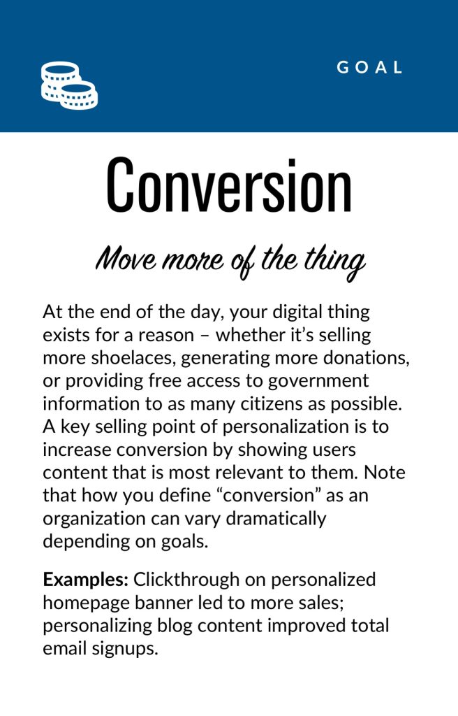 Goal cards. Examples of some common KPIs related to personalization that are concrete and measurable.
Touchpoints
Goal cards. Examples of some common KPIs related to personalization that are concrete and measurable.
Touchpoints
Touchpoints are where the personalization happens. As a UX designer, this will be one of your largest areas of responsibility. The touchpoints available to you will depend on how your personalization and associated technology capabilities are instrumented, and should be rooted in improving a user's experience at a particular point in the journey. Touchpoints can be multi-device (mobile, in-store, website) but also more granular (web banner, web pop-up etc.). Here are some examples:
Channel-level Touchpoints
- Email: Role
- Email: Time of open
- In-store display (JSON endpoint)
- Native app
- Search
Wireframe-level Touchpoints
- Web overlay
- Web alert bar
- Web banner
- Web content block
- Web menu
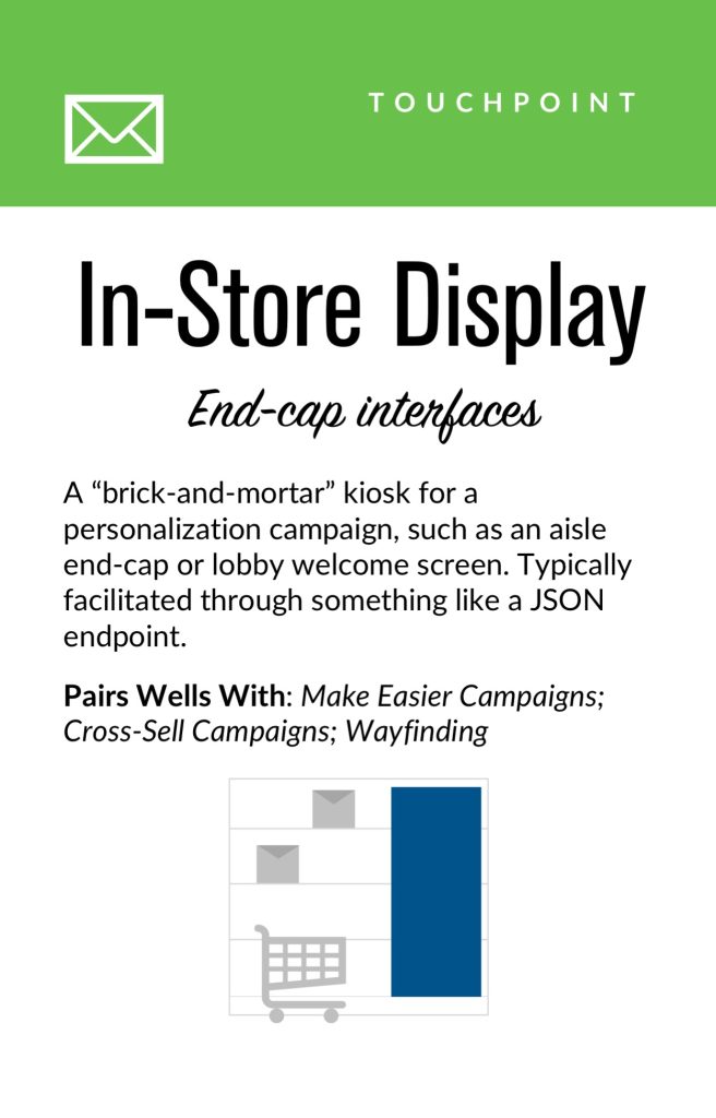
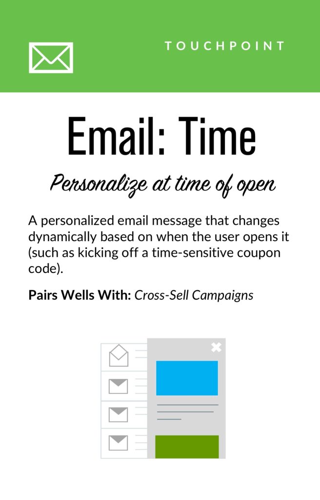
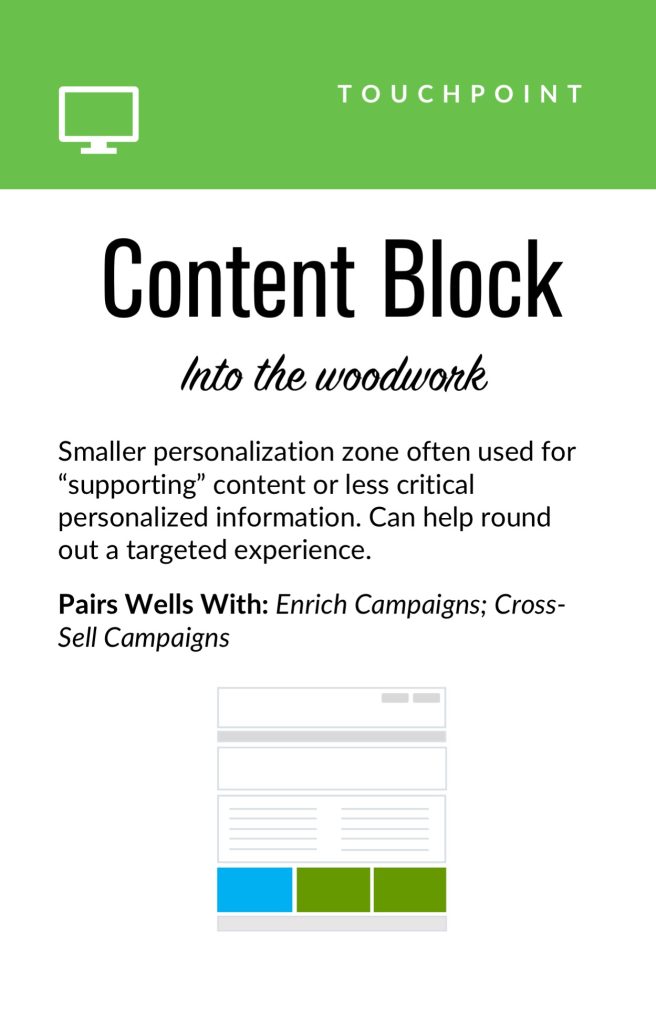 Touchpoint cards. Examples of common personalization touchpoints: these can vary from narrow (e.g., email) to broad (e.g., in-store).
If you're designing for web interfaces, for example, you will likely need to include personalized "zones" in your wireframes. The content for these can be presented programmatically in touchpoints based on our next step, contexts and campaigns.
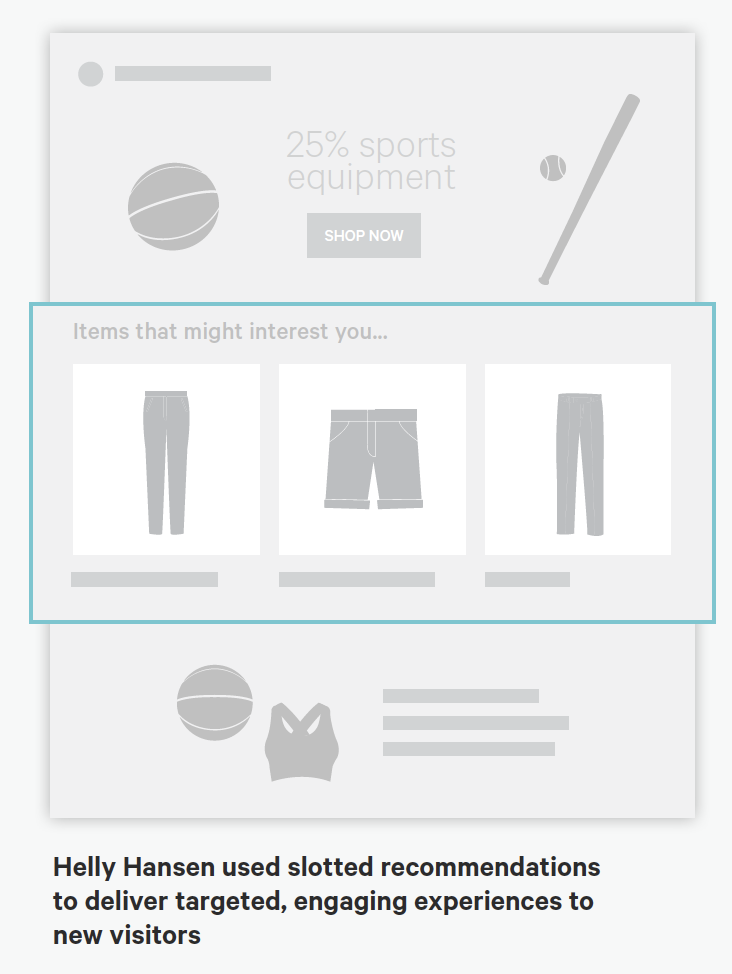
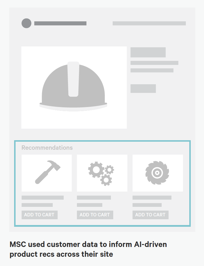 Targeted Zones: Examples from Kibo of personalized "zones" on page-level wireframes occurring at various stages of a user journey (Engagement phase at left and Purchase phase at right.)
Source: "Essential Guide to End-to-End Personaliztion" by Kibo. Contexts and Campaigns
Once you've outlined some touchpoints, you can consider the actual personalized content a user will receive. Many personalization tools will refer to these as "campaigns" (so, for example, a campaign on a web banner for new visitors to the website). These will programmatically be shown at certain touchpoints to certain user segments, as defined by user data. At this stage, we find it helpful to consider two separate models: a context model and a content model. The context helps you consider the level of engagement of the user at the personalization moment, for example a user casually browsing information vs. doing a deep-dive. Think of it in terms of information retrieval behaviors. The content model can then help you determine what type of personalization to serve based on the context (for example, an "Enrich" campaign that shows related articles may be a suitable supplement to extant content).
Personalization Context Model:
- Browse
- Skim
- Nudge
- Feast
Personalization Content Model:
- Alert
- Make Easier
- Cross-Sell
- Enrich
We've written extensively about each of these models elsewhere, so if you'd like to read more you can check out Colin's Personalization Content Model and Jeff's Personalization Context Model.
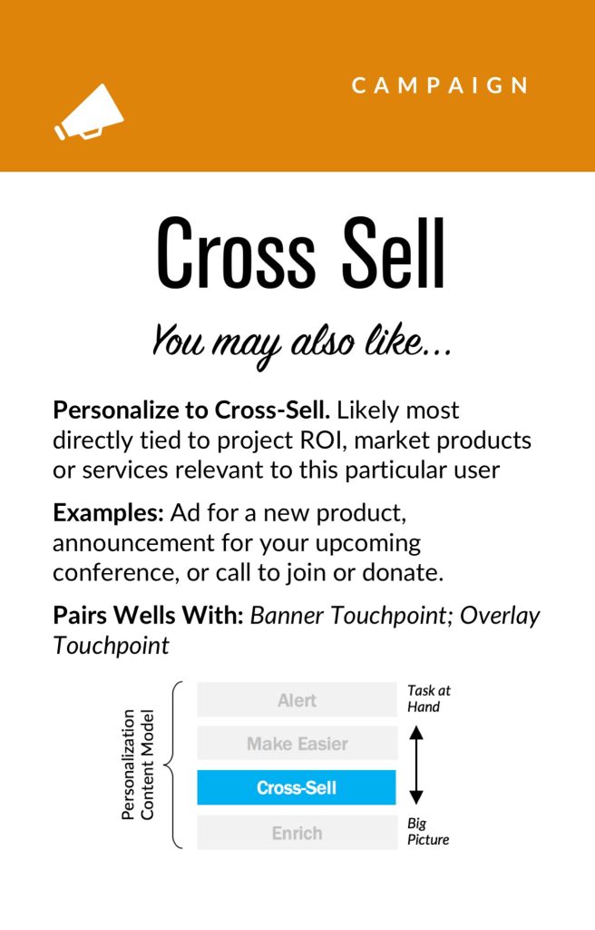
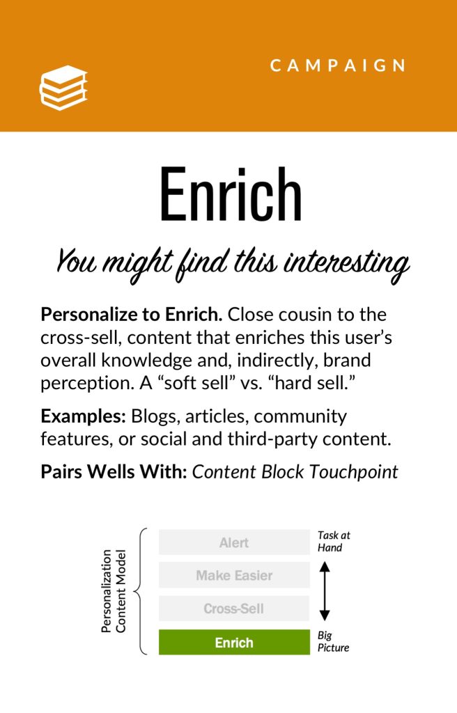
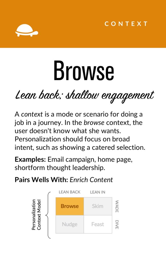 Campaign and Context cards: This level of the pyramid can help your team focus around the types of personalization to deliver end users and the use-cases in which they will experience it.
User Segments
Campaign and Context cards: This level of the pyramid can help your team focus around the types of personalization to deliver end users and the use-cases in which they will experience it.
User Segments
User segments can be created prescriptively or adaptively, based on user research (e.g. via rules and logic tied to set user behaviors or via A/B testing). At a minimum you will likely need to consider how to treat the unknown or first-time visitor, the guest or returning visitor for whom you may have a stateful cookie (or equivalent post-cookie identifier), or the authenticated visitor who is logged in. Here are some examples from the personalization pyramid:
- Unknown
- Guest
- Authenticated
- Default
- Referred
- Role
- Cohort
- Unique ID
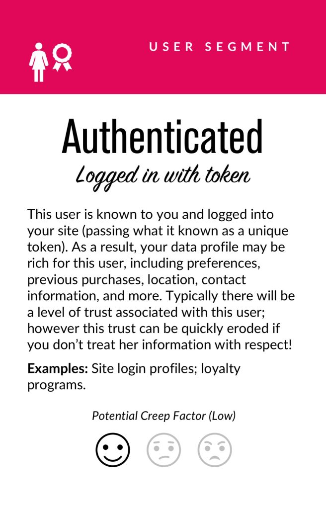
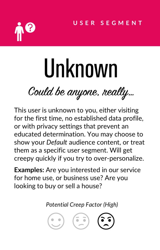
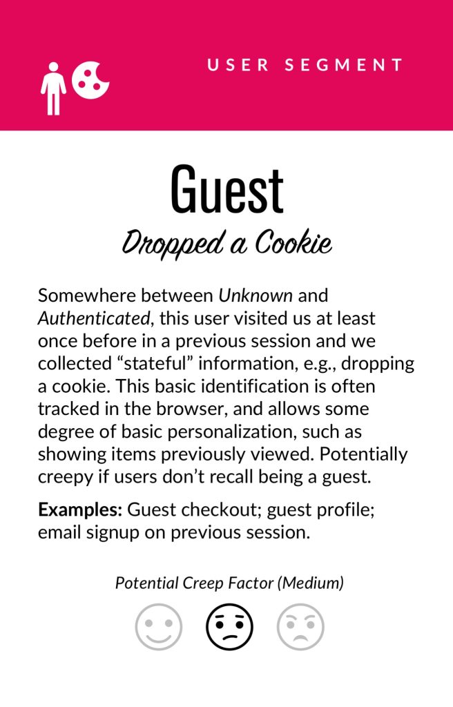 Segment cards. Examples of common personalization segments: at a minimum, you will need to consider the anonymous, guest, and logged in user types. Segmentation can get dramatically more complex from there.
Actionable Data
Segment cards. Examples of common personalization segments: at a minimum, you will need to consider the anonymous, guest, and logged in user types. Segmentation can get dramatically more complex from there.
Actionable Data
Every organization with any digital presence has data. It's a matter of asking what data you can ethically collect on users, its inherent reliability and value, as to how can you use it (sometimes known as "data activation.") Fortunately, the tide is turning to first-party data: a recent study by Twilio estimates some 80% of businesses are using at least some type of first-party data to personalize the customer experience.
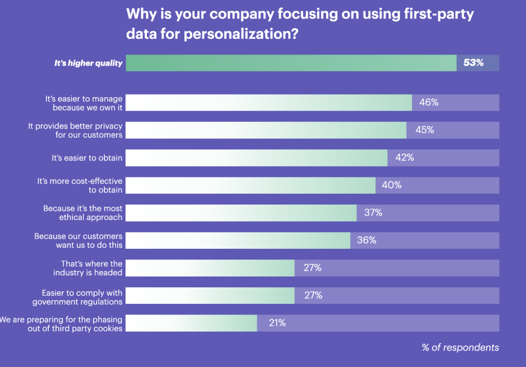 Source: "The State of Personalization 2021" by Twilio. Survey respondents were n=2,700 adult consumers who have purchased something online in the past 6 months, and n=300 adult manager+ decision-makers at consumer-facing companies that provide goods and/or services online. Respondents were from the United States, United Kingdom, Australia, and New Zealand.Data was collected from April 8 to April 20, 2021.
First-party data represents multiple advantages on the UX front, including being relatively simple to collect, more likely to be accurate, and less susceptible to the "creep factor" of third-party data. So a key part of your UX strategy should be to determine what the best form of data collection is on your audiences. Here are some examples:
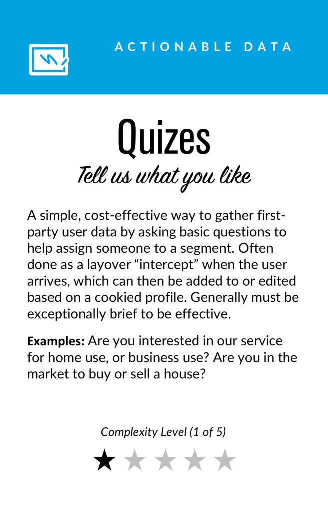
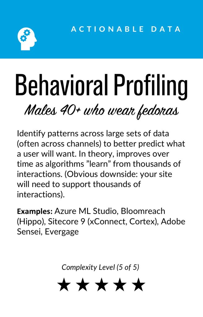
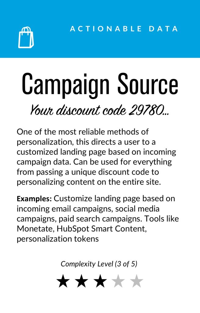
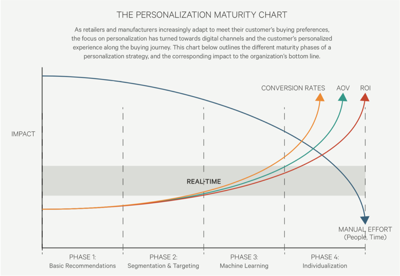 Figure 1.1.2: Example of a personalization maturity curve, showing progression from basic recommendations functionality to true individualization. Credit: https://kibocommerce.com/blog/kibos-personalization-maturity-chart/
There is a progression of profiling when it comes to recognizing and making decisioning about different audiences and their signals. It tends to move towards more granular constructs about smaller and smaller cohorts of users as time and confidence and data volume grow.
While some combination of implicit / explicit data is generally a prerequisite for any implementation (more commonly referred to as first party and third-party data) ML efforts are typically not cost-effective directly out of the box. This is because a strong data backbone and content repository is a prerequisite for optimization. But these approaches should be considered as part of the larger roadmap and may indeed help accelerate the organization's overall progress. Typically at this point you will partner with key stakeholders and product owners to design a profiling model. The profiling model includes defining approach to configuring profiles, profile keys, profile cards and pattern cards. A multi-faceted approach to profiling which makes it scalable.
Pulling it TogetherWhile the cards comprise the starting point to an inventory of sorts (we provide blanks for you to tailor your own), a set of potential levers and motivations for the style of personalization activities you aspire to deliver, they are more valuable when thought of in a grouping.
In assembling a card "hand", one can begin to trace the entire trajectory from leadership focus down through a strategic and tactical execution. It is also at the heart of the way both co-authors have conducted workshops in assembling a program backlog—which is a fine subject for another article.
In the meantime, what is important to note is that each colored class of card is helpful to survey in understanding the range of choices potentially at your disposal, it is threading through and making concrete decisions about for whom this decisioning will be made: where, when, and how.
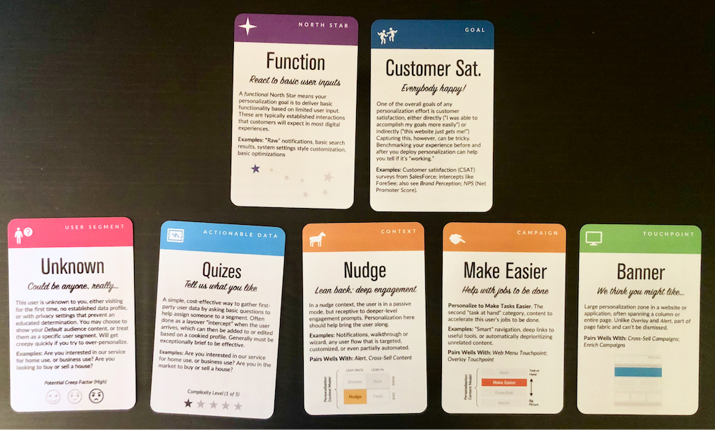 Scenario A: We want to use personalization to improve customer satisfaction on the website. For unknown users, we will create a short quiz to better identify what the user has come to do. This is sometimes referred to as "badging" a user in onboarding contexts, to better characterize their present intent and context.
Lay Down Your Cards
Scenario A: We want to use personalization to improve customer satisfaction on the website. For unknown users, we will create a short quiz to better identify what the user has come to do. This is sometimes referred to as "badging" a user in onboarding contexts, to better characterize their present intent and context.
Lay Down Your Cards
Any sustainable personalization strategy must consider near, mid and long-term goals. Even with the leading CMS platforms like Sitecore and Adobe or the most exciting composable CMS DXP out there, there is simply no "easy button" wherein a personalization program can be stood up and immediately view meaningful results. That said, there is a common grammar to all personalization activities, just like every sentence has nouns and verbs. These cards attempt to map that territory.
Mobile-First CSS: Is It Time for a Rethink? [ 09-Jun-22 3:13am ]The mobile-first design methodology is great—it focuses on what really matters to the user, it's well-practiced, and it's been a common design pattern for years. So developing your CSS mobile-first should also be great, too…right?
Well, not necessarily. Classic mobile-first CSS development is based on the principle of overwriting style declarations: you begin your CSS with default style declarations, and overwrite and/or add new styles as you add breakpoints with min-width media queries for larger viewports (for a good overview see "What is Mobile First CSS and Why Does It Rock?"). But all those exceptions create complexity and inefficiency, which in turn can lead to an increased testing effort and a code base that's harder to maintain. Admit it—how many of us willingly want that?
On your own projects, mobile-first CSS may yet be the best tool for the job, but first you need to evaluate just how appropriate it is in light of the visual design and user interactions you're working on. To help you get started, here's how I go about tackling the factors you need to watch for, and I'll discuss some alternate solutions if mobile-first doesn't seem to suit your project.
Advantages of mobile-firstSome of the things to like with mobile-first CSS development—and why it's been the de facto development methodology for so long—make a lot of sense:
Development hierarchy. One thing you undoubtedly get from mobile-first is a nice development hierarchy—you just focus on the mobile view and get developing.
Tried and tested. It's a tried and tested methodology that's worked for years for a reason: it solves a problem really well.
Prioritizes the mobile view. The mobile view is the simplest and arguably the most important, as it encompasses all the key user journeys, and often accounts for a higher proportion of user visits (depending on the project).
Prevents desktop-centric development. As development is done using desktop computers, it can be tempting to initially focus on the desktop view. But thinking about mobile from the start prevents us from getting stuck later on; no one wants to spend their time retrofitting a desktop-centric site to work on mobile devices!
Disadvantages of mobile-firstSetting style declarations and then overwriting them at higher breakpoints can lead to undesirable ramifications:
More complexity. The farther up the breakpoint hierarchy you go, the more unnecessary code you inherit from lower breakpoints.
Higher CSS specificity. Styles that have been reverted to their browser default value in a class name declaration now have a higher specificity. This can be a headache on large projects when you want to keep the CSS selectors as simple as possible.
Requires more regression testing. Changes to the CSS at a lower view (like adding a new style) requires all higher breakpoints to be regression tested.
The browser can't prioritize CSS downloads. At wider breakpoints, classic mobile-first min-width media queries don't leverage the browser's capability to download CSS files in priority order.
The problem of property value overridesThere is nothing inherently wrong with overwriting values; CSS was designed to do just that. Still, inheriting incorrect values is unhelpful and can be burdensome and inefficient. It can also lead to increased style specificity when you have to overwrite styles to reset them back to their defaults, something that may cause issues later on, especially if you are using a combination of bespoke CSS and utility classes. We won't be able to use a utility class for a style that has been reset with a higher specificity.
With this in mind, I'm developing CSS with a focus on the default values much more these days. Since there's no specific order, and no chains of specific values to keep track of, this frees me to develop breakpoints simultaneously. I concentrate on finding common styles and isolating the specific exceptions in closed media query ranges (that is, any range with a max-width set).
This approach opens up some opportunities, as you can look at each breakpoint as a clean slate. If a component's layout looks like it should be based on Flexbox at all breakpoints, it's fine and can be coded in the default style sheet. But if it looks like Grid would be much better for large screens and Flexbox for mobile, these can both be done entirely independently when the CSS is put into closed media query ranges. Also, developing simultaneously requires you to have a good understanding of any given component in all breakpoints up front. This can help surface issues in the design earlier in the development process. We don't want to get stuck down a rabbit hole building a complex component for mobile, and then get the designs for desktop and find they are equally complex and incompatible with the HTML we created for the mobile view!
Though this approach isn't going to suit everyone, I encourage you to give it a try. There are plenty of tools out there to help with concurrent development, such as Responsively App, Blisk, and many others.
Having said that, I don't feel the order itself is particularly relevant. If you are comfortable with focusing on the mobile view, have a good understanding of the requirements for other breakpoints, and prefer to work on one device at a time, then by all means stick with the classic development order. The important thing is to identify common styles and exceptions so you can put them in the relevant stylesheet—a sort of manual tree-shaking process! Personally, I find this a little easier when working on a component across breakpoints, but that's by no means a requirement.
Closed media query ranges in practiceIn classic mobile-first CSS we overwrite the styles, but we can avoid this by using media query ranges. To illustrate the difference (I'm using SCSS for brevity), let's assume there are three visual designs:
- smaller than 768
- from 768 to below 1024
- 1024 and anything larger
Take a simple example where a block-level element has a default padding of "20px," which is overwritten at tablet to be "40px" and set back to "20px" on desktop.
Classic min-width mobile-first
.my-block {
  padding: 20px;
  @media (min-width: 768px) {
    padding: 40px;
  }
  @media (min-width: 1024px) {
    padding: 20px;
  }
}
Closed media query range
.my-block {
  padding: 20px;
  @media (min-width: 768px) and (max-width: 1023.98px) {
    padding: 40px;
  }
}


The subtle difference is that the mobile-first example sets the default padding to "20px" and then overwrites it at each breakpoint, setting it three times in total. In contrast, the second example sets the default padding to "20px" and only overrides it at the relevant breakpoint where it isn't the default value (in this instance, tablet is the exception).


The goal is to:
- Only set styles when needed.
- Not set them with the expectation of overwriting them later on, again and again.
To this end, closed media query ranges are our best friend. If we need to make a change to any given view, we make it in the CSS media query range that applies to the specific breakpoint. We'll be much less likely to introduce unwanted alterations, and our regression testing only needs to focus on the breakpoint we have actually edited.
Taking the above example, if we find that .my-block spacing on desktop is already accounted for by the margin at that breakpoint, and since we want to remove the padding altogether, we could do this by setting the mobile padding in a closed media query range.
.my-block {
  @media (max-width: 767.98px) {
    padding: 20px;
  }
  @media (min-width: 768px) and (max-width: 1023.98px) {
    padding: 40px;
  }
}
The browser default padding for our block is "0," so instead of adding a desktop media query and using unset or "0" for the padding value (which we would need with mobile-first), we can wrap the mobile padding in a closed media query (since it is now also an exception) so it won't get picked up at wider breakpoints. At the desktop breakpoint, we won't need to set any padding style, as we want the browser default value.
Bundling versus separating the CSSBack in the day, keeping the number of requests to a minimum was very important due to the browser's limit of concurrent requests (typically around six). As a consequence, the use of image sprites and CSS bundling was the norm, with all the CSS being downloaded in one go, as one stylesheet with highest priority.
With HTTP/2 and HTTP/3 now on the scene, the number of requests is no longer the big deal it used to be. This allows us to separate the CSS into multiple files by media query. The clear benefit of this is the browser can now request the CSS it currently needs with a higher priority than the CSS it doesn't. This is more performant and can reduce the overall time page rendering is blocked.
Which HTTP version are you using?To determine which version of HTTP you're using, go to your website and open your browser's dev tools. Next, select the Network tab and make sure the Protocol column is visible. If "h2" is listed under Protocol, it means HTTP/2 is being used.
Note: to view the Protocol in your browser's dev tools, go to the Network tab, reload your page, right-click any column header (e.g., Name), and check the Protocol column.
 Note: for a summarized comparison, see ImageKit's "HTTP/2 vs. HTTP/1."
Also, if your site is still using HTTP/1...WHY?!! What are you waiting for? There is excellent user support for HTTP/2.
Splitting the CSSSeparating the CSS into individual files is a worthwhile task. Linking the separate CSS files using the relevant media attribute allows the browser to identify which files are needed immediately (because they're render-blocking) and which can be deferred. Based on this, it allocates each file an appropriate priority.
In the following example of a website visited on a mobile breakpoint, we can see the mobile and default CSS are loaded with "Highest" priority, as they are currently needed to render the page. The remaining CSS files (print, tablet, and desktop) are still downloaded in case they'll be needed later, but with "Lowest" priority.
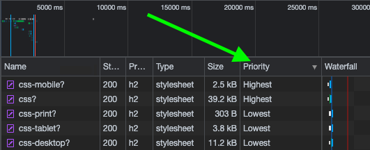
With bundled CSS, the browser will have to download the CSS file and parse it before rendering can start.
While, as noted, with the CSS separated into different files linked and marked up with the relevant media attribute, the browser can prioritize the files it currently needs. Using closed media query ranges allows the browser to do this at all widths, as opposed to classic mobile-first min-width queries, where the desktop browser would have to download all the CSS with Highest priority. We can't assume that desktop users always have a fast connection. For instance, in many rural areas, internet connection speeds are still slow.
The media queries and number of separate CSS files will vary from project to project based on project requirements, but might look similar to the example below.
Bundled CSS
<link href="site.css" rel="stylesheet">This single file contains all the CSS, including all media queries, and it will be downloaded with Highest priority.
Separated CSS
<link href="default.css" rel="stylesheet"><link href="mobile.css" media="screen and (max-width: 767.98px)" rel="stylesheet"><link href="tablet.css" media="screen and (min-width: 768px) and (max-width: 1083.98px)" rel="stylesheet"><link href="desktop.css" media="screen and (min-width: 1084px)" rel="stylesheet"><link href="print.css" media="print" rel="stylesheet">Separating the CSS and specifying a media attribute value on each link tag allows the browser to prioritize what it currently needs. Out of the five files listed above, two will be downloaded with Highest priority: the default file, and the file that matches the current media query. The others will be downloaded with Lowest priority.
Depending on the project's deployment strategy, a change to one file (mobile.css, for example) would only require the QA team to regression test on devices in that specific media query range. Compare that to the prospect of deploying the single bundled site.css file, an approach that would normally trigger a full regression test.
Moving onThe uptake of mobile-first CSS was a really important milestone in web development; it has helped front-end developers focus on mobile web applications, rather than developing sites on desktop and then attempting to retrofit them to work on other devices.
I don't think anyone wants to return to that development model again, but it's important we don't lose sight of the issue it highlighted: that things can easily get convoluted and less efficient if we prioritize one particular device—any device—over others. For this reason, focusing on the CSS in its own right, always mindful of what is the default setting and what's an exception, seems like the natural next step. I've started noticing small simplifications in my own CSS, as well as other developers', and that testing and maintenance work is also a bit more simplified and productive.
In general, simplifying CSS rule creation whenever we can is ultimately a cleaner approach than going around in circles of overrides. But whichever methodology you choose, it needs to suit the project. Mobile-first may—or may not—turn out to be the best choice for what's involved, but first you need to solidly understand the trade-offs you're stepping into.
Designers, (Re)define Success First [ 12-May-22 3:00pm ]About two and a half years ago, I introduced the idea of daily ethical design. It was born out of my frustration with the many obstacles to achieving design that's usable and equitable; protects people's privacy, agency, and focus; benefits society; and restores nature. I argued that we need to overcome the inconveniences that prevent us from acting ethically and that we need to elevate design ethics to a more practical level by structurally integrating it into our daily work, processes, and tools.
Unfortunately, we're still very far from this ideal.
At the time, I didn't know yet how to structurally integrate ethics. Yes, I had found some tools that had worked for me in previous projects, such as using checklists, assumption tracking, and "dark reality" sessions, but I didn't manage to apply those in every project. I was still struggling for time and support, and at best I had only partially achieved a higher (moral) quality of design—which is far from my definition of structurally integrated.
I decided to dig deeper for the root causes in business that prevent us from practicing daily ethical design. Now, after much research and experimentation, I believe that I've found the key that will let us structurally integrate ethics. And it's surprisingly simple! But first we need to zoom out to get a better understanding of what we're up against.
Influence the systemSadly, we're trapped in a capitalistic system that reinforces consumerism and inequality, and it's obsessed with the fantasy of endless growth. Sea levels, temperatures, and our demand for energy continue to rise unchallenged, while the gap between rich and poor continues to widen. Shareholders expect ever-higher returns on their investments, and companies feel forced to set short-term objectives that reflect this. Over the last decades, those objectives have twisted our well-intended human-centered mindset into a powerful machine that promotes ever-higher levels of consumption. When we're working for an organization that pursues "double-digit growth" or "aggressive sales targets" (which is 99 percent of us), that's very hard to resist while remaining human friendly. Even with our best intentions, and even though we like to say that we create solutions for people, we're a part of the problem.
What can we do to change this?
We can start by acting on the right level of the system. Donella H. Meadows, a system thinker, once listed ways to influence a system in order of effectiveness. When you apply these to design, you get:
- At the lowest level of effectiveness, you can affect numbers such as usability scores or the number of design critiques. But none of that will change the direction of a company.
- Similarly, affecting buffers (such as team budgets), stocks (such as the number of designers), flows (such as the number of new hires), and delays (such as the time that it takes to hear about the effect of design) won't significantly affect a company.
- Focusing instead on feedback loops such as management control, employee recognition, or design-system investments can help a company become better at achieving its objectives. But that doesn't change the objectives themselves, which means that the organization will still work against your ethical-design ideals.
- The next level, information flows, is what most ethical-design initiatives focus on now: the exchange of ethical methods, toolkits, articles, conferences, workshops, and so on. This is also where ethical design has remained mostly theoretical. We've been focusing on the wrong level of the system all this time.
- Take rules, for example—they beat knowledge every time. There can be widely accepted rules, such as how finance works, or a scrum team's definition of done. But ethical design can also be smothered by unofficial rules meant to maintain profits, often revealed through comments such as "the client didn't ask for it" or "don't make it too big."
- Changing the rules without holding official power is very hard. That's why the next level is so influential: self-organization. Experimentation, bottom-up initiatives, passion projects, self-steering teams—all of these are examples of self-organization that improve the resilience and creativity of a company. It's exactly this diversity of viewpoints that's needed to structurally tackle big systemic issues like consumerism, wealth inequality, and climate change.
- Yet even stronger than self-organization are objectives and metrics. Our companies want to make more money, which means that everything and everyone in the company does their best to… make the company more money. And once I realized that profit is nothing more than a measurement, I understood how crucial a very specific, defined metric can be toward pushing a company in a certain direction.
The takeaway? If we truly want to incorporate ethics into our daily design practice, we must first change the measurable objectives of the company we work for, from the bottom up.
Redefine successTraditionally, we consider a product or service successful if it's desirable to humans, technologically feasible, and financially viable. You tend to see these represented as equals; if you type the three words in a search engine, you'll find diagrams of three equally sized, evenly arranged circles.
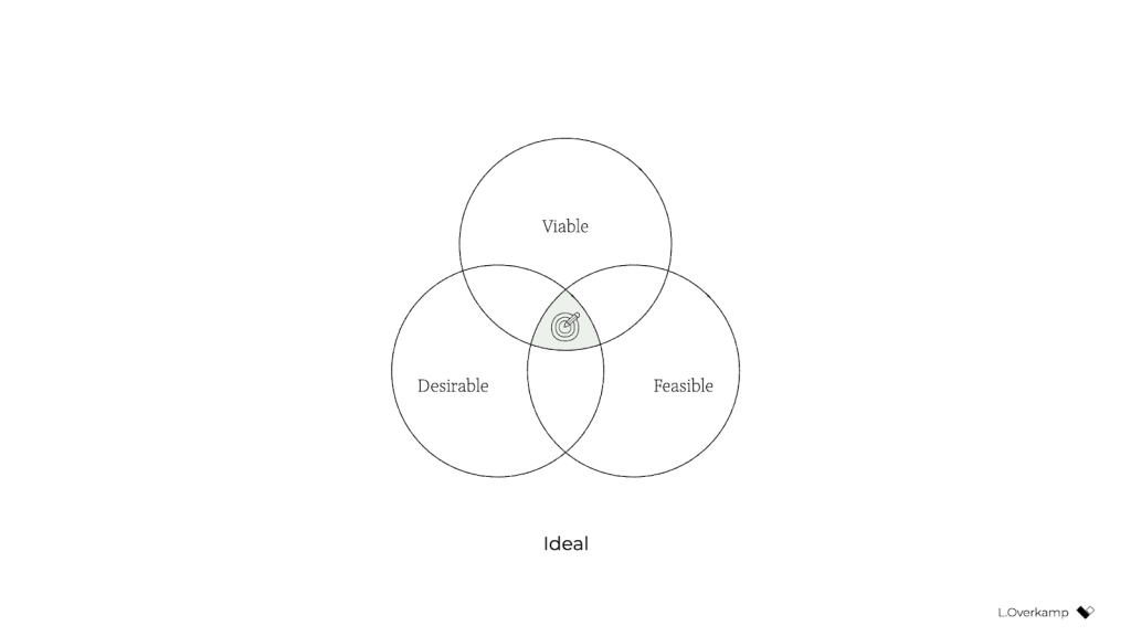
But in our hearts, we all know that the three dimensions aren't equally weighted: it's viability that ultimately controls whether a product will go live. So a more realistic representation might look like this:
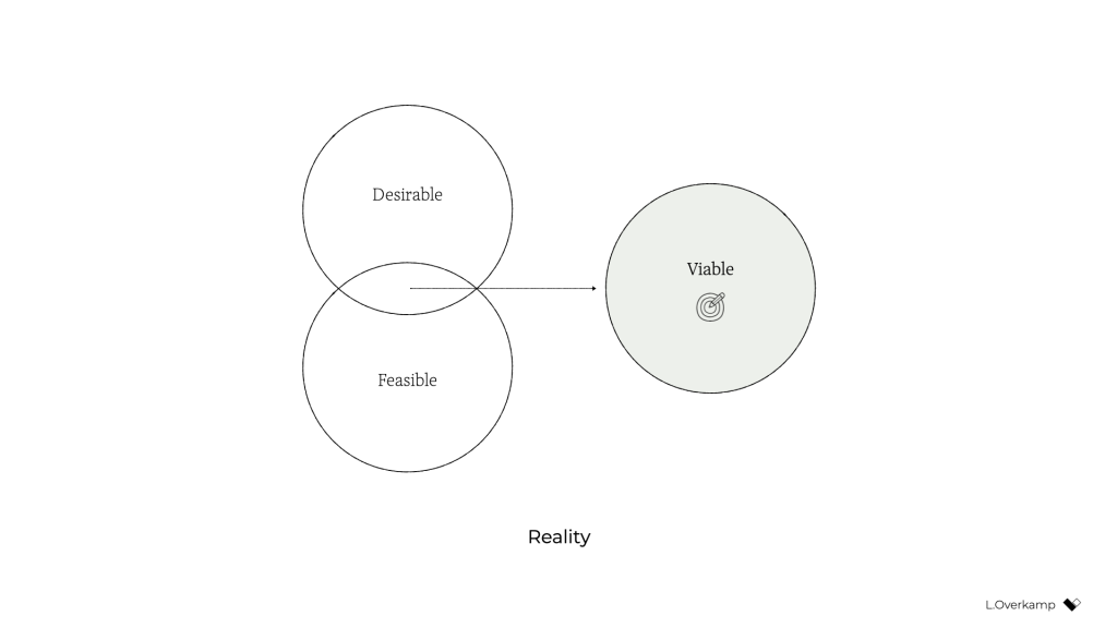
Desirability and feasibility are the means; viability is the goal. Companies—outside of nonprofits and charities—exist to make money.
A genuinely purpose-driven company would try to reverse this dynamic: it would recognize finance for what it was intended for: a means. So both feasibility and viability are means to achieve what the company set out to achieve. It makes intuitive sense: to achieve most anything, you need resources, people, and money. (Fun fact: the Italian language knows no difference between feasibility and viability; both are simply fattibilità.)
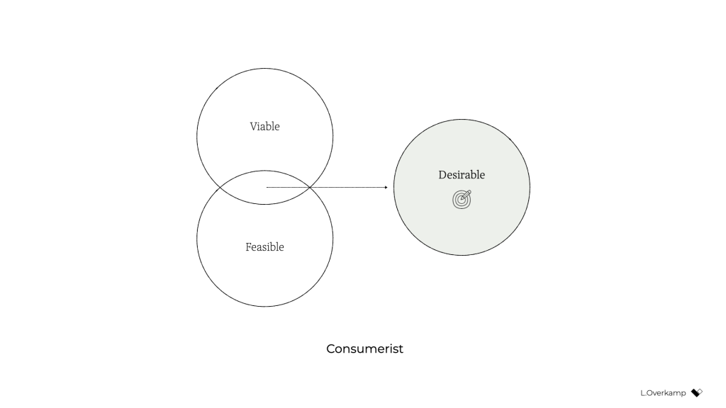
But simply swapping viable for desirable isn't enough to achieve an ethical outcome. Desirability is still linked to consumerism because the associated activities aim to identify what people want—whether it's good for them or not. Desirability objectives, such as user satisfaction or conversion, don't consider whether a product is healthy for people. They don't prevent us from creating products that distract or manipulate people or stop us from contributing to society's wealth inequality. They're unsuitable for establishing a healthy balance with nature.
There's a fourth dimension of success that's missing: our designs also need to be ethical in the effect that they have on the world.
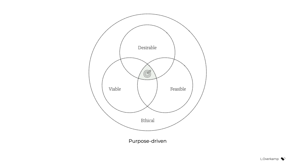
This is hardly a new idea. Many similar models exist, some calling the fourth dimension accountability, integrity, or responsibility. What I've never seen before, however, is the necessary step that comes after: to influence the system as designers and to make ethical design more practical, we must create objectives for ethical design that are achievable and inspirational. There's no one way to do this because it highly depends on your culture, values, and industry. But I'll give you the version that I developed with a group of colleagues at a design agency. Consider it a template to get started.
Pursue well-being, equity, and sustainabilityWe created objectives that address design's effect on three levels: individual, societal, and global.
An objective on the individual level tells us what success is beyond the typical focus of usability and satisfaction—instead considering matters such as how much time and attention is required from users. We pursued well-being:
We create products and services that allow for people's health and happiness. Our solutions are calm, transparent, nonaddictive, and nonmisleading. We respect our users' time, attention, and privacy, and help them make healthy and respectful choices.
An objective on the societal level forces us to consider our impact beyond just the user, widening our attention to the economy, communities, and other indirect stakeholders. We called this objective equity:
We create products and services that have a positive social impact. We consider economic equality, racial justice, and the inclusivity and diversity of people as teams, users, and customer segments. We listen to local culture, communities, and those we affect.
Finally, the objective on the global level aims to ensure that we remain in balance with the only home we have as humanity. Referring to it simply as sustainability, our definition was:
We create products and services that reward sufficiency and reusability. Our solutions support the circular economy: we create value from waste, repurpose products, and prioritize sustainable choices. We deliver functionality instead of ownership, and we limit energy use.
In short, ethical design (to us) meant achieving wellbeing for each user and an equitable value distribution within society through a design that can be sustained by our living planet. When we introduced these objectives in the company, for many colleagues, design ethics and responsible design suddenly became tangible and achievable through practical—and even familiar—actions.
Measure impactBut defining these objectives still isn't enough. What truly caught the attention of senior management was the fact that we created a way to measure every design project's well-being, equity, and sustainability.
This overview lists example metrics that you can use as you pursue well-being, equity, and sustainability:
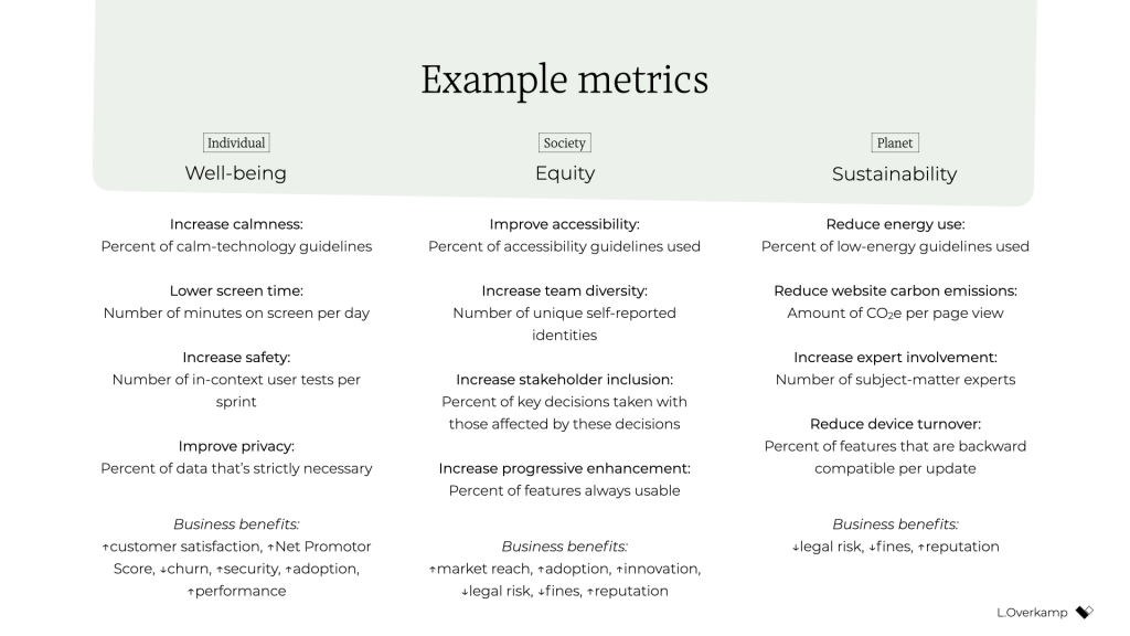
There's a lot of power in measurement. As the saying goes, what gets measured gets done. Donella Meadows once shared this example:
"If the desired system state is national security, and that is defined as the amount of money spent on the military, the system will produce military spending. It may or may not produce national security."
This phenomenon explains why desirability is a poor indicator of success: it's typically defined as the increase in customer satisfaction, session length, frequency of use, conversion rate, churn rate, download rate, and so on. But none of these metrics increase the health of people, communities, or ecosystems. What if instead we measured success through metrics for (digital) well-being, such as (reduced) screen time or software energy consumption?
There's another important message here. Even if we set an objective to build a calm interface, if we were to choose the wrong metric for calmness—say, the number of interface elements—we could still end up with a screen that induces anxiety. Choosing the wrong metric can completely undo good intentions.
Additionally, choosing the right metric is enormously helpful in focusing the design team. Once you go through the exercise of choosing metrics for our objectives, you're forced to consider what success looks like concretely and how you can prove that you've reached your ethical objectives. It also forces you to consider what we as designers have control over: what can I include in my design or change in my process that will lead to the right type of success? The answer to this question brings a lot of clarity and focus.
And finally, it's good to remember that traditional businesses run on measurements, and managers love to spend much time discussing charts (ideally hockey-stick shaped)—especially if they concern profit, the one-above-all of metrics. For good or ill, to improve the system, to have a serious discussion about ethical design with managers, we'll need to speak that business language.
Practice daily ethical designOnce you've defined your objectives and you have a reasonable idea of the potential metrics for your design project, only then do you have a chance to structurally practice ethical design. It "simply" becomes a matter of using your creativity and choosing from all the knowledge and toolkits already available to you.
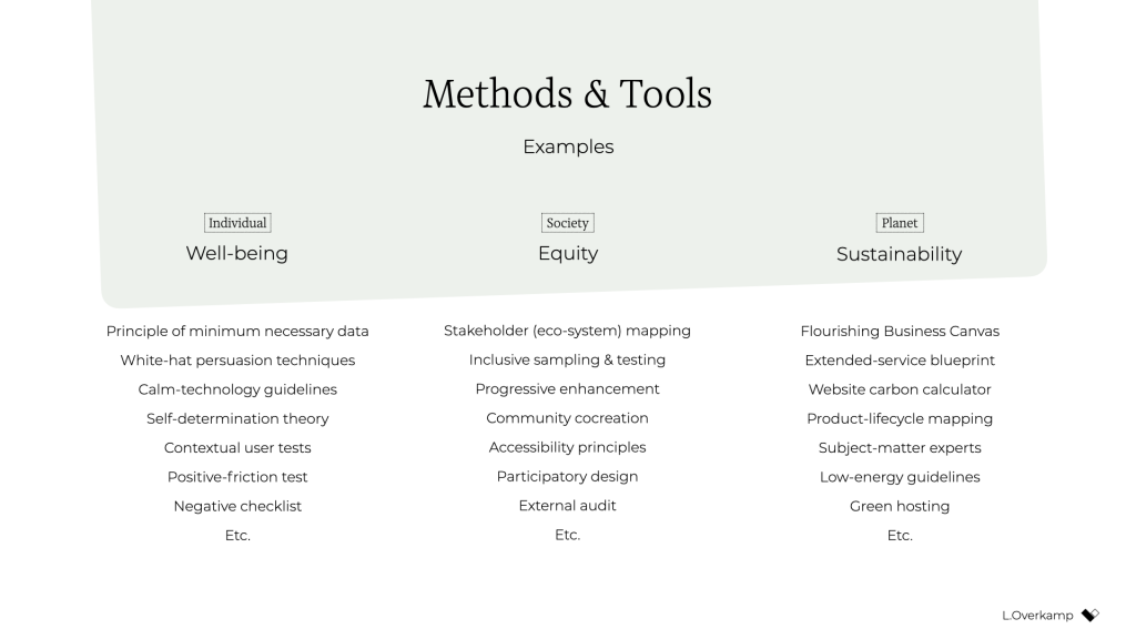
I think this is quite exciting! It opens a whole new set of challenges and considerations for the design process. Should you go with that energy-consuming video or would a simple illustration be enough? Which typeface is the most calm and inclusive? Which new tools and methods do you use? When is the website's end of life? How can you provide the same service while requiring less attention from users? How do you make sure that those who are affected by decisions are there when those decisions are made? How can you measure our effects?
The redefinition of success will completely change what it means to do good design.
There is, however, a final piece of the puzzle that's missing: convincing your client, product owner, or manager to be mindful of well-being, equity, and sustainability. For this, it's essential to engage stakeholders in a dedicated kickoff session.
Kick it off or fall back to status quoThe kickoff is the most important meeting that can be so easy to forget to include. It consists of two major phases: 1) the alignment of expectations, and 2) the definition of success.
In the first phase, the entire (design) team goes over the project brief and meets with all the relevant stakeholders. Everyone gets to know one another and express their expectations on the outcome and their contributions to achieving it. Assumptions are raised and discussed. The aim is to get on the same level of understanding and to in turn avoid preventable miscommunications and surprises later in the project.
For example, for a recent freelance project that aimed to design a digital platform that facilitates US student advisors' documentation and communication, we conducted an online kickoff with the client, a subject-matter expert, and two other designers. We used a combination of canvases on Miro: one with questions from "Manual of Me" (to get to know each other), a Team Canvas (to express expectations), and a version of the Project Canvas to align on scope, timeline, and other practical matters.
The above is the traditional purpose of a kickoff. But just as important as expressing expectations is agreeing on what success means for the project—in terms of desirability, viability, feasibility, and ethics. What are the objectives in each dimension?
Agreement on what success means at such an early stage is crucial because you can rely on it for the remainder of the project. If, for example, the design team wants to build an inclusive app for a diverse user group, they can raise diversity as a specific success criterion during the kickoff. If the client agrees, the team can refer back to that promise throughout the project. "As we agreed in our first meeting, having a diverse user group that includes A and B is necessary to build a successful product. So we do activity X and follow research process Y." Compare those odds to a situation in which the team didn't agree to that beforehand and had to ask for permission halfway through the project. The client might argue that that came on top of the agreed scope—and she'd be right.
In the case of this freelance project, to define success I prepared a round canvas that I call the Wheel of Success. It consists of an inner ring, meant to capture ideas for objectives, and a set of outer rings, meant to capture ideas on how to measure those objectives. The rings are divided into five dimensions of successful design: healthy, equitable, sustainable, desirable, feasible, and viable.
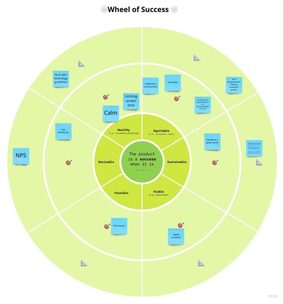
We went through each dimension, writing down ideas on digital sticky notes. Then we discussed our ideas and verbally agreed on the most important ones. For example, our client agreed that sustainability and progressive enhancement are important success criteria for the platform. And the subject-matter expert emphasized the importance of including students from low-income and disadvantaged groups in the design process.
After the kickoff, we summarized our ideas and shared understanding in a project brief that captured these aspects:
- the project's origin and purpose: why are we doing this project?
- the problem definition: what do we want to solve?
- the concrete goals and metrics for each success dimension: what do we want to achieve?
- the scope, process, and role descriptions: how will we achieve it?
With such a brief in place, you can use the agreed-upon objectives and concrete metrics as a checklist of success, and your design team will be ready to pursue the right objective—using the tools, methods, and metrics at their disposal to achieve ethical outcomes.
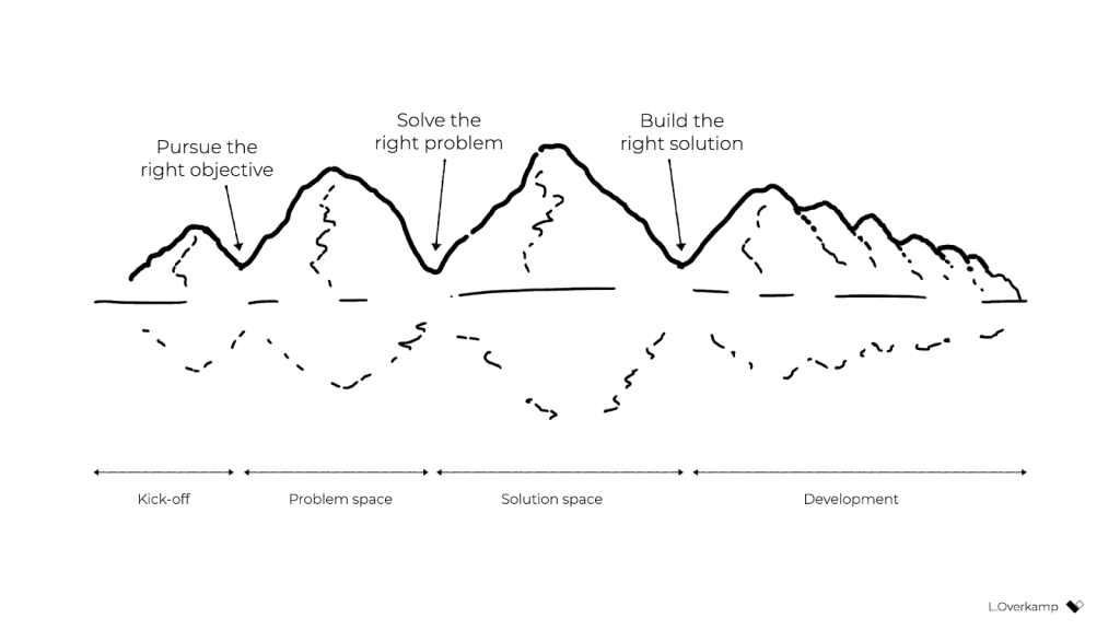 Conclusion
Over the past year, quite a few colleagues have asked me, "Where do I start with ethical design?" My answer has always been the same: organize a session with your stakeholders to (re)define success. Even though you might not always be 100 percent successful in agreeing on goals that cover all responsibility objectives, that beats the alternative (the status quo) every time. If you want to be an ethical, responsible designer, there's no skipping this step.
To be even more specific: if you consider yourself a strategic designer, your challenge is to define ethical objectives, set the right metrics, and conduct those kick-off sessions. If you consider yourself a system designer, your starting point is to understand how your industry contributes to consumerism and inequality, understand how finance drives business, and brainstorm which levers are available to influence the system on the highest level. Then redefine success to create the space to exercise those levers.
And for those who consider themselves service designers or UX designers or UI designers: if you truly want to have a positive, meaningful impact, stay away from the toolkits and meetups and conferences for a while. Instead, gather your colleagues and define goals for well-being, equity, and sustainability through design. Engage your stakeholders in a workshop and challenge them to think of ways to achieve and measure those ethical goals. Take their input, make it concrete and visible, ask for their agreement, and hold them to it.
Otherwise, I'm genuinely sorry to say, you're wasting your precious time and creative energy.
Of course, engaging your stakeholders in this way can be uncomfortable. Many of my colleagues expressed doubts such as "What will the client think of this?," "Will they take me seriously?," and "Can't we just do it within the design team instead?" In fact, a product manager once asked me why ethics couldn't just be a structured part of the design process—to just do it without spending the effort to define ethical objectives. It's a tempting idea, right? We wouldn't have to have difficult discussions with stakeholders about what values or which key-performance indicators to pursue. It would let us focus on what we like and do best: designing.
But as systems theory tells us, that's not enough. For those of us who aren't from marginalized groups and have the privilege to be able to speak up and be heard, that uncomfortable space is exactly where we need to be if we truly want to make a difference. We can't remain within the design-for-designers bubble, enjoying our privileged working-from-home situation, disconnected from the real world out there. For those of us who have the possibility to speak up and be heard: if we solely keep talking about ethical design and it remains at the level of articles and toolkits—we're not designing ethically. It's just theory. We need to actively engage our colleagues and clients by challenging them to redefine success in business.
With a bit of courage, determination, and focus, we can break out of this cage that finance and business-as-usual have built around us and become facilitators of a new type of business that can see beyond financial value. We just need to agree on the right objectives at the start of each design project, find the right metrics, and realize that we already have everything that we need to get started. That's what it means to do daily ethical design.
For their inspiration and support over the years, I would like to thank Emanuela Cozzi Schettini, José Gallegos, Annegret Bönemann, Ian Dorr, Vera Rademaker, Virginia Rispoli, Cecilia Scolaro, Rouzbeh Amini, and many others.
Breaking Out of the Box [ 09-Dec-21 3:00pm ]CSS is about styling boxes. In fact, the whole web is made of boxes, from the browser viewport to elements on a page. But every once in a while a new feature comes along that makes us rethink our design approach.
Round displays, for example, make it fun to play with circular clip areas. Mobile screen notches and virtual keyboards offer challenges to best organize content that stays clear of them. And dual screen or foldable devices make us rethink how to best use available space in a number of different device postures.
 Sketches of a round display, a common rectangular mobile display, and a device with a foldable display.
These recent evolutions of the web platform made it both more challenging and more interesting to design products. They're great opportunities for us to break out of our rectangular boxes.
I'd like to talk about a new feature similar to the above: the Window Controls Overlay for Progressive Web Apps (PWAs).
Progressive Web Apps are blurring the lines between apps and websites. They combine the best of both worlds. On one hand, they're stable, linkable, searchable, and responsive just like websites. On the other hand, they provide additional powerful capabilities, work offline, and read files just like native apps.
As a design surface, PWAs are really interesting because they challenge us to think about what mixing web and device-native user interfaces can be. On desktop devices in particular, we have more than 40 years of history telling us what applications should look like, and it can be hard to break out of this mental model.
At the end of the day though, PWAs on desktop are constrained to the window they appear in: a rectangle with a title bar at the top.
Here's what a typical desktop PWA app looks like:
 Sketches of two rectangular user interfaces representing the desktop Progressive Web App status quo on the macOS and Windows operating systems, respectively.
Sure, as the author of a PWA, you get to choose the color of the title bar (using the Web Application Manifest theme_color property), but that's about it.
What if we could think outside this box, and reclaim the real estate of the app's entire window? Doing so would give us a chance to make our apps more beautiful and feel more integrated in the operating system.
This is exactly what the Window Controls Overlay offers. This new PWA functionality makes it possible to take advantage of the full surface area of the app, including where the title bar normally appears.
About the title bar and window controlsLet's start with an explanation of what the title bar and window controls are.
The title bar is the area displayed at the top of an app window, which usually contains the app's name. Window controls are the affordances, or buttons, that make it possible to minimize, maximize, or close the app's window, and are also displayed at the top.
 A sketch of a rectangular application user interface highlighting the title bar area and window control buttons.
Window Controls Overlay removes the physical constraint of the title bar and window controls areas. It frees up the full height of the app window, enabling the title bar and window control buttons to be overlaid on top of the application's web content.
 A sketch of a rectangular application user interface using Window Controls Overlay. The title bar and window controls are no longer in an area separated from the app's content.
If you are reading this article on a desktop computer, take a quick look at other apps. Chances are they're already doing something similar to this. In fact, the very web browser you are using to read this uses the top area to display tabs.
 A screenshot of the top area of a browser's user interface showing a group of tabs that share the same horizontal space as the app window controls.
Spotify displays album artwork all the way to the top edge of the application window.
 A screenshot of an album in Spotify's desktop application. Album artwork spans the entire width of the main content area, all the way to the top and right edges of the window, and the right edge of the main navigation area on the left side. The application and album navigation controls are overlaid directly on top of the album artwork.
Microsoft Word uses the available title bar space to display the auto-save and search functionalities, and more.
 A screenshot of Microsoft Word's toolbar interface. Document file information, search, and other functionality appear at the top of the window, sharing the same horizontal space as the app's window controls.
The whole point of this feature is to allow you to make use of this space with your own content while providing a way to account for the window control buttons. And it enables you to offer this modified experience on a range of platforms while not adversely affecting the experience on browsers or devices that don't support Window Controls Overlay. After all, PWAs are all about progressive enhancement, so this feature is a chance to enhance your app to use this extra space when it's available.
Let's use the featureFor the rest of this article, we'll be working on a demo app to learn more about using the feature.
The demo app is called 1DIV. It's a simple CSS playground where users can create designs using CSS and a single HTML element.
The app has two pages. The first lists the existing CSS designs you've created:
 A screenshot of the 1DIV app displaying a thumbnail grid of CSS designs a user created.
The second page enables you to create and edit CSS designs:
 A screenshot of the 1DIV app editor page. The top half of the window displays a rendered CSS design, and a text editor on the bottom half of the window displays the CSS used to create it.
Since I've added a simple web manifest and service worker, we can install the app as a PWA on desktop. Here is what it looks like on macOS:
 Screenshots of the 1DIV app thumbnail view and CSS editor view on macOS. This version of the app's window has a separate control bar at the top for the app name and window control buttons.
And on Windows:
 Screenshots of the 1DIV app thumbnail view and CSS editor view on the Windows operating system. This version of the app's window also has a separate control bar at the top for the app name and window control buttons.
Our app is looking good, but the white title bar in the first page is wasted space. In the second page, it would be really nice if the design area went all the way to the top of the app window.
Let's use the Window Controls Overlay feature to improve this.
Enabling Window Controls OverlayThe feature is still experimental at the moment. To try it, you need to enable it in one of the supported browsers.
As of now, it has been implemented in Chromium, as a collaboration between Microsoft and Google. We can therefore use it in Chrome or Edge by going to the internal about://flags page, and enabling the Desktop PWA Window Controls Overlay flag.
Using Window Controls OverlayTo use the feature, we need to add the following display_override member to our web app's manifest file:
{
  "name": "1DIV",
  "description": "1DIV is a mini CSS playground",
  "lang": "en-US",
  "start_url": "/",
  "theme_color": "#ffffff",
  "background_color": "#ffffff",
  "display_override": [
    "window-controls-overlay"
  ],
  "icons": [
    ...
  ]
}
On the surface, the feature is really simple to use. This manifest change is the only thing we need to make the title bar disappear and turn the window controls into an overlay.
However, to provide a great experience for all users regardless of what device or browser they use, and to make the most of the title bar area in our design, we'll need a bit of CSS and JavaScript code.
Here is what the app looks like now:
 Screenshot of the 1DIV app thumbnail view using Window Controls Overlay on macOS. The separate top bar area is gone, but the window controls are now blocking some of the app's interface
The title bar is gone, which is what we wanted, but our logo, search field, and NEW button are partially covered by the window controls because now our layout starts at the top of the window.
It's similar on Windows, with the difference that the close, maximize, and minimize buttons appear on the right side, grouped together with the PWA control buttons:
 Screenshot of the 1DIV app thumbnail display using Window Controls Overlay on the Windows operating system. The separate top bar area is gone, but the window controls are now blocking some of the app's content.
Using CSS to keep clear of the window controls
Screenshot of the 1DIV app thumbnail display using Window Controls Overlay on the Windows operating system. The separate top bar area is gone, but the window controls are now blocking some of the app's content.
Using CSS to keep clear of the window controls
Along with the feature, new CSS environment variables have been introduced:
- titlebar-area-x
- titlebar-area-y
- titlebar-area-width
- titlebar-area-height
You use these variables with the CSS env() function to position your content where the title bar would have been while ensuring it won't overlap with the window controls. In our case, we'll use two of the variables to position our header, which contains the logo, search bar, and NEW button.
header {
  position: absolute;
  left: env(titlebar-area-x, 0);
  width: env(titlebar-area-width, 100%);
  height: var(--toolbar-height);
}
The titlebar-area-x variable gives us the distance from the left of the viewport to where the title bar would appear, and titlebar-area-width is its width. (Remember, this is not equivalent to the width of the entire viewport, just the title bar portion, which as noted earlier, doesn't include the window controls.)
By doing this, we make sure our content remains fully visible. We're also defining fallback values (the second parameter in the env() function) for when the variables are not defined (such as on non-supporting browsers, or when the Windows Control Overlay feature is disabled).
 Screenshot of the 1DIV app thumbnail view on macOS with Window Controls Overlay and our CSS updated. The app content that the window controls had been blocking has been repositioned.
 Screenshot of the 1DIV app thumbnail view on the Windows operating system with Window Controls Overlay and our updated CSS. The app content that the window controls had been blocking has been repositioned.
Now our header adapts to its surroundings, and it doesn't feel like the window control buttons have been added as an afterthought. The app looks a lot more like a native app.
Changing the window controls background color so it blends inNow let's take a closer look at our second page: the CSS playground editor.
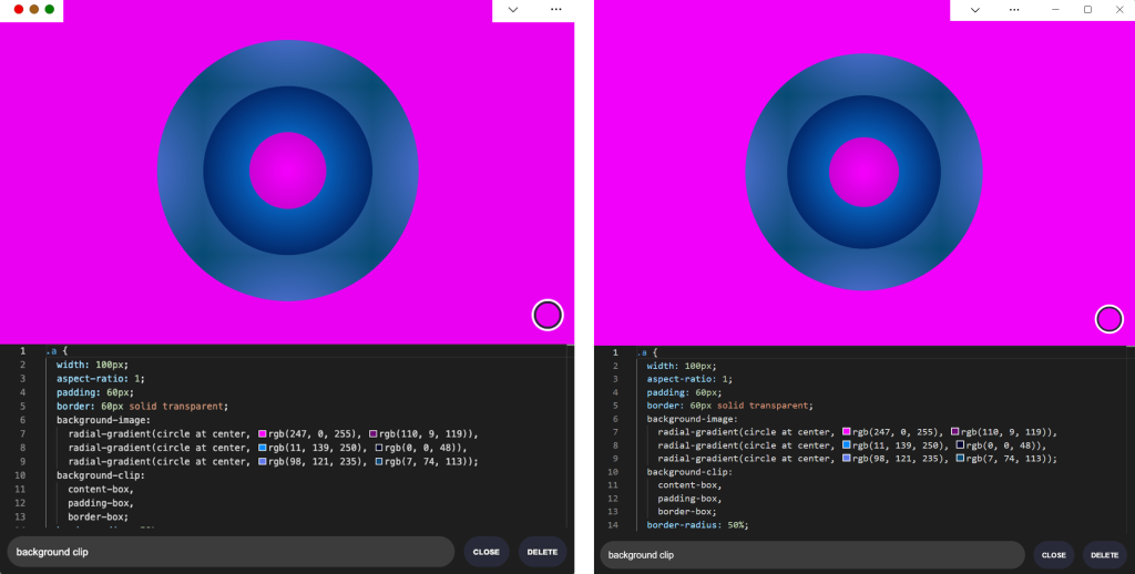 Screenshots of the 1DIV app CSS editor view with Window Controls Overlay in macOS and Windows, respectively. The window controls overlay areas have a solid white background color, which contrasts with the hot pink color of the example CSS design displayed in the editor.
Not great. Our CSS demo area does go all the way to the top, which is what we wanted, but the way the window controls appear as white rectangles on top of it is quite jarring.
We can fix this by changing the app's theme color. There are a couple of ways to define it:
- PWAs can define a theme color in the web app manifest file using the theme_color manifest member. This color is then used by the OS in different ways. On desktop platforms, it is used to provide a background color to the title bar and window controls.
- Websites can use the theme-color meta tag as well. It's used by browsers to customize the color of the UI around the web page. For PWAs, this color can override the manifest theme_color.
In our case, we can set the manifest theme_color to white to provide the right default color for our app. The OS will read this color value when the app is installed and use it to make the window controls background color white. This color works great for our main page with the list of demos.
The theme-color meta tag can be changed at runtime, using JavaScript. So we can do that to override the white with the right demo background color when one is opened.
Here is the function we'll use:
function themeWindow(bgColor) {
  document.querySelector("meta[name=theme-color]").setAttribute('content', bgColor);
}
With this in place, we can imagine how using color and CSS transitions can produce a smooth change from the list page to the demo page, and enable the window control buttons to blend in with the rest of the app's interface.
 Screenshot of the 1DIV app CSS editor view on the Windows operating system with Window Controls Overlay and updated CSS demonstrating how the window control buttons blend in with the rest of the app's interface.
Dragging the window
Screenshot of the 1DIV app CSS editor view on the Windows operating system with Window Controls Overlay and updated CSS demonstrating how the window control buttons blend in with the rest of the app's interface.
Dragging the window
Now, getting rid of the title bar entirely does have an important accessibility consequence: it's much more difficult to move the application window around.
The title bar provides a sizable area for users to click and drag, but by using the Window Controls Overlay feature, this area becomes limited to where the control buttons are, and users have to very precisely aim between these buttons to move the window.
Fortunately, this can be fixed using CSS with the app-region property. This property is, for now, only supported in Chromium-based browsers and needs the -webkit- vendor prefix.
To make any element of the app become a dragging target for the window, we can use the following:
-webkit-app-region: drag;
It is also possible to explicitly make an element non-draggable:
-webkit-app-region: no-drag;
These options can be useful for us. We can make the entire header a dragging target, but make the search field and NEW button within it non-draggable so they can still be used as normal.
However, because the editor page doesn't display the header, users wouldn't be able to drag the window while editing code. So let's use a different approach. We'll create another element before our header, also absolutely positioned, and dedicated to dragging the window.
<div ></div>
<header>...</header>
.drag {
  position: absolute;
  top: 0;
  width: 100%;
  height: env(titlebar-area-height, 0);
  -webkit-app-region: drag;
}
With the above code, we're making the draggable area span the entire viewport width, and using the titlebar-area-height variable to make it as tall as what the title bar would have been. This way, our draggable area is aligned with the window control buttons as shown below.
And, now, to make sure our search field and button remain usable:
header .search,
header .new {
  -webkit-app-region: no-drag;
}
With the above code, users can click and drag where the title bar used to be. It is an area that users expect to be able to use to move windows on desktop, and we're not breaking this expectation, which is good.
 An animated view of the 1DIV app being dragged across a Windows desktop with the mouse.
Adapting to window resize
An animated view of the 1DIV app being dragged across a Windows desktop with the mouse.
Adapting to window resize
It may be useful for an app to know both whether the window controls overlay is visible and when its size changes. In our case, if the user made the window very narrow, there wouldn't be enough space for the search field, logo, and button to fit, so we'd want to push them down a bit.
The Window Controls Overlay feature comes with a JavaScript API we can use to do this: navigator.windowControlsOverlay.
The API provides three interesting things:
- navigator.windowControlsOverlay.visible lets us know whether the overlay is visible.
- navigator.windowControlsOverlay.getBoundingClientRect() lets us know the position and size of the title bar area.
- navigator.windowControlsOverlay.ongeometrychange lets us know when the size or visibility changes.
Let's use this to be aware of the size of the title bar area and move the header down if it's too narrow.
if (navigator.windowControlsOverlay) {
  navigator.windowControlsOverlay.addEventListener('geometrychange', () => {
    const { width } = navigator.windowControlsOverlay.getBoundingClientRect();
    document.body.classList.toggle('narrow', width < 250);
  });
}
In the example above, we set the narrow class on the body of the app if the title bar area is narrower than 250px. We could do something similar with a media query, but using the windowControlsOverlay API has two advantages for our use case:
- It's only fired when the feature is supported and used; we don't want to adapt the design otherwise.
- We get the size of the title bar area across operating systems, which is great because the size of the window controls is different on Mac and Windows. Using a media query wouldn't make it possible for us to know exactly how much space remains.
.narrow header {
  top: env(titlebar-area-height, 0);
  left: 0;
  width: 100%;
}
Using the above CSS code, we can move our header down to stay clear of the window control buttons when the window is too narrow, and move the thumbnails down accordingly.
 A screenshot of the 1DIV app on Windows showing the app's content adjusted for a much narrower viewport.
Thirty pixels of exciting design opportunities
A screenshot of the 1DIV app on Windows showing the app's content adjusted for a much narrower viewport.
Thirty pixels of exciting design opportunities
Using the Window Controls Overlay feature, we were able to take our simple demo app and turn it into something that feels so much more integrated on desktop devices. Something that reaches out of the usual window constraints and provides a custom experience for its users.
In reality, this feature only gives us about 30 pixels of extra room and comes with challenges on how to deal with the window controls. And yet, this extra room and those challenges can be turned into exciting design opportunities.
More devices of all shapes and forms get invented all the time, and the web keeps on evolving to adapt to them. New features get added to the web platform to allow us, web authors, to integrate more and more deeply with those devices. From watches or foldable devices to desktop computers, we need to evolve our design approach for the web. Building for the web now lets us think outside the rectangular box.
So let's embrace this. Let's use the standard technologies already at our disposal, and experiment with new ideas to provide tailored experiences for all devices, all from a single codebase!
If you get a chance to try the Window Controls Overlay feature and have feedback about it, you can open issues on the spec's repository. It's still early in the development of this feature, and you can help make it even better. Or, you can take a look at the feature's existing documentation, or this demo app and its source code.
How to Sell UX Research with Two Simple Questions [ 21-Oct-21 3:00pm ]Do you find yourself designing screens with only a vague idea of how the things on the screen relate to the things elsewhere in the system? Do you leave stakeholder meetings with unclear directives that often seem to contradict previous conversations? You know a better understanding of user needs would help the team get clear on what you are actually trying to accomplish, but time and budget for research is tight. When it comes to asking for more direct contact with your users, you might feel like poor Oliver Twist, timidly asking, "Please, sir, I want some more."
Here's the trick. You need to get stakeholders themselves to identify high-risk assumptions and hidden complexity, so that they become just as motivated as you to get answers from users. Basically, you need to make them think it's their idea.
In this article, I'll show you how to collaboratively expose misalignment and gaps in the team's shared understanding by bringing the team together around two simple questions:
- What are the objects?
- What are the relationships between those objects?
These two questions align to the first two steps of the ORCA process, which might become your new best friend when it comes to reducing guesswork. Wait, what's ORCA?! Glad you asked.
ORCA stands for Objects, Relationships, CTAs, and Attributes, and it outlines a process for creating solid object-oriented user experiences. Object-oriented UX is my design philosophy. ORCA is an iterative methodology for synthesizing user research into an elegant structural foundation to support screen and interaction design. OOUX and ORCA have made my work as a UX designer more collaborative, effective, efficient, fun, strategic, and meaningful.
The ORCA process has four iterative rounds and a whopping fifteen steps. In each round we get more clarity on our Os, Rs, Cs, and As.
 The four rounds and fifteen steps of the ORCA process. In the OOUX world, we love color-coding. Blue is reserved for objects! (Yellow is for core content, pink is for metadata, and green is for calls-to-action. Learn more about the color-coded object map and connecting CTAs to objects.)
I sometimes say that ORCA is a "garbage in, garbage out" process. To ensure that the testable prototype produced in the final round actually tests well, the process needs to be fed by good research. But if you don't have a ton of research, the beginning of the ORCA process serves another purpose: it helps you sell the need for research.
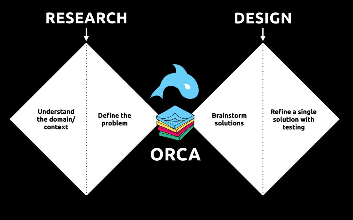 ORCA strengthens the weak spot between research and design by helping distill research into solid information architecture—scaffolding for the screen design and interaction design to hang on.
In other words, the ORCA process serves as a gauntlet between research and design. With good research, you can gracefully ride the killer whale from research into design. But without good research, the process effectively spits you back into research and with a cache of specific open questions.
Getting in the same curiosity-boatWhat gets us into trouble is not what we don't know. It's what we know for sure that just ain't so.
Mark Twain
The first two steps of the ORCA process—Object Discovery and Relationship Discovery—shine a spotlight on the dark, dusty corners of your team's misalignments and any inherent complexity that's been swept under the rug. It begins to expose what this classic comic so beautifully illustrates:
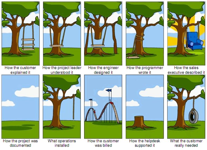 The original "Tree Swing Project Management" cartoon dates back to the 1960s or 1970s and has no artist attribution we could find.
This is one reason why so many UX designers are frustrated in their job and why many projects fail. And this is also why we often can't sell research: every decision-maker is confident in their own mental picture.
Once we expose hidden fuzzy patches in each picture and the differences between them all, the case for user research makes itself.
But how we do this is important. However much we might want to, we can't just tell everyone, "YOU ARE WRONG!" Instead, we need to facilitate and guide our team members to self-identify holes in their picture. When stakeholders take ownership of assumptions and gaps in understanding, BAM! Suddenly, UX research is not such a hard sell, and everyone is aboard the same curiosity-boat.
Say your users are doctors. And you have no idea how doctors use the system you are tasked with redesigning.
You might try to sell research by honestly saying: "We need to understand doctors better! What are their pain points? How do they use the current app?" But here's the problem with that. Those questions are vague, and the answers to them don't feel acutely actionable.
Instead, you want your stakeholders themselves to ask super-specific questions. This is more like the kind of conversation you need to facilitate. Let's listen in:
"Wait a sec, how often do doctors share patients? Does a patient in this system have primary and secondary doctors?"
"Can a patient even have more than one primary doctor?"
"Is it a 'primary doctor' or just a 'primary caregiver'… Can't that role be a nurse practitioner?"
"No, caregivers are something else… That's the patient's family contacts, right?"
"So are caregivers in scope for this redesign?"
"Yeah, because if a caregiver is present at an appointment, the doctor needs to note that. Like, tag the caregiver on the note… Or on the appointment?"
Now we are getting somewhere. Do you see how powerful it can be getting stakeholders to debate these questions themselves? The diabolical goal here is to shake their confidence—gently and diplomatically.
When these kinds of questions bubble up collaboratively and come directly from the mouths of your stakeholders and decision-makers, suddenly, designing screens without knowing the answers to these questions seems incredibly risky, even silly.
If we create software without understanding the real-world information environment of our users, we will likely create software that does not align to the real-world information environment of our users. And this will, hands down, result in a more confusing, more complex, and less intuitive software product.
The two questionsBut how do we get to these kinds of meaty questions diplomatically, efficiently, collaboratively, and reliably?
We can do this by starting with those two big questions that align to the first two steps of the ORCA process:
- What are the objects?
- What are the relationships between those objects?
In practice, getting to these answers is easier said than done. I'm going to show you how these two simple questions can provide the outline for an Object Definition Workshop. During this workshop, these "seed" questions will blossom into dozens of specific questions and shine a spotlight on the need for more user research.
Prep work: Noun foragingIn the next section, I'll show you how to run an Object Definition Workshop with your stakeholders (and entire cross-functional team, hopefully). But first, you need to do some prep work.
Basically, look for nouns that are particular to the business or industry of your project, and do it across at least a few sources. I call this noun foraging.
Here are just a few great noun foraging sources:
- the product's marketing site
- the product's competitors' marketing sites (competitive analysis, anyone?)
- the existing product (look at labels!)
- user interview transcripts
- notes from stakeholder interviews or vision docs from stakeholders
Put your detective hat on, my dear Watson. Get resourceful and leverage what you have. If all you have is a marketing website, some screenshots of the existing legacy system, and access to customer service chat logs, then use those.
As you peruse these sources, watch for the nouns that are used over and over again, and start listing them (preferably on blue sticky notes if you'll be creating an object map later!).
You'll want to focus on nouns that might represent objects in your system. If you are having trouble determining if a noun might be object-worthy, remember the acronym SIP and test for:
- Structure
- Instances
- Purpose
Think of a library app, for example. Is "book" an object?
Structure: can you think of a few attributes for this potential object? Title, author, publish date… Yep, it has structure. Check!
Instance: what are some examples of this potential "book" object? Can you name a few? The Alchemist, Ready Player One, Everybody Poops… OK, check!
Purpose: why is this object important to the users and business? Well, "book" is what our library client is providing to people and books are why people come to the library… Check, check, check!
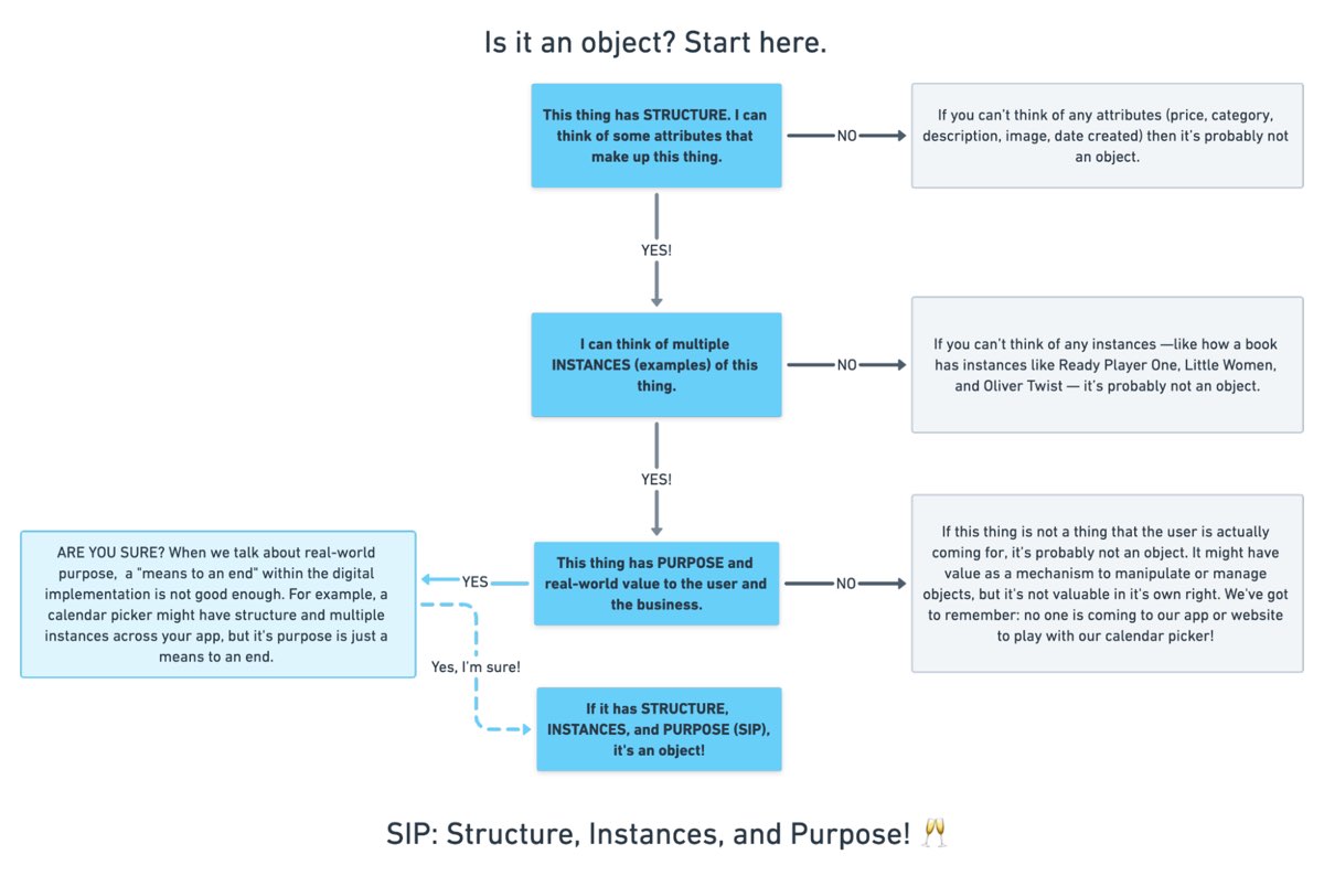 SIP: Structure, Instances, and Purpose! (Here's a flowchart where I elaborate even more on SIP.)
As you are noun foraging, focus on capturing the nouns that have SIP. Avoid capturing components like dropdowns, checkboxes, and calendar pickers—your UX system is not your design system! Components are just the packaging for objects—they are a means to an end. No one is coming to your digital place to play with your dropdown! They are coming for the VALUABLE THINGS and what they can do with them. Those things, or objects, are what we are trying to identify.
Let's say we work for a startup disrupting the email experience. This is how I'd start my noun foraging.
First I'd look at my own email client, which happens to be Gmail. I'd then look at Outlook and the new HEY email. I'd look at Yahoo, Hotmail…I'd even look at Slack and Basecamp and other so-called "email replacers." I'd read some articles, reviews, and forum threads where people are complaining about email. While doing all this, I would look for and write down the nouns.
(Before moving on, feel free to go noun foraging for this hypothetical product, too, and then scroll down to see how much our lists match up. Just don't get lost in your own emails! Come back to me!)
Drumroll, please…
Here are a few nouns I came up with during my noun foraging:
- email message
- thread
- contact
- client
- rule/automation
- email address that is not a contact?
- contact groups
- attachment
- Google doc file / other integrated file
- newsletter? (HEY treats this differently)
- saved responses and templates
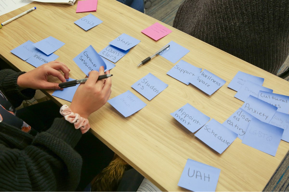 In the OOUX world, we love color-coding. Blue is reserved for objects! (Yellow is for core content, pink is for metadata, and green is for calls-to-action. Learn more about the color coded object map and connecting CTAs to objects.)
Scan your list of nouns and pick out words that you are completely clueless about. In our email example, it might be client or automation. Do as much homework as you can before your session with stakeholders: google what's googleable. But other terms might be so specific to the product or domain that you need to have a conversation about them.
Aside: here are some real nouns foraged during my own past project work that I needed my stakeholders to help me understand:
- Record Locator
- Incentive Home
- Augmented Line Item
- Curriculum-Based Measurement Probe
This is really all you need to prepare for the workshop session: a list of nouns that represent potential objects and a short list of nouns that need to be defined further.
Facilitate an Object Definition WorkshopYou could actually start your workshop with noun foraging—this activity can be done collaboratively. If you have five people in the room, pick five sources, assign one to every person, and give everyone ten minutes to find the objects within their source. When the time's up, come together and find the overlap. Affinity mapping is your friend here!
If your team is short on time and might be reluctant to do this kind of grunt work (which is usually the case) do your own noun foraging beforehand, but be prepared to show your work. I love presenting screenshots of documents and screens with all the nouns already highlighted. Bring the artifacts of your process, and start the workshop with a five-minute overview of your noun foraging journey.
HOT TIP: before jumping into the workshop, frame the conversation as a requirements-gathering session to help you better understand the scope and details of the system. You don't need to let them know that you're looking for gaps in the team's understanding so that you can prove the need for more user research—that will be our little secret. Instead, go into the session optimistically, as if your knowledgeable stakeholders and PMs and biz folks already have all the answers.
Then, let the question whack-a-mole commence.
1. What is this thing?Want to have some real fun? At the beginning of your session, ask stakeholders to privately write definitions for the handful of obscure nouns you might be uncertain about. Then, have everyone show their cards at the same time and see if you get different definitions (you will). This is gold for exposing misalignment and starting great conversations.
As your discussion unfolds, capture any agreed-upon definitions. And when uncertainty emerges, quietly (but visibly) start an "open questions" parking lot.
A Content Model Is Not a Design System [ 23-Sep-21 3:00pm ]Do you remember when having a great website was enough? Now, people are getting answers from Siri, Google search snippets, and mobile apps, not just our websites. Forward-thinking organizations have adopted an omnichannel content strategy, whose mission is to reach audiences across multiple digital channels and platforms.
But how do you set up a content management system (CMS) to reach your audience now and in the future? I learned the hard way that creating a content model—a definition of content types, attributes, and relationships that let people and systems understand content—with my more familiar design-system thinking would capsize my customer's omnichannel content strategy. You can avoid that outcome by creating content models that are semantic and that also connect related content.
I recently had the opportunity to lead the CMS implementation for a Fortune 500 company. The client was excited by the benefits of an omnichannel content strategy, including content reuse, multichannel marketing, and robot delivery—designing content to be intelligible to bots, Google knowledge panels, snippets, and voice user interfaces.
A content model is a critical foundation for an omnichannel content strategy, and for our content to be understood by multiple systems, the model needed semantic types—types named according to their meaning instead of their presentation. Our goal was to let authors create content and reuse it wherever it was relevant. But as the project proceeded, I realized that supporting content reuse at the scale that my customer needed required the whole team to recognize a new pattern.
Despite our best intentions, we kept drawing from what we were more familiar with: design systems. Unlike web-focused content strategies, an omnichannel content strategy can't rely on WYSIWYG tools for design and layout. Our tendency to approach the content model with our familiar design-system thinking constantly led us to veer away from one of the primary purposes of a content model: delivering content to audiences on multiple marketing channels.
Two essential principles for an effective content modelWe needed to help our designers, developers, and stakeholders understand that we were doing something very different from their prior web projects, where it was natural for everyone to think about content as visual building blocks fitting into layouts. The previous approach was not only more familiar but also more intuitive—at least at first—because it made the designs feel more tangible. We discovered two principles that helped the team understand how a content model differs from the design systems that we were used to:
- Content models must define semantics instead of layout.
- And content models should connect content that belongs together.
A semantic content model uses type and attribute names that reflect the meaning of the content, not how it will be displayed. For example, in a nonsemantic model, teams might create types like teasers, media blocks, and cards. Although these types might make it easy to lay out content, they don't help delivery channels understand the content's meaning, which in turn would have opened the door to the content being presented in each marketing channel. In contrast, a semantic content model uses type names like product, service, and testimonial so that each delivery channel can understand the content and use it as it sees fit.
When you're creating a semantic content model, a great place to start is to look over the types and properties defined by Schema.org, a community-driven resource for type definitions that are intelligible to platforms like Google search.
A semantic content model has several benefits:
- Even if your team doesn't care about omnichannel content, a semantic content model decouples content from its presentation so that teams can evolve the website's design without needing to refactor its content. In this way, content can withstand disruptive website redesigns.
- A semantic content model also provides a competitive edge. By adding structured data based on Schema.org's types and properties, a website can provide hints to help Google understand the content, display it in search snippets or knowledge panels, and use it to answer voice-interface user questions. Potential visitors could discover your content without ever setting foot in your website.
- Beyond those practical benefits, you'll also need a semantic content model if you want to deliver omnichannel content. To use the same content in multiple marketing channels, delivery channels need to be able to understand it. For example, if your content model were to provide a list of questions and answers, it could easily be rendered on a frequently asked questions (FAQ) page, but it could also be used in a voice interface or by a bot that answers common questions.
For example, using a semantic content model for articles, events, people, and locations lets A List Apart provide cleanly structured data for search engines so that users can read the content on the website, in Google knowledge panels, and even with hypothetical voice interfaces in the future.
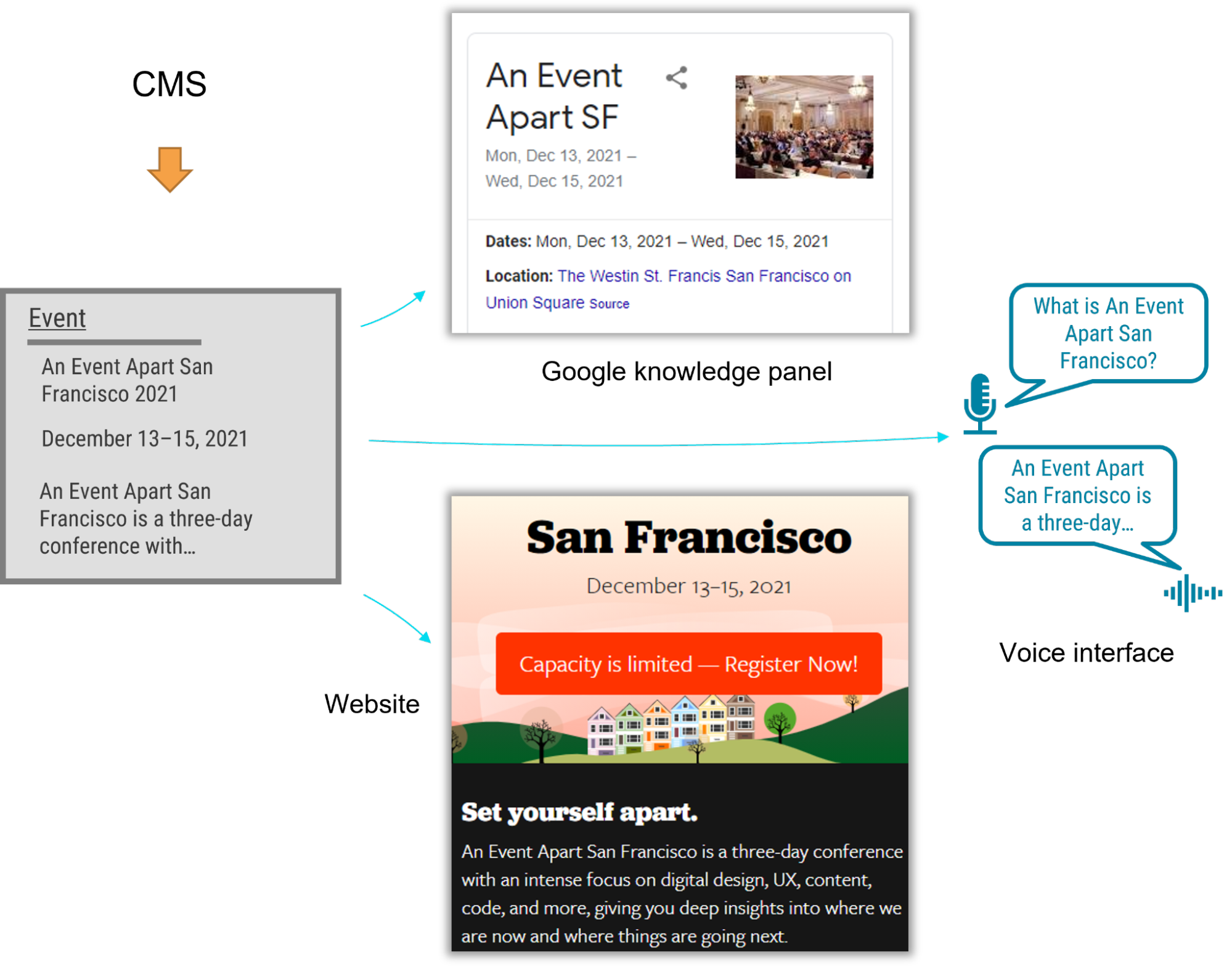 Content models that connect
After struggling to describe what makes a good content model, I've come to realize that the best models are those that are semantic and that also connect related content components (such as a FAQ item's question and answer pair), instead of slicing up related content across disparate content components. A good content model connects content that should remain together so that multiple delivery channels can use it without needing to first put those pieces back together.
Think about writing an article or essay. An article's meaning and usefulness depends upon its parts being kept together. Would one of the headings or paragraphs be meaningful on their own without the context of the full article? On our project, our familiar design-system thinking often led us to want to create content models that would slice content into disparate chunks to fit the web-centric layout. This had a similar impact to an article that were to have been separated from its headline. Because we were slicing content into standalone pieces based on layout, content that belonged together became difficult to manage and nearly impossible for multiple delivery channels to understand.
To illustrate, let's look at how connecting related content applies in a real-world scenario. The design team for our customer presented a complex layout for a software product page that included multiple tabs and sections. Our instincts were to follow suit with the content model. Shouldn't we make it as easy and as flexible as possible to add any number of tabs in the future?
Because our design-system instincts were so familiar, it felt like we had needed a content type called "tab section" so that multiple tab sections could be added to a page. Each tab section would display various types of content. One tab might provide the software's overview or its specifications. Another tab might provide a list of resources.
Our inclination to break down the content model into "tab section" pieces would have led to an unnecessarily complex model and a cumbersome editing experience, and it would have also created content that couldn't have been understood by additional delivery channels. For example, how would another system have been able to tell which "tab section" referred to a product's specifications or its resource list—would that other system have to have resorted to counting tab sections and content blocks? This would have prevented the tabs from ever being reordered, and it would have required adding logic in every other delivery channel to interpret the design system's layout. Furthermore, if the customer were to have no longer wanted to display this content in a tab layout, it would have been tedious to migrate to a new content model to reflect the new page redesign.
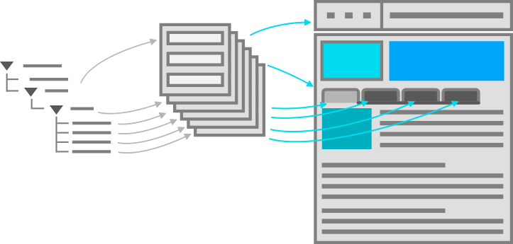 A content model based on design components is unnecessarily complex, and it's unintelligible to systems.
We had a breakthrough when we discovered that our customer had a specific purpose in mind for each tab: it would reveal specific information such as the software product's overview, specifications, related resources, and pricing. Once implementation began, our inclination to focus on what's visual and familiar had obscured the intent of the designs. With a little digging, it didn't take long to realize that the concept of tabs wasn't relevant to the content model. The meaning of the content that they were planning to display in the tabs was what mattered.
In fact, the customer could have decided to display this content in a different way—without tabs—somewhere else. This realization prompted us to define content types for the software product based on the meaningful attributes that the customer had wanted to render on the web. There were obvious semantic attributes like name and description as well as rich attributes like screenshots, software requirements, and feature lists. The software's product information stayed together because it wasn't sliced across separate components like "tab sections" that were derived from the content's presentation. Any delivery channel—including future ones—could understand and present this content.
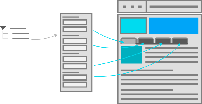 A good content model connects content that belongs together so it can be easily managed and reused.
Conclusion
A good content model connects content that belongs together so it can be easily managed and reused.
Conclusion
In this omnichannel marketing project, we discovered that the best way to keep our content model on track was to ensure that it was semantic (with type and attribute names that reflected the meaning of the content) and that it kept content together that belonged together (instead of fragmenting it). These two concepts curtailed our temptation to shape the content model based on the design. So if you're working on a content model to support an omnichannel content strategy—or even if you just want to make sure that Google and other interfaces understand your content—remember:
- A design system isn't a content model. Team members may be tempted to conflate them and to make your content model mirror your design system, so you should protect the semantic value and contextual structure of the content strategy during the entire implementation process. This will let every delivery channel consume the content without needing a magic decoder ring.
- If your team is struggling to make this transition, you can still reap some of the benefits by using Schema.org-based structured data in your website. Even if additional delivery channels aren't on the immediate horizon, the benefit to search engine optimization is a compelling reason on its own.
- Additionally, remind the team that decoupling the content model from the design will let them update the designs more easily because they won't be held back by the cost of content migrations. They'll be able to create new designs without the obstacle of compatibility between the design and the content, and they'll be ready for the next big thing.
By rigorously advocating for these principles, you'll help your team treat content the way that it deserves—as the most critical asset in your user experience and the best way to connect with your audience.
Design for Safety, An Excerpt [ 26-Aug-21 4:01pm ]Antiracist economist Kim Crayton says that "intention without strategy is chaos." We've discussed how our biases, assumptions, and inattention toward marginalized and vulnerable groups lead to dangerous and unethical tech—but what, specifically, do we need to do to fix it? The intention to make our tech safer is not enough; we need a strategy.
This chapter will equip you with that plan of action. It covers how to integrate safety principles into your design work in order to create tech that's safe, how to convince your stakeholders that this work is necessary, and how to respond to the critique that what we actually need is more diversity. (Spoiler: we do, but diversity alone is not the antidote to fixing unethical, unsafe tech.)
The process for inclusive safetyWhen you are designing for safety, your goals are to:
- identify ways your product can be used for abuse,
- design ways to prevent the abuse, and
- provide support for vulnerable users to reclaim power and control.
The Process for Inclusive Safety is a tool to help you reach those goals (Fig 5.1). It's a methodology I created in 2018 to capture the various techniques I was using when designing products with safety in mind. Whether you are creating an entirely new product or adding to an existing feature, the Process can help you make your product safe and inclusive. The Process includes five general areas of action:
- Conducting research
- Creating archetypes
- Brainstorming problems
- Designing solutions
- Testing for safety
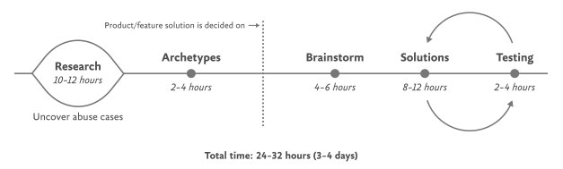 Fig 5.1: Each aspect of the Process for Inclusive Safety can be incorporated into your design process where it makes the most sense for you. The times given are estimates to help you incorporate the stages into your design plan.
The Process is meant to be flexible—it won't make sense for teams to implement every step in some situations. Use the parts that are relevant to your unique work and context; this is meant to be something you can insert into your existing design practice.
And once you use it, if you have an idea for making it better or simply want to provide context of how it helped your team, please get in touch with me. It's a living document that I hope will continue to be a useful and realistic tool that technologists can use in their day-to-day work.
If you're working on a product specifically for a vulnerable group or survivors of some form of trauma, such as an app for survivors of domestic violence, sexual assault, or drug addiction, be sure to read Chapter 7, which covers that situation explicitly and should be handled a bit differently. The guidelines here are for prioritizing safety when designing a more general product that will have a wide user base (which, we already know from statistics, will include certain groups that should be protected from harm). Chapter 7 is focused on products that are specifically for vulnerable groups and people who have experienced trauma.
Step 1: Conduct researchDesign research should include a broad analysis of how your tech might be weaponized for abuse as well as specific insights into the experiences of survivors and perpetrators of that type of abuse. At this stage, you and your team will investigate issues of interpersonal harm and abuse, and explore any other safety, security, or inclusivity issues that might be a concern for your product or service, like data security, racist algorithms, and harassment.
Broad researchYour project should begin with broad, general research into similar products and issues around safety and ethical concerns that have already been reported. For example, a team building a smart home device would do well to understand the multitude of ways that existing smart home devices have been used as tools of abuse. If your product will involve AI, seek to understand the potentials for racism and other issues that have been reported in existing AI products. Nearly all types of technology have some kind of potential or actual harm that's been reported on in the news or written about by academics. Google Scholar is a useful tool for finding these studies.
Specific research: SurvivorsWhen possible and appropriate, include direct research (surveys and interviews) with people who are experts in the forms of harm you have uncovered. Ideally, you'll want to interview advocates working in the space of your research first so that you have a more solid understanding of the topic and are better equipped to not retraumatize survivors. If you've uncovered possible domestic violence issues, for example, the experts you'll want to speak with are survivors themselves, as well as workers at domestic violence hotlines, shelters, other related nonprofits, and lawyers.
Especially when interviewing survivors of any kind of trauma, it is important to pay people for their knowledge and lived experiences. Don't ask survivors to share their trauma for free, as this is exploitative. While some survivors may not want to be paid, you should always make the offer in the initial ask. An alternative to payment is to donate to an organization working against the type of violence that the interviewee experienced. We'll talk more about how to appropriately interview survivors in Chapter 6.
Specific research: AbusersIt's unlikely that teams aiming to design for safety will be able to interview self-proclaimed abusers or people who have broken laws around things like hacking. Don't make this a goal; rather, try to get at this angle in your general research. Aim to understand how abusers or bad actors weaponize technology to use against others, how they cover their tracks, and how they explain or rationalize the abuse.
Step 2: Create archetypesOnce you've finished conducting your research, use your insights to create abuser and survivor archetypes. Archetypes are not personas, as they're not based on real people that you interviewed and surveyed. Instead, they're based on your research into likely safety issues, much like when we design for accessibility: we don't need to have found a group of blind or low-vision users in our interview pool to create a design that's inclusive of them. Instead, we base those designs on existing research into what this group needs. Personas typically represent real users and include many details, while archetypes are broader and can be more generalized.
The abuser archetype is someone who will look at the product as a tool to perform harm (Fig 5.2). They may be trying to harm someone they don't know through surveillance or anonymous harassment, or they may be trying to control, monitor, abuse, or torment someone they know personally.
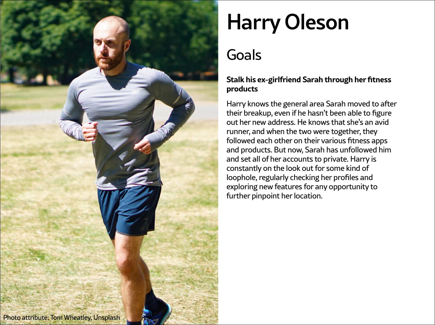 Fig 5.2: Harry Oleson, an abuser archetype for a fitness product, is looking for ways to stalk his ex-girlfriend through the fitness apps she uses.
The survivor archetype is someone who is being abused with the product. There are various situations to consider in terms of the archetype's understanding of the abuse and how to put an end to it: Do they need proof of abuse they already suspect is happening, or are they unaware they've been targeted in the first place and need to be alerted (Fig 5.3)?
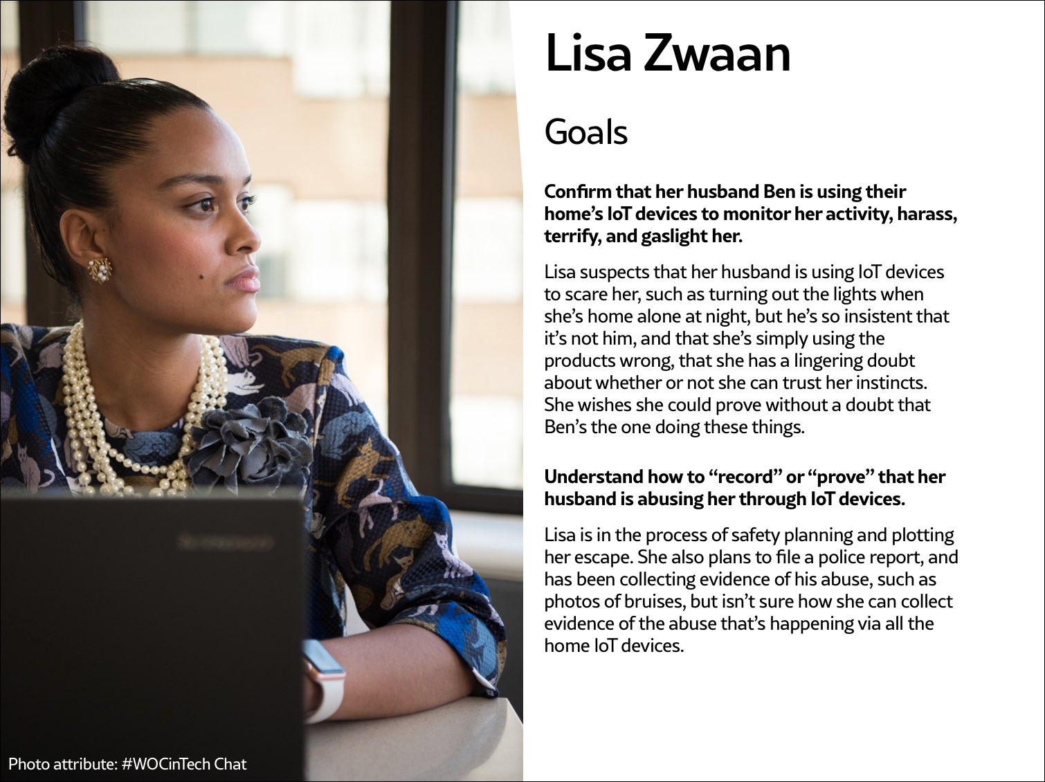 Fig 5.3: The survivor archetype Lisa Zwaan suspects her husband is weaponizing their home's IoT devices against her, but in the face of his insistence that she simply doesn't understand how to use the products, she's unsure. She needs some kind of proof of the abuse.
You may want to make multiple survivor archetypes to capture a range of different experiences. They may know that the abuse is happening but not be able to stop it, like when an abuser locks them out of IoT devices; or they know it's happening but don't know how, such as when a stalker keeps figuring out their location (Fig 5.4). Include as many of these scenarios as you need to in your survivor archetype. You'll use these later on when you design solutions to help your survivor archetypes achieve their goals of preventing and ending abuse.
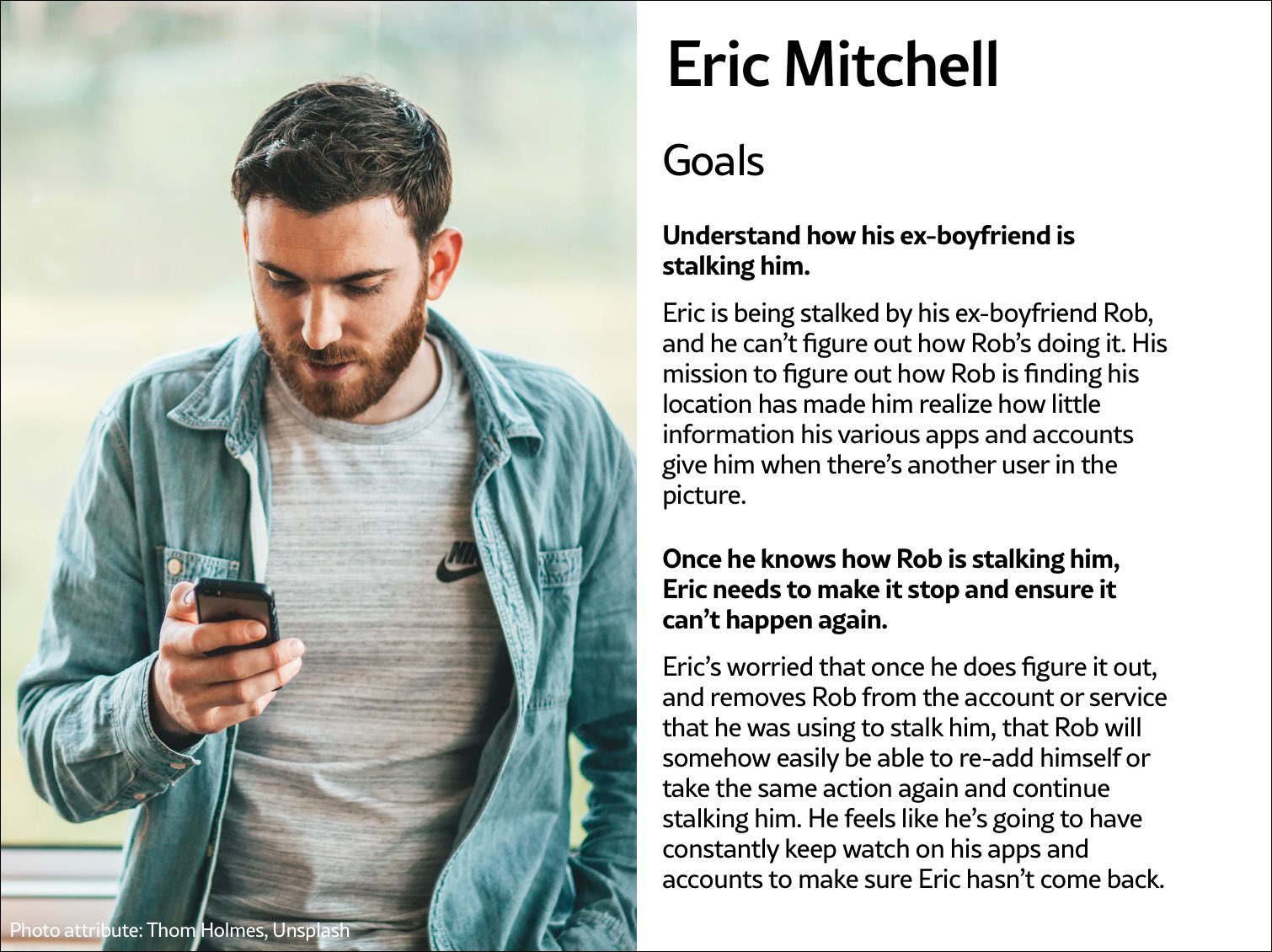 Fig 5.4: The survivor archetype Eric Mitchell knows he's being stalked by his ex-boyfriend Rob but can't figure out how Rob is learning his location information.
It may be useful for you to create persona-like artifacts for your archetypes, such as the three examples shown. Instead of focusing on the demographic information we often see in personas, focus on their goals. The goals of the abuser will be to carry out the specific abuse you've identified, while the goals of the survivor will be to prevent abuse, understand that abuse is happening, make ongoing abuse stop, or regain control over the technology that's being used for abuse. Later, you'll brainstorm how to prevent the abuser's goals and assist the survivor's goals.
And while the "abuser/survivor" model fits most cases, it doesn't fit all, so modify it as you need to. For example, if you uncovered an issue with security, such as the ability for someone to hack into a home camera system and talk to children, the malicious hacker would get the abuser archetype and the child's parents would get survivor archetype.
Step 3: Brainstorm problemsAfter creating archetypes, brainstorm novel abuse cases and safety issues. "Novel" means things not found in your research; you're trying to identify completely new safety issues that are unique to your product or service. The goal with this step is to exhaust every effort of identifying harms your product could cause. You aren't worrying about how to prevent the harm yet—that comes in the next step.
How could your product be used for any kind of abuse, outside of what you've already identified in your research? I recommend setting aside at least a few hours with your team for this process.
If you're looking for somewhere to start, try doing a Black Mirror brainstorm. This exercise is based on the show Black Mirror, which features stories about the dark possibilities of technology. Try to figure out how your product would be used in an episode of the show—the most wild, awful, out-of-control ways it could be used for harm. When I've led Black Mirror brainstorms, participants usually end up having a good deal of fun (which I think is great—it's okay to have fun when designing for safety!). I recommend time-boxing a Black Mirror brainstorm to half an hour, and then dialing it back and using the rest of the time thinking of more realistic forms of harm.
After you've identified as many opportunities for abuse as possible, you may still not feel confident that you've uncovered every potential form of harm. A healthy amount of anxiety is normal when you're doing this kind of work. It's common for teams designing for safety to worry, "Have we really identified every possible harm? What if we've missed something?" If you've spent at least four hours coming up with ways your product could be used for harm and have run out of ideas, go to the next step.
It's impossible to guarantee you've thought of everything; instead of aiming for 100 percent assurance, recognize that you've taken this time and have done the best you can, and commit to continuing to prioritize safety in the future. Once your product is released, your users may identify new issues that you missed; aim to receive that feedback graciously and course-correct quickly.
Step 4: Design solutionsAt this point, you should have a list of ways your product can be used for harm as well as survivor and abuser archetypes describing opposing user goals. The next step is to identify ways to design against the identified abuser's goals and to support the survivor's goals. This step is a good one to insert alongside existing parts of your design process where you're proposing solutions for the various problems your research uncovered.
Some questions to ask yourself to help prevent harm and support your archetypes include:
- Can you design your product in such a way that the identified harm cannot happen in the first place? If not, what roadblocks can you put up to prevent the harm from happening?
- How can you make the victim aware that abuse is happening through your product?
- How can you help the victim understand what they need to do to make the problem stop?
- Can you identify any types of user activity that would indicate some form of harm or abuse? Could your product help the user access support?
In some products, it's possible to proactively recognize that harm is happening. For example, a pregnancy app might be modified to allow the user to report that they were the victim of an assault, which could trigger an offer to receive resources for local and national organizations. This sort of proactiveness is not always possible, but it's worth taking a half hour to discuss if any type of user activity would indicate some form of harm or abuse, and how your product could assist the user in receiving help in a safe manner.
That said, use caution: you don't want to do anything that could put a user in harm's way if their devices are being monitored. If you do offer some kind of proactive help, always make it voluntary, and think through other safety issues, such as the need to keep the user in-app in case an abuser is checking their search history. We'll walk through a good example of this in the next chapter.
Step 5: Test for safetyThe final step is to test your prototypes from the point of view of your archetypes: the person who wants to weaponize the product for harm and the victim of the harm who needs to regain control over the technology. Just like any other kind of product testing, at this point you'll aim to rigorously test out your safety solutions so that you can identify gaps and correct them, validate that your designs will help keep your users safe, and feel more confident releasing your product into the world.
Ideally, safety testing happens along with usability testing. If you're at a company that doesn't do usability testing, you might be able to use safety testing to cleverly perform both; a user who goes through your design attempting to weaponize the product against someone else can also be encouraged to point out interactions or other elements of the design that don't make sense to them.
You'll want to conduct safety testing on either your final prototype or the actual product if it's already been released. There's nothing wrong with testing an existing product that wasn't designed with safety goals in mind from the onset—"retrofitting" it for safety is a good thing to do.
Remember that testing for safety involves testing from the perspective of both an abuser and a survivor, though it may not make sense for you to do both. Alternatively, if you made multiple survivor archetypes to capture multiple scenarios, you'll want to test from the perspective of each one.
As with other sorts of usability testing, you as the designer are most likely too close to the product and its design by this point to be a valuable tester; you know the product too well. Instead of doing it yourself, set up testing as you would with other usability testing: find someone who is not familiar with the product and its design, set the scene, give them a task, encourage them to think out loud, and observe how they attempt to complete it.
Abuser testingThe goal of this testing is to understand how easy it is for someone to weaponize your product for harm. Unlike with usability testing, you want to make it impossible, or at least difficult, for them to achieve their goal. Reference the goals in the abuser archetype you created earlier, and use your product in an attempt to achieve them.
For example, for a fitness app with GPS-enabled location features, we can imagine that the abuser archetype would have the goal of figuring out where his ex-girlfriend now lives. With this goal in mind, you'd try everything possible to figure out the location of another user who has their privacy settings enabled. You might try to see her running routes, view any available information on her profile, view anything available about her location (which she has set to private), and investigate the profiles of any other users somehow connected with her account, such as her followers.
If by the end of this you've managed to uncover some of her location data, despite her having set her profile to private, you know now that your product enables stalking. Your next step is to go back to step 4 and figure out how to prevent this from happening. You may need to repeat the process of designing solutions and testing them more than once.
Survivor testingSurvivor testing involves identifying how to give information and power to the survivor. It might not always make sense based on the product or context. Thwarting the attempt of an abuser archetype to stalk someone also satisfies the goal of the survivor archetype to not be stalked, so separate testing wouldn't be needed from the survivor's perspective.
However, there are cases where it makes sense. For example, for a smart thermostat, a survivor archetype's goals would be to understand who or what is making the temperature change when they aren't doing it themselves. You could test this by looking for the thermostat's history log and checking for usernames, actions, and times; if you couldn't find that information, you would have more work to do in step 4.
Another goal might be regaining control of the thermostat once the survivor realizes the abuser is remotely changing its settings. Your test would involve attempting to figure out how to do this: are there instructions that explain how to remove another user and change the password, and are they easy to find? This might again reveal that more work is needed to make it clear to the user how they can regain control of the device or account.
Stress testingTo make your product more inclusive and compassionate, consider adding stress testing. This concept comes from Design for Real Life by Eric Meyer and Sara Wachter-Boettcher. The authors pointed out that personas typically center people who are having a good day—but real users are often anxious, stressed out, having a bad day, or even experiencing tragedy. These are called "stress cases," and testing your products for users in stress-case situations can help you identify places where your design lacks compassion. Design for Real Life has more details about what it looks like to incorporate stress cases into your design as well as many other great tactics for compassionate design.
Sustainable Web Design, An Excerpt [ 05-Aug-21 3:00pm ]In the 1950s, many in the elite running community had begun to believe it wasn't possible to run a mile in less than four minutes. Runners had been attempting it since the late 19th century and were beginning to draw the conclusion that the human body simply wasn't built for the task.
But on May 6, 1956, Roger Bannister took everyone by surprise. It was a cold, wet day in Oxford, England—conditions no one expected to lend themselves to record-setting—and yet Bannister did just that, running a mile in 3:59.4 and becoming the first person in the record books to run a mile in under four minutes.
This shift in the benchmark had profound effects; the world now knew that the four-minute mile was possible. Bannister's record lasted only forty-six days, when it was snatched away by Australian runner John Landy. Then a year later, three runners all beat the four-minute barrier together in the same race. Since then, over 1,400 runners have officially run a mile in under four minutes; the current record is 3:43.13, held by Moroccan athlete Hicham El Guerrouj.
We achieve far more when we believe that something is possible, and we will believe it's possible only when we see someone else has already done it—and as with human running speed, so it is with what we believe are the hard limits for how a website needs to perform.
Establishing standards for a sustainable webIn most major industries, the key metrics of environmental performance are fairly well established, such as miles per gallon for cars or energy per square meter for homes. The tools and methods for calculating those metrics are standardized as well, which keeps everyone on the same page when doing environmental assessments. In the world of websites and apps, however, we aren't held to any particular environmental standards, and only recently have gained the tools and methods we need to even make an environmental assessment.
The primary goal in sustainable web design is to reduce carbon emissions. However, it's almost impossible to actually measure the amount of CO2 produced by a web product. We can't measure the fumes coming out of the exhaust pipes on our laptops. The emissions of our websites are far away, out of sight and out of mind, coming out of power stations burning coal and gas. We have no way to trace the electrons from a website or app back to the power station where the electricity is being generated and actually know the exact amount of greenhouse gas produced. So what do we do?
If we can't measure the actual carbon emissions, then we need to find what we can measure. The primary factors that could be used as indicators of carbon emissions are:
- Data transfer
- Carbon intensity of electricity
Let's take a look at how we can use these metrics to quantify the energy consumption, and in turn the carbon footprint, of the websites and web apps we create.
Data transferMost researchers use kilowatt-hours per gigabyte (kWh/GB) as a metric of energy efficiency when measuring the amount of data transferred over the internet when a website or application is used. This provides a great reference point for energy consumption and carbon emissions. As a rule of thumb, the more data transferred, the more energy used in the data center, telecoms networks, and end user devices.
For web pages, data transfer for a single visit can be most easily estimated by measuring the page weight, meaning the transfer size of the page in kilobytes the first time someone visits the page. It's fairly easy to measure using the developer tools in any modern web browser. Often your web hosting account will include statistics for the total data transfer of any web application (Fig 2.1).
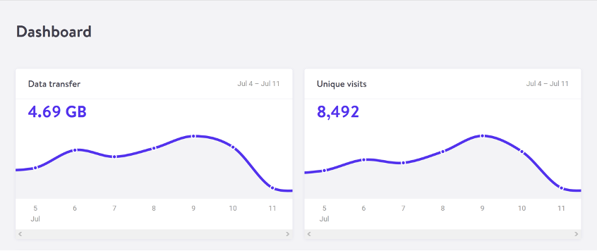 Fig 2.1: The Kinsta hosting dashboard displays data transfer alongside traffic volumes. If you divide data transfer by visits, you get the average data per visit, which can be used as a metric of efficiency.
The nice thing about page weight as a metric is that it allows us to compare the efficiency of web pages on a level playing field without confusing the issue with constantly changing traffic volumes.
Reducing page weight requires a large scope. By early 2020, the median page weight was 1.97 MB for setups the HTTP Archive classifies as "desktop" and 1.77 MB for "mobile," with desktop increasing 36 percent since January 2016 and mobile page weights nearly doubling in the same period (Fig 2.2). Roughly half of this data transfer is image files, making images the single biggest source of carbon emissions on the average website.
History clearly shows us that our web pages can be smaller, if only we set our minds to it. While most technologies become ever more energy efficient, including the underlying technology of the web such as data centers and transmission networks, websites themselves are a technology that becomes less efficient as time goes on.
 Fig 2.2: The historical page weight data from HTTP Archive can teach us a lot about what is possible in the future.
You might be familiar with the concept of performance budgeting as a way of focusing a project team on creating faster user experiences. For example, we might specify that the website must load in a maximum of one second on a broadband connection and three seconds on a 3G connection. Much like speed limits while driving, performance budgets are upper limits rather than vague suggestions, so the goal should always be to come in under budget.
Designing for fast performance does often lead to reduced data transfer and emissions, but it isn't always the case. Web performance is often more about the subjective perception of load times than it is about the true efficiency of the underlying system, whereas page weight and transfer size are more objective measures and more reliable benchmarks for sustainable web design.
We can set a page weight budget in reference to a benchmark of industry averages, using data from sources like HTTP Archive. We can also benchmark page weight against competitors or the old version of the website we're replacing. For example, we might set a maximum page weight budget as equal to our most efficient competitor, or we could set the benchmark lower to guarantee we are best in class.
If we want to take it to the next level, then we could also start looking at the transfer size of our web pages for repeat visitors. Although page weight for the first time someone visits is the easiest thing to measure, and easy to compare on a like-for-like basis, we can learn even more if we start looking at transfer size in other scenarios too. For example, visitors who load the same page multiple times will likely have a high percentage of the files cached in their browser, meaning they don't need to transfer all of the files on subsequent visits. Likewise, a visitor who navigates to new pages on the same website will likely not need to load the full page each time, as some global assets from areas like the header and footer may already be cached in their browser. Measuring transfer size at this next level of detail can help us learn even more about how we can optimize efficiency for users who regularly visit our pages, and enable us to set page weight budgets for additional scenarios beyond the first visit.
Page weight budgets are easy to track throughout a design and development process. Although they don't actually tell us carbon emission and energy consumption analytics directly, they give us a clear indication of efficiency relative to other websites. And as transfer size is an effective analog for energy consumption, we can actually use it to estimate energy consumption too.
In summary, reduced data transfer translates to energy efficiency, a key factor to reducing carbon emissions of web products. The more efficient our products, the less electricity they use, and the less fossil fuels need to be burned to produce the electricity to power them. But as we'll see next, since all web products demand some power, it's important to consider the source of that electricity, too.
Carbon intensity of electricityRegardless of energy efficiency, the level of pollution caused by digital products depends on the carbon intensity of the energy being used to power them. Carbon intensity is a term used to define the grams of CO2 produced for every kilowatt-hour of electricity (gCO2/kWh). This varies widely, with renewable energy sources and nuclear having an extremely low carbon intensity of less than 10 gCO2/kWh (even when factoring in their construction); whereas fossil fuels have very high carbon intensity of approximately 200-400 gCO2/kWh.
Most electricity comes from national or state grids, where energy from a variety of different sources is mixed together with varying levels of carbon intensity. The distributed nature of the internet means that a single user of a website or app might be using energy from multiple different grids simultaneously; a website user in Paris uses electricity from the French national grid to power their home internet and devices, but the website's data center could be in Dallas, USA, pulling electricity from the Texas grid, while the telecoms networks use energy from everywhere between Dallas and Paris.
We don't have control over the full energy supply of web services, but we do have some control over where we host our projects. With a data center using a significant proportion of the energy of any website, locating the data center in an area with low carbon energy will tangibly reduce its carbon emissions. Danish startup Tomorrow reports and maps this user-contributed data, and a glance at their map shows how, for example, choosing a data center in France will have significantly lower carbon emissions than a data center in the Netherlands (Fig 2.3).
 Fig 2.3: Tomorrow's electricityMap shows live data for the carbon intensity of electricity by country.
That said, we don't want to locate our servers too far away from our users; it takes energy to transmit data through the telecom's networks, and the further the data travels, the more energy is consumed. Just like food miles, we can think of the distance from the data center to the website's core user base as "megabyte miles"—and we want it to be as small as possible.
Using the distance itself as a benchmark, we can use website analytics to identify the country, state, or even city where our core user group is located and measure the distance from that location to the data center used by our hosting company. This will be a somewhat fuzzy metric as we don't know the precise center of mass of our users or the exact location of a data center, but we can at least get a rough idea.
For example, if a website is hosted in London but the primary user base is on the West Coast of the USA, then we could look up the distance from London to San Francisco, which is 5,300 miles. That's a long way! We can see that hosting it somewhere in North America, ideally on the West Coast, would significantly reduce the distance and thus the energy used to transmit the data. In addition, locating our servers closer to our visitors helps reduce latency and delivers better user experience, so it's a win-win.
Converting it back to carbon emissionsIf we combine carbon intensity with a calculation for energy consumption, we can calculate the carbon emissions of our websites and apps. A tool my team created does this by measuring the data transfer over the wire when loading a web page, calculating the amount of electricity associated, and then converting that into a figure for CO2 (Fig 2.4). It also factors in whether or not the web hosting is powered by renewable energy.
If you want to take it to the next level and tailor the data more accurately to the unique aspects of your project, the Energy and Emissions Worksheet accompanying this book shows you how.
 Fig 2.4: The Website Carbon Calculator shows how the Riverford Organic website embodies their commitment to sustainability, being both low carbon and hosted in a data center using renewable energy.
With the ability to calculate carbon emissions for our projects, we could actually take a page weight budget one step further and set carbon budgets as well. CO2 is not a metric commonly used in web projects; we're more familiar with kilobytes and megabytes, and can fairly easily look at design options and files to assess how big they are. Translating that into carbon adds a layer of abstraction that isn't as intuitive—but carbon budgets do focus our minds on the primary thing we're trying to reduce, and support the core objective of sustainable web design: reducing carbon emissions.
Browser EnergyData transfer might be the simplest and most complete analog for energy consumption in our digital projects, but by giving us one number to represent the energy used in the data center, the telecoms networks, and the end user's devices, it can't offer us insights into the efficiency in any specific part of the system.
One part of the system we can look at in more detail is the energy used by end users' devices. As front-end web technologies become more advanced, the computational load is increasingly moving from the data center to users' devices, whether they be phones, tablets, laptops, desktops, or even smart TVs. Modern web browsers allow us to implement more complex styling and animation on the fly using CSS and JavaScript. Furthermore, JavaScript libraries such as Angular and React allow us to create applications where the "thinking" work is done partly or entirely in the browser.
All of these advances are exciting and open up new possibilities for what the web can do to serve society and create positive experiences. However, more computation in the user's web browser means more energy used by their devices. This has implications not just environmentally, but also for user experience and inclusivity. Applications that put a heavy processing load on the user's device can inadvertently exclude users with older, slower devices and cause batteries on phones and laptops to drain faster. Furthermore, if we build web applications that require the user to have up-to-date, powerful devices, people throw away old devices much more frequently. This isn't just bad for the environment, but it puts a disproportionate financial burden on the poorest in society.
In part because the tools are limited, and partly because there are so many different models of devices, it's difficult to measure website energy consumption on end users' devices. One tool we do currently have is the Energy Impact monitor inside the developer console of the Safari browser (Fig 2.5).
 Fig 2.5: The Energy Impact meter in Safari (on the right) shows how a website consumes CPU energy.
You know when you load a website and your computer's cooling fans start spinning so frantically you think it might actually take off? That's essentially what this tool is measuring.
It shows us the percentage of CPU used and the duration of CPU usage when loading the web page, and uses these figures to generate an energy impact rating. It doesn't give us precise data for the amount of electricity used in kilowatts, but the information it does provide can be used to benchmark how efficiently your websites use energy and set targets for improvement.
Voice Content and Usability [ 29-Jul-21 2:00pm ]We've been having conversations for thousands of years. Whether to convey information, conduct transactions, or simply to check in on one another, people have yammered away, chattering and gesticulating, through spoken conversation for countless generations. Only in the last few millennia have we begun to commit our conversations to writing, and only in the last few decades have we begun to outsource them to the computer, a machine that shows much more affinity for written correspondence than for the slangy vagaries of spoken language.
Computers have trouble because between spoken and written language, speech is more primordial. To have successful conversations with us, machines must grapple with the messiness of human speech: the disfluencies and pauses, the gestures and body language, and the variations in word choice and spoken dialect that can stymie even the most carefully crafted human-computer interaction. In the human-to-human scenario, spoken language also has the privilege of face-to-face contact, where we can readily interpret nonverbal social cues.
In contrast, written language immediately concretizes as we commit it to record and retains usages long after they become obsolete in spoken communication (the salutation "To whom it may concern," for example), generating its own fossil record of outdated terms and phrases. Because it tends to be more consistent, polished, and formal, written text is fundamentally much easier for machines to parse and understand.
Spoken language has no such luxury. Besides the nonverbal cues that decorate conversations with emphasis and emotional context, there are also verbal cues and vocal behaviors that modulate conversation in nuanced ways: how something is said, not what. Whether rapid-fire, low-pitched, or high-decibel, whether sarcastic, stilted, or sighing, our spoken language conveys much more than the written word could ever muster. So when it comes to voice interfaces—the machines we conduct spoken conversations with—we face exciting challenges as designers and content strategists.
Voice InteractionsWe interact with voice interfaces for a variety of reasons, but according to Michael McTear, Zoraida Callejas, and David Griol in The Conversational Interface, those motivations by and large mirror the reasons we initiate conversations with other people, too (http://bkaprt.com/vcu36/01-01). Generally, we start up a conversation because:
- we need something done (such as a transaction),
- we want to know something (information of some sort), or
- we are social beings and want someone to talk to (conversation for conversation's sake).
These three categories—which I call transactional, informational, and prosocial—also characterize essentially every voice interaction: a single conversation from beginning to end that realizes some outcome for the user, starting with the voice interface's first greeting and ending with the user exiting the interface. Note here that a conversation in our human sense—a chat between people that leads to some result and lasts an arbitrary length of time—could encompass multiple transactional, informational, and prosocial voice interactions in succession. In other words, a voice interaction is a conversation, but a conversation is not necessarily a single voice interaction.
Purely prosocial conversations are more gimmicky than captivating in most voice interfaces, because machines don't yet have the capacity to really want to know how we're doing and to do the sort of glad-handing humans crave. There's also ongoing debate as to whether users actually prefer the sort of organic human conversation that begins with a prosocial voice interaction and shifts seamlessly into other types. In fact, in Voice User Interface Design, Michael Cohen, James Giangola, and Jennifer Balogh recommend sticking to users' expectations by mimicking how they interact with other voice interfaces rather than trying too hard to be human—potentially alienating them in the process (http://bkaprt.com/vcu36/01-01).
That leaves two genres of conversations we can have with one another that a voice interface can easily have with us, too: a transactional voice interaction realizing some outcome ("buy iced tea") and an informational voice interaction teaching us something new ("discuss a musical").
Transactional voice interactionsUnless you're tapping buttons on a food delivery app, you're generally having a conversation—and therefore a voice interaction—when you order a Hawaiian pizza with extra pineapple. Even when we walk up to the counter and place an order, the conversation quickly pivots from an initial smattering of neighborly small talk to the real mission at hand: ordering a pizza (generously topped with pineapple, as it should be).
Alison: Hey, how's it going?
Burhan: Hi, welcome to Crust Deluxe! It's cold out there. How can I help you?
Alison: Can I get a Hawaiian pizza with extra pineapple?
Burhan: Sure, what size?
Alison: Large.
Burhan: Anything else?
Alison: No thanks, that's it.
Burhan: Something to drink?
Alison: I'll have a bottle of Coke.
Burhan: You got it. That'll be $13.55 and about fifteen minutes.
Each progressive disclosure in this transactional conversation reveals more and more of the desired outcome of the transaction: a service rendered or a product delivered. Transactional conversations have certain key traits: they're direct, to the point, and economical. They quickly dispense with pleasantries.
Informational voice interactionsMeanwhile, some conversations are primarily about obtaining information. Though Alison might visit Crust Deluxe with the sole purpose of placing an order, she might not actually want to walk out with a pizza at all. She might be just as interested in whether they serve halal or kosher dishes, gluten-free options, or something else. Here, though we again have a prosocial mini-conversation at the beginning to establish politeness, we're after much more.
Alison: Hey, how's it going?
Burhan: Hi, welcome to Crust Deluxe! It's cold out there. How can I help you?
Alison: Can I ask a few questions?
Burhan: Of course! Go right ahead.
Alison: Do you have any halal options on the menu?
Burhan: Absolutely! We can make any pie halal by request. We also have lots of vegetarian, ovo-lacto, and vegan options. Are you thinking about any other dietary restrictions?
Alison: What about gluten-free pizzas?
Burhan: We can definitely do a gluten-free crust for you, no problem, for both our deep-dish and thin-crust pizzas. Anything else I can answer for you?
Alison: That's it for now. Good to know. Thanks!
Burhan: Anytime, come back soon!
This is a very different dialogue. Here, the goal is to get a certain set of facts. Informational conversations are investigative quests for the truth—research expeditions to gather data, news, or facts. Voice interactions that are informational might be more long-winded than transactional conversations by necessity. Responses tend to be lengthier, more informative, and carefully communicated so the customer understands the key takeaways.
Voice InterfacesAt their core, voice interfaces employ speech to support users in reaching their goals. But simply because an interface has a voice component doesn't mean that every user interaction with it is mediated through voice. Because multimodal voice interfaces can lean on visual components like screens as crutches, we're most concerned in this book with pure voice interfaces, which depend entirely on spoken conversation, lack any visual component whatsoever, and are therefore much more nuanced and challenging to tackle.
Though voice interfaces have long been integral to the imagined future of humanity in science fiction, only recently have those lofty visions become fully realized in genuine voice interfaces.
Interactive voice response (IVR) systemsThough written conversational interfaces have been fixtures of computing for many decades, voice interfaces first emerged in the early 1990s with text-to-speech (TTS) dictation programs that recited written text aloud, as well as speech-enabled in-car systems that gave directions to a user-provided address. With the advent of interactive voice response (IVR) systems, intended as an alternative to overburdened customer service representatives, we became acquainted with the first true voice interfaces that engaged in authentic conversation.
IVR systems allowed organizations to reduce their reliance on call centers but soon became notorious for their clunkiness. Commonplace in the corporate world, these systems were primarily designed as metaphorical switchboards to guide customers to a real phone agent ("Say Reservations to book a flight or check an itinerary"); chances are you will enter a conversation with one when you call an airline or hotel conglomerate. Despite their functional issues and users' frustration with their inability to speak to an actual human right away, IVR systems proliferated in the early 1990s across a variety of industries (http://bkaprt.com/vcu36/01-02, PDF).
While IVR systems are great for highly repetitive, monotonous conversations that generally don't veer from a single format, they have a reputation for less scintillating conversation than we're used to in real life (or even in science fiction).
Screen readersParallel to the evolution of IVR systems was the invention of the screen reader, a tool that transcribes visual content into synthesized speech. For Blind or visually impaired website users, it's the predominant method of interacting with text, multimedia, or form elements. Screen readers represent perhaps the closest equivalent we have today to an out-of-the-box implementation of content delivered through voice.
Among the first screen readers known by that moniker was the Screen Reader for the BBC Micro and NEEC Portable developed by the Research Centre for the Education of the Visually Handicapped (RCEVH) at the University of Birmingham in 1986 (http://bkaprt.com/vcu36/01-03). That same year, Jim Thatcher created the first IBM Screen Reader for text-based computers, later recreated for computers with graphical user interfaces (GUIs) (http://bkaprt.com/vcu36/01-04).
With the rapid growth of the web in the 1990s, the demand for accessible tools for websites exploded. Thanks to the introduction of semantic HTML and especially ARIA roles beginning in 2008, screen readers started facilitating speedy interactions with web pages that ostensibly allow disabled users to traverse the page as an aural and temporal space rather than a visual and physical one. In other words, screen readers for the web "provide mechanisms that translate visual design constructs—proximity, proportion, etc.—into useful information," writes Aaron Gustafson in A List Apart. "At least they do when documents are authored thoughtfully" (http://bkaprt.com/vcu36/01-05).
Though deeply instructive for voice interface designers, there's one significant problem with screen readers: they're difficult to use and unremittingly verbose. The visual structures of websites and web navigation don't translate well to screen readers, sometimes resulting in unwieldy pronouncements that name every manipulable HTML element and announce every formatting change. For many screen reader users, working with web-based interfaces exacts a cognitive toll.
In Wired, accessibility advocate and voice engineer Chris Maury considers why the screen reader experience is ill-suited to users relying on voice:
From the beginning, I hated the way that Screen Readers work. Why are they designed the way they are? It makes no sense to present information visually and then, and only then, translate that into audio. All of the time and energy that goes into creating the perfect user experience for an app is wasted, or even worse, adversely impacting the experience for blind users. (http://bkaprt.com/vcu36/01-06)
In many cases, well-designed voice interfaces can speed users to their destination better than long-winded screen reader monologues. After all, visual interface users have the benefit of darting around the viewport freely to find information, ignoring areas irrelevant to them. Blind users, meanwhile, are obligated to listen to every utterance synthesized into speech and therefore prize brevity and efficiency. Disabled users who have long had no choice but to employ clunky screen readers may find that voice interfaces, particularly more modern voice assistants, offer a more streamlined experience.
Voice assistantsWhen we think of voice assistants (the subset of voice interfaces now commonplace in living rooms, smart homes, and offices), many of us immediately picture HAL from 2001: A Space Odyssey or hear Majel Barrett's voice as the omniscient computer in Star Trek. Voice assistants are akin to personal concierges that can answer questions, schedule appointments, conduct searches, and perform other common day-to-day tasks. And they're rapidly gaining more attention from accessibility advocates for their assistive potential.
Before the earliest IVR systems found success in the enterprise, Apple published a demonstration video in 1987 depicting the Knowledge Navigator, a voice assistant that could transcribe spoken words and recognize human speech to a great degree of accuracy. Then, in 2001, Tim Berners-Lee and others formulated their vision for a Semantic Web "agent" that would perform typical errands like "checking calendars, making appointments, and finding locations" (http://bkaprt.com/vcu36/01-07, behind paywall). It wasn't until 2011 that Apple's Siri finally entered the picture, making voice assistants a tangible reality for consumers.
Thanks to the plethora of voice assistants available today, there is considerable variation in how programmable and customizable certain voice assistants are over others (Fig 1.1). At one extreme, everything except vendor-provided features is locked down; for example, at the time of their release, the core functionality of Apple's Siri and Microsoft's Cortana couldn't be extended beyond their existing capabilities. Even today, it isn't possible to program Siri to perform arbitrary functions, because there's no means by which developers can interact with Siri at a low level, apart from predefined categories of tasks like sending messages, hailing rideshares, making restaurant reservations, and certain others.
At the opposite end of the spectrum, voice assistants like Amazon Alexa and Google Home offer a core foundation on which developers can build custom voice interfaces. For this reason, programmable voice assistants that lend themselves to customization and extensibility are becoming increasingly popular for developers who feel stifled by the limitations of Siri and Cortana. Amazon offers the Alexa Skills Kit, a developer framework for building custom voice interfaces for Amazon Alexa, while Google Home offers the ability to program arbitrary Google Assistant skills. Today, users can choose from among thousands of custom-built skills within both the Amazon Alexa and Google Assistant ecosystems.
 Fig 1.1: Voice assistants like Amazon Alexa and Google Home tend to be more programmable, and thus more flexible, than their counterpart Apple Siri.
As corporations like Amazon, Apple, Microsoft, and Google continue to stake their territory, they're also selling and open-sourcing an unprecedented array of tools and frameworks for designers and developers that aim to make building voice interfaces as easy as possible, even without code.
Often by necessity, voice assistants like Amazon Alexa tend to be monochannel—they're tightly coupled to a device and can't be accessed on a computer or smartphone instead. By contrast, many development platforms like Google's Dialogflow have introduced omnichannel capabilities so users can build a single conversational interface that then manifests as a voice interface, textual chatbot, and IVR system upon deployment. I don't prescribe any specific implementation approaches in this design-focused book, but in Chapter 4 we'll get into some of the implications these variables might have on the way you build out your design artifacts.
Voice ContentSimply put, voice content is content delivered through voice. To preserve what makes human conversation so compelling in the first place, voice content needs to be free-flowing and organic, contextless and concise—everything written content isn't.
Our world is replete with voice content in various forms: screen readers reciting website content, voice assistants rattling off a weather forecast, and automated phone hotline responses governed by IVR systems. In this book, we're most concerned with content delivered auditorily—not as an option, but as a necessity.
For many of us, our first foray into informational voice interfaces will be to deliver content to users. There's only one problem: any content we already have isn't in any way ready for this new habitat. So how do we make the content trapped on our websites more conversational? And how do we write new copy that lends itself to voice interactions?
Lately, we've begun slicing and dicing our content in unprecedented ways. Websites are, in many respects, colossal vaults of what I call macrocontent: lengthy prose that can extend for infinitely scrollable miles in a browser window, like microfilm viewers of newspaper archives. Back in 2002, well before the present-day ubiquity of voice assistants, technologist Anil Dash defined microcontent as permalinked pieces of content that stay legible regardless of environment, such as email or text messages:
A day's weather forcast [sic], the arrival and departure times for an airplane flight, an abstract from a long publication, or a single instant message can all be examples of microcontent. (http://bkaprt.com/vcu36/01-08)
I'd update Dash's definition of microcontent to include all examples of bite-sized content that go well beyond written communiqués. After all, today we encounter microcontent in interfaces where a small snippet of copy is displayed alone, unmoored from the browser, like a textbot confirmation of a restaurant reservation. Microcontent offers the best opportunity to gauge how your content can be stretched to the very edges of its capabilities, informing delivery channels both established and novel.
As microcontent, voice content is unique because it's an example of how content is experienced in time rather than in space. We can glance at a digital sign underground for an instant and know when the next train is arriving, but voice interfaces hold our attention captive for periods of time that we can't easily escape or skip, something screen reader users are all too familiar with.
Because microcontent is fundamentally made up of isolated blobs with no relation to the channels where they'll eventually end up, we need to ensure that our microcontent truly performs well as voice content—and that means focusing on the two most important traits of robust voice content: voice content legibility and voice content discoverability.
Fundamentally, the legibility and discoverability of our voice content both have to do with how voice content manifests in perceived time and space.
Designing for the Unexpected [ 15-Jul-21 2:00pm ]I'm not sure when I first heard this quote, but it's something that has stayed with me over the years. How do you create services for situations you can't imagine? Or design products that work on devices yet to be invented?
Flash, Photoshop, and responsive designWhen I first started designing websites, my go-to software was Photoshop. I created a 960px canvas and set about creating a layout that I would later drop content in. The development phase was about attaining pixel-perfect accuracy using fixed widths, fixed heights, and absolute positioning.
Ethan Marcotte's talk at An Event Apart and subsequent article "Responsive Web Design" in A List Apart in 2010 changed all this. I was sold on responsive design as soon as I heard about it, but I was also terrified. The pixel-perfect designs full of magic numbers that I had previously prided myself on producing were no longer good enough.
The fear wasn't helped by my first experience with responsive design. My first project was to take an existing fixed-width website and make it responsive. What I learned the hard way was that you can't just add responsiveness at the end of a project. To create fluid layouts, you need to plan throughout the design phase.
A new way to designDesigning responsive or fluid sites has always been about removing limitations, producing content that can be viewed on any device. It relies on the use of percentage-based layouts, which I initially achieved with native CSS and utility classes:
.column-span-6 {
  width: 49%;
  float: left;
  margin-right: 0.5%;
  margin-left: 0.5%;
}


.column-span-4 {
  width: 32%;
  float: left;
  margin-right: 0.5%;
  margin-left: 0.5%;
}

.column-span-3 {
  width: 24%;
  float: left;
  margin-right: 0.5%;
  margin-left: 0.5%;
}
Then with Sass so I could take advantage of @includes to re-use repeated blocks of code and move back to more semantic markup:
.logo {
  @include colSpan(6);
}

.search {
  @include colSpan(3);
}

.social-share {
  @include colSpan(3);
}
Media queries
The second ingredient for responsive design is media queries. Without them, content would shrink to fit the available space regardless of whether that content remained readable (The exact opposite problem occurred with the introduction of a mobile-first approach).
 Components becoming too small at mobile breakpoints
Media queries prevented this by allowing us to add breakpoints where the design could adapt. Like most people, I started out with three breakpoints: one for desktop, one for tablets, and one for mobile. Over the years, I added more and more for phablets, wide screens, and so on.
For years, I happily worked this way and improved both my design and front-end skills in the process. The only problem I encountered was making changes to content, since with our Sass grid system in place, there was no way for the site owners to add content without amending the markup—something a small business owner might struggle with. This is because each row in the grid was defined using a div as a container. Adding content meant creating new row markup, which requires a level of HTML knowledge.
Row markup was a staple of early responsive design, present in all the widely used frameworks like Bootstrap and Skeleton.
<section >
  <div >1 of 7</div>
  <div >2 of 7</div>
  <div >3 of 7</div>
</section>

<section >
  <div >4 of 7</div>
  <div >5 of 7</div>
  <div >6 of 7</div>
</section>

<section >
  <div >7 of 7</div>
</section>
 Components placed in the rows of a Sass grid
Another problem arose as I moved from a design agency building websites for small- to medium-sized businesses, to larger in-house teams where I worked across a suite of related sites. In those roles I started to work much more with reusable components.
Our reliance on media queries resulted in components that were tied to common viewport sizes. If the goal of component libraries is reuse, then this is a real problem because you can only use these components if the devices you're designing for correspond to the viewport sizes used in the pattern library—in the process not really hitting that "devices that don't yet exist" goal.
Then there's the problem of space. Media queries allow components to adapt based on the viewport size, but what if I put a component into a sidebar, like in the figure below?
 Components responding to the viewport width with media queries
Container queries: our savior or a false dawn?
Components responding to the viewport width with media queries
Container queries: our savior or a false dawn?
Container queries have long been touted as an improvement upon media queries, but at the time of writing are unsupported in most browsers. There are JavaScript workarounds, but they can create dependency and compatibility issues. The basic theory underlying container queries is that elements should change based on the size of their parent container and not the viewport width, as seen in the following illustrations.
 Components responding to their parent container with container queries
One of the biggest arguments in favor of container queries is that they help us create components or design patterns that are truly reusable because they can be picked up and placed anywhere in a layout. This is an important step in moving toward a form of component-based design that works at any size on any device.
In other words, responsive components to replace responsive layouts.
Container queries will help us move from designing pages that respond to the browser or device size to designing components that can be placed in a sidebar or in the main content, and respond accordingly.
My concern is that we are still using layout to determine when a design needs to adapt. This approach will always be restrictive, as we will still need pre-defined breakpoints. For this reason, my main question with container queries is, How would we decide when to change the CSS used by a component?
A component library removed from context and real content is probably not the best place for that decision.
As the diagrams below illustrate, we can use container queries to create designs for specific container widths, but what if I want to change the design based on the image size or ratio?
 Cards responding to their parent container with container queries
 Cards responding based on their own content
In this example, the dimensions of the container are not what should dictate the design; rather, the image is.
It's hard to say for sure whether container queries will be a success story until we have solid cross-browser support for them. Responsive component libraries would definitely evolve how we design and would improve the possibilities for reuse and design at scale. But maybe we will always need to adjust these components to suit our content.
CSS is changingWhilst the container query debate rumbles on, there have been numerous advances in CSS that change the way we think about design. The days of fixed-width elements measured in pixels and floated div elements used to cobble layouts together are long gone, consigned to history along with table layouts. Flexbox and CSS Grid have revolutionized layouts for the web. We can now create elements that wrap onto new rows when they run out of space, not when the device changes.
.wrapper {
  display: grid;
  grid-template-columns: repeat(auto-fit, 450px);
  gap: 10px;
}
The repeat() function paired with auto-fit or auto-fill allows us to specify how much space each column should use while leaving it up to the browser to decide when to spill the columns onto a new line. Similar things can be achieved with Flexbox, as elements can wrap over multiple rows and "flex" to fill available space.
.wrapper {
  display: flex;
  flex-wrap: wrap;
  justify-content: space-between;
}

.child {
  flex-basis: 32%;
  margin-bottom: 20px;
}
The biggest benefit of all this is you don't need to wrap elements in container rows. Without rows, content isn't tied to page markup in quite the same way, allowing for removals or additions of content without additional development.
 A traditional Grid layout without the usual row containers
This is a big step forward when it comes to creating designs that allow for evolving content, but the real game changer for flexible designs is CSS Subgrid.
Remember the days of crafting perfectly aligned interfaces, only for the customer to add an unbelievably long header almost as soon as they're given CMS access, like the illustration below?
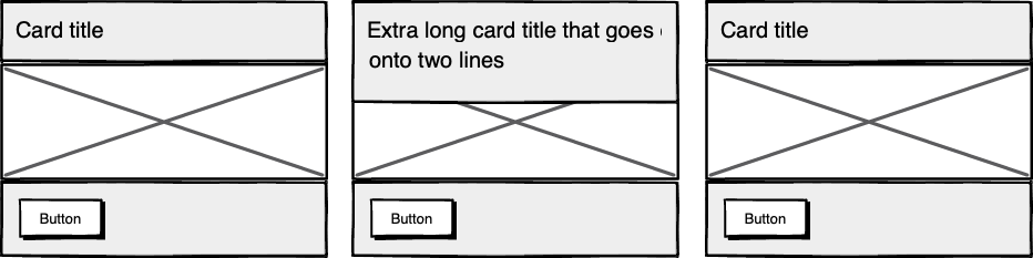 Cards unable to respond to a sibling's content changes
Subgrid allows elements to respond to adjustments in their own content and in the content of sibling elements, helping us create designs more resilient to change.
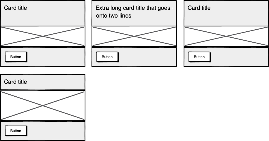 Cards responding to content in sibling cards
.wrapper {
  display: grid;
  grid-template-columns: repeat(auto-fit, minmax(150px, 1fr));
     grid-template-rows: auto 1fr auto;
  gap: 10px;
}

.sub-grid {
  display: grid;
  grid-row: span 3;
  grid-template-rows: subgrid; /* sets rows to parent grid */
}
CSS Grid allows us to separate layout and content, thereby enabling flexible designs. Meanwhile, Subgrid allows us to create designs that can adapt in order to suit morphing content. Subgrid at the time of writing is only supported in Firefox but the above code can be implemented behind an @supports feature query.
Intrinsic layoutsI'd be remiss not to mention intrinsic layouts, the term created by Jen Simmons to describe a mixture of new and old CSS features used to create layouts that respond to available space.
Responsive layouts have flexible columns using percentages. Intrinsic layouts, on the other hand, use the fr unit to create flexible columns that won't ever shrink so much that they render the content illegible.
fr units is a way to say I want you to distribute the extra space in this way, but...don't ever make it smaller than the content that's inside of it.
—Jen Simmons, "Designing Intrinsic Layouts"
Intrinsic layouts can also utilize a mixture of fixed and flexible units, allowing the content to dictate the space it takes up.
 Slide from "Designing Intrinsic Layouts" by Jen Simmons
What makes intrinsic design stand out is that it not only creates designs that can withstand future devices but also helps scale design without losing flexibility. Components and patterns can be lifted and reused without the prerequisite of having the same breakpoints or the same amount of content as in the previous implementation.
We can now create designs that adapt to the space they have, the content within them, and the content around them. With an intrinsic approach, we can construct responsive components without depending on container queries.
Another 2010 moment?This intrinsic approach should in my view be every bit as groundbreaking as responsive web design was ten years ago. For me, it's another "everything changed" moment.
But it doesn't seem to be moving quite as fast; I haven't yet had that same career-changing moment I had with responsive design, despite the widely shared and brilliant talk that brought it to my attention.
One reason for that could be that I now work in a large organization, which is quite different from the design agency role I had in 2010. In my agency days, every new project was a clean slate, a chance to try something new. Nowadays, projects use existing tools and frameworks and are often improvements to existing websites with an existing codebase.
Another could be that I feel more prepared for change now. In 2010 I was new to design in general; the shift was frightening and required a lot of learning. Also, an intrinsic approach isn't exactly all-new; it's about using existing skills and existing CSS knowledge in a different way.
You can't framework your way out of a content problemAnother reason for the slightly slower adoption of intrinsic design could be the lack of quick-fix framework solutions available to kick-start the change.
Responsive grid systems were all over the place ten years ago. With a framework like Bootstrap or Skeleton, you had a responsive design template at your fingertips.
Intrinsic design and frameworks do not go hand in hand quite so well because the benefit of having a selection of units is a hindrance when it comes to creating layout templates. The beauty of intrinsic design is combining different units and experimenting with techniques to get the best for your content.
And then there are design tools. We probably all, at some point in our careers, used Photoshop templates for desktop, tablet, and mobile devices to drop designs in and show how the site would look at all three stages.
How do you do that now, with each component responding to content and layouts flexing as and when they need to? This type of design must happen in the browser, which personally I'm a big fan of.
The debate about "whether designers should code" is another that has rumbled on for years. When designing a digital product, we should, at the very least, design for a best- and worst-case scenario when it comes to content. To do this in a graphics-based software package is far from ideal. In code, we can add longer sentences, more radio buttons, and extra tabs, and watch in real time as the design adapts. Does it still work? Is the design too reliant on the current content?
Personally, I look forward to the day intrinsic design is the standard for design, when a design component can be truly flexible and adapt to both its space and content with no reliance on device or container dimensions.
Content firstContent is not constant. After all, to design for the unknown or unexpected we need to account for content changes like our earlier Subgrid card example that allowed the cards to respond to adjustments to their own content and the content of sibling elements.
Thankfully, there's more to CSS than layout, and plenty of properties and values can help us put content first. Subgrid and pseudo-elements like ::first-line and ::first-letter help to separate design from markup so we can create designs that allow for changes.
Instead of old markup hacks like this—
<p>
  <span >First line of text with different styling</span>...
</p>
—we can target content based on where it appears.
.element::first-line {
  font-size: 1.4em;
}

.element::first-letter {
  color: red;
}
Much bigger additions to CSS include logical properties, which change the way we construct designs using logical dimensions (start and end) instead of physical ones (left and right), something CSS Grid also does with functions like min(), max(), and clamp().
This flexibility allows for directional changes according to content, a common requirement when we need to present content in multiple languages. In the past, this was often achieved with Sass mixins but was often limited to switching from left-to-right to right-to-left orientation.
In the Sass version, directional variables need to be set.
$direction: rtl;
$opposite-direction: ltr;

$start-direction: right;
$end-direction: left;
These variables can be used as values—
body {
  direction: $direction;
  text-align: $start-direction;
}
—or as properties.
margin-#{$end-direction}: 10px;
padding-#{$start-direction}: 10px;
However, now we have native logical properties, removing the reliance on both Sass (or a similar tool) and pre-planning that necessitated using variables throughout a codebase. These properties also start to break apart the tight coupling between a design and strict physical dimensions, creating more flexibility for changes in language and in direction.
margin-block-end: 10px;
padding-block-start: 10px;
There are also native start and end values for properties like text-align, which means we can replace text-align: right with text-align: start.
Like the earlier examples, these properties help to build out designs that aren't constrained to one language; the design will reflect the content's needs.
 Fixed and fluid
We briefly covered the power of combining fixed widths with fluid widths with intrinsic layouts. The min() and max() functions are a similar concept, allowing you to specify a fixed value with a flexible alternative.
For min() this means setting a fluid minimum value and a maximum fixed value.
.element {
  width: min(50%, 300px);
}
The element in the figure above will be 50% of its container as long as the element's width doesn't exceed 300px.
For max() we can set a flexible max value and a minimum fixed value.
.element {
  width: max(50%, 300px);
}
Now the element will be 50% of its container as long as the element's width is at least 300px. This means we can set limits but allow content to react to the available space.
The clamp() function builds on this by allowing us to set a preferred value with a third parameter. Now we can allow the element to shrink or grow if it needs to without getting to a point where it becomes unusable.
.element {
  width: clamp(300px, 50%, 600px);
}
This time, the element's width will be 50% (the preferred value) of its container but never less than 300px and never more than 600px.
With these techniques, we have a content-first approach to responsive design. We can separate content from markup, meaning the changes users make will not affect the design. We can start to future-proof designs by planning for unexpected changes in language or direction. And we can increase flexibility by setting desired dimensions alongside flexible alternatives, allowing for more or less content to be displayed correctly.
Situation firstThanks to what we've discussed so far, we can cover device flexibility by changing our approach, designing around content and space instead of catering to devices. But what about that last bit of Jeffrey Zeldman's quote, "...situations you haven't imagined"?
It's a very different thing to design for someone seated at a desktop computer as opposed to someone using a mobile phone and moving through a crowded street in glaring sunshine. Situations and environments are hard to plan for or predict because they change as people react to their own unique challenges and tasks.
This is why choice is so important. One size never fits all, so we need to design for multiple scenarios to create equal experiences for all our users.
Thankfully, there is a lot we can do to provide choice.
Responsible design"There are parts of the world where mobile data is prohibitively expensive, and where there is little or no broadband infrastructure."
"I Used the Web for a Day on a 50 MB Budget"
Chris Ashton
One of the biggest assumptions we make is that people interacting with our designs have a good wifi connection and a wide screen monitor. But in the real world, our users may be commuters traveling on trains or other forms of transport using smaller mobile devices that can experience drops in connectivity. There is nothing more frustrating than a web page that won't load, but there are ways we can help users use less data or deal with sporadic connectivity.
The srcset attribute allows the browser to decide which image to serve. This means we can create smaller 'cropped' images to display on mobile devices in turn using less bandwidth and less data.
<img
  src="image-file.jpg"
  srcset="large.jpg 1024w,
             medium.jpg 640w,
             small.jpg 320w"
     alt="Image alt text" />
The preload attribute can also help us to think about how and when media is downloaded. It can be used to tell a browser about any critical assets that need to be downloaded with high priority, improving perceived performance and the user experience.
<link rel="stylesheet" href="style.css"> <!--Standard stylesheet markup-->
<link rel="preload" href="style.css" as="style"> <!--Preload stylesheet markup-->
There's also native lazy loading, which indicates assets that should only be downloaded when they are needed.
<img src="image.png" loading="lazy" alt="…">
With srcset, preload, and lazy loading, we can start to tailor a user's experience based on the situation they find themselves in. What none of this does, however, is allow the user themselves to decide what they want downloaded, as the decision is usually the browser's to make.
So how can we put users in control?
The return of media queriesMedia queries have always been about much more than device sizes. They allow content to adapt to different situations, with screen size being just one of them.
We've long been able to check for media types like print and speech and features such as hover, resolution, and color. These checks allow us to provide options that suit more than one scenario; it's less about one-size-fits-all and more about serving adaptable content.
As of this writing, the Media Queries Level 5 spec is still under development. It introduces some really exciting queries that in the future will help us design for multiple other unexpected situations.
For example, there's a light-level feature that allows you to modify styles if a user is in sunlight or darkness. Paired with custom properties, these features allow us to quickly create designs or themes for specific environments.
@media (light-level: normal) {
  --background-color: #fff;
  --text-color: #0b0c0c;
}

@media (light-level: dim) {
  --background-color: #efd226;
  --text-color: #0b0c0c;
}
Another key feature of the Level 5 spec is personalization. Instead of creating designs that are the same for everyone, users can choose what works for them. This is achieved by using features like prefers-reduced-data, prefers-color-scheme, and prefers-reduced-motion, the latter two of which already enjoy broad browser support. These features tap into preferences set via the operating system or browser so people don't have to spend time making each site they visit more usable.
Media queries like this go beyond choices made by a browser to grant more control to the user.
Expect the unexpectedIn the end, the one thing we should always expect is for things to change. Devices in particular change faster than we can keep up, with foldable screens already on the market.
We can't design the same way we have for this ever-changing landscape, but we can design for content. By putting content first and allowing that content to adapt to whatever space surrounds it, we can create more robust, flexible designs that increase the longevity of our products.
A lot of the CSS discussed here is about moving away from layouts and putting content at the heart of design. From responsive components to fixed and fluid units, there is so much more we can do to take a more intrinsic approach. Even better, we can test these techniques during the design phase by designing in-browser and watching how our designs adapt in real-time.
When it comes to unexpected situations, we need to make sure our products are usable when people need them, whenever and wherever that might be. We can move closer to achieving this by involving users in our design decisions, by creating choice via browsers, and by giving control to our users with user-preference-based media queries.
Good design for the unexpected should allow for change, provide choice, and give control to those we serve: our users themselves.